🎨 AI Art Basics Guide 1.1 (V4.5 Full Ver.)
Written for NAI — everything that shapes an art style, plus assorted tips
Thanks for checking this out.
It's long, so here's the 3-line TL;DR first.
1. If you want a style fast without long-winded lectures, jump straight to section 3 (artist tags).
2. You probably know the basics already, so honestly just start from section 3 anyway.
3. It's written for V4.5 Full, but a lot of it helps with local models too — hence the title.
Also yes, this is a repost, but a lot has changed~
1. Added basic settings
2. Added body type & anatomy tags (section 7)
Before we start...
I've written a bunch of art info posts, but the same questions keep coming 6.974 times over and it's driving me insane.
So I tidied up the stuff I'd crammed everywhere and rewrote it as nice clean HTML — now I can FINALLY take a break from explaining....
▶ 0. What even is an art style?
It is not a singular thing.
There's a question that will come up forever and always.
"How do I make this art style?" "Which artist is this style from?"
A lot of you probably came here looking for the answer.
But what IS an art style? That round-ish thing? Thin lines and punchy colors? Dreamy vibes? Drawing bodies that look stupidly hot?
Dig a little deeper and you get line type, colors, lighting, how the body is drawn, and so on… the number of techniques packed into one image is that huge.
And with AI art these days you can even mix the weirdest combos, like ‘Picasso composition with Van Gogh coloring, but make it 3D’. That's where AI art is now.
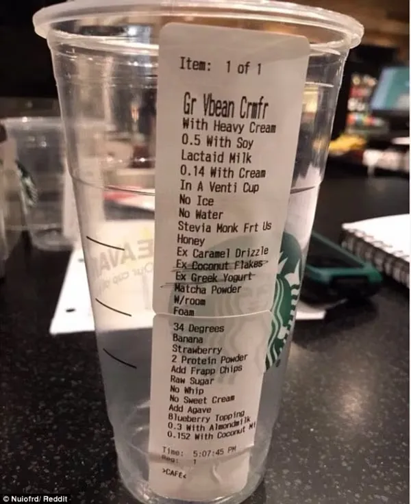 |
“Heavy cream, lactose-free milk, venti cup, no water, honey, extra caramel syrup, extra Greek yogurt, 34 degrees, extra foam, strawberries, frappuccino chips, no whipped cream, add 0.3 shot almond milk, add 0.5 shot soy milk, add 0.14 shot cream, no ice, stevia and monk fruit syrup, extra coconut powder, matcha powder, banana, raw sugar, two scoops of protein powder, unfermented cream, blueberry topping, coconut milk, add 0.152 shot, and only fill the cup 90%.“ |
Just like how a single coffee order can turn into this kind of madness.
So it's hard to look at an image and just go 'oh, do this and you're set'.
That's why I'm cramming basically everything that affects art style into this one post.
Covering the absolute basics too would make this endless, so if you're at the 'how do I even use NAI' stage, at least skim the official docs (docs.novelai.net) first.
Anyway, we said an art style is shaped by tons of factors. Let's split them into 4 big groups.
- 1. Basic settings: system stuff like Sampler and Prompt Guidance
- 2. Artist tags: tags that (try to) mimic a specific artist's style.
- 3. Drawing style: oil painting, ink, 3D, oekaki — all the other tags that shape the look
- 4. Quality tags / negative prompt: add what raises quality / remove what lowers it.
Honestly just read 2 and 3 — for 1 and 4 you'll have to bash your head against it yourself. Good luck.
▶ 1. Basic Settings
The final stage of tuning is stock.
1.1. The 3-line analogy
• Prompt Guidance (CPG): the gas pedal (booster). Higher = obeys you harder, but floor it and the engine blows (image breaks).
• Rescale: the brakes (safety). Holds things down when the gas is about to blow it up.
• Step: number of brush passes.
1.2. Details
• Steps: how many refinement passes the image gets. 28 is standard — higher gets sharper, but too high can oversaturate colors.
• Prompt Guidance (CPG): how strongly the prompt is applied. (Recommended: 5~7)
- Low (3~4): dreamy and soft. The AI gets creative.
- High (8~10+): follows your orders hard. In exchange colors get punchy and contrast harsh — the so-called 'deep-fried' look.
• Prompt Guidance Rescale: keeps the image from breaking (over-applying) when CPG is high. (Recommended: 0 ~ 0.5)
- Image too punchy? → lower CPG or raise Rescale.
- Not listening to you? → raise CPG.
• Seed: the image's ID number (initial noise). Keep the seed and settings, change only the prompt, and you can play 'variations' — same composition, different outfit or expression.
• Variety+: when checked, delays prompt influence in the early generation steps, nudging out more varied poses and compositions.
For everything else, see the official docs: https://docs.novelai.net/en/image
1.3. Recommended tag order
NAI : [Frame] → [Creator] → [Setting] → [Style]
Local : [Frame] → [Setting] → [Character (see below)] → [Creator] → [Style]
Base (4 groups)
[Frame] headcount (1girl, 2boys, etc.), how much body is shown (upper body, cowboy shot, full body), angle (from above and such)
[Setting] location (classroom, beach), lighting (sunlight, backlight), effects (depth of field etc.)
[Creator] artist (artist:name), year (year 2024)
[Render] source (official art, blue archive), style (anime coloring, realistic), quality (masterpiece, highres)
Character (7 groups)
[Basic] character (kisaki, hatsune miku), gaze (looking at viewer)
[Context] job/race (knight, elf), situation (fighting, restrained) ※the character's situation, not the background
[Action] pose (standing, sitting), action (holding sword, drinking), emotion (smile, blush)
[Appearance] face (blue eyes, mole under eye), hair (blonde hair, ponytail, twintails), upper body (large breasts), lower body (thick thighs, wide hips), body state (wet, sweating)
[Outfit] genre (school uniform, armor), material (leather, lace), structure (sleeveless, off shoulder), top (shirt), outerwear (coat, cape), bottom (skirt, shorts)
[Accessories] head/neck (hairpin, choker), arms/waist (bracelet, belt), legs/main (thighhighs, bag)
[Finish] shoes (boots, high heels)
Of course this is only a suggestion — don't obsess over the order. I wing it too when I'm in a hurry.
1.4. Syntax & features (NAI-specific)
Stop using square and curly brackets...
1. Weights (Emphasis)
Please stop using {} and [] — use the intuitive numeric weights.
• Usage: number::tag:: (e.g. 1.2::hat:: → emphasizes the hat 1.2x)
• Careful: if the tag ends with a number, add a space (e.g. 1.2::1girl ::)
2. Negative weights (Negative Emphasis)
The core of V4.5. Not the same as putting things in the negative prompt (Undesired Content).
• How: -number::tag::
• Remove: -1::hat:: (plucks off just the hat)
• Invert: -1::monochrome:: (the opposite of monochrome → adds color)
Strongly recommended when you want to tweeze out one specific element.
3. Add Character
Keeps blonde/black hair etc. from mixing when drawing two or more characters.
Press the button under the prompt box and separate input fields appear — describe each character's looks there. Not perfect, but mixing definitely goes down.
▶ 2. Vibe Transfer & References
Why NAI slaps.
Vibe Transfer (vibe) and References make keeping an art style and character consistent much easier.
Sounds like a no-brainer, but unlike default-size gens these cost Anlas. Only 2 and 5 each, but that adds up fast, and it's limiting if you juggle multiple styles.
2.1. Vibe Transfer
Upload a reference image and it extracts style elements — colors, texture, brushwork — and layers them onto the finished gen. It rules.
[Settings tips]
• Reference Strength: how hard to follow the reference's style. Higher = it slaps that image's colors and texture on more aggressively.
• Information Extracted: how much info to read from the image. The official recommendation is 0.7 — crank it too high and unwanted props or background noise tag along; too low and the style mimicry gets watered down.
[Other tips]
Vibe is said to be most stable with a single image, but you can feed it several similar ones to chase a style. If building a style from scratch is too painful, try this.
And once you've run the exact same image once, reusing it costs no extra Anlas unless you add or change images!
2.2. The Reference Rework (Character / Style)
The star of a very loud, very messy update.
This update reworked the old Character Reference — references are now split into three types: Character & Style, Character, and Style. (Vibe Transfer itself is still around.)
The way I see the current state:
| Reference | Before | Now |
| Art style | Followed my tags | Gets warped by the image's influence |
| Character | Kept the image's traits as-is | Some traits get dropped, and tags interfere |
There are pros and cons to this... I'll get into those in each section.
[Settings]
Fidelity - how much to reference the image = how much info to pull from it
Strength - how much to apply to generation = how much the pulled info steers the gen
That's one theory, and there's also:
Fidelity - copies fine appearance details (facial features etc.).
Strength - how much the AI follows the reference's style, colors, and mood. Too high and it grabs composition and expression too.
Honestly it behaves so erratically that I need to research it more.
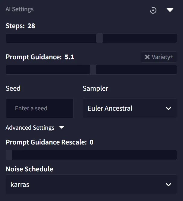
These are the base settings I'll run with — now let's go through them one by one.
2.3. Style Reference (style yoinker)
No more, no less — it yoinks the art style.
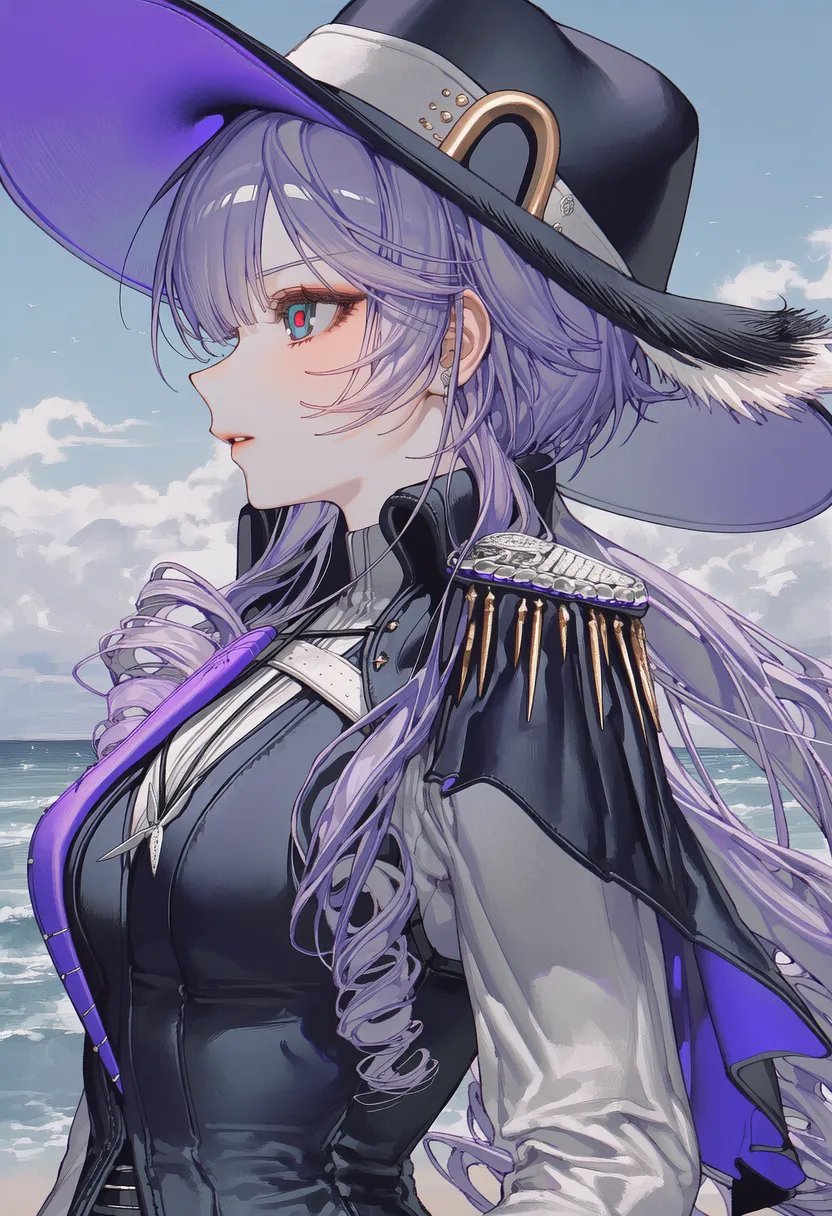
Here are today's two test styles.
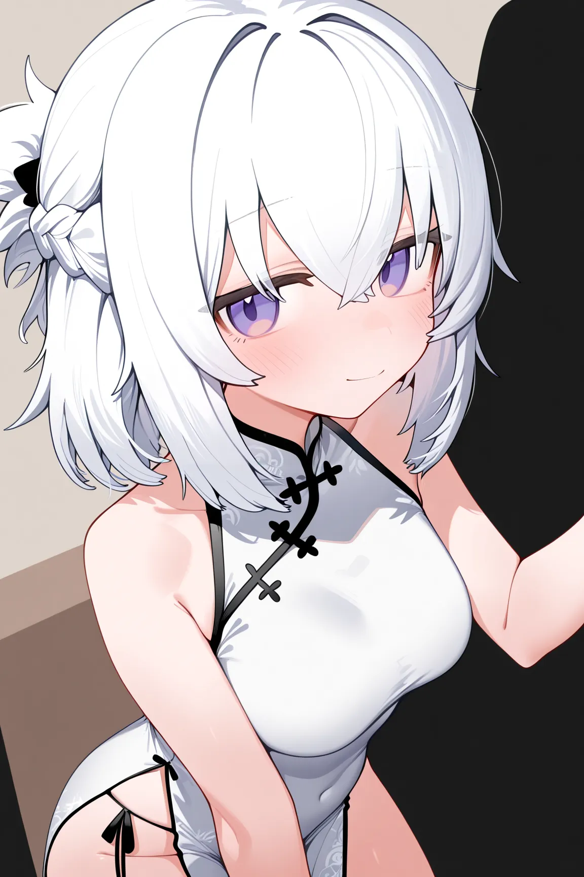 |
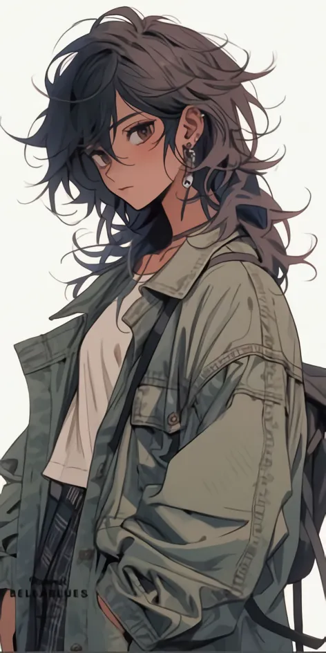 |
Now I'll strip out all base and negative tags and run with appearance tags only.
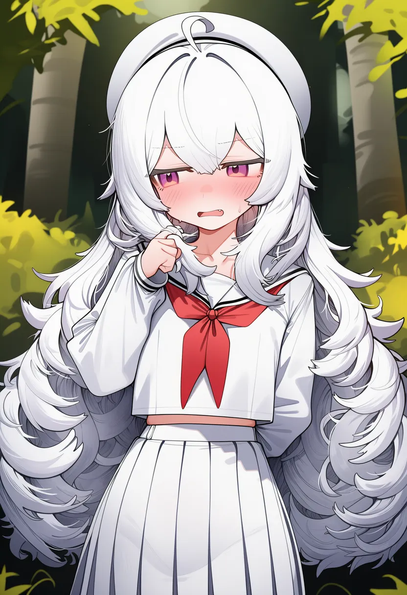
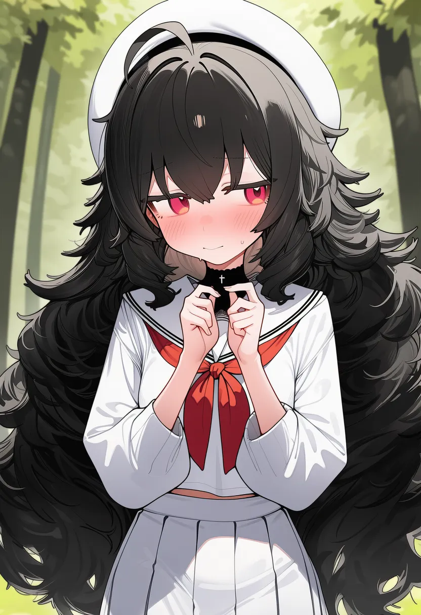
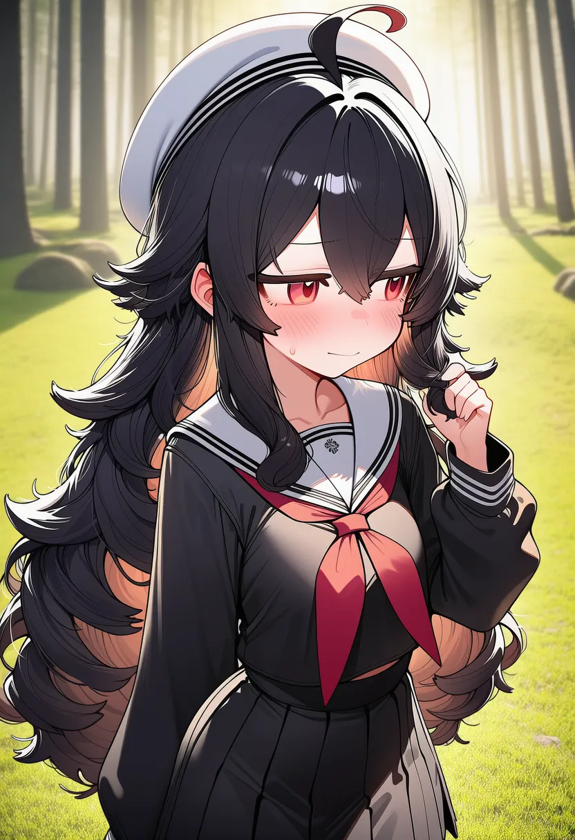
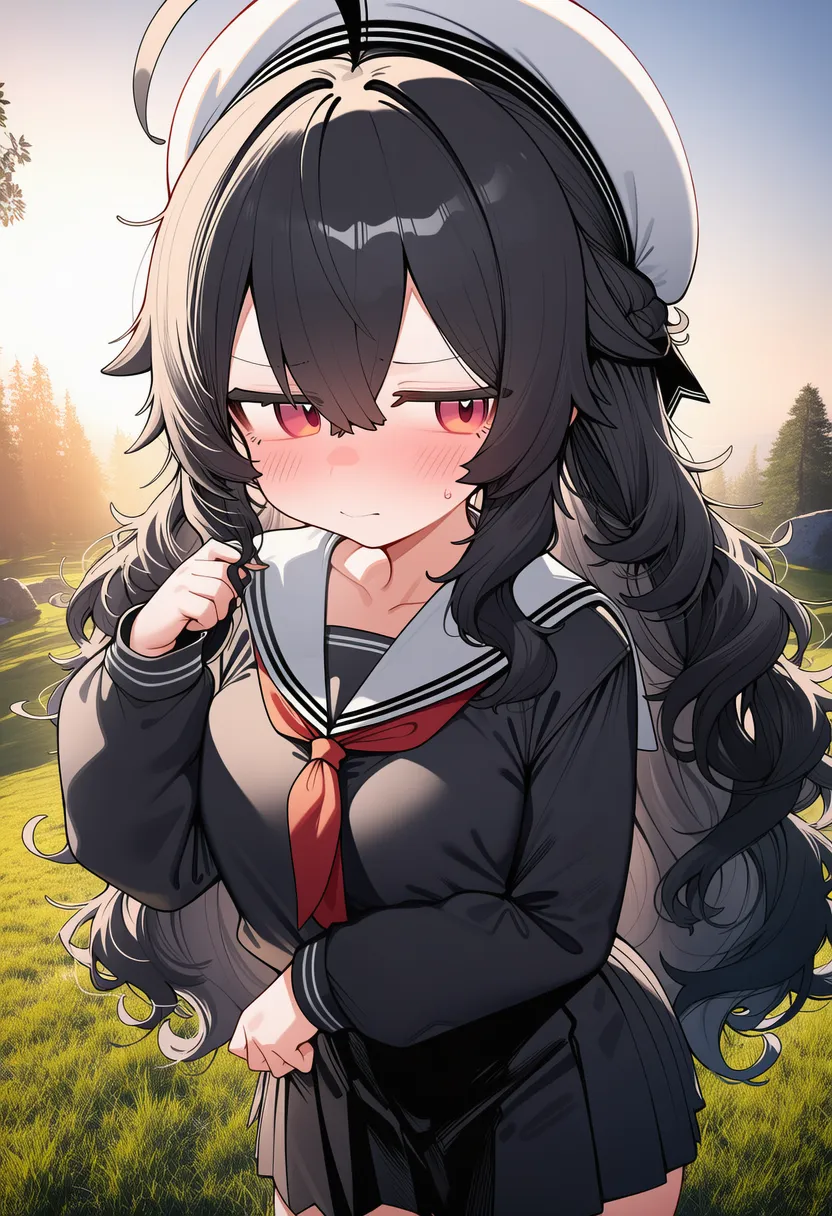
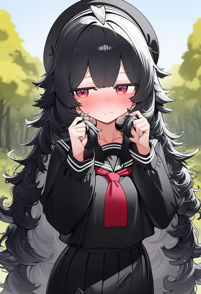
Straight into style #1. (Strength 1.2 / Fidelity 1.2)
 |
 |
 |
 |
 |
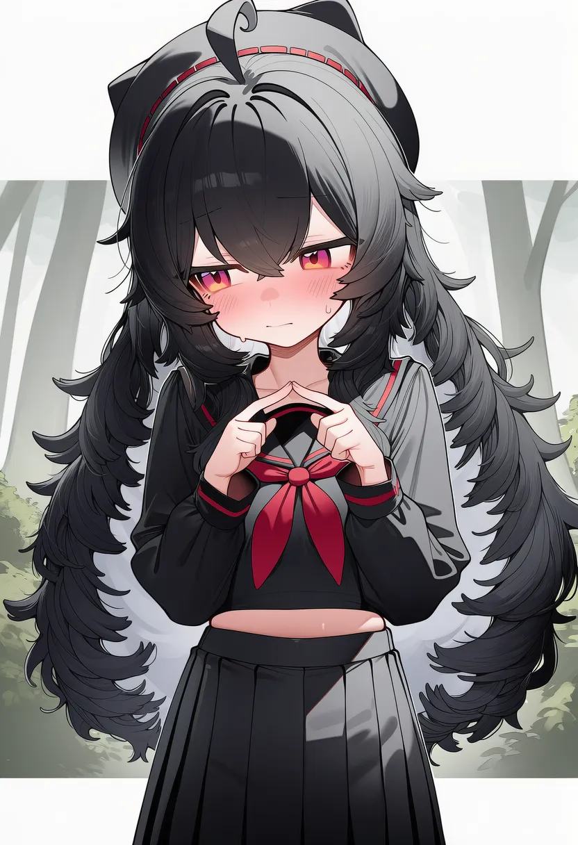 |
You might think the colors glitched — I actually edited the tags to test whether colors different from the original would stick. Looks like some white is left on the inner side too.
Other than that though, the characters come out weirdly bland, like it's drawing with the base model only.
[Sampler differences]
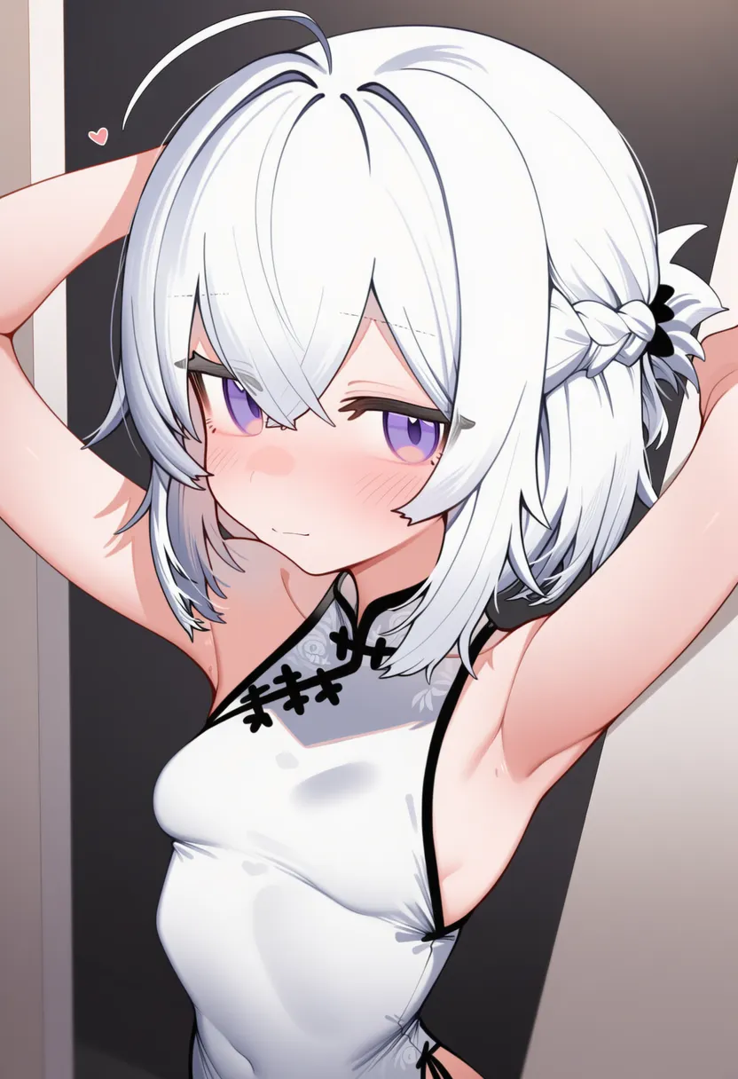
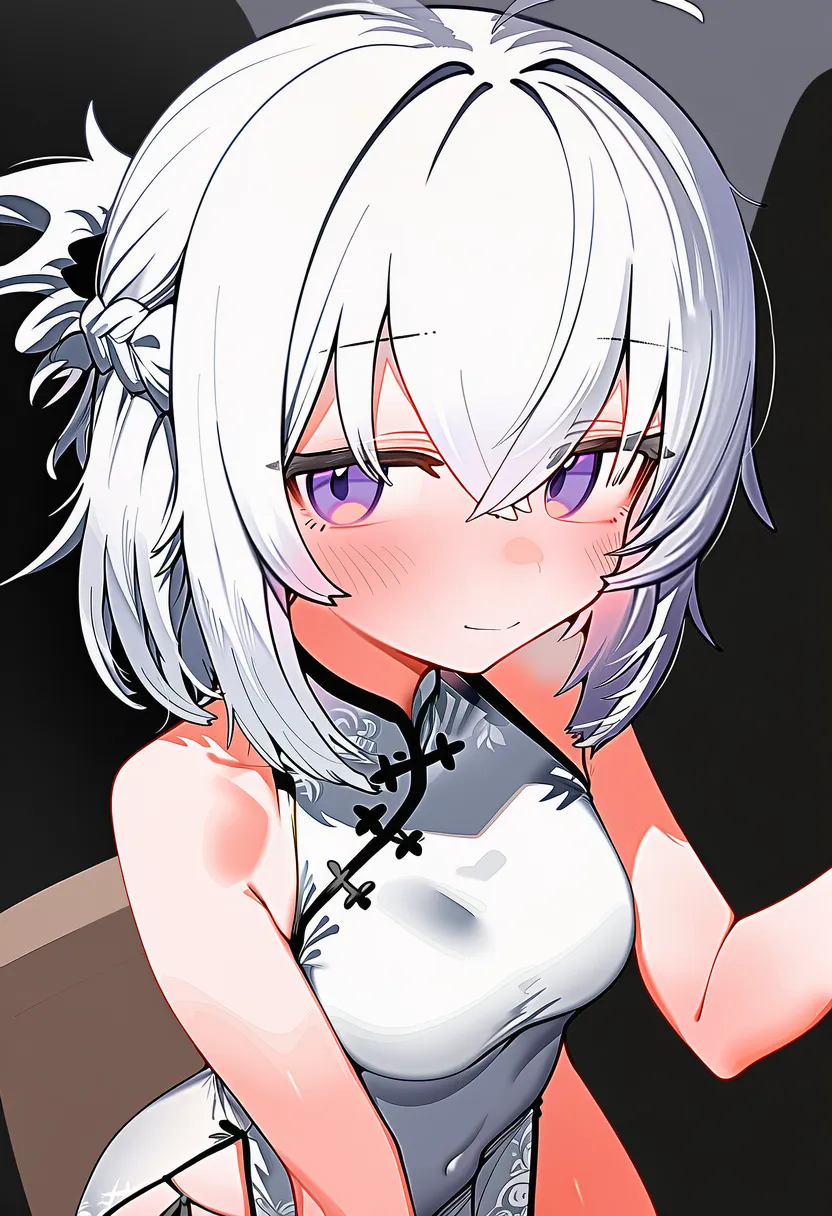
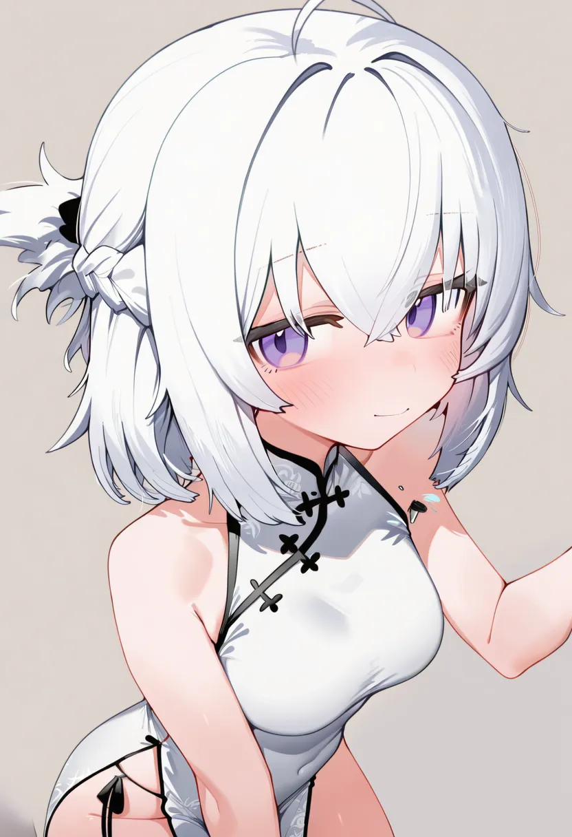
All runs used the same prompt:
girl, from above, upper body, looking away, purple eyes, ahoge, short hair, white hair, skinny, white china dress
Euler Ancestral |
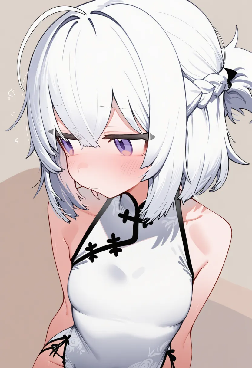
Euler |
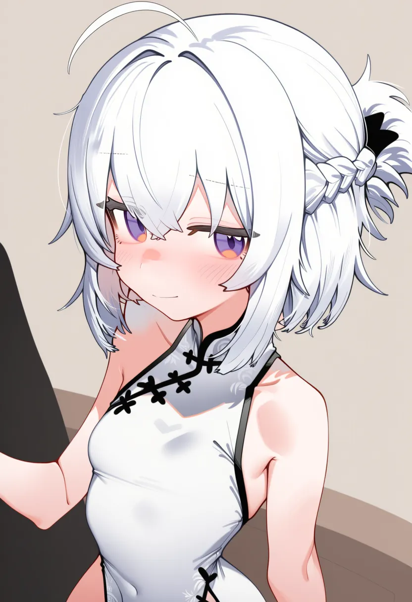
DPM++ 2S Ancestral |
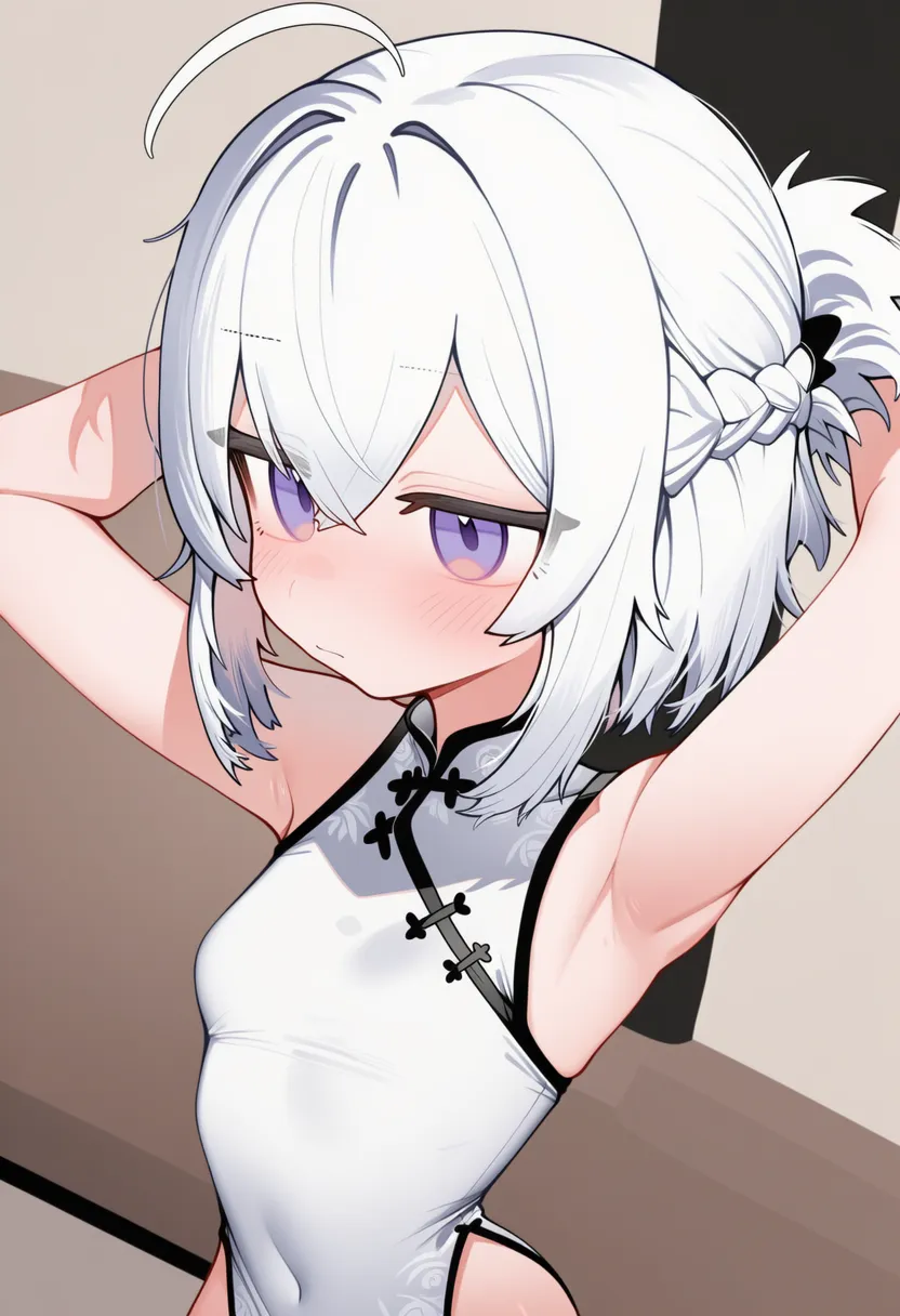
DPM++ 2M SDE |
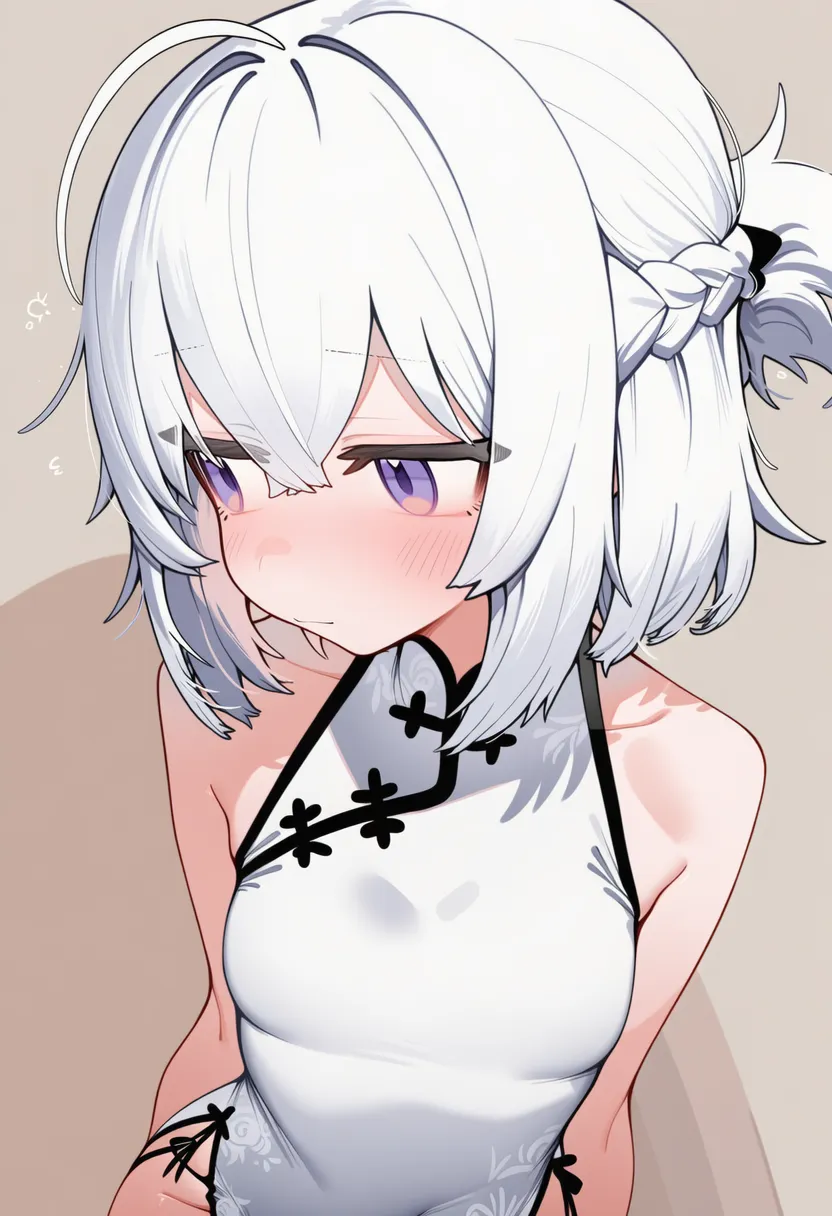
DPM++ 2M |
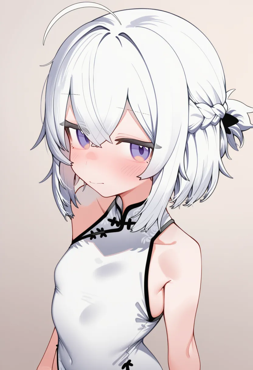
DPM++ SDE |
I tested how each comes out from identical settings, and my verdict: with artist tags removed, the sampler doesn't make that big a difference.
Call it surprising or call it obvious — even with Style only, the character's looks get reproduced to a fair degree.
And they split these apart so consistency would just- (I'll hold my tongue)
Style #2
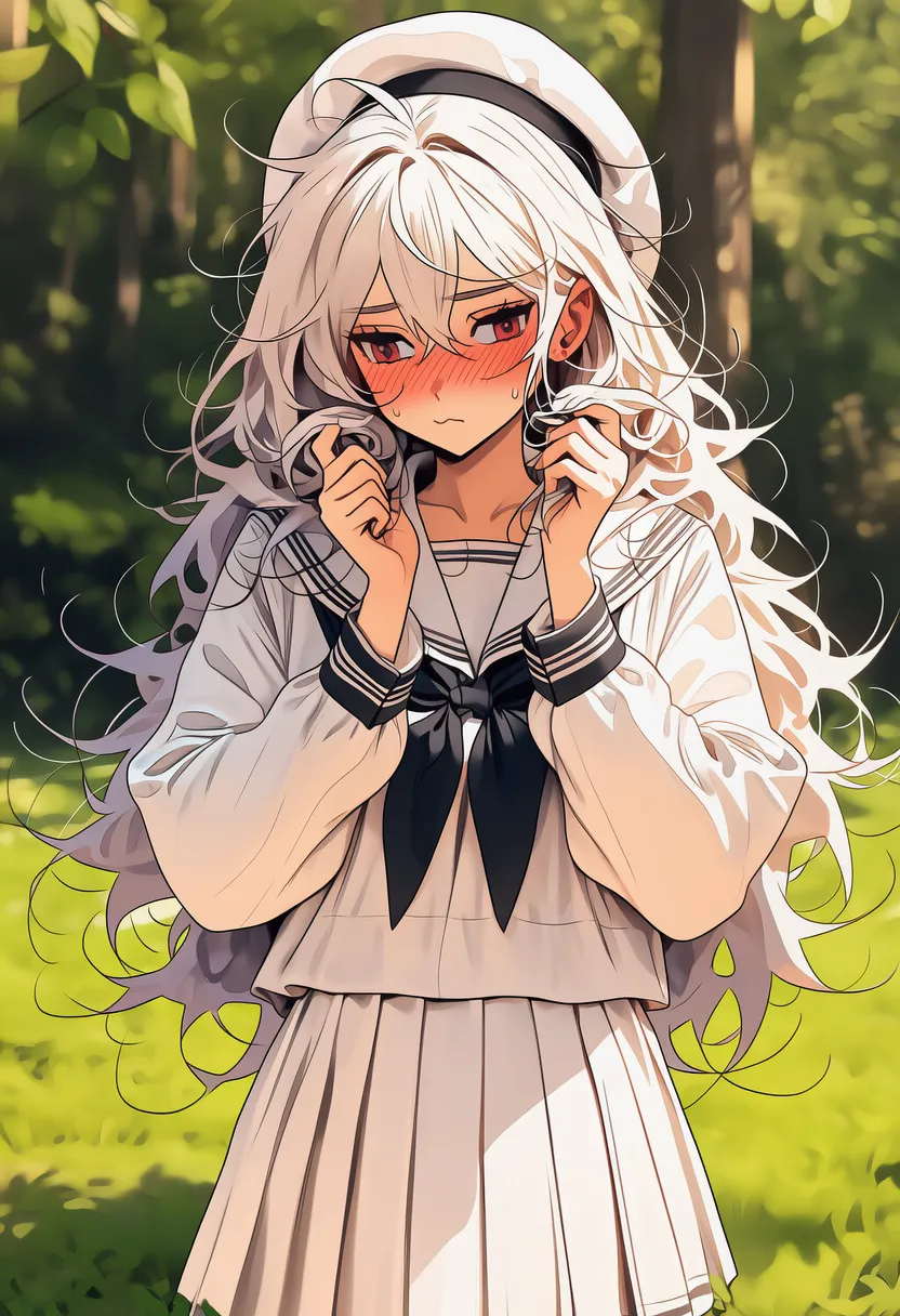
Oh... oh no.
The source image is blurry to begin with, so hands, feet and eyes come out mangled.
Some source images were small too, so I upscaled the original 2x, sharpened it, fed it back in, and added negative tags.
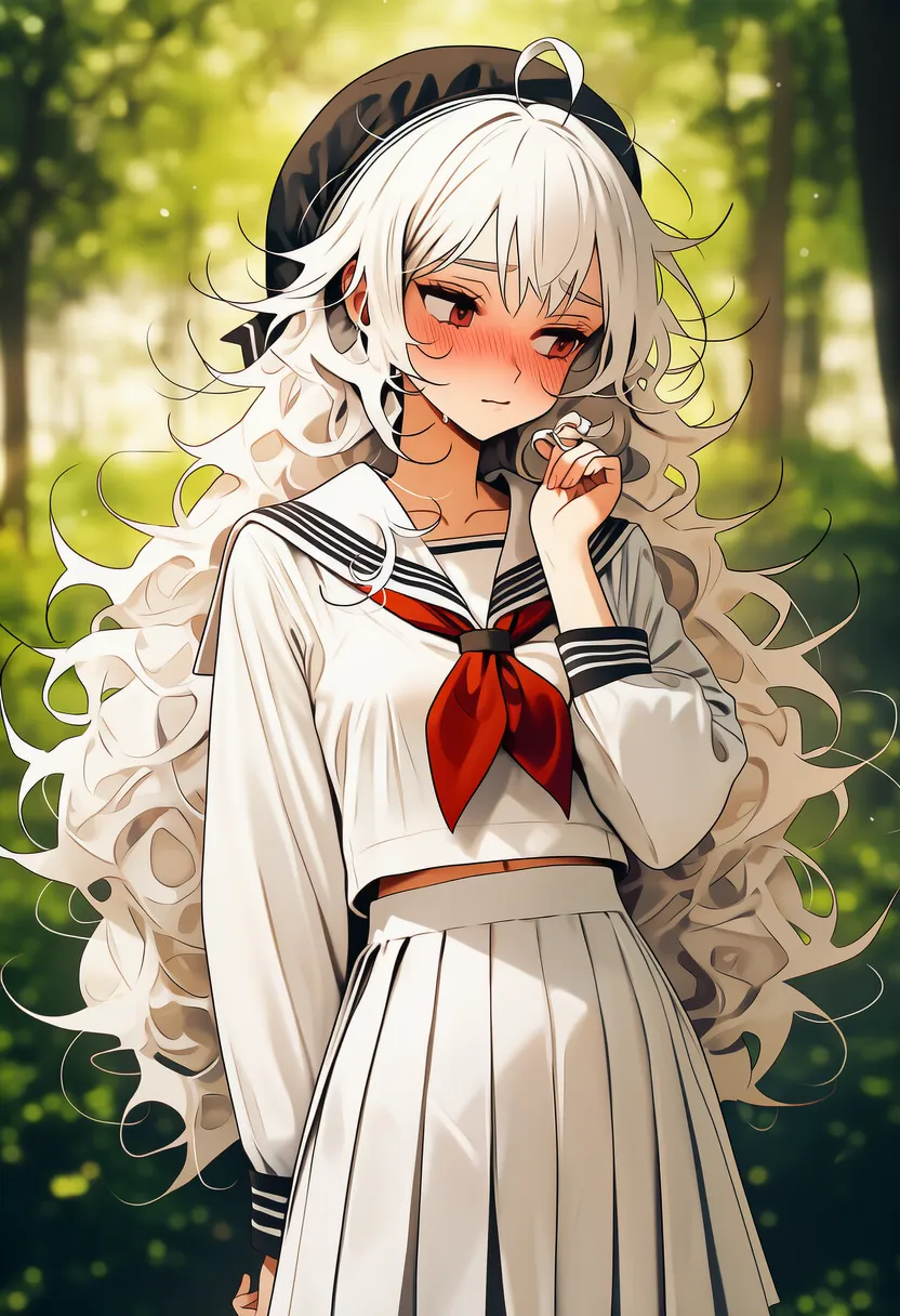
Yosh~ Now it follows the style nicely.
From this we learn that even a Style reference can affect the character's looks (eyes, hands/feet, hair).
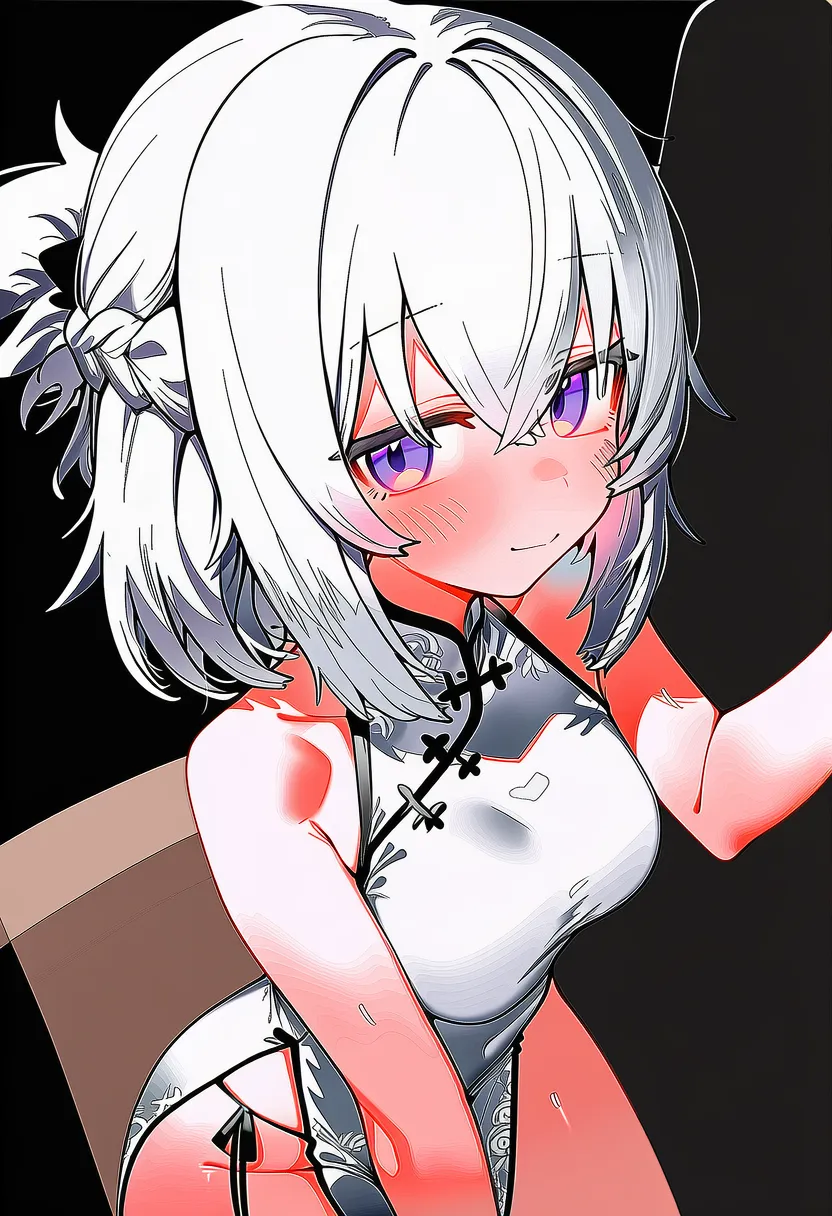
Also, with Strength and Fidelity above 1 it references the original too hard and glitches like these can happen...
 |
 |
 |
Reroll, and like the 3rd image the style magically restores itself! But it's random!
So I still can't confidently write settings recommendations for this feature... It's unstable and comes out different every time. It'd be easy to shrug and say 'it glitches sometimes, keep rolling until it works' — but that's not a guide, is it. And even when I dial the settings down, it behaves differently per style.
Brace yourself, NAI.
2.4. Character Reference (the troublemaker)
This one ticks me off so much I'm reusing something I wrote earlier.
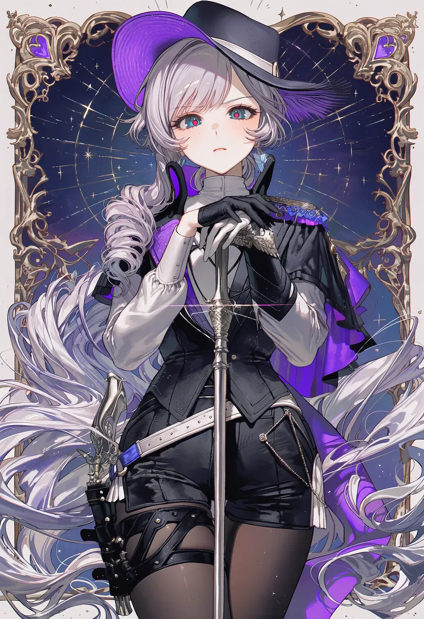
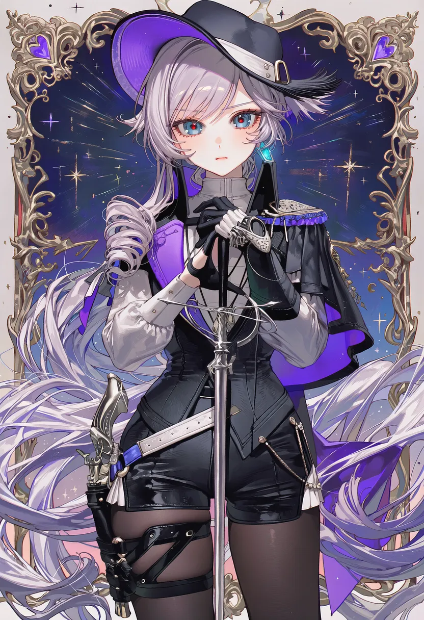
Fidelity used to pull fine details even at 0 — now it feels like you have to raise it before it digs up and uses the fine details.
And here it references not just hair color, eye color, outfit or accessories, but 'the face shape (oval, round, chibi-ish, etc.), eye size, the position and angle of hair strands, and their fine shapes' — which probably explains why people feel their art style changed.
Below: Fidelity sweep at a fixed Strength of 1.

0.0 |
0.2 |
0.4 |
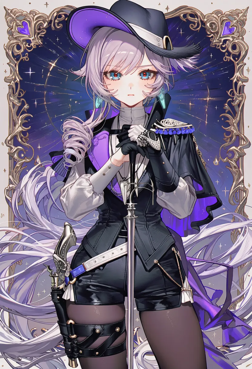
0.6 (face shape shifts) |
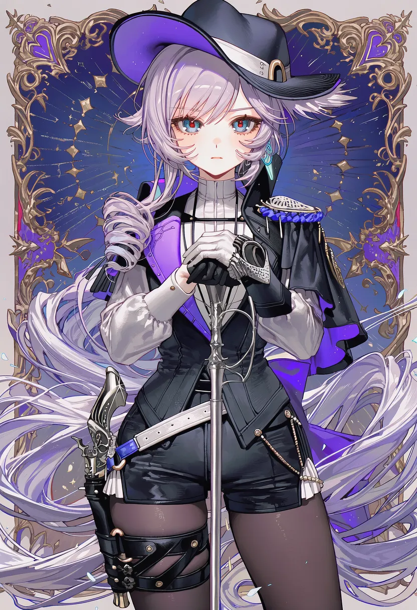
0.8 |
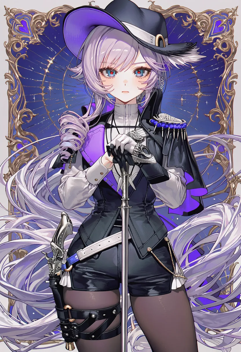
1.0 |
2.5. Character & Style Reference
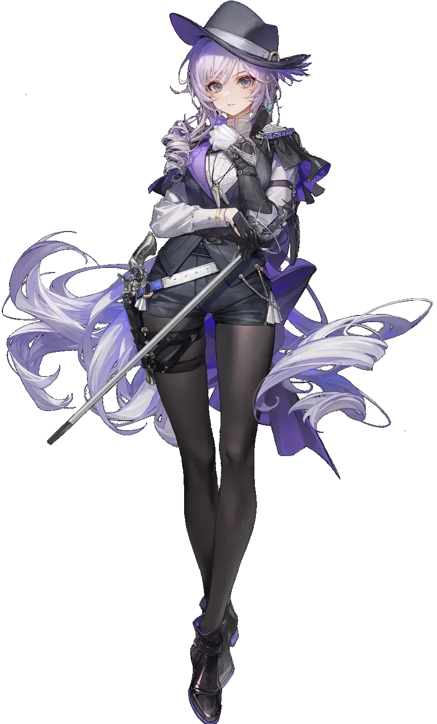
This is the initial reference image.
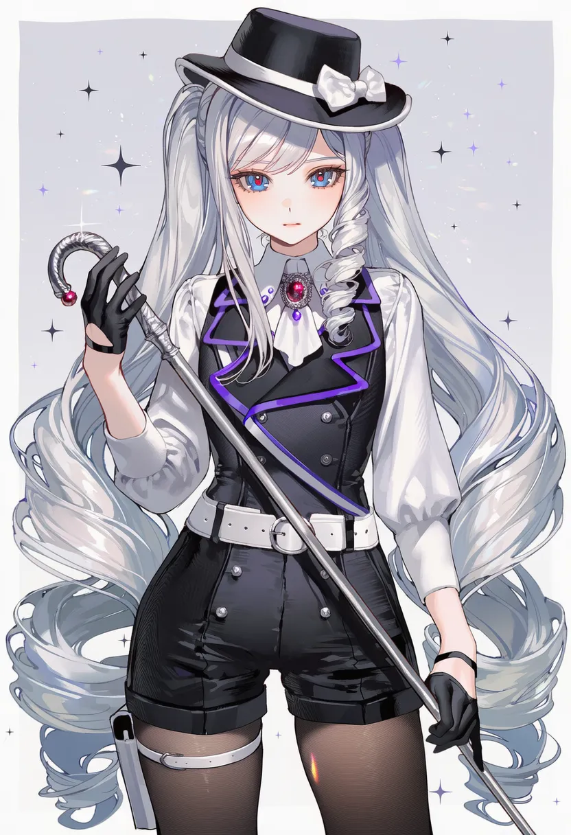
This is the art style.
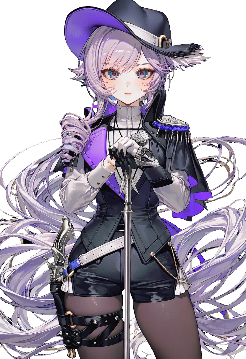
This is an image made with the reference, cut out onto a clean background to use as a new reference image —
strip out all artist and character tags, feed it as Character & Style reference at 0.8~0.9 / 0.8~0.9, and:
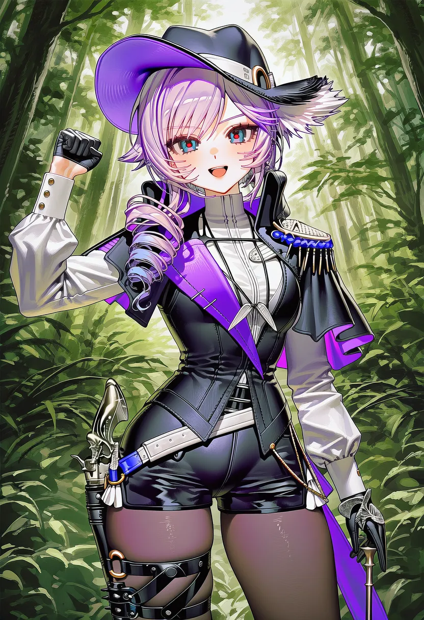
It gets remarkably close even with zero artist tags.
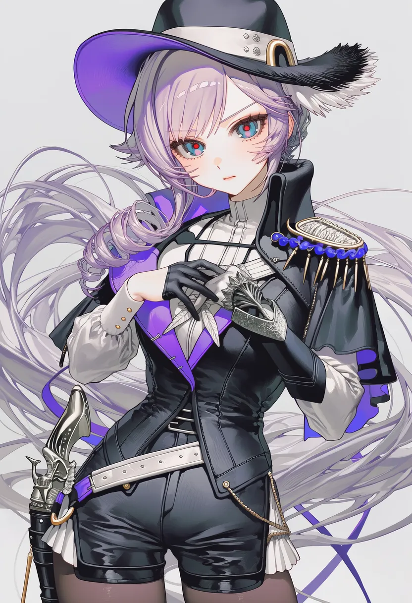
From there, add artist tags, turn on Variety+, and lower Guidance from around 6.9 to 5 — it comes out close to the reference image.
So it seems rather than dropping artists entirely, what you need is weight and guidance tuning.
2.6. Misc (reference sheets etc.)
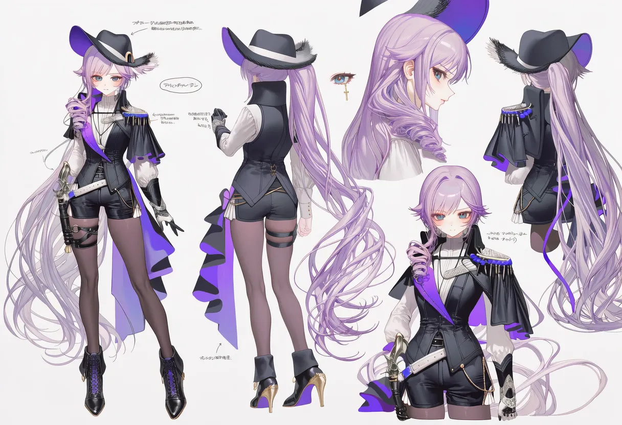
Honestly this one startled me... it came out with exactly the hair design I would have wanted.
With a frontal shot as Style and a different reference sheet as Character, side shots came out fine too.
[Old tips that still hold]
• Big, clean images are best: a turnaround reference sheet on a simple background works well.
• If building detailed tags from an image is hard, upload it to wd-tagger (search it on Hugging Face) and run that.
• Use image editing (Photoshop etc.): add props or accents directly onto the reference image, then use it as a reference for easy variations.
• Tags that contradict the image (flat vs busty, male vs female, etc.) invite unstable results, so tune the settings as you go.
▶ 3. Artist Tags
The artist you're looking for is in this box
I said styles have tons of factors, but there's one tag that handles most of it for you
artist: <- this one right here. The artist tag.
It mimics a specific artist's style. Write the artist's name after artist:, searching the name on Danbooru first. Underscores can stay or go — I recommend dropping them.
Just the name without artist: works similarly. NAI officially recommends keeping the prefix (dropping it adds randomness), but it does save tokens, so your call.
Some artists have two names with one in parentheses, like alexi (tits!). Don't write just alexi or just tits! — write the whole thing: artist: alexi (tits!).
3.1. Finding artists
But you don't know how an artist actually renders, right? There are a few ways.
3.1.1. Artist gallery sites
There are sites collecting samples of how artist/character/series tags actually render. nax.moe is the big one, and a search will turn up things like danbooru artist galleries for NoobAI-XL. Browse those and shortlist artists you like.
3.1.2. Artist finder
On Hugging Face there's the Kaloscope artist style classifier. Feed it an image you like and it finds similar artists. It doesn't tell you 'which artists were mixed' — it tells you ‘who draws like this finished piece'.
[Settings tips] Top K: how many artists to show. Threshold: just leave it at 0 and don't touch it.
3.2. Artist order
A prompt is like 'layers' building the image from the front. The vectors play tug-of-war, and whoever claims ground first takes the big picture.
Earlier tags handle the 'broad strokes', later ones fill in 'whatever's left'. Big-picture stuff like body shape follows the early artists; fine details like eyes follow the later ones.
So here's the artist order I suggest.
- • Early: artists great at bodies and composition
- • Middle: artists great at coloring and mood (skin texture, backgrounds, etc.)
- • Late: artists who draw pretty eyes and details (eyes are where AI-ness shows most)
Note down each artist's strengths, then line up your favorites in that order per role — you'll land on the style you want much faster.
Too lazy? Just slap them in whatever order you like! Put the tag whose traits you want more of anywhere, front or back.
[Other tips]
Rather than one artist at a huge weight, splitting the weight and placing the same artist 2+ times (front, back, even middle) brings out their flavor better.
3.3. Weight tuning
The artist-tag world is brutal. The more an artist has drawn, the stronger their pull — they'll ignore your ordering and paint everything their way. So we weight artist tags, in number::prompt :: form or with {} [].
Apparently weighting each prompt individually causes less noise than weighting them as a group.
There's no right ratio — you just keep tweaking and rerolling. There are community programs that auto-sweep weight combos, so hunting one down cuts the grind.
[Tiny tip] -3::artist collaboration :: , solo artist : good when one artist pops out too hard.
Three-line summary
• Find artists: browse the finder or gallery sites, pick ones with the vibe you want.
• Set the order: check their strengths (body/coloring/eyes) and line them up.
• Run combos: keep rolling with different weights.
▶ 4. Drawing Styles
It's... multiplying...
I say 'drawing styles' but these are general tags shaping the look. 4.5 understands natural language fine, but tags work better, so I beat an AI into spitting out tags.
Since they're AI-suggested they needed verifying — I dropped a few, ran each tag at about weight 2 under identical conditions, and made tables.
Lots of images, so they're split by category. Only the realistic family ran at weight 1.5. It was too much of a shock...
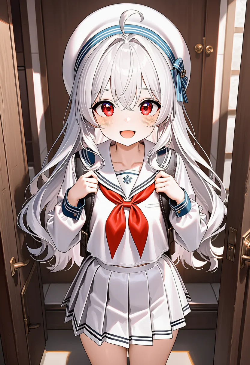
This is my daughter who helped with today's experiments. There's exif, but since it's for testing I stripped all artist tags. (except negatives).
▶ 4.1. Medium
Decides what tool the image was 'drawn' with. The foundation of the look.
Reference original |
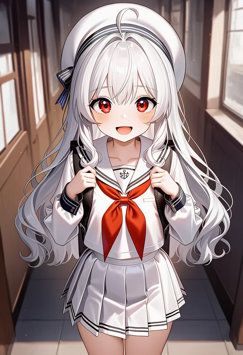 traditional media: Real paper and paint (analog) |
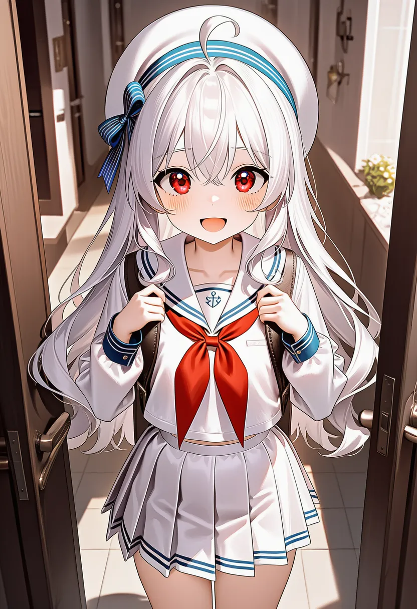 faux traditional media: Digital tools imitating analog |
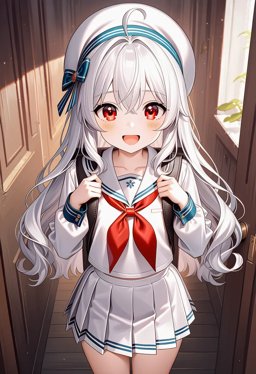 mixed media: Mixed: photo+drawing, ink+pastel, etc. |
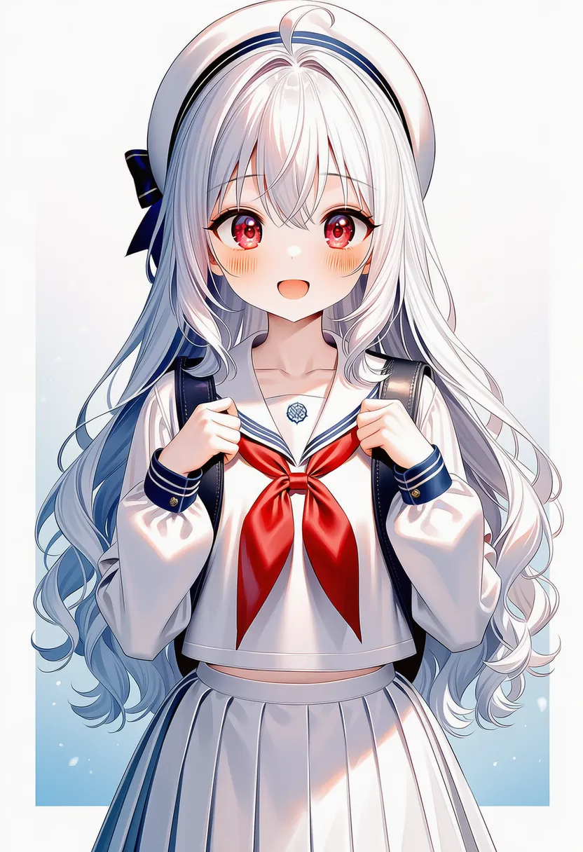 unconventional media: Unusual materials (coffee, blood, petals) |
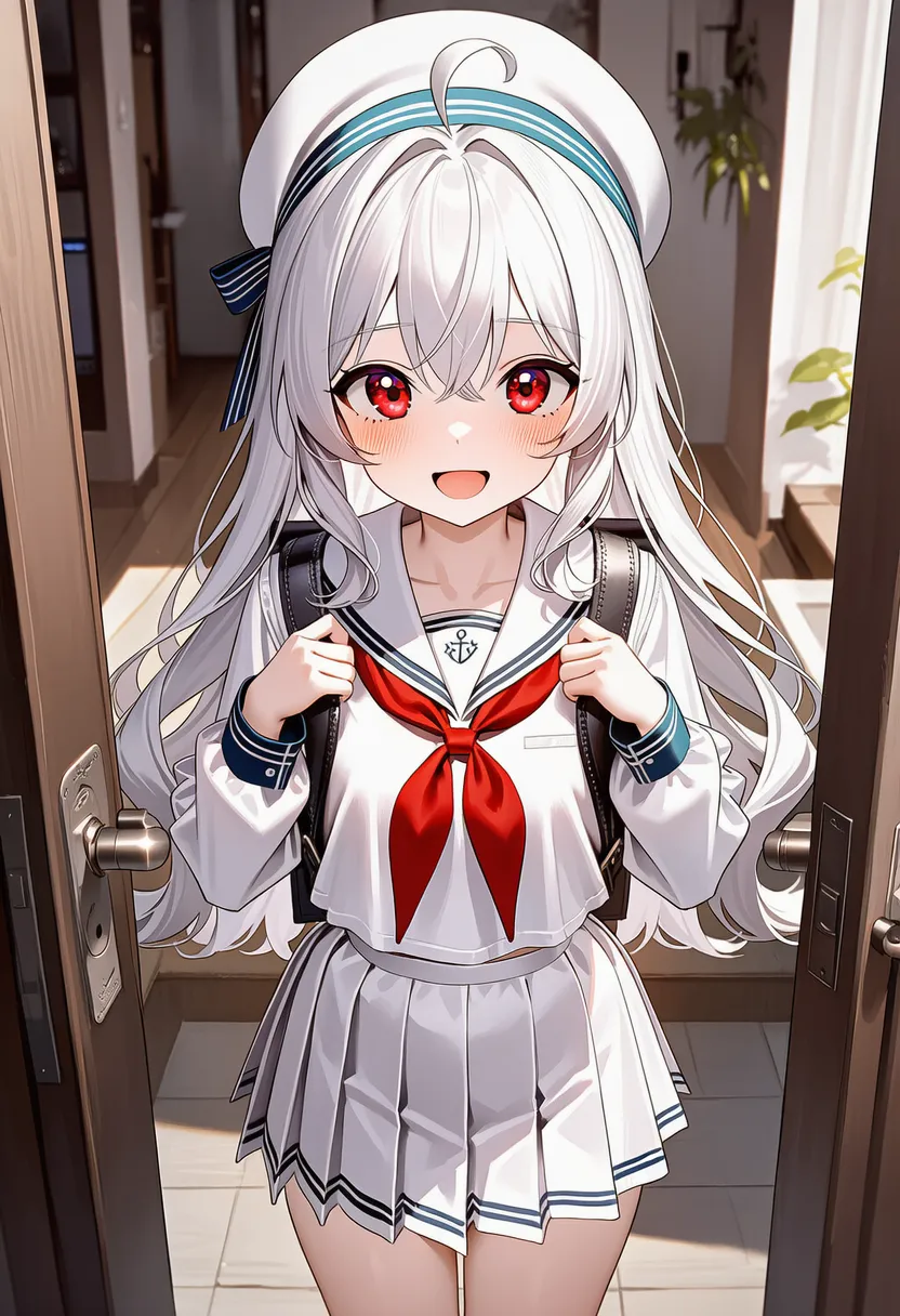 Reference original |
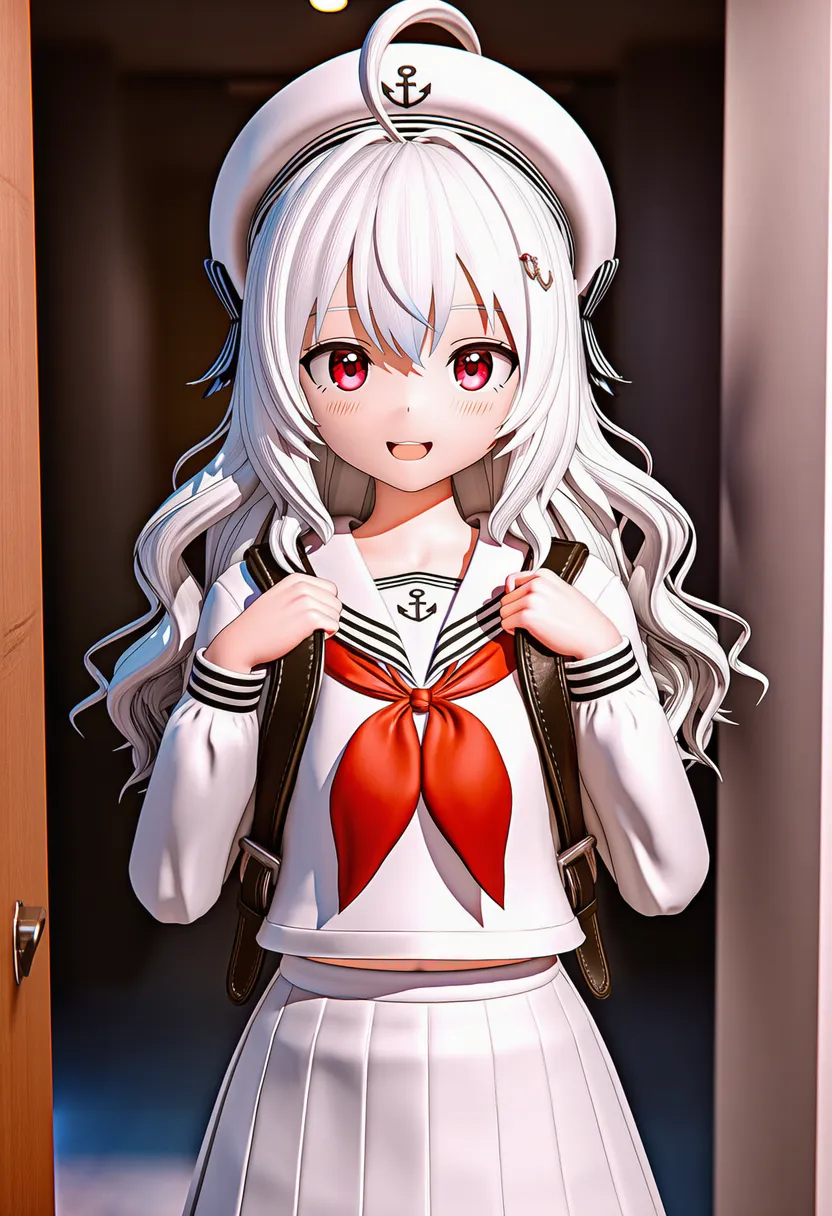 blender (medium): 3D rendering |
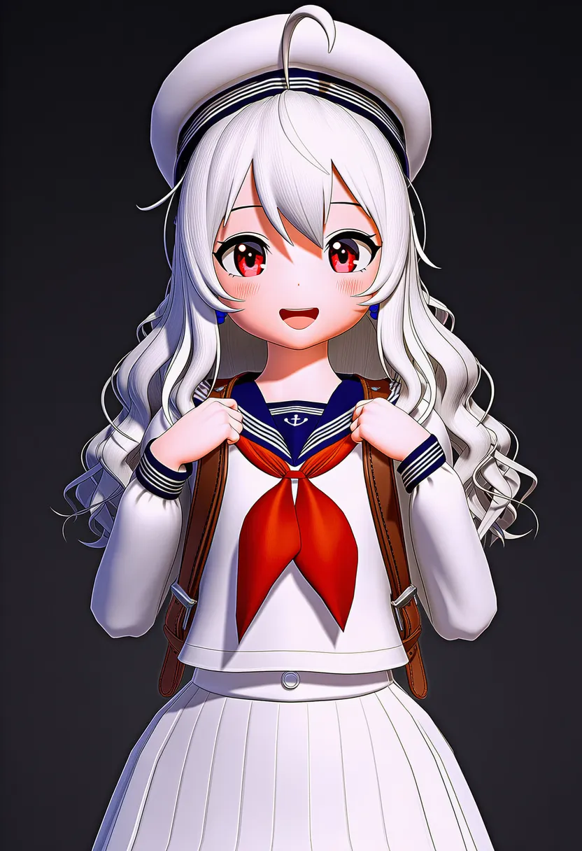 3d (medium): 3D-ish feel |
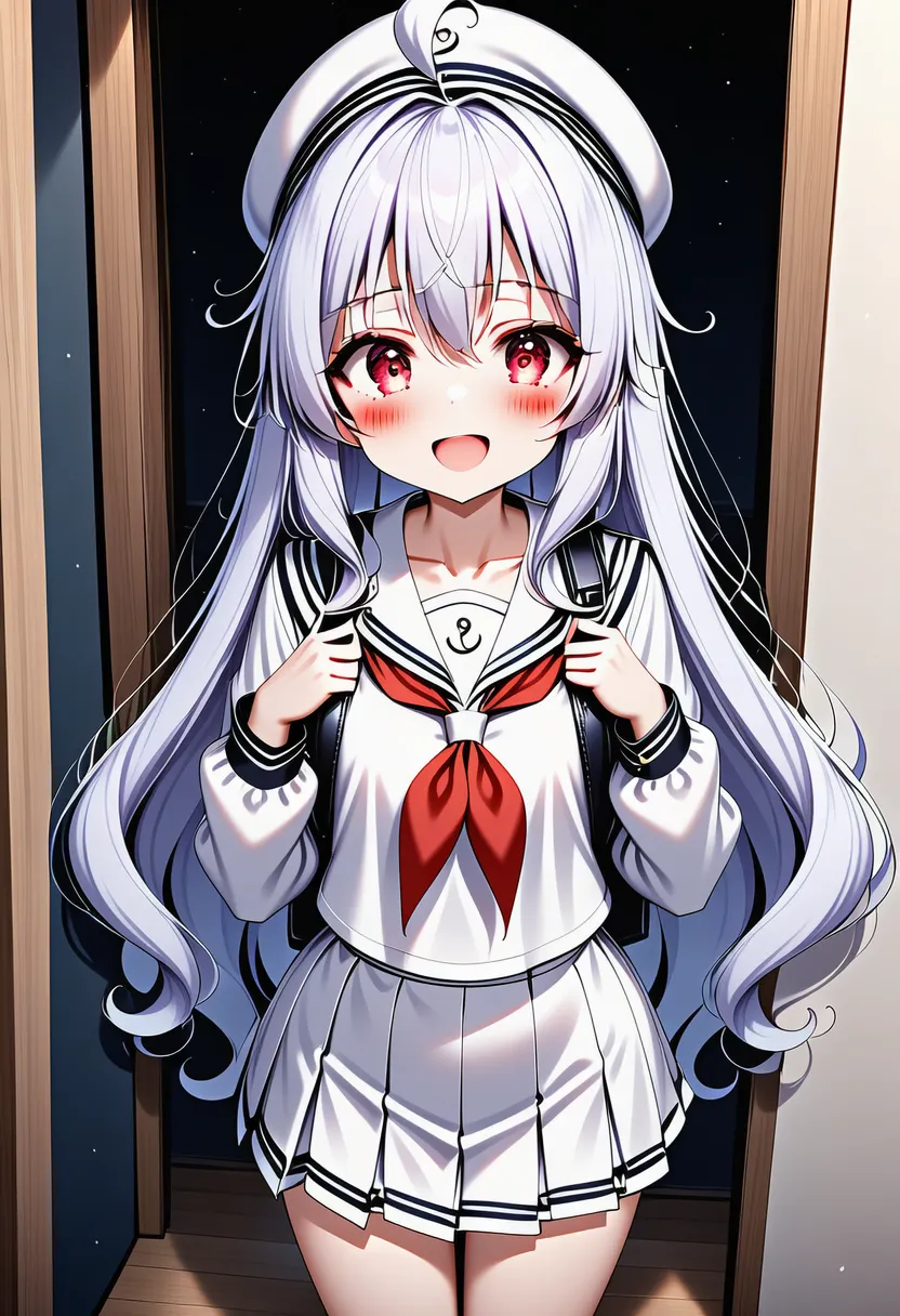 ai-generated: That smooth, overly intricate AI-pattern look |
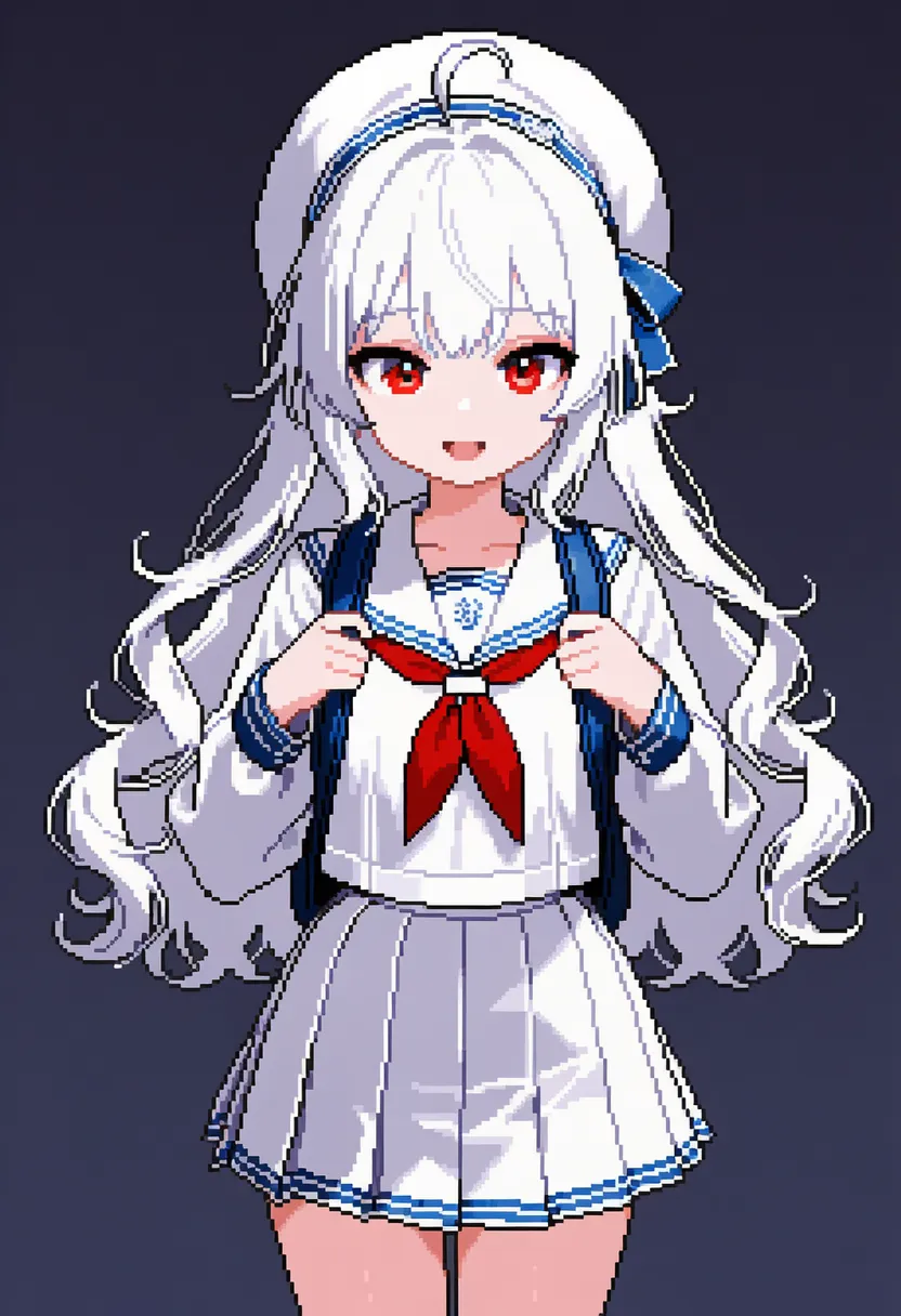 pixel art: Pixel graphics |
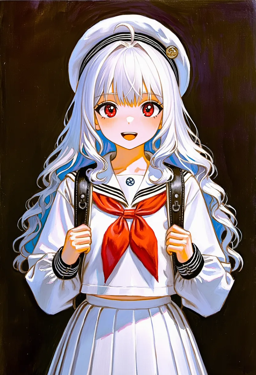 acrylic paint: Acrylic. Crisp, vivid feel |
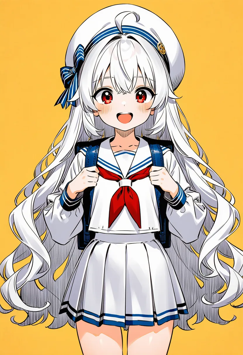 ballpoint pen: Ballpoint pen. Sharp lines, doodle vibe |
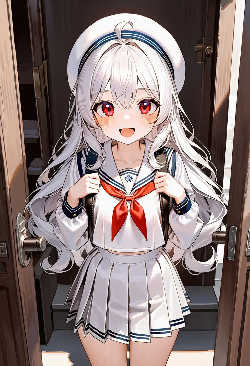 calligraphy brush: Calligraphy brush. Ink, East Asian linework |
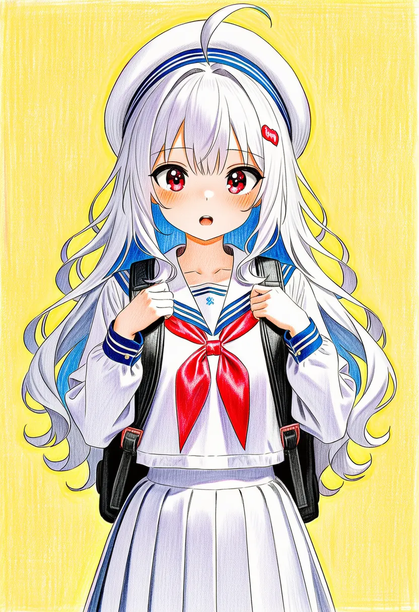 colored pencil: Colored pencil. Paper texture, scratchy feel |
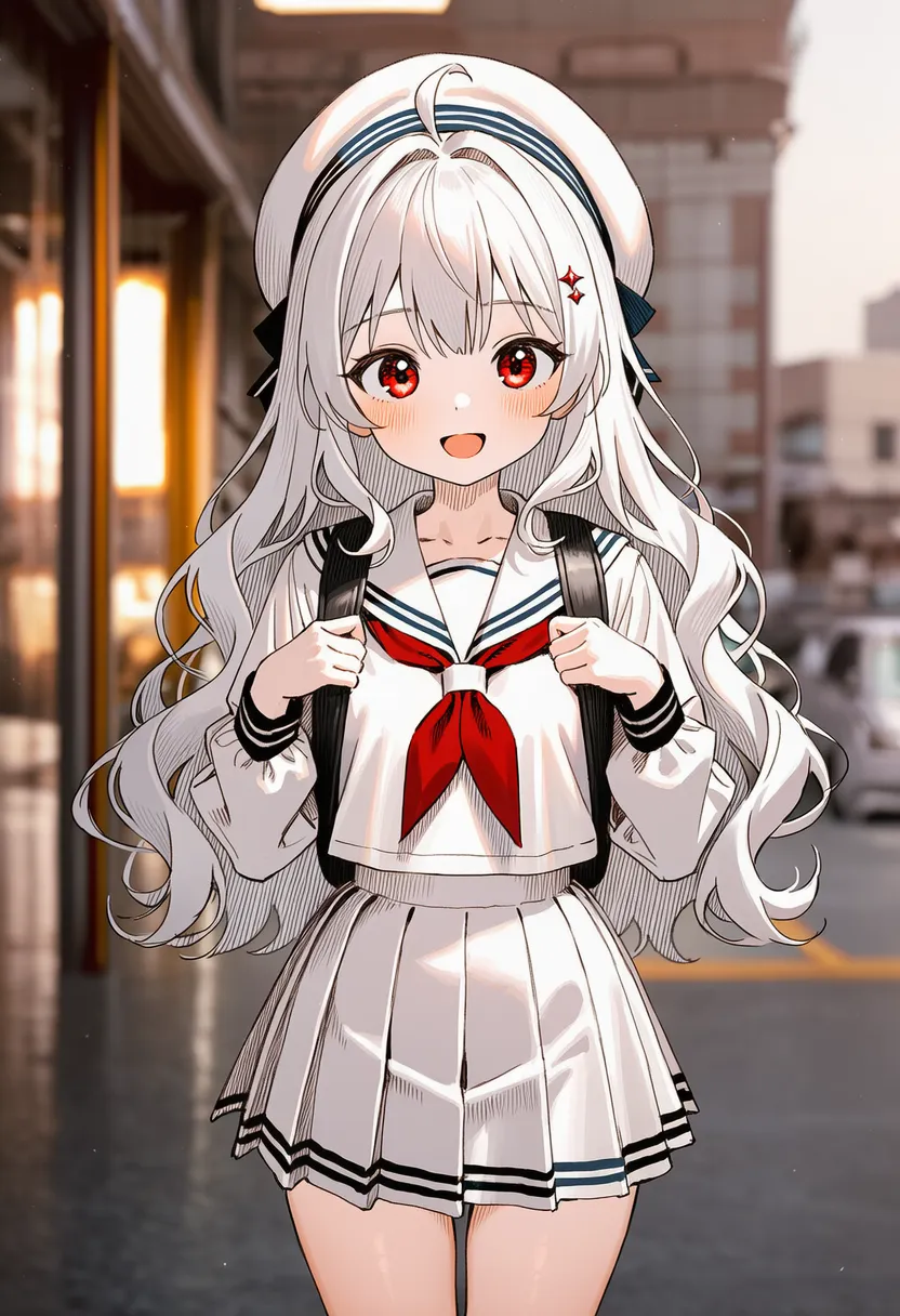 graphite: Graphite/pencil. Sketch, dessin feel |
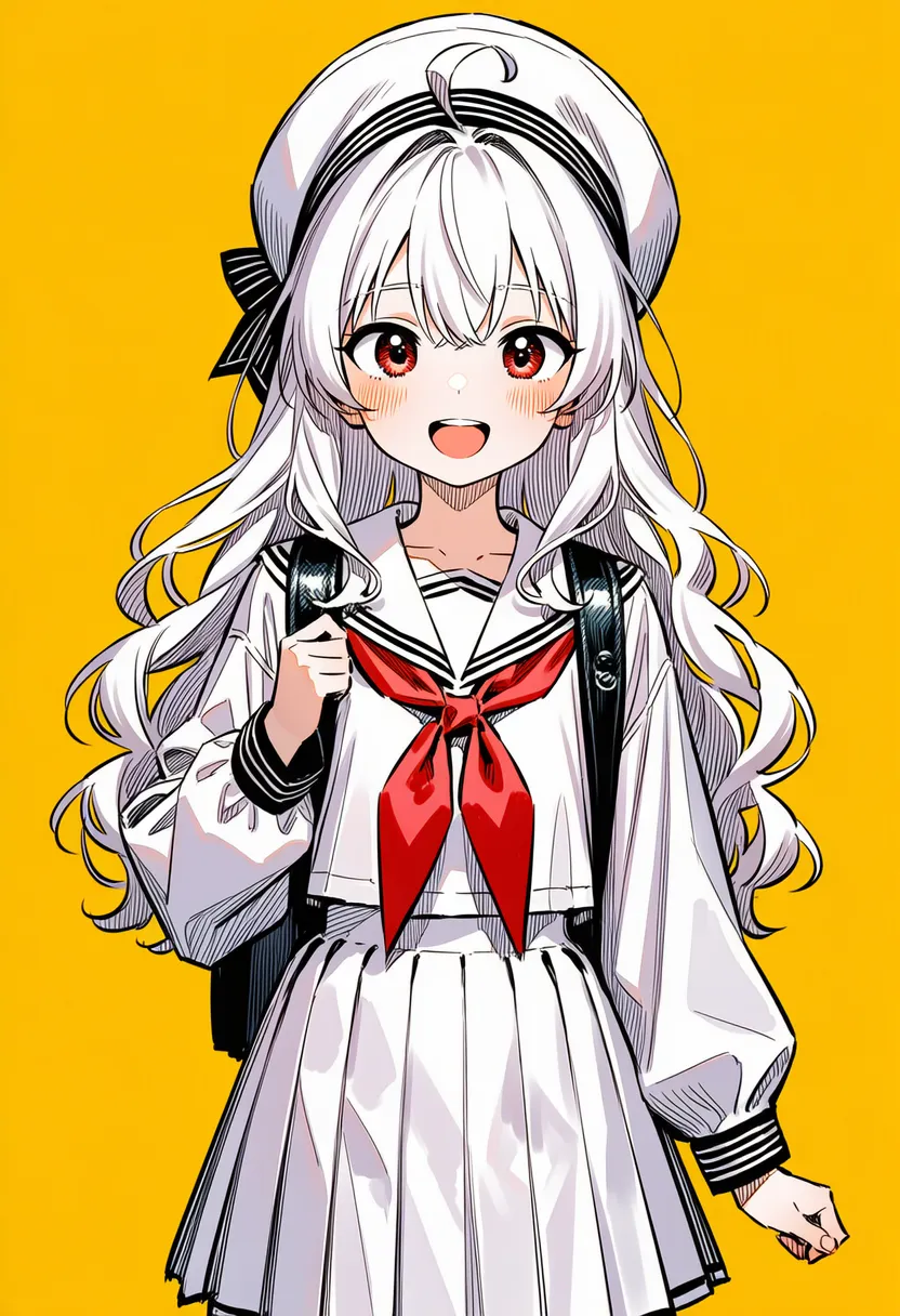 ink: Ink. Fountain pen, clear values |
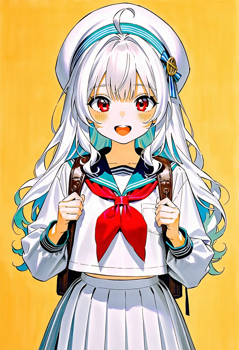 marker: Marker. Layered strokes, clear colors |
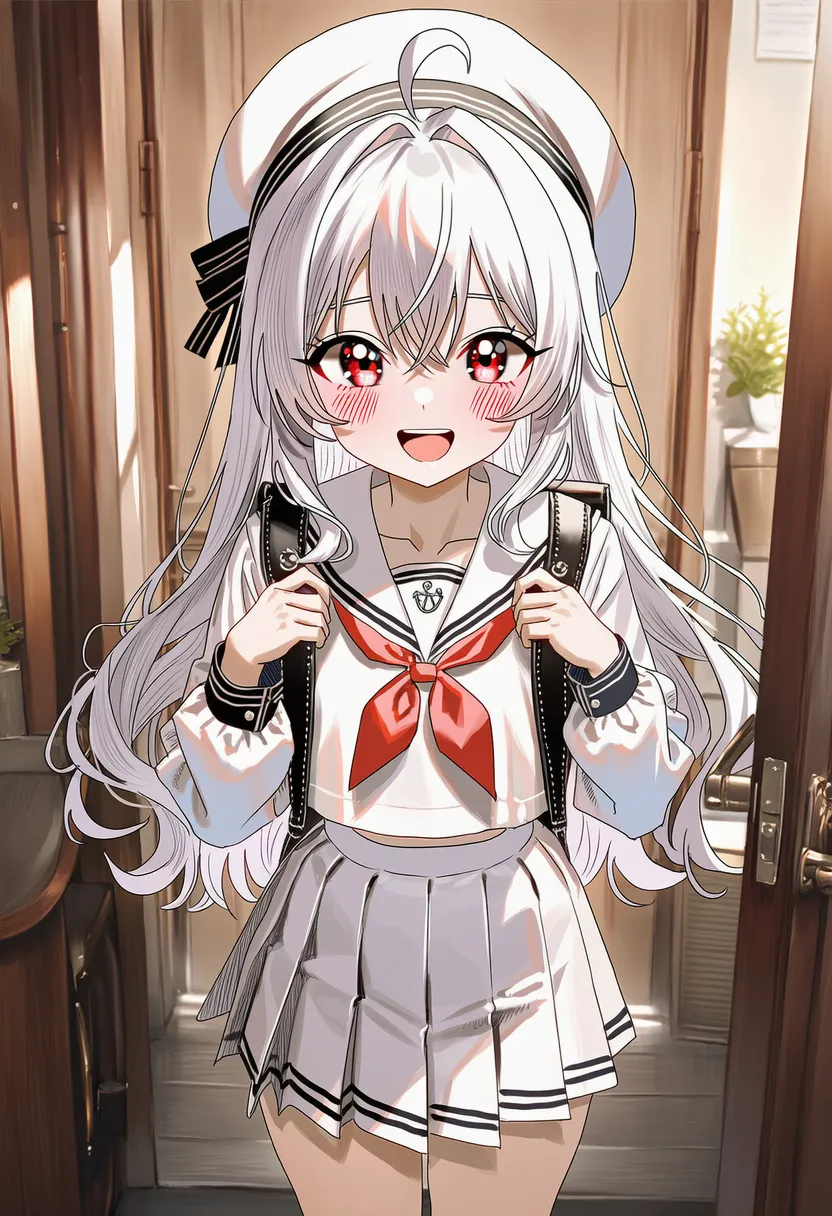 millipen: Millipen. Technical pen, uniform thin lines |
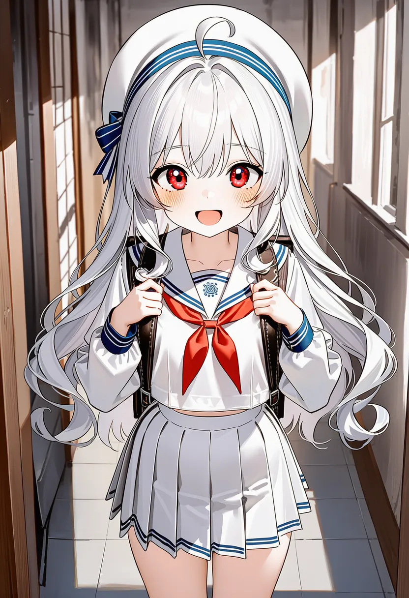 nib pen: Nib pen (G-pen). Manga manuscript, stroke-weight variation |
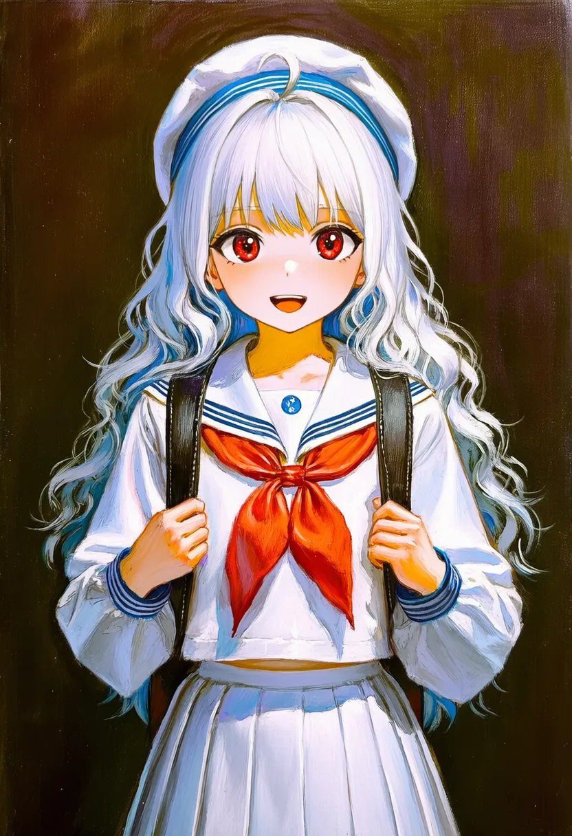 oil painting: Oil painting. Thick texture, deep colors |
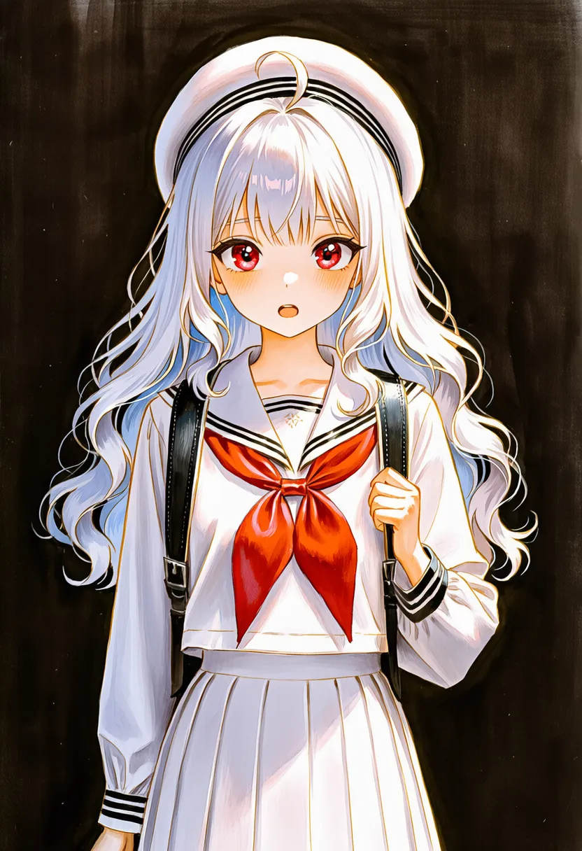 painting: Painting. Generic brush painting |
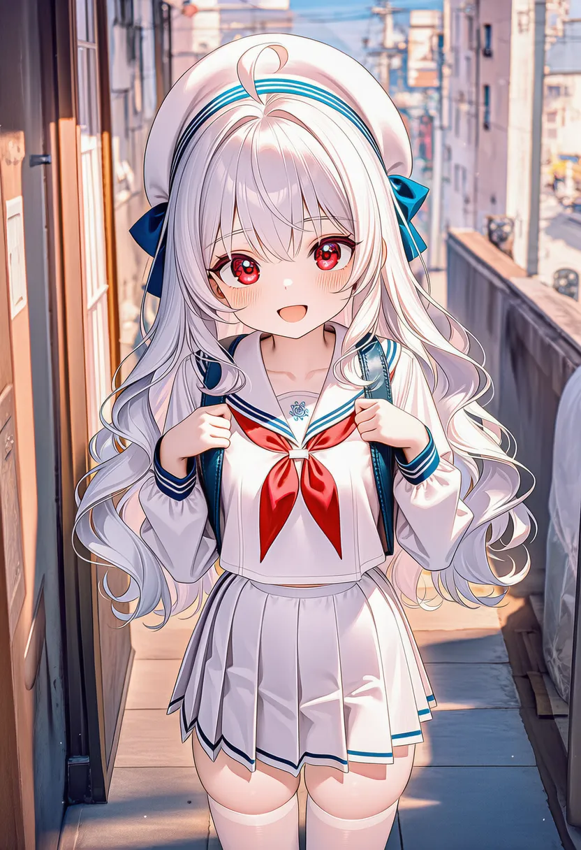 pastel: Pastel. Powdery and dreamy |
 pen: Pen. Generic pen drawing |
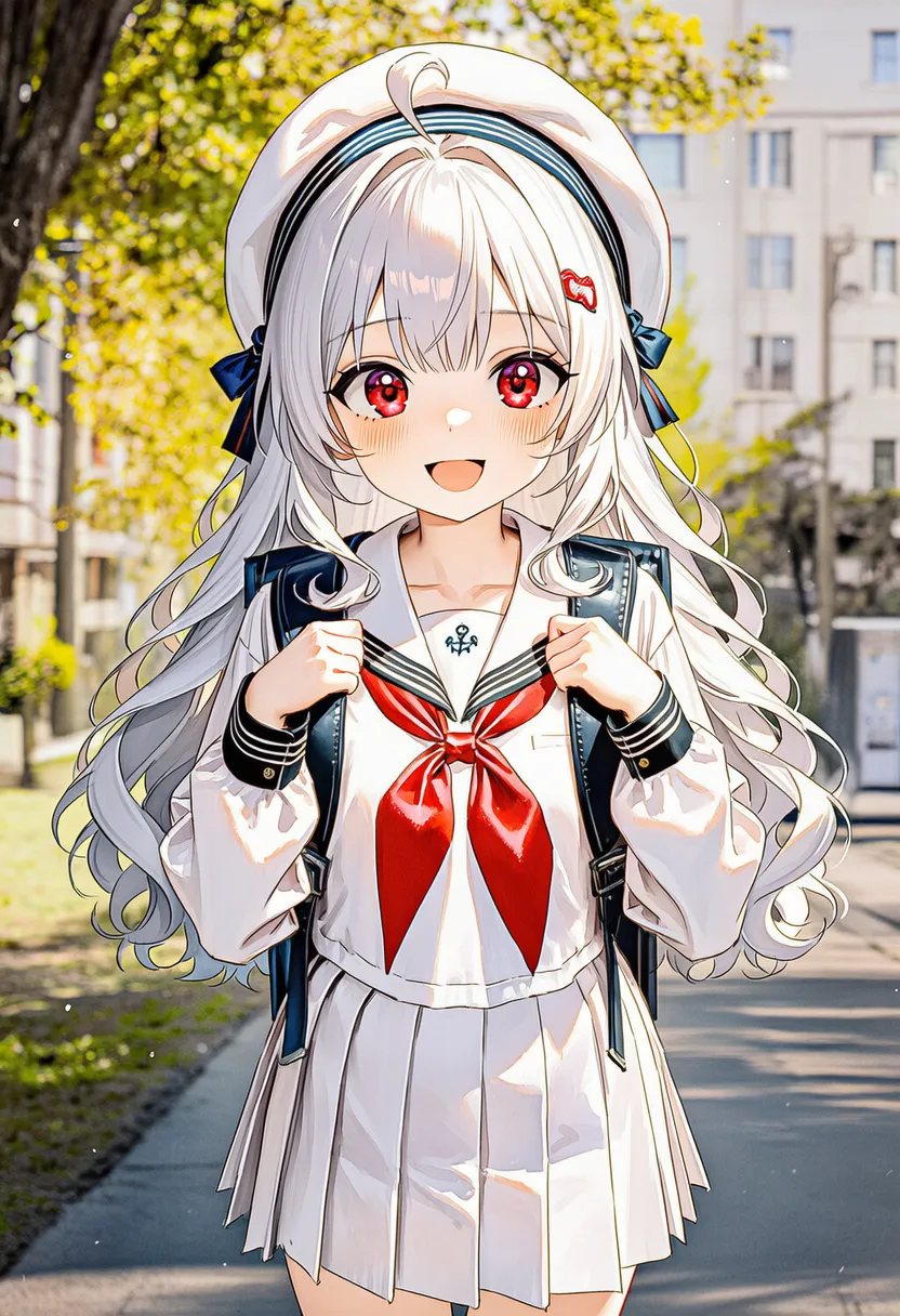 watercolor: Watercolor. Water bleed, transparent colors |
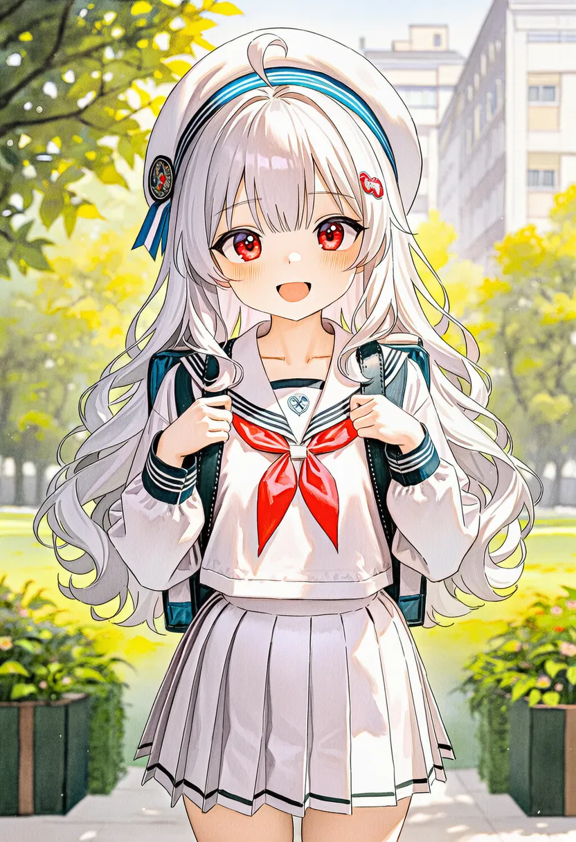 watercolor pencil: Watercolor pencil. Drawn, then washed with water |
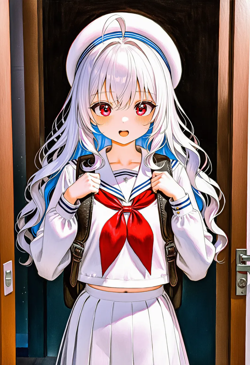 gouache: Gouache. Opaque watercolor, matte |
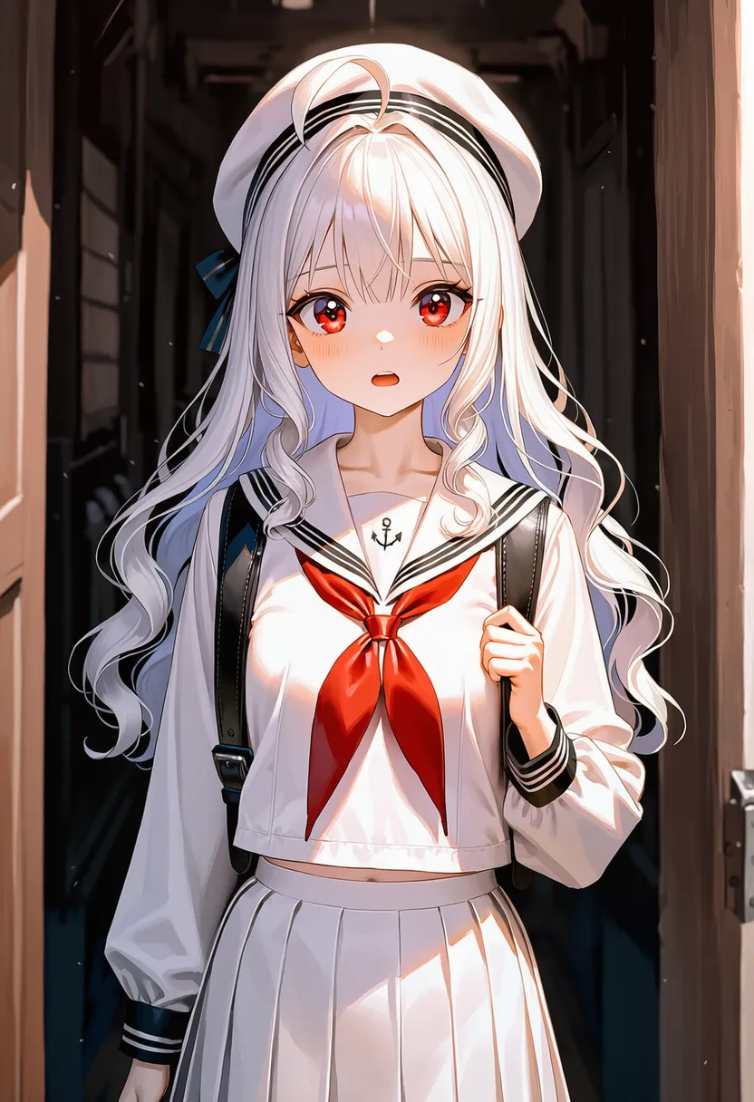 digital painting: Clean digital brushes, webtoon feel |
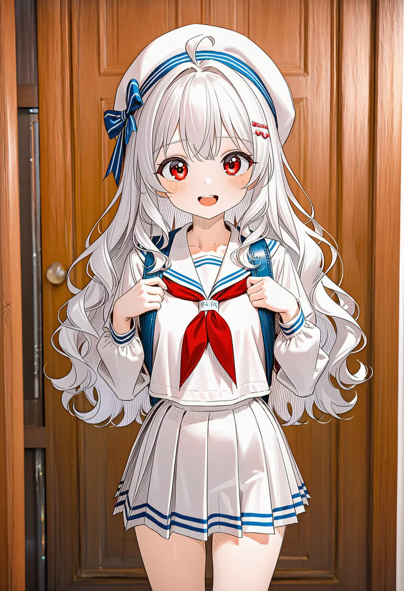 crayon: Crayon. Waxy texture, kids'-drawing feel |
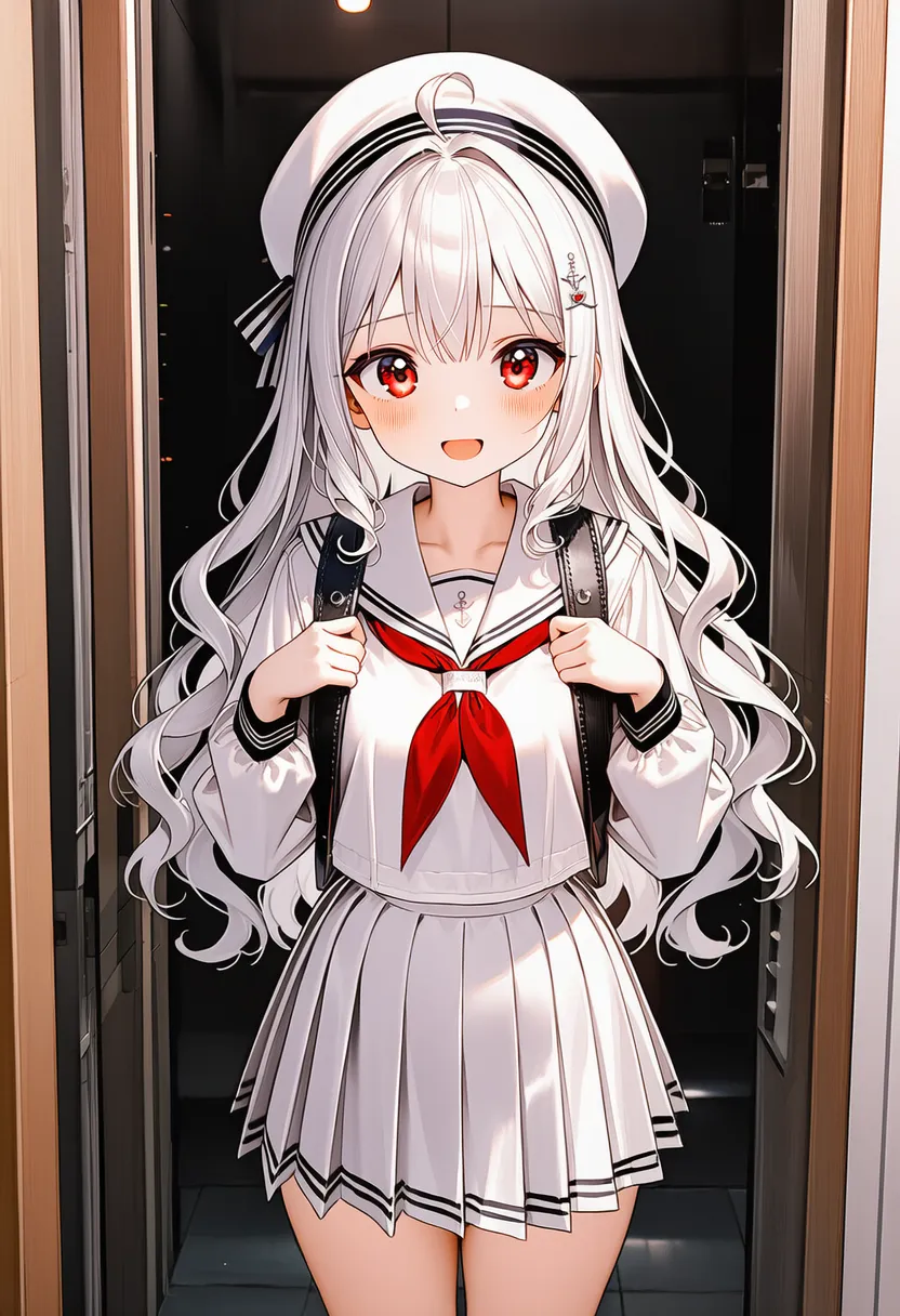 collage: Collage. Cut-and-pasted look |
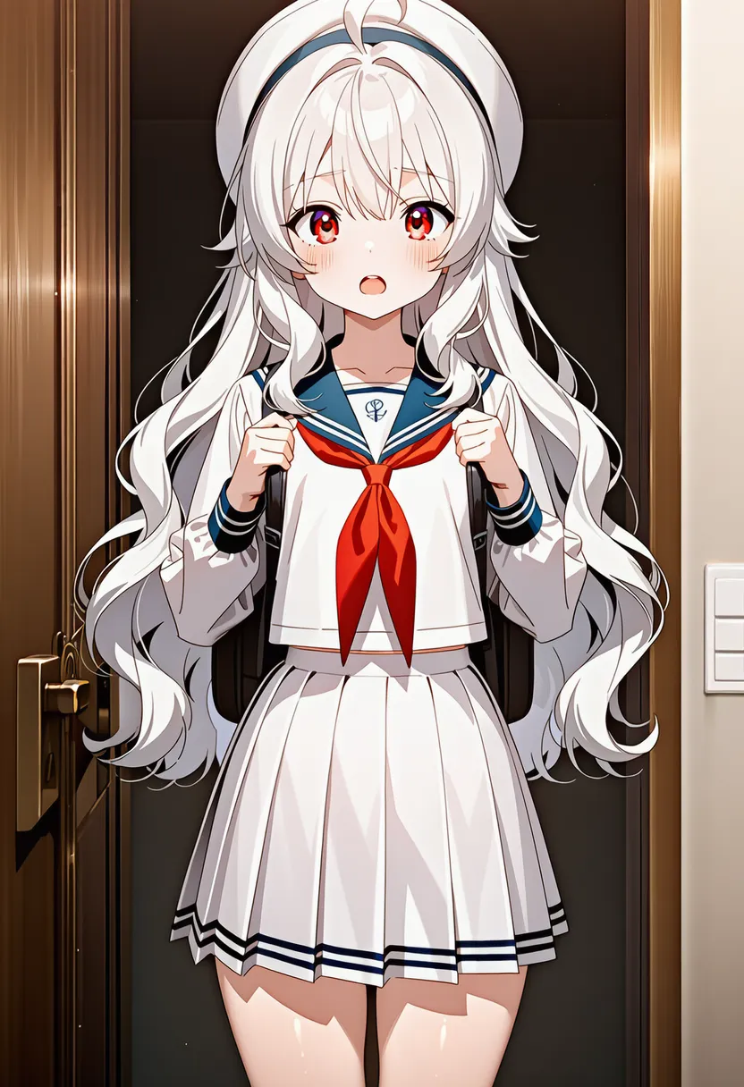 anime screencap: Anime broadcast screenshot look |
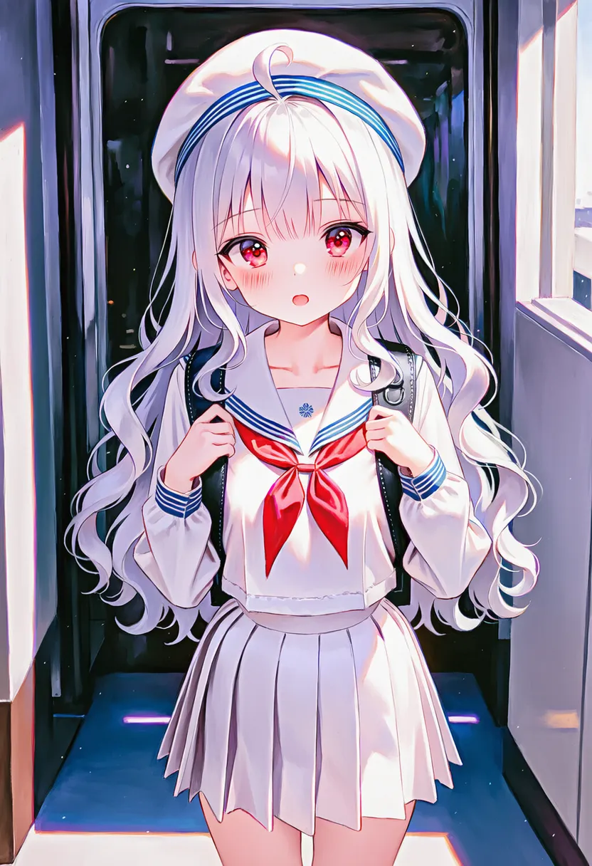 encaustic: Encaustic. Melted wax pigment, glossy |
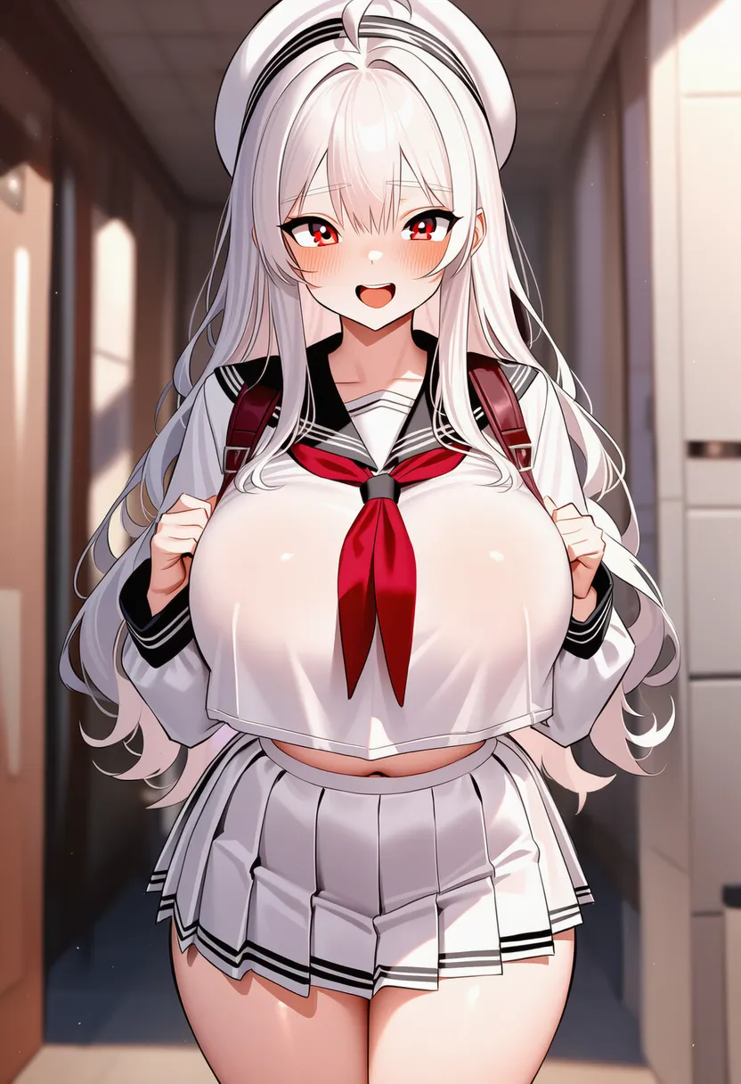 fresco: Fresco. Plaster mural texture |
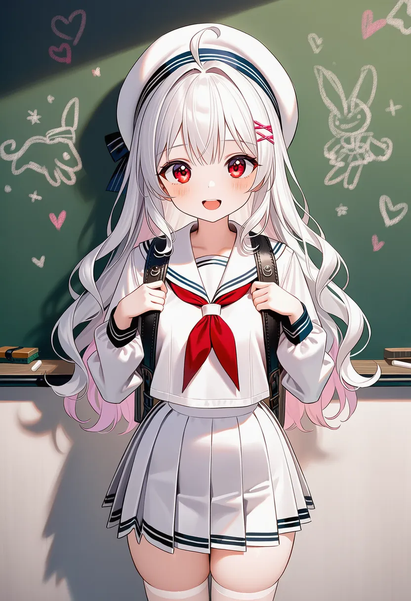 chalk: Chalk. Blackboard drawing, dusty lines |
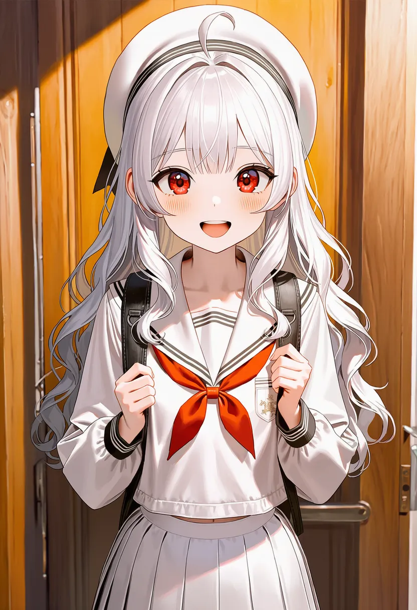 conte: Conté. Harder and heavier than charcoal |
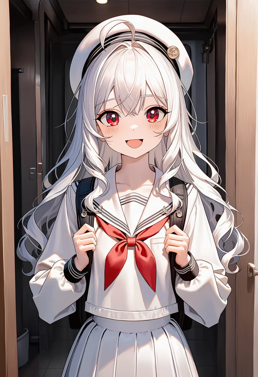 silverpoint: Silverpoint. Oxidized, delicate gray tones |
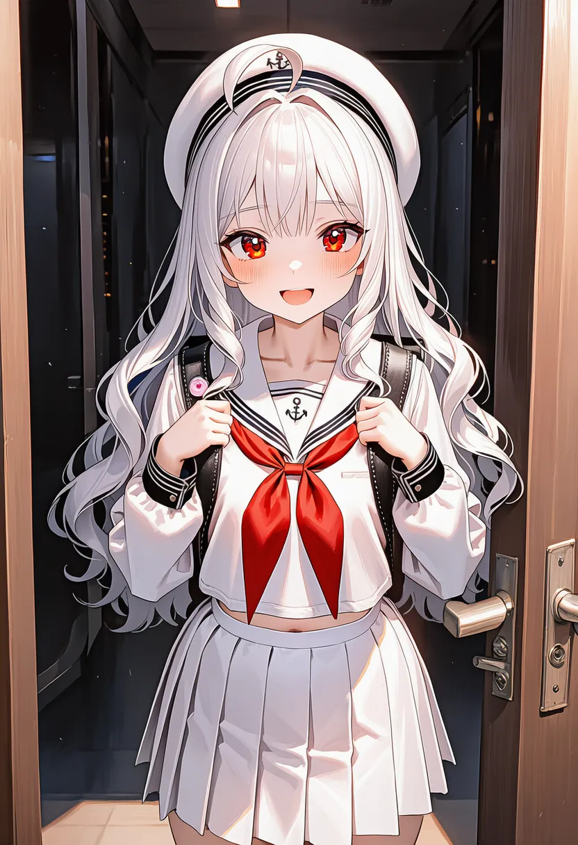 airbrush: Airbrush. Fine spray, soft |
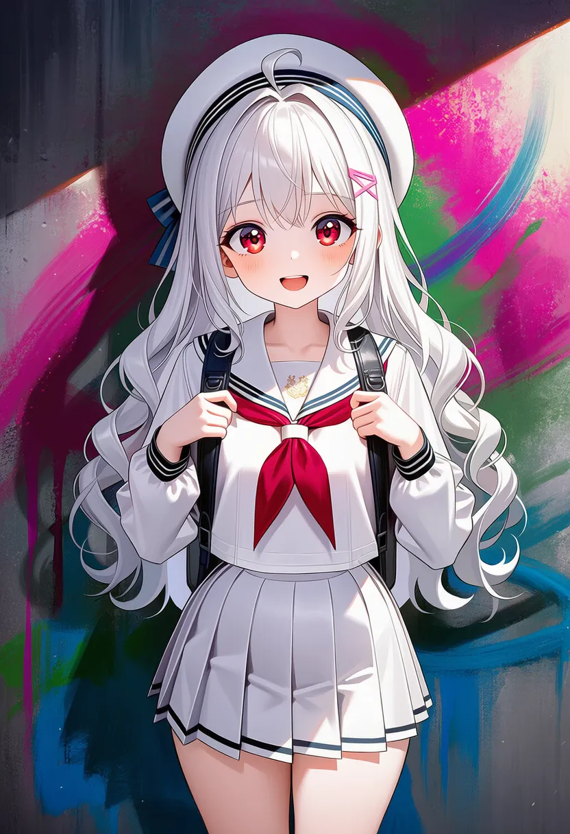 spray paint: Spray paint. Rough graffiti feel |
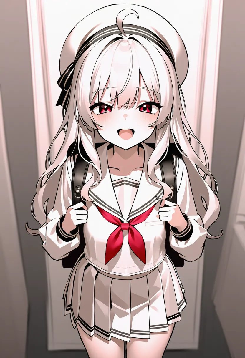 vector: Vector. Clean shapes that never pixelate |
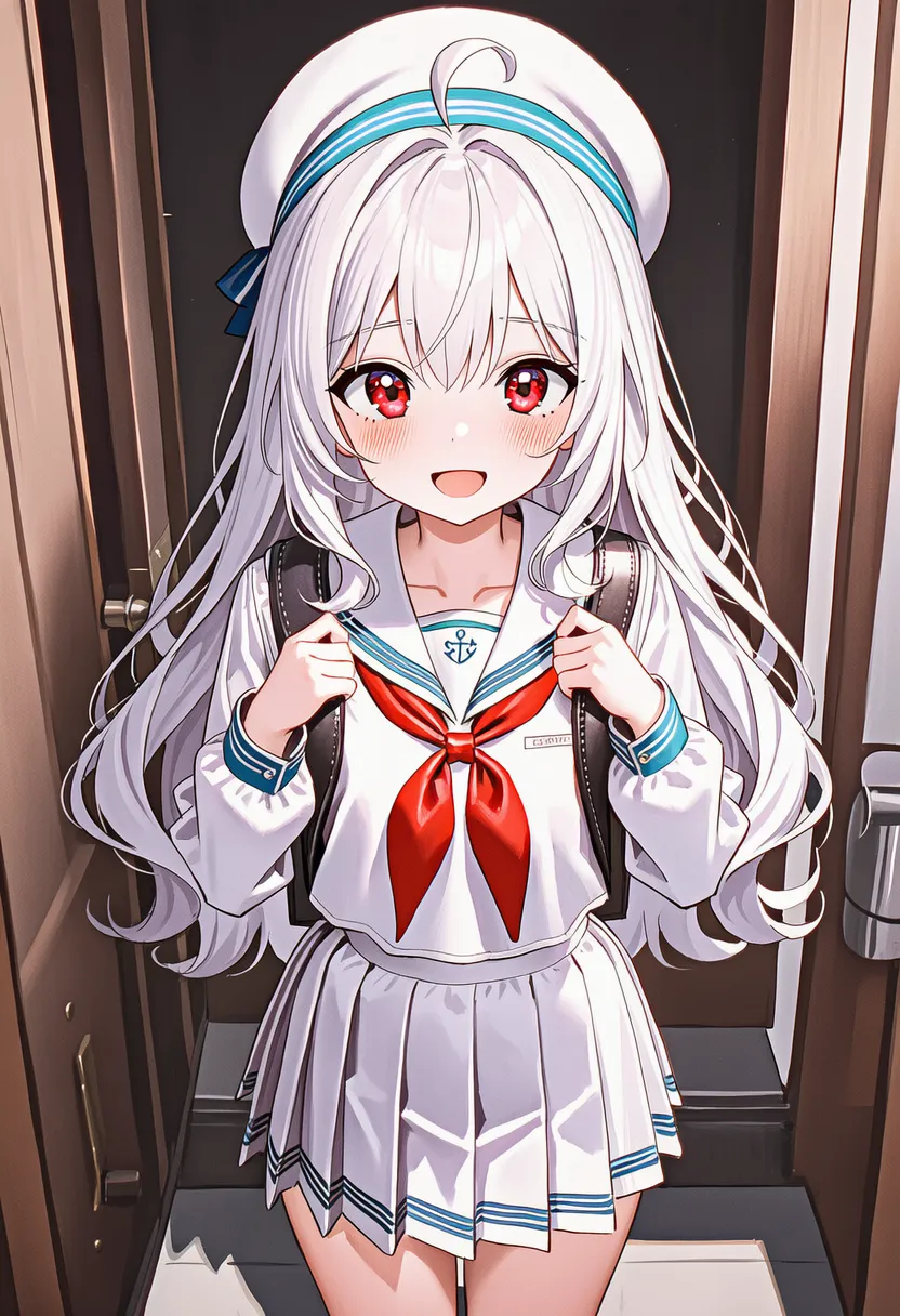 casein: Casein. Between oil and watercolor, matte |
 egg tempera: Egg tempera. Medieval icon look, subtle sheen |
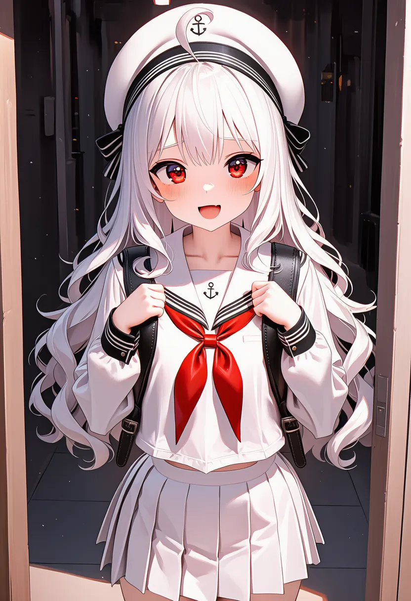 impasto: Impasto. Thick paint, sculptural texture |
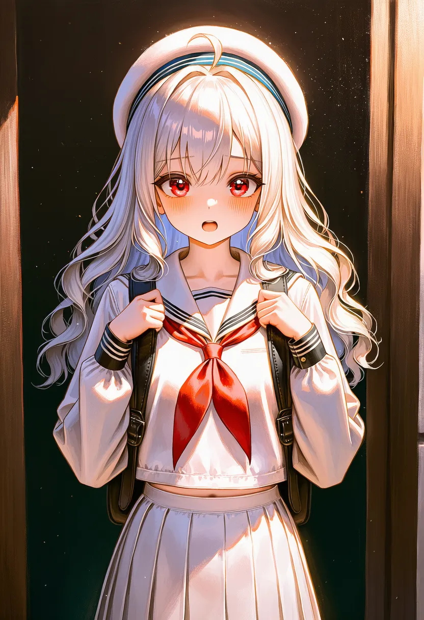 glazing: Glazing. Thin layers building depth |
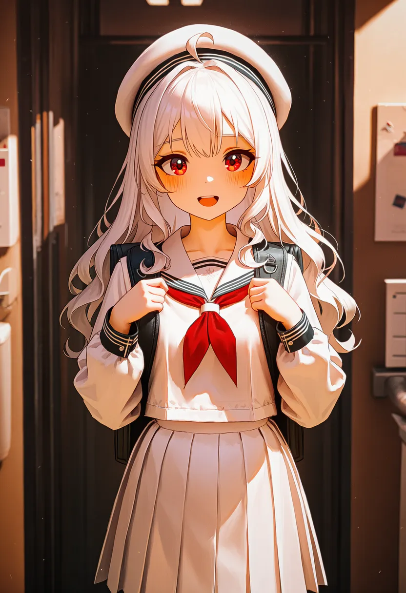 sgraffito: Sgraffito. Scratching the surface to reveal the base color |
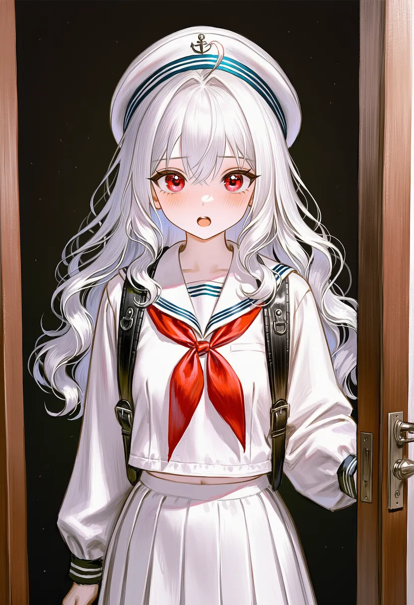 charcoal: Charcoal. Rougher, darker B/W than pencil |
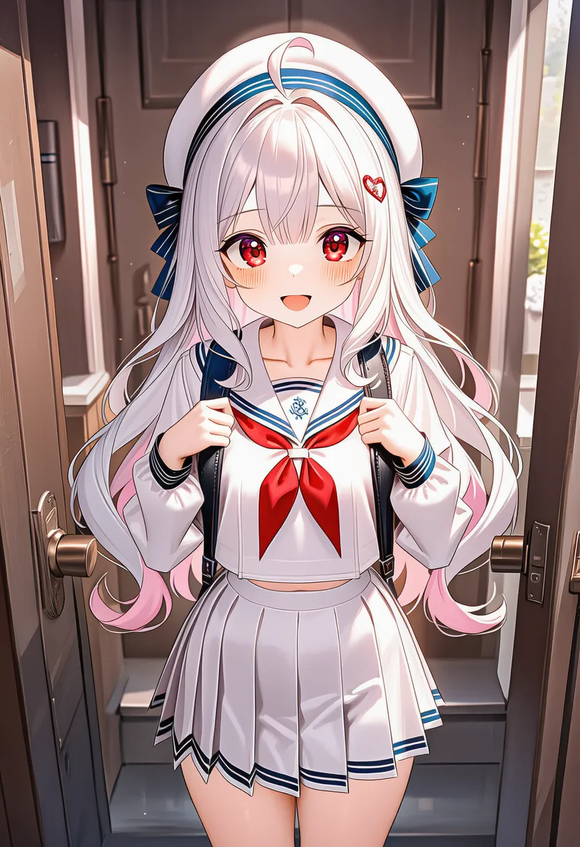 tempera: Tempera. Matte, classical painting |
▶ 4.2. Lineart & Outlines
Sets line weight, roughness and presence — changes the whole impression.
Reference original |
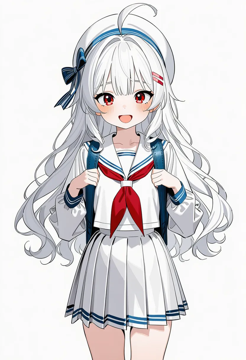 no lineart: No lineart (lineless) |
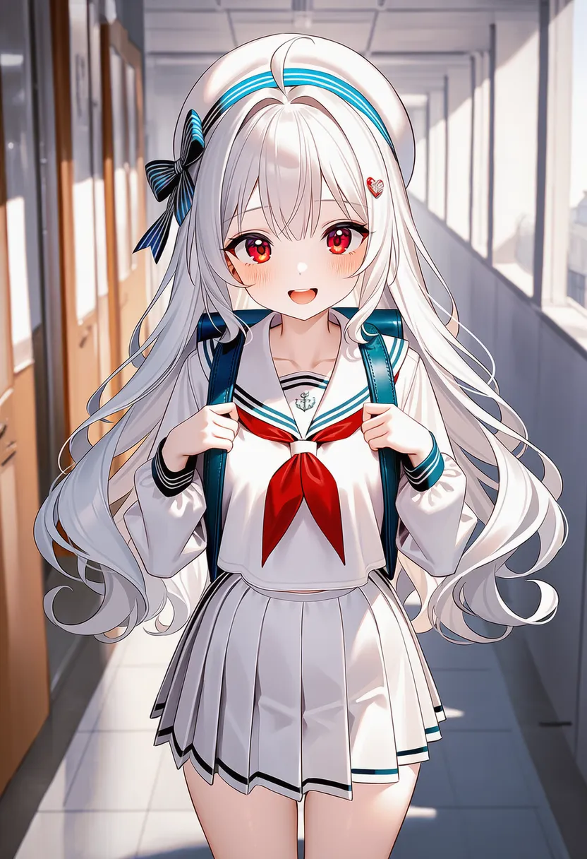 lineart: With lineart |
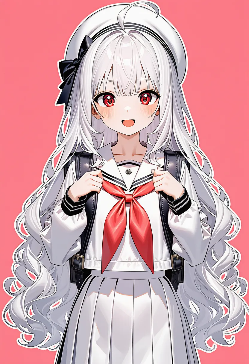 outline: Emphasized outlines |
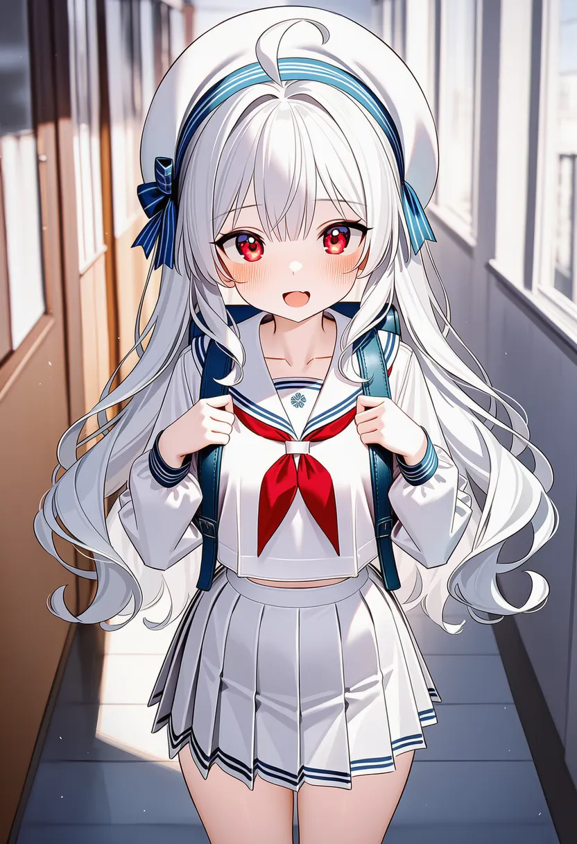 jaggy lines: Rough pixel lines, aliasing |
 sketch: Clean, near-final sketch |
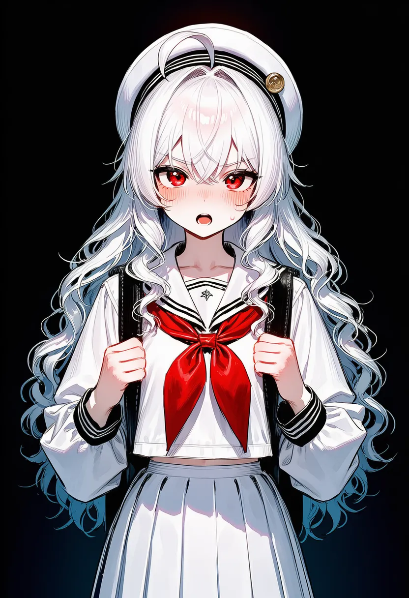 rough lines: Quick rough strokes |
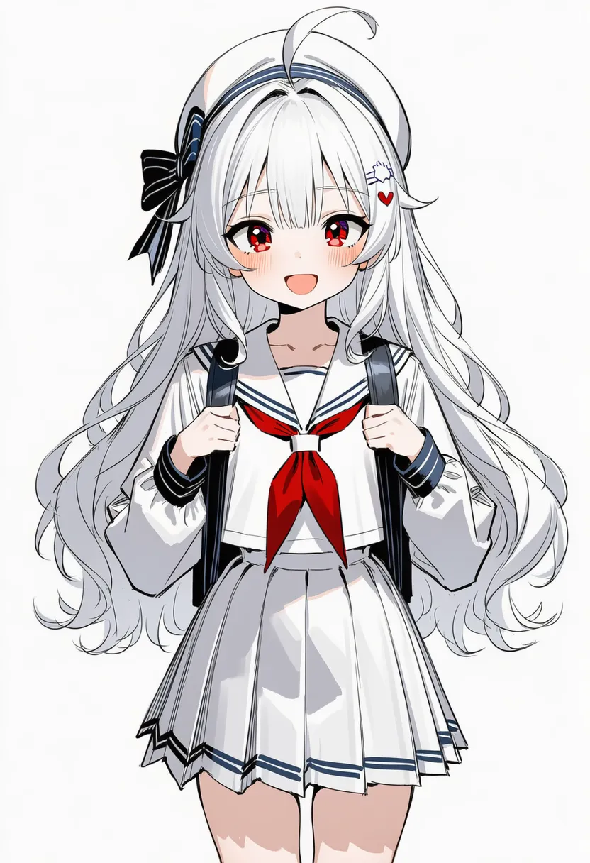 sketch lines: Overlapping exploratory lines |
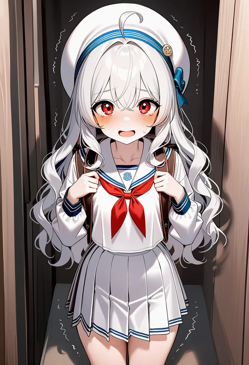 shaky lines: Trembling, shaky lines |
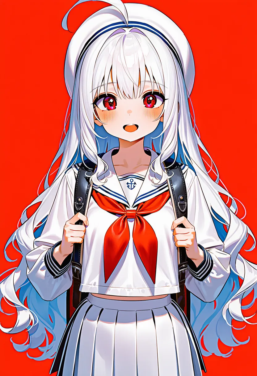 thick lines: Thick lines |
thin lines: Thin lines |
clean lines: Tidy, cleaned-up lineart |
precise lineart: Precise lines like a technical drawing |
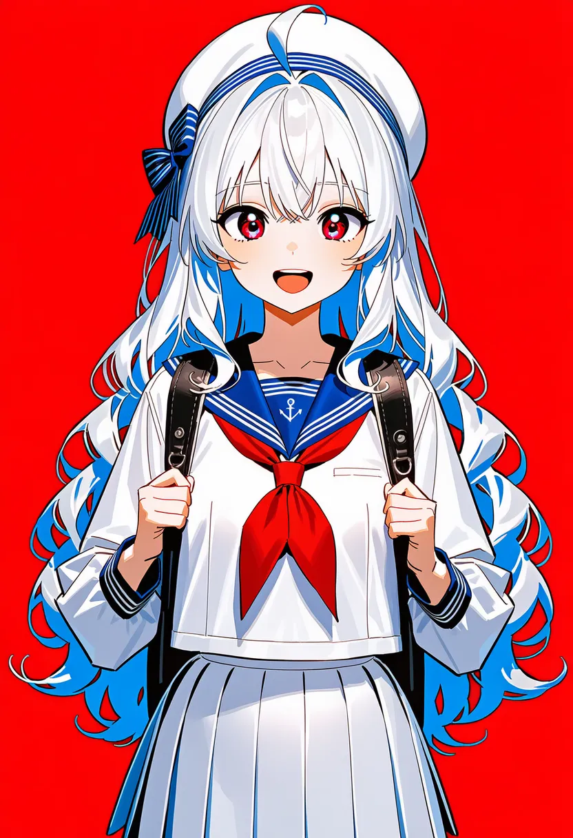 bold outlines: Very thick borders (sticker look) |
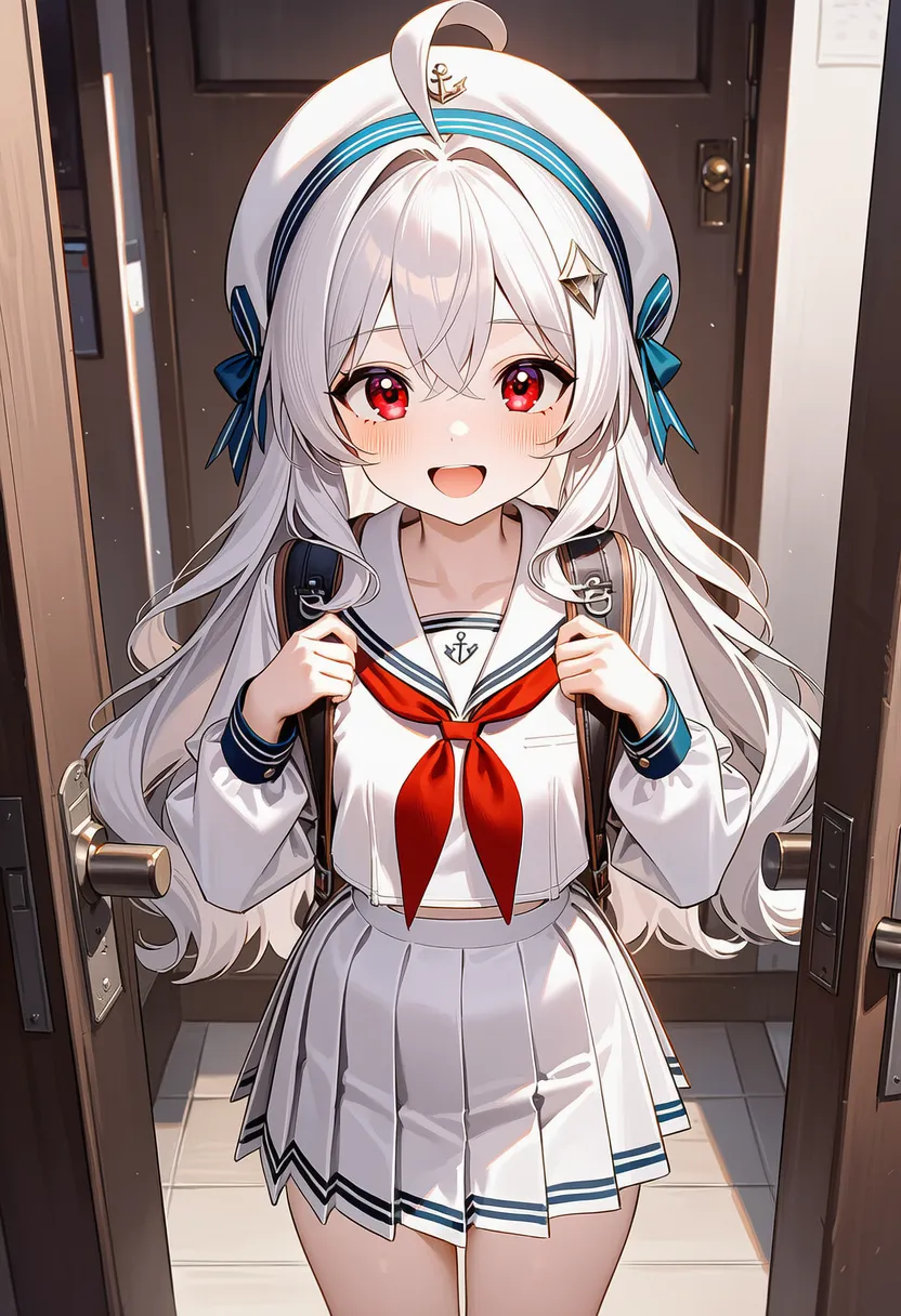 borderless: No borders — shapes defined by color only |
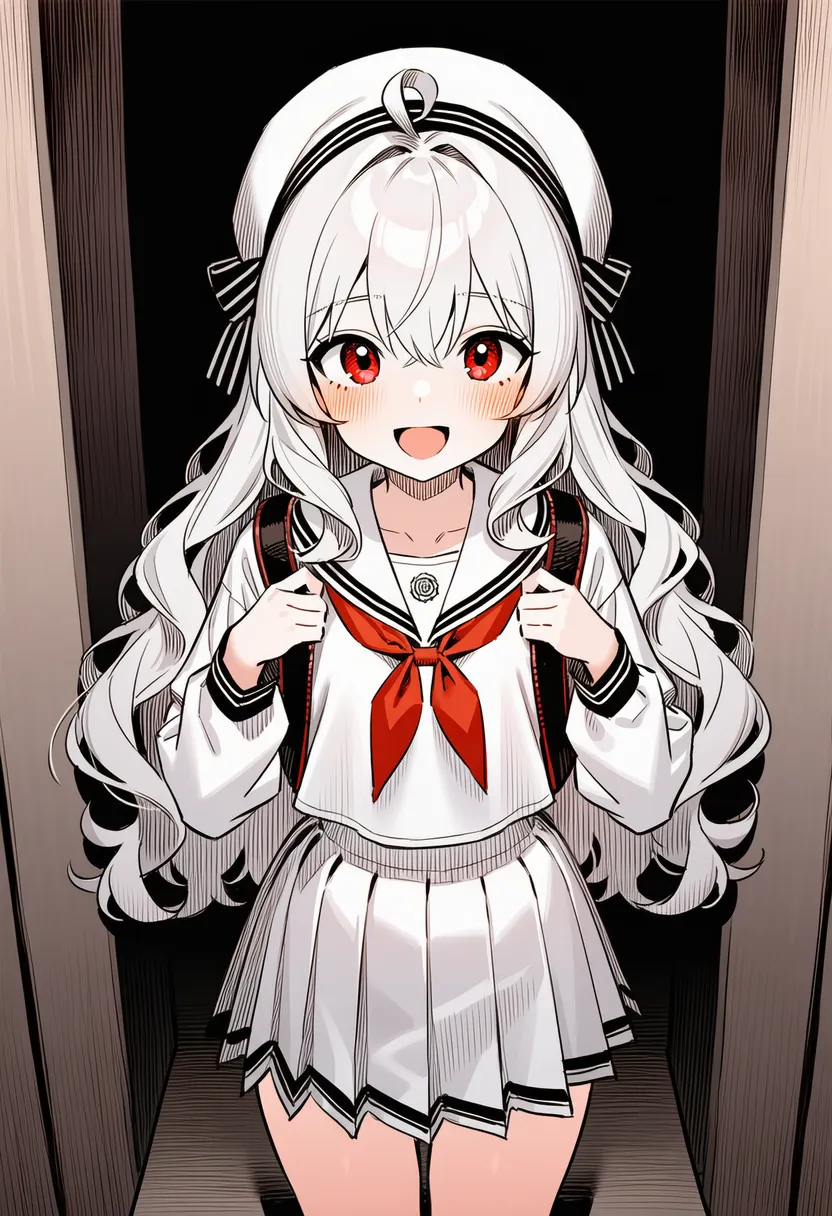 crosshatching: Cross-hatched shading |
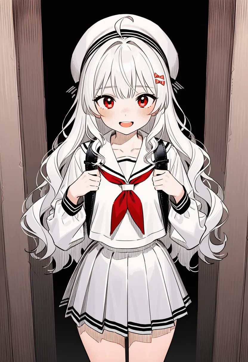 hatching shading: Hatched shading |
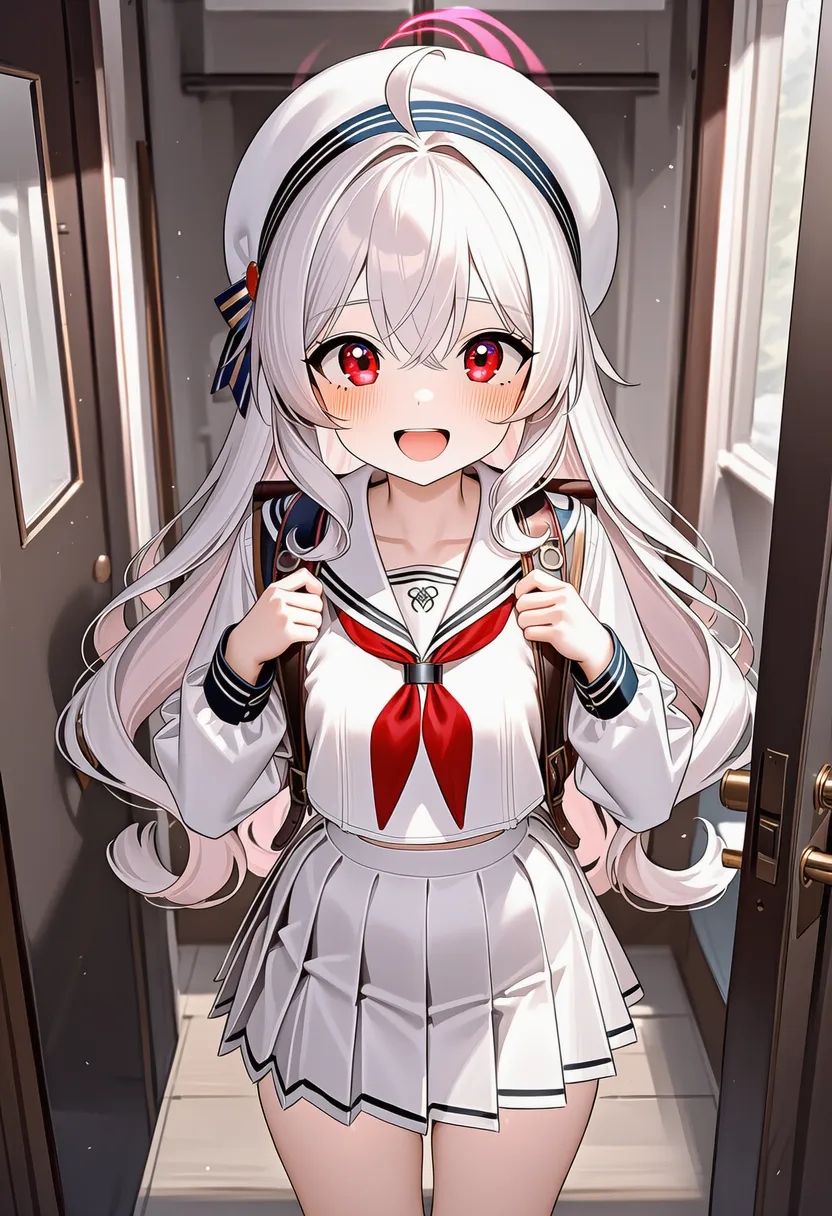 speed lines: Speed lines in the background |
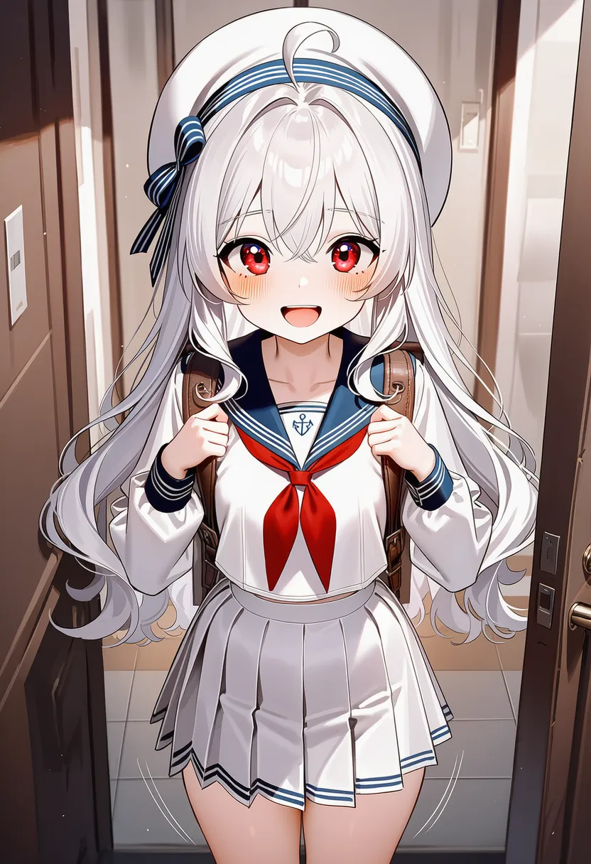 motion lines: Lines expressing motion |
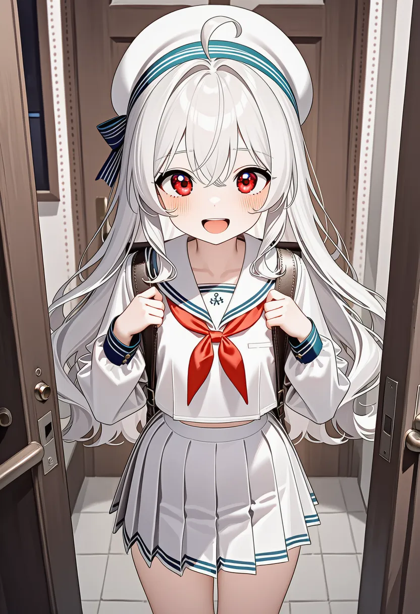 dotted lines: Dotted lines |
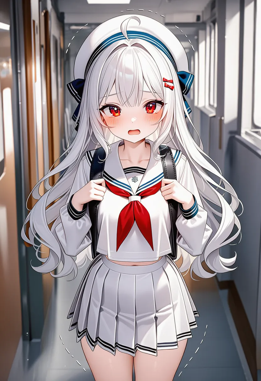 dashed lines: Dashed lines |
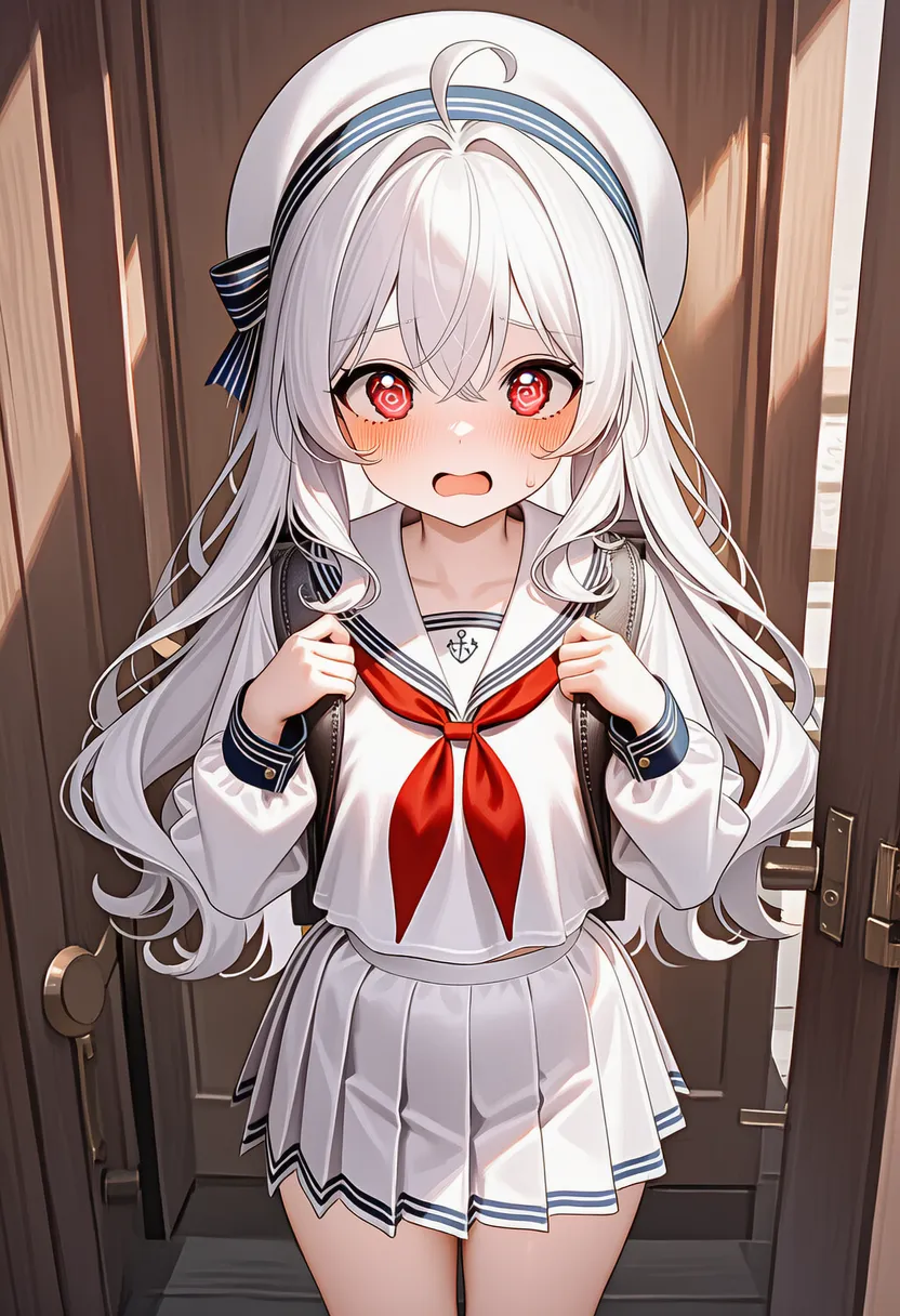 wavy lines: Wavy, squiggly lines |
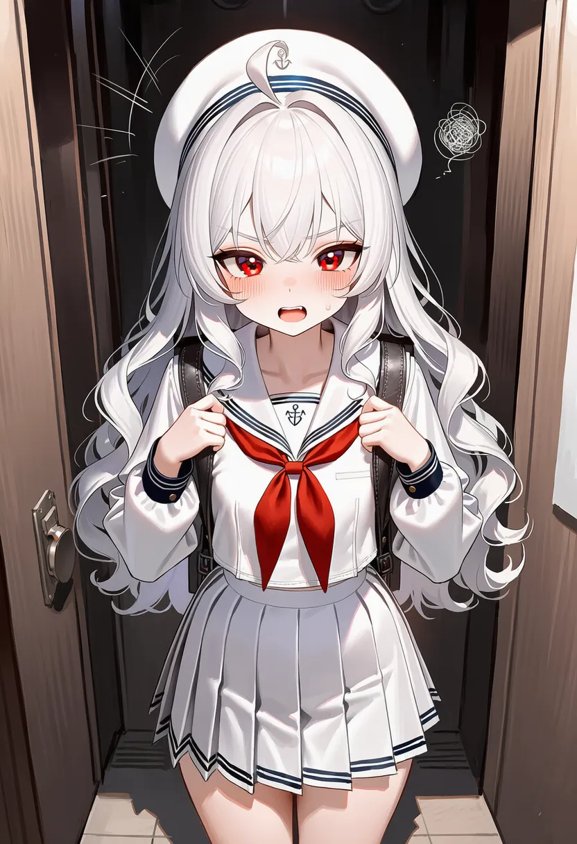 scribble: Scribbled doodle |
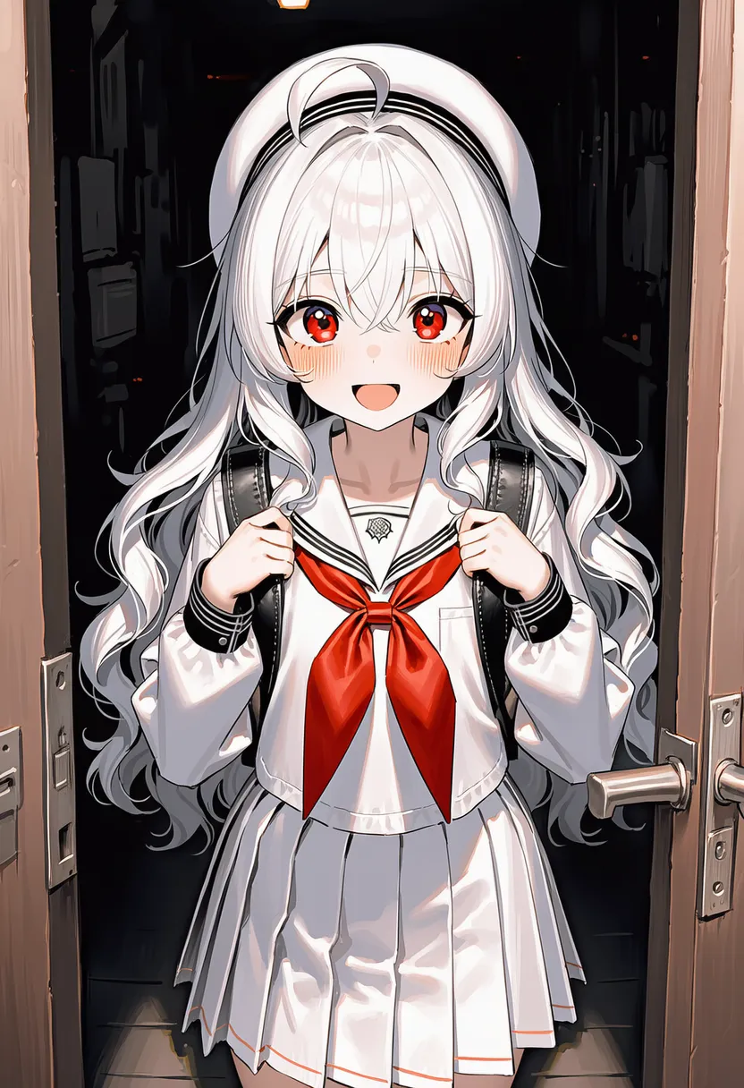 messy lines: Messy, untidy lines |
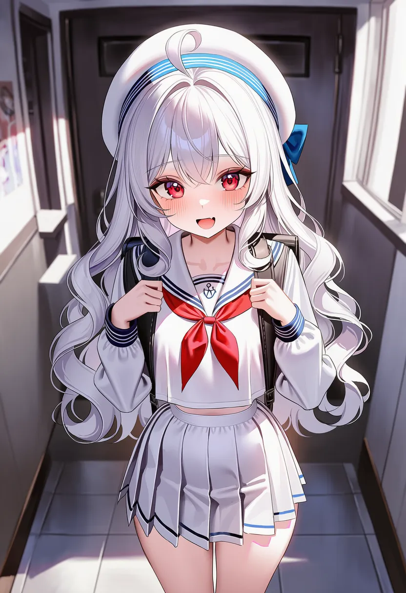 hard edges: Razor-sharp edges |
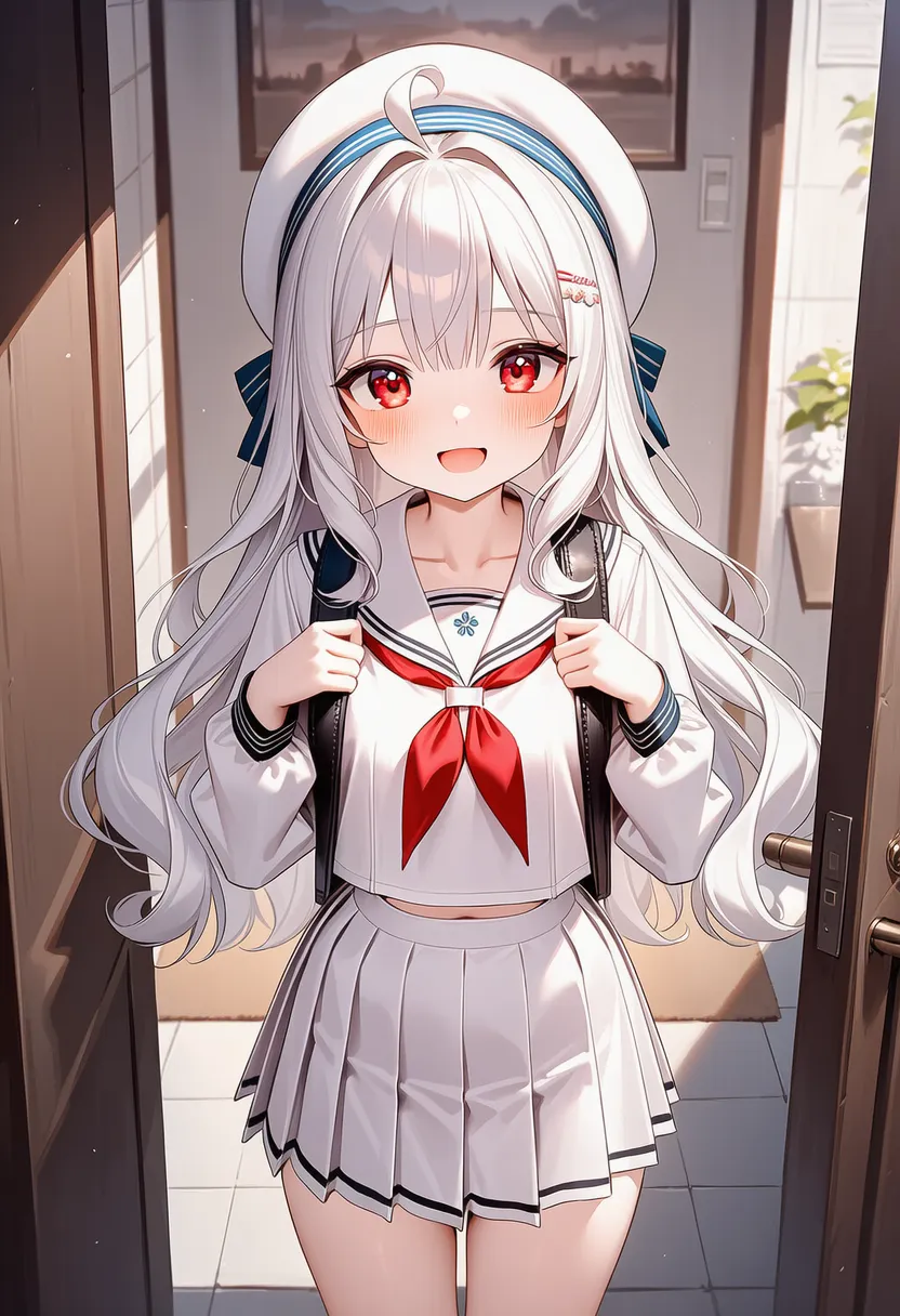 soft edges: Softly dissolving edges |
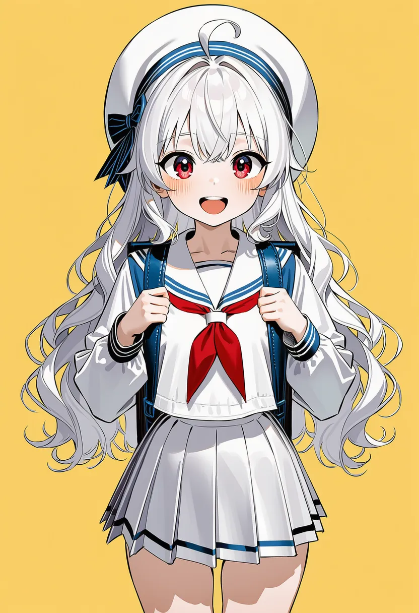 ink drawing: Ink pen drawing |
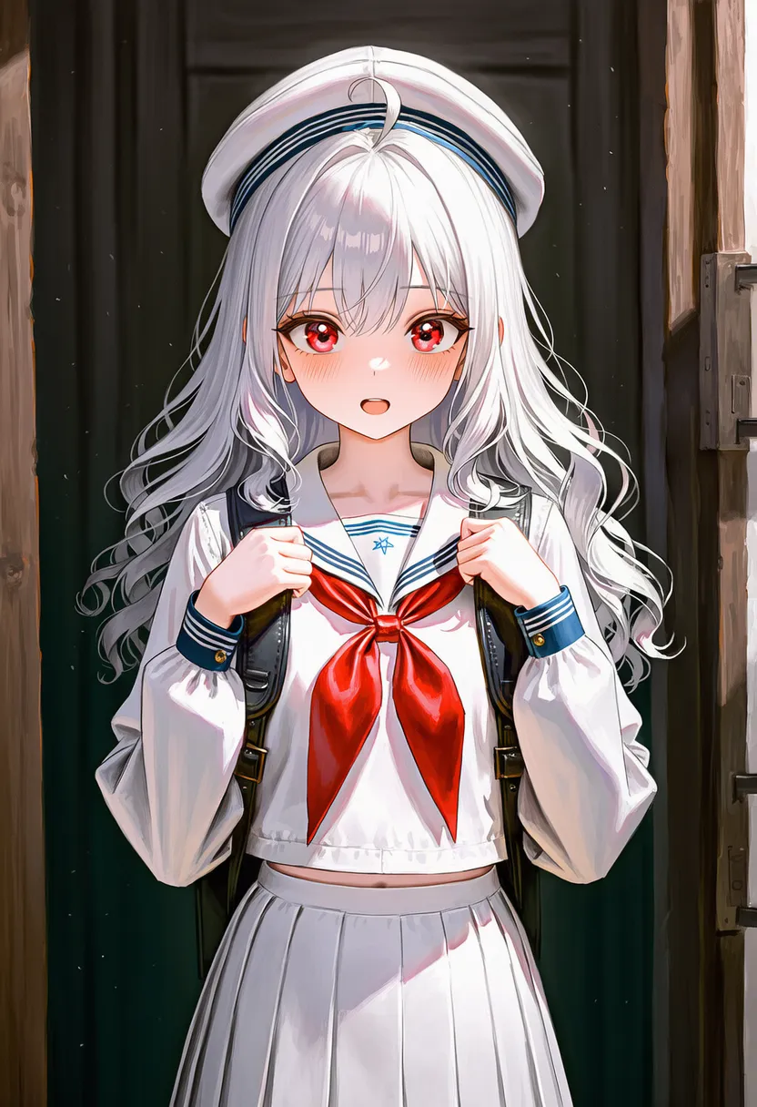 charcoal drawing: Charcoal sketch |
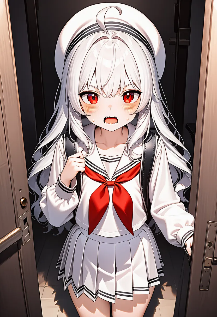 sharp focus lines: Sharp, in-focus lines |
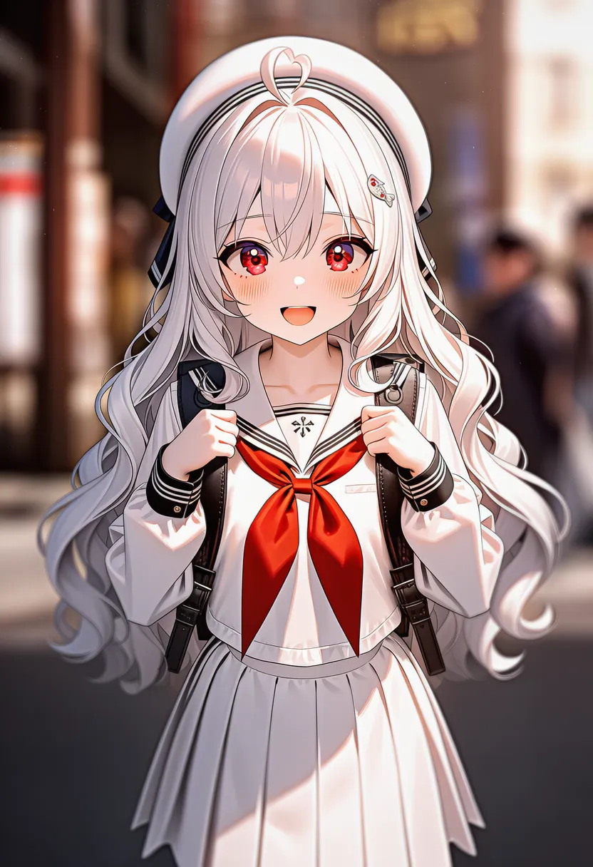 blurred edges: Blurry, bleeding edges |
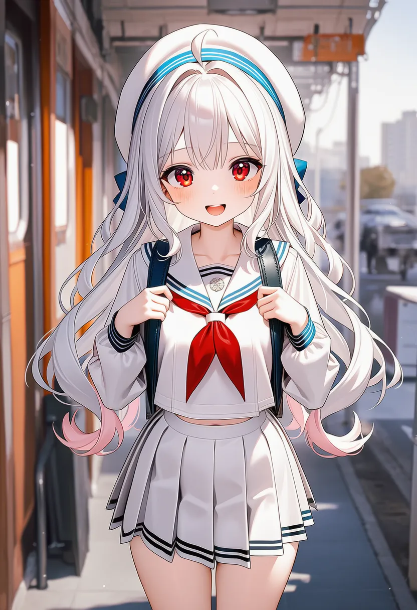 hand-drawn: Hand-drawn feel |
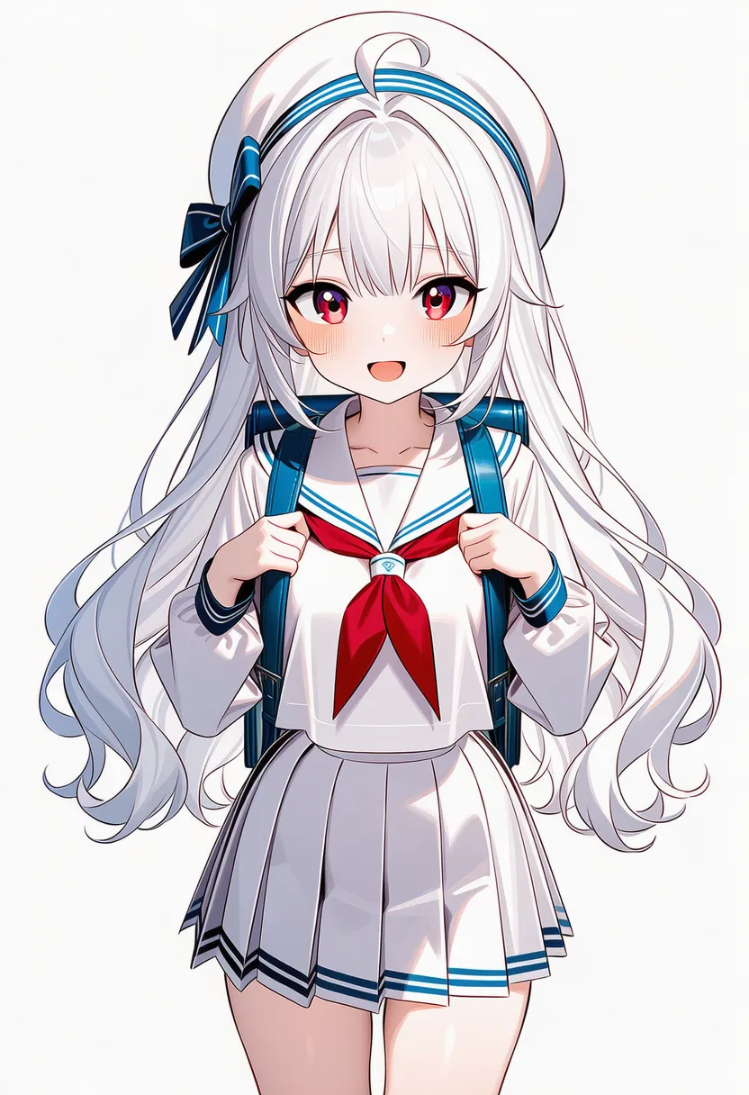 visible lineart: Lineart visible |
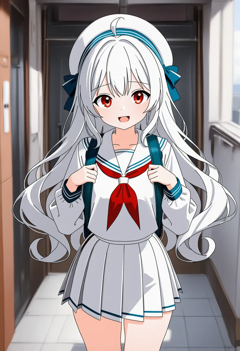 invisible lineart: Lineart buried under the coloring |
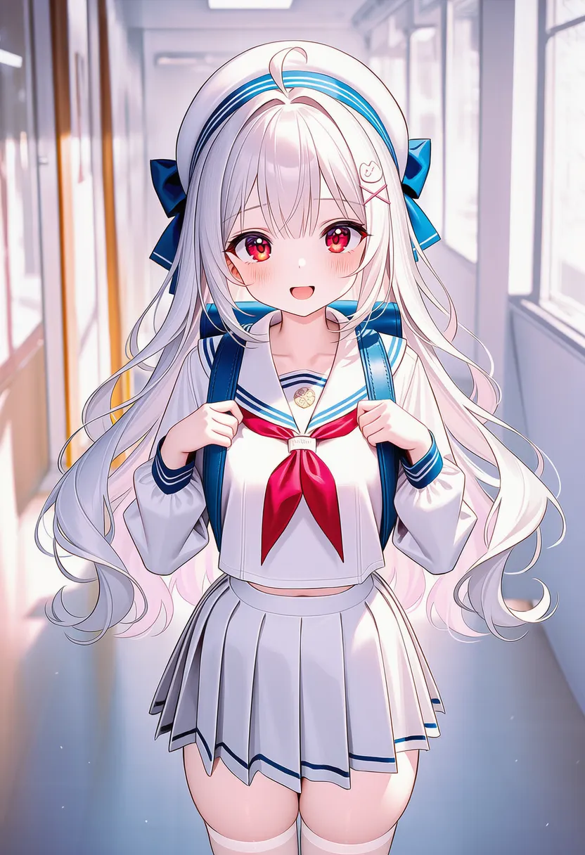 delicate lineart: Extremely fine, delicate lines |
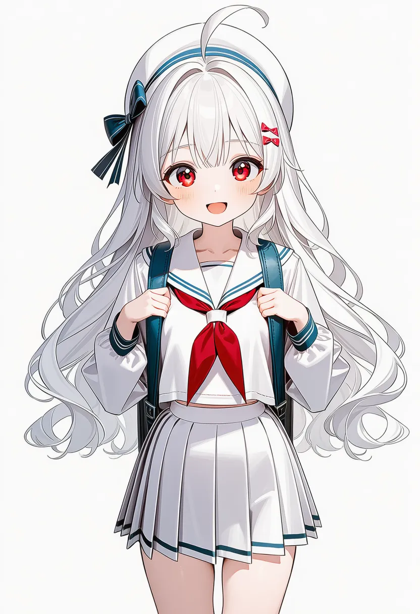 loose lines: Loose, relaxed lines |
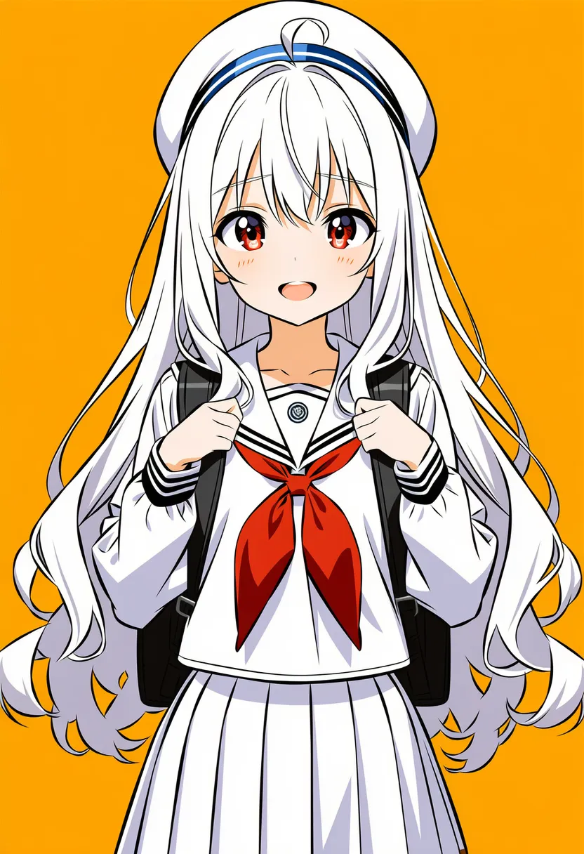 vector trace: Bitmap traced into vector |
▶ 4.3. Coloring & Shading
Sets how light and coloring are handled.
Reference original |
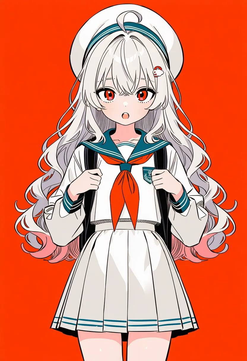 flat color: Flat fills (poster/icon) |
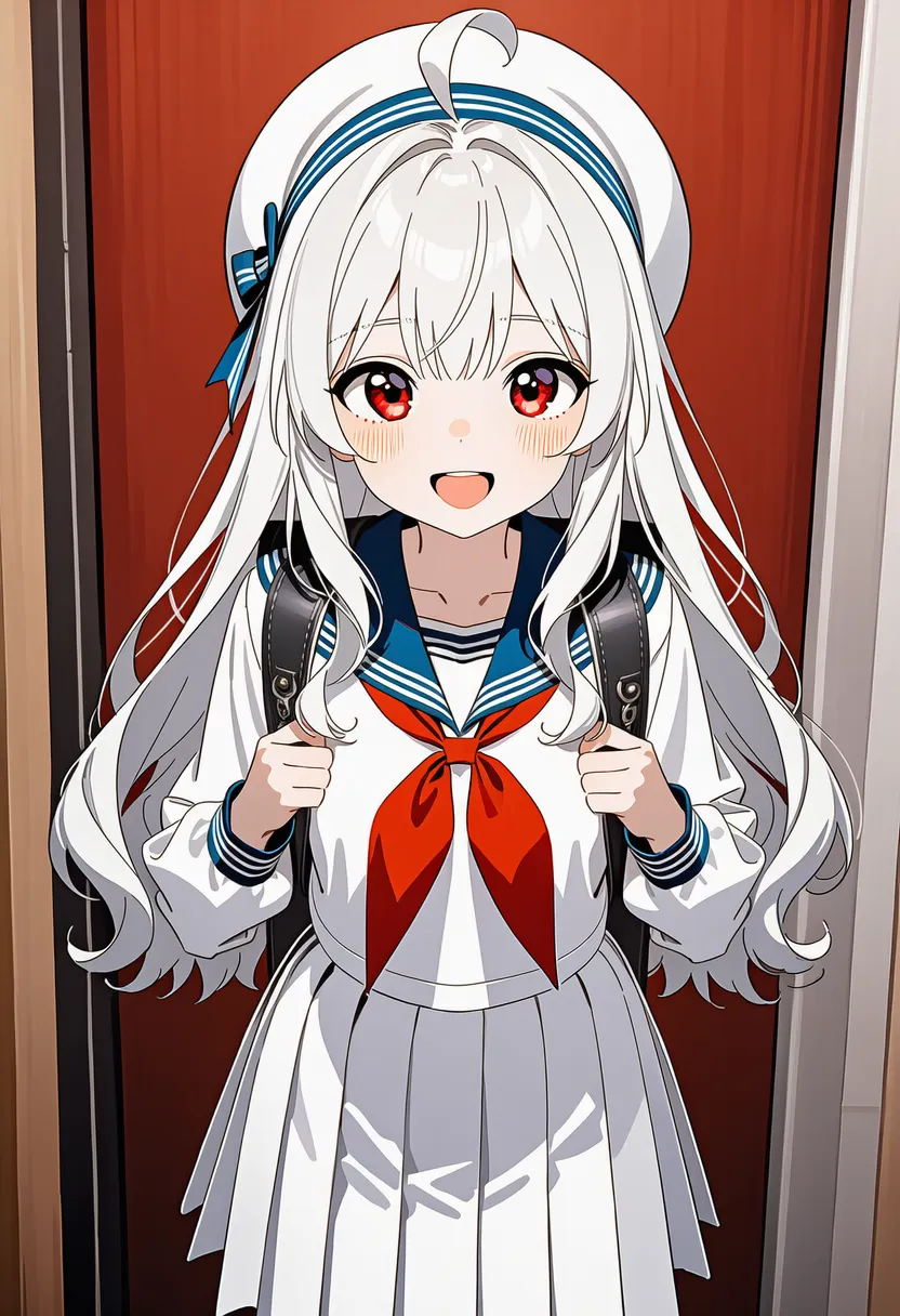 cel shading: Hard-edged cel animation |
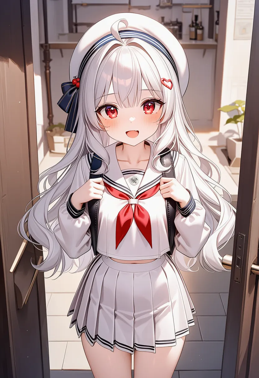 soft shading: Soft gradient shading |
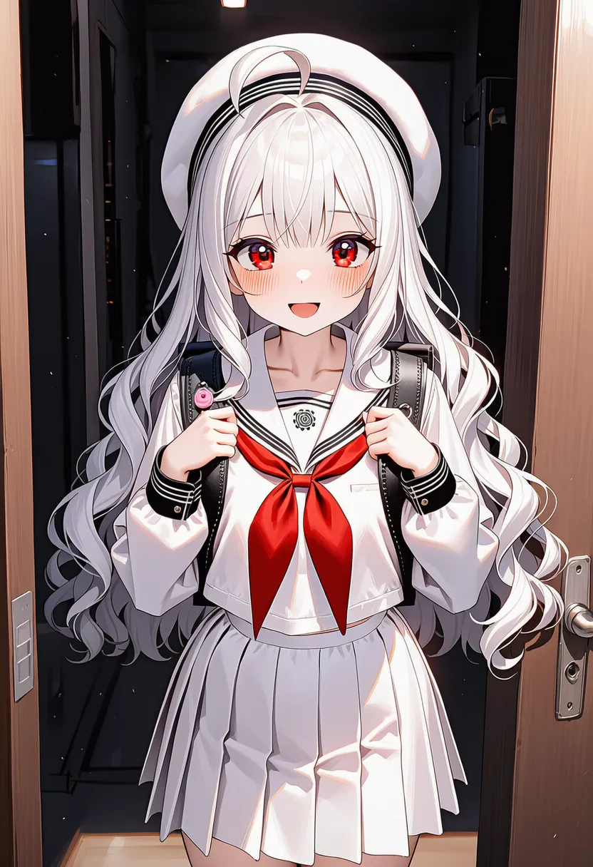 hard shading: Strong contrast, hard edges |
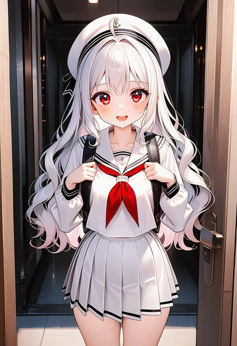 airbrushed: Airbrushed, soft-glam look |
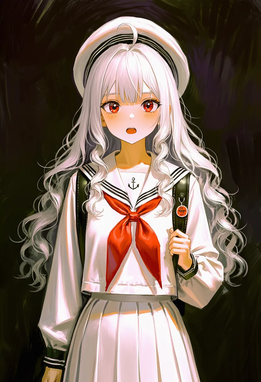 painterly: Visible brush strokes |
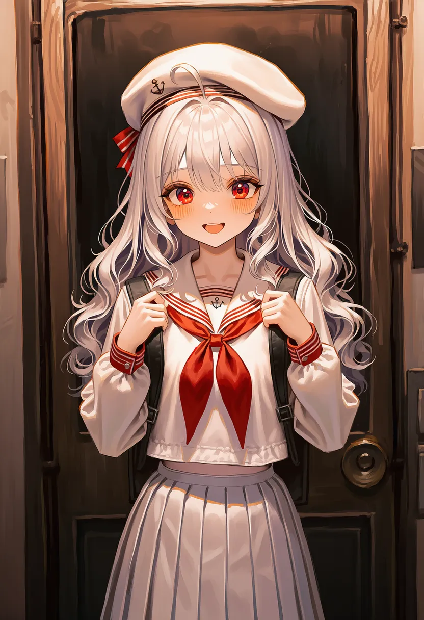 blotchy painting: Blotchy, uneven paint |
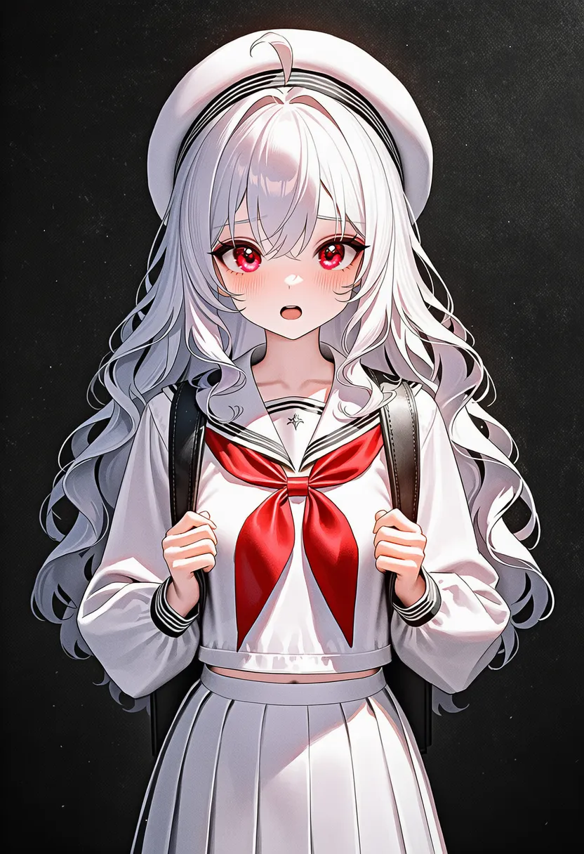 textured: Paper or canvas texture |
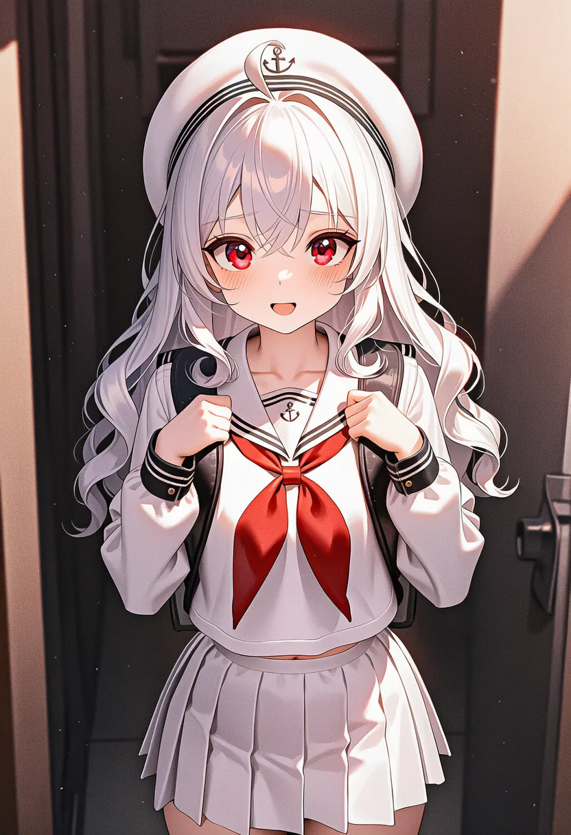 grainy: Grainy like film noise |
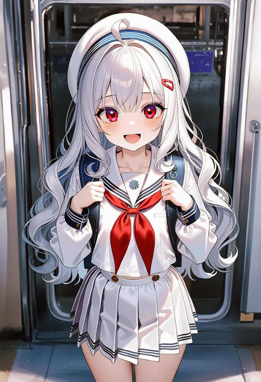 noisy: Grainy texture, take 2 |
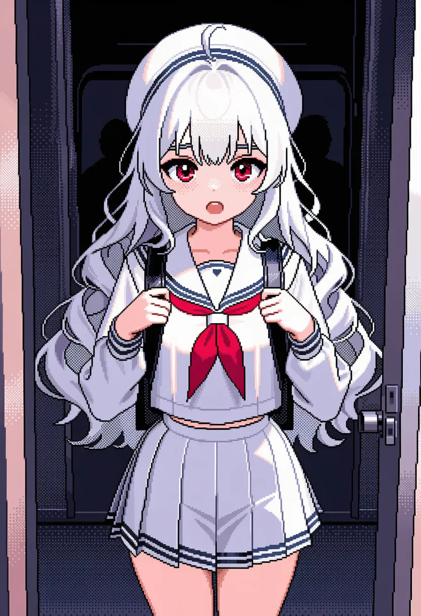 dithering: Dot-based midtones (retro) |
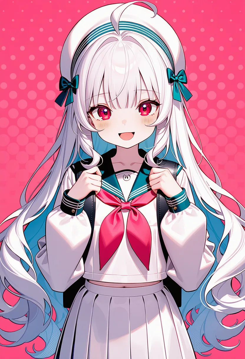 halftone: Manga tone, halftone pattern |
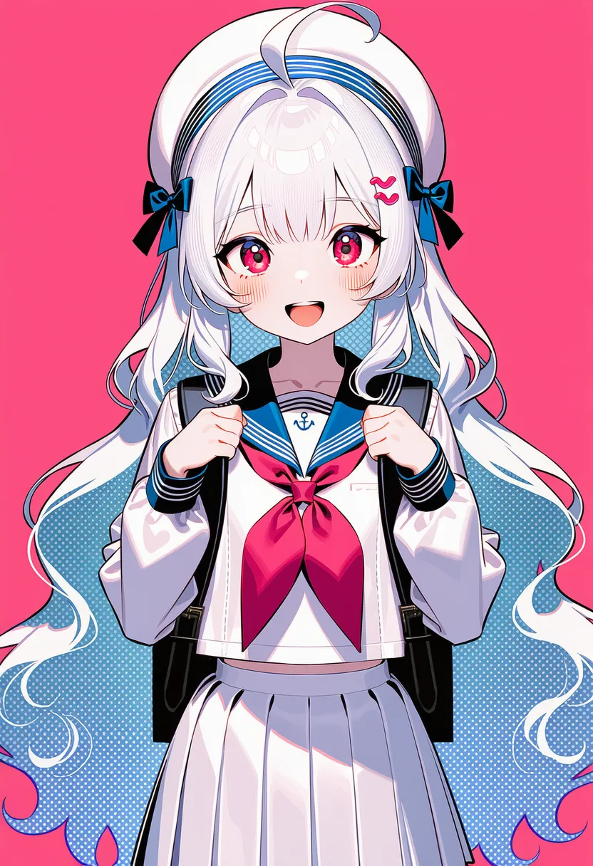 halftone dots: Halftone-dot pixel vibe |
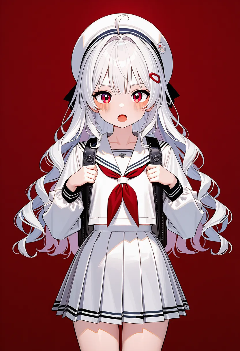 blocky shading: Blocky, chunked shading |
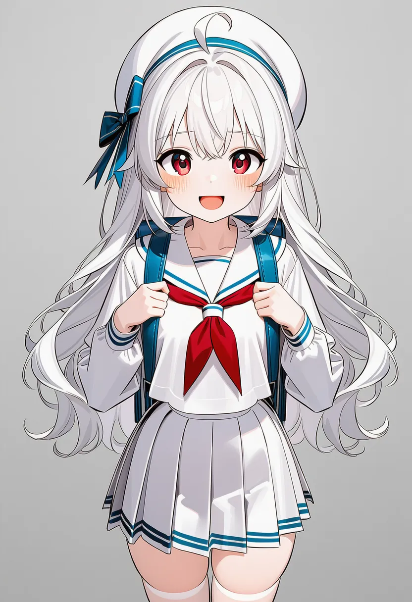 soft cel shading: Cel shading with slightly softened edges |
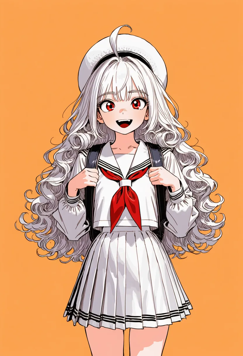 gooch shading: Depth via warm/cool colors |
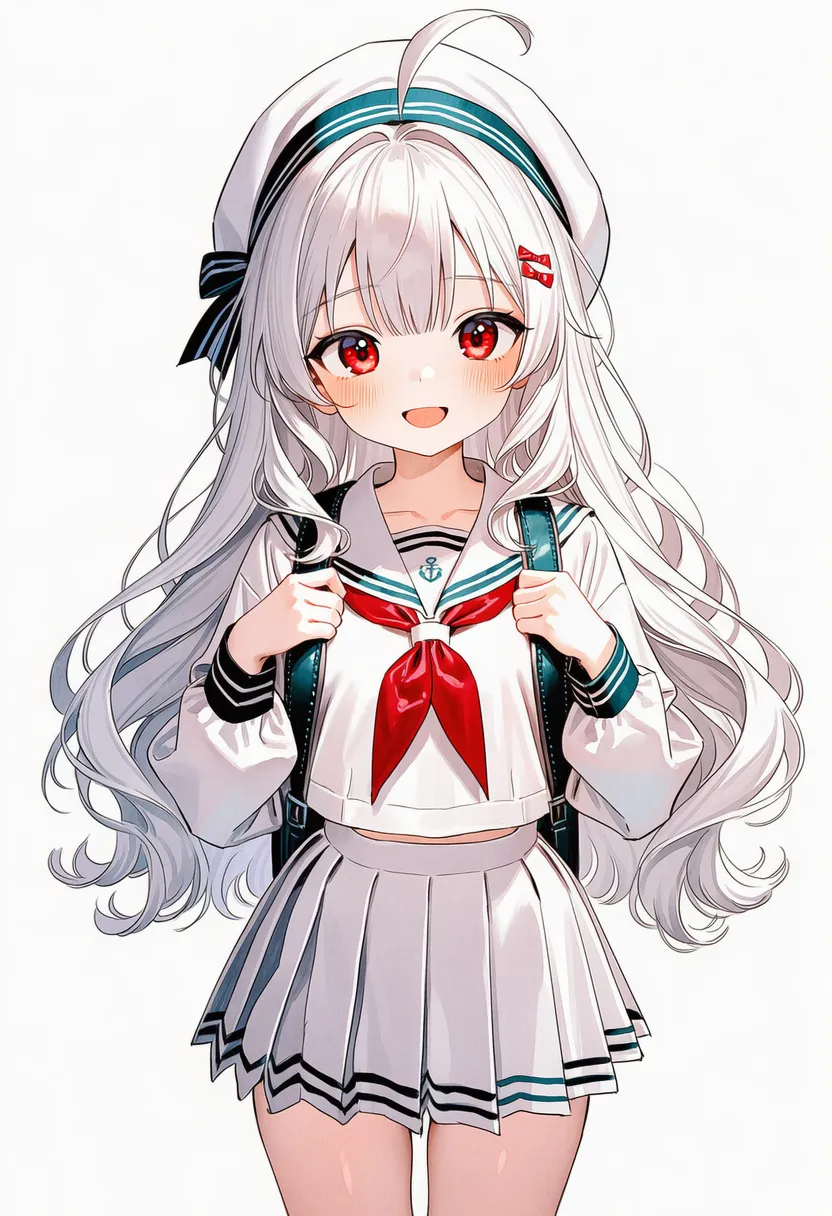 watercolor edges: Dark dried-watercolor edge effect |
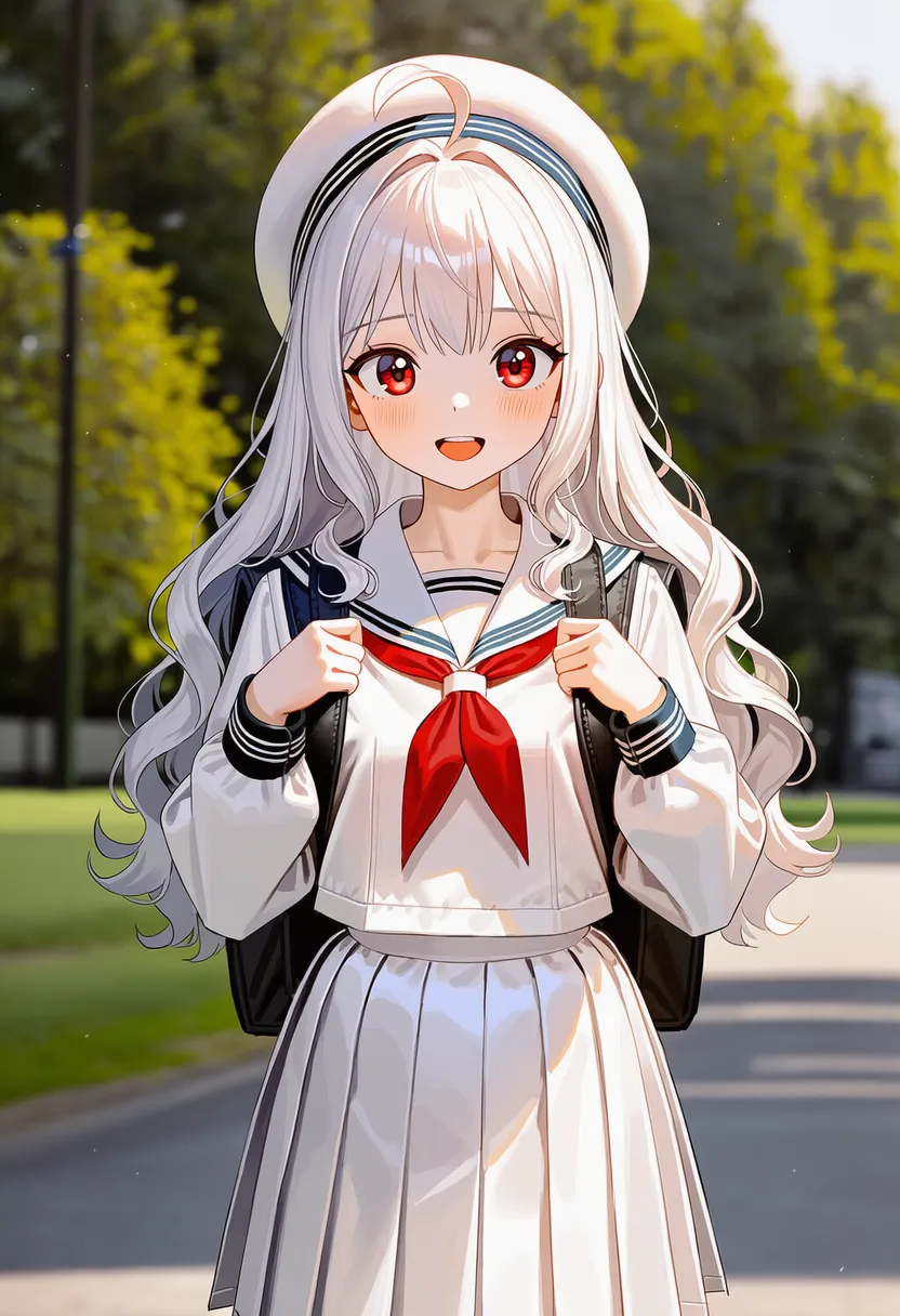 dry brush: Scratchy dry-brush strokes |
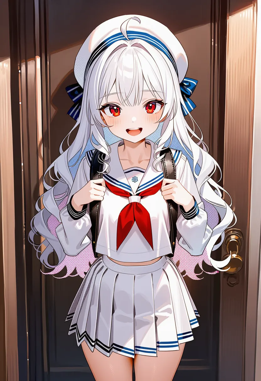 screentones: Manga screentones (dots) |
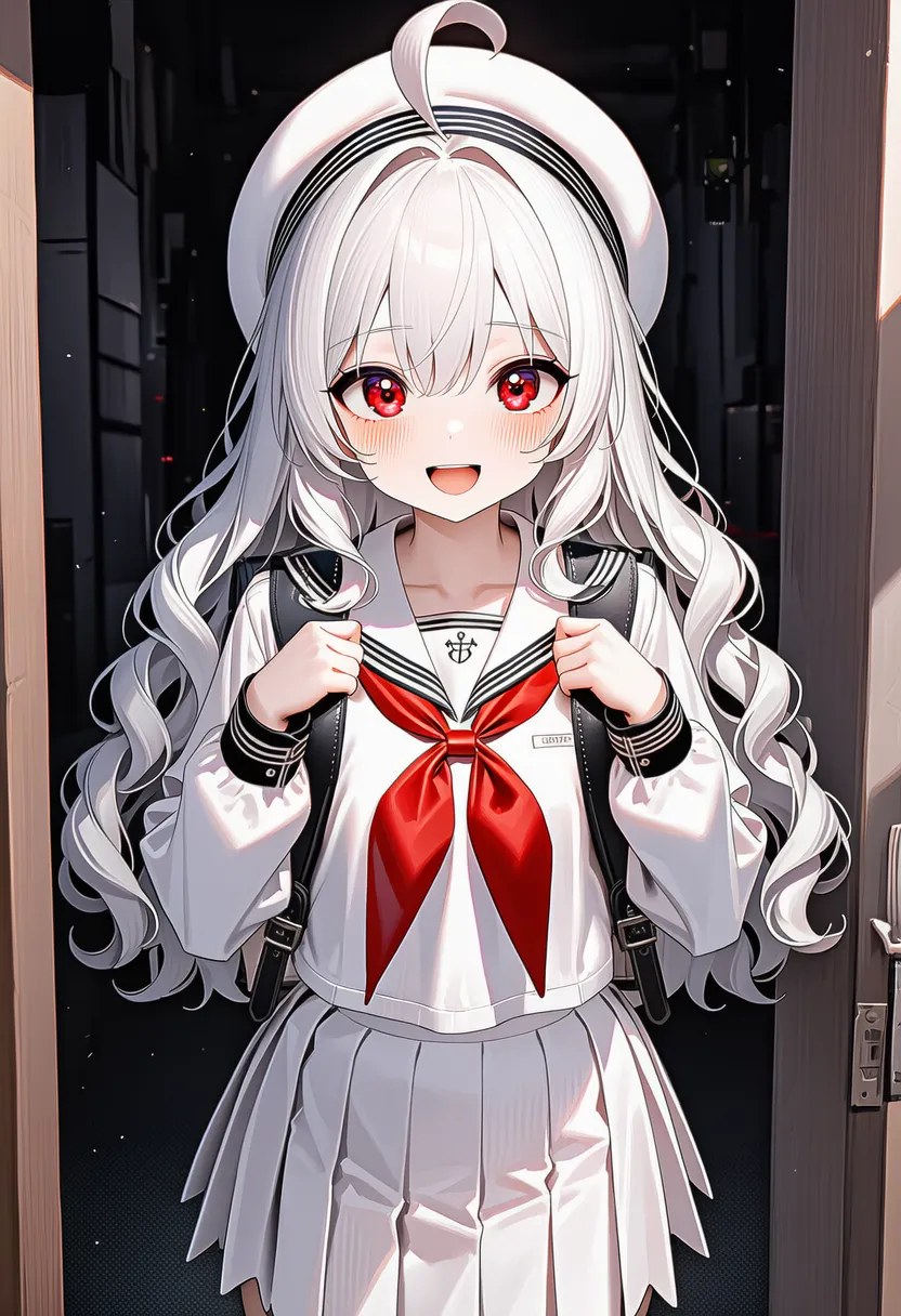 stippling: Stippling. Shading with dots |
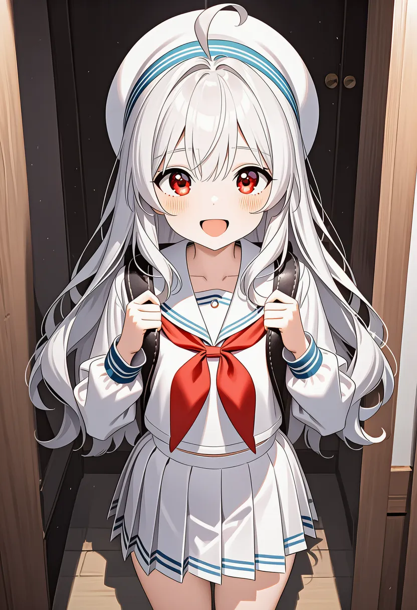 anime shading: Anime-style shading |
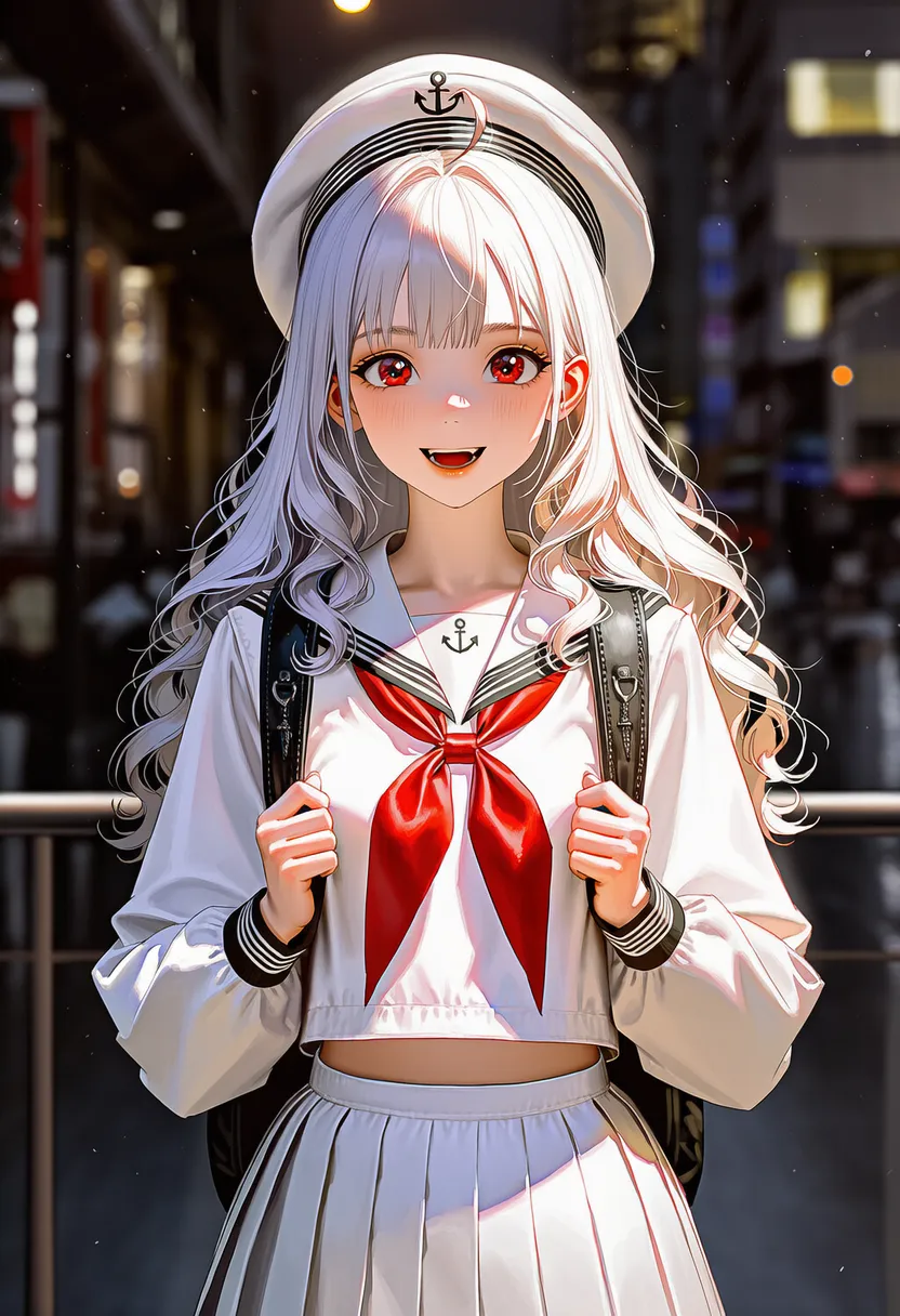 realistic shading: Realistic, lifelike shading |
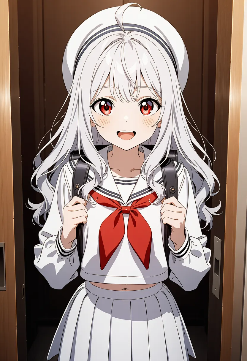 anime coloring: Classic anime coloring |
▶ 4.4. Painting Styles
Affects the overall style, era, and composition.
Reference original |
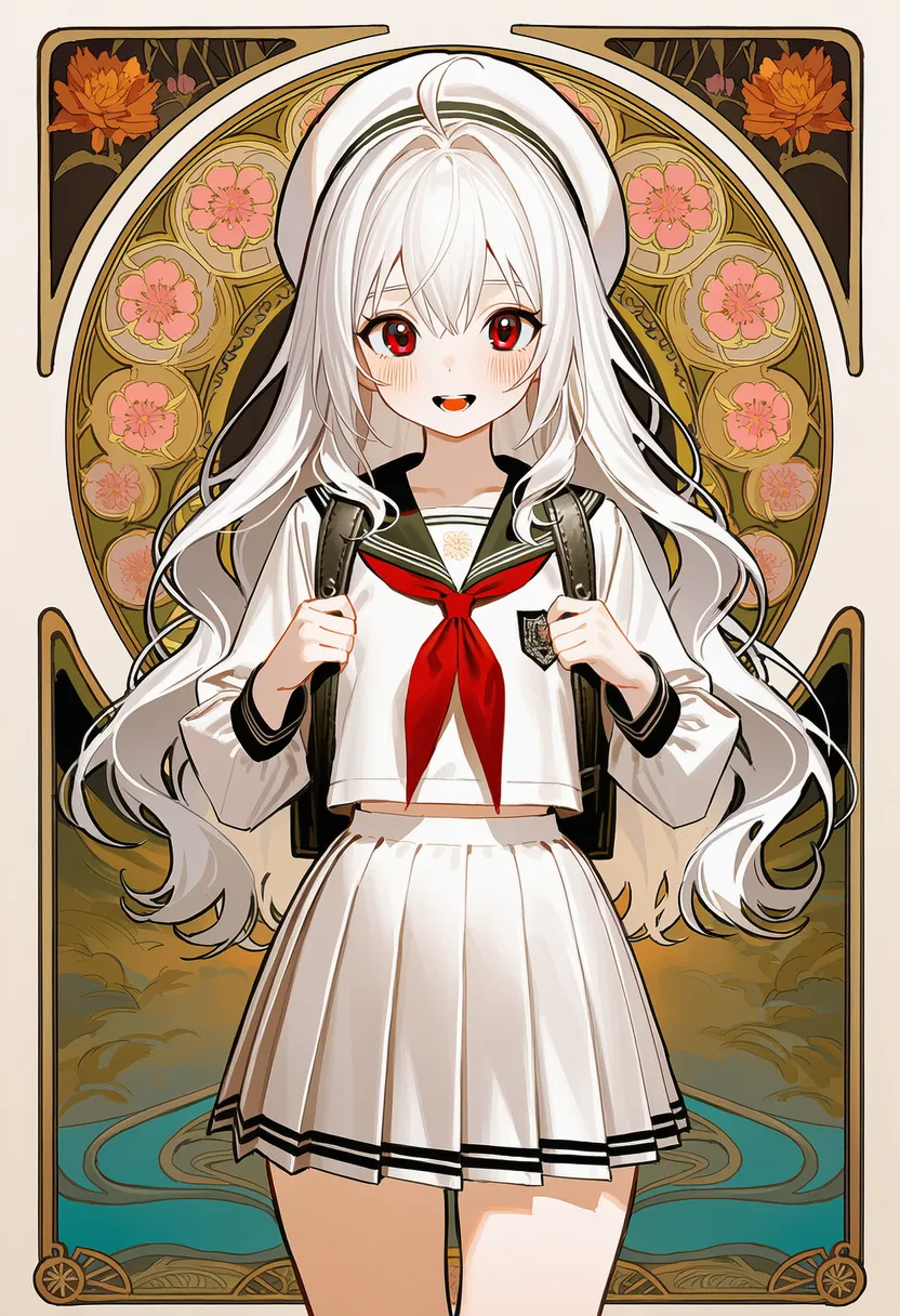
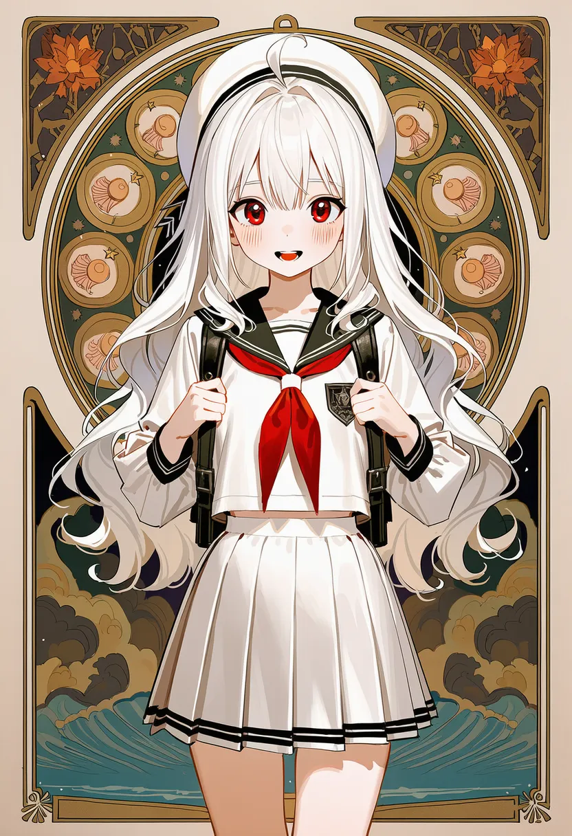 art nouveau: Art Nouveau. Botanical curves, ornament |
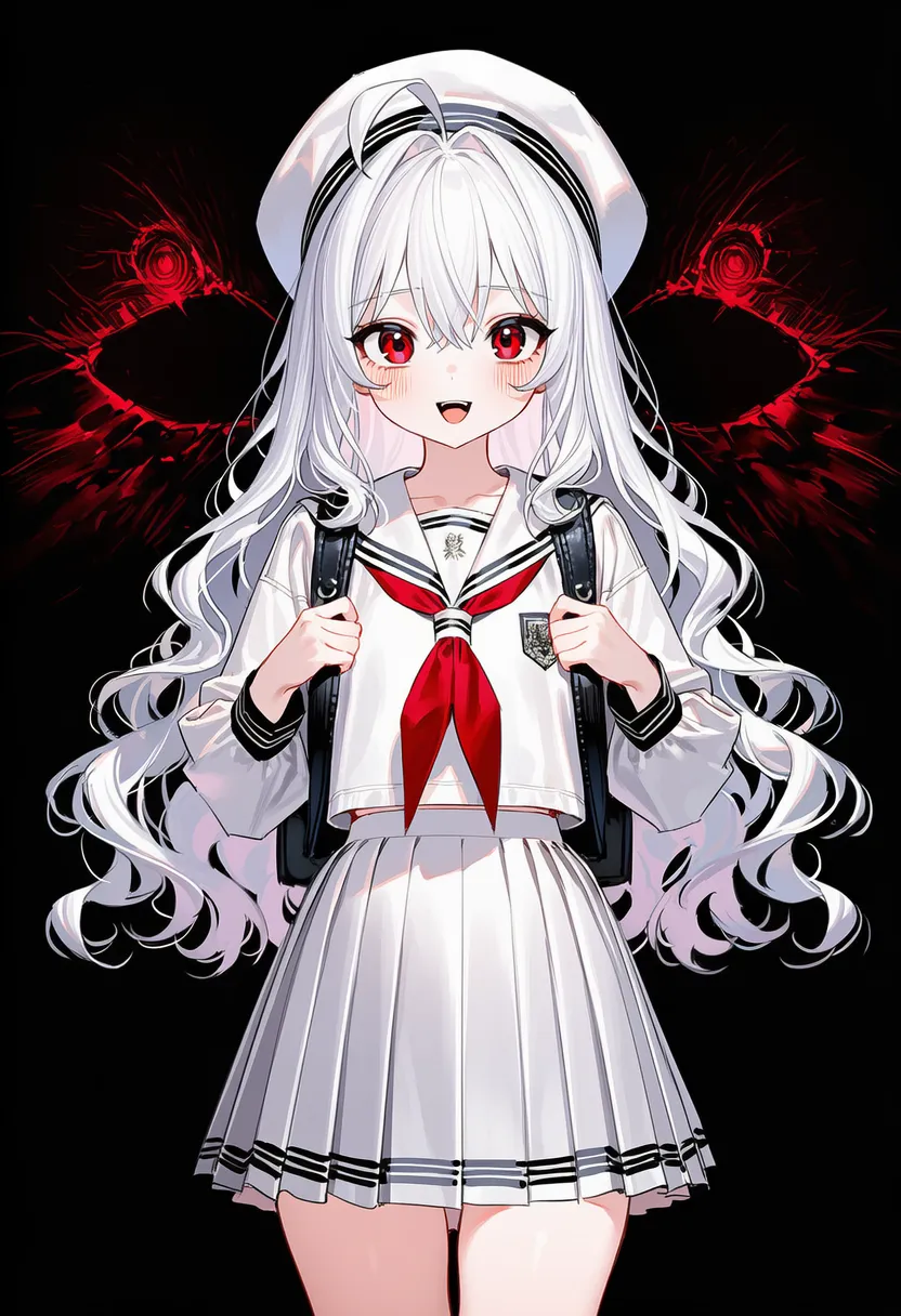
 art deco: Art Deco. Geometric, metallic |
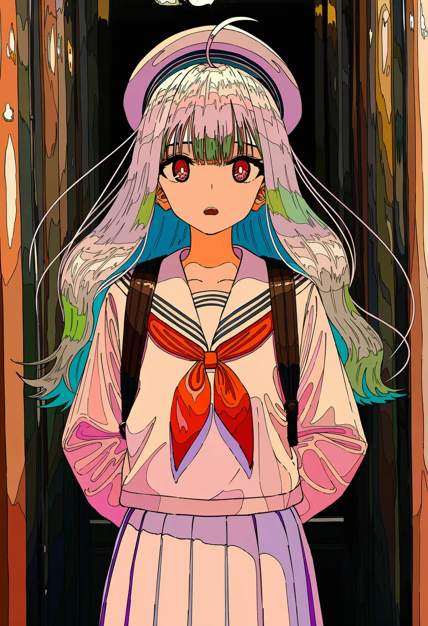
 abstract: Abstract. Vague forms, color-driven |
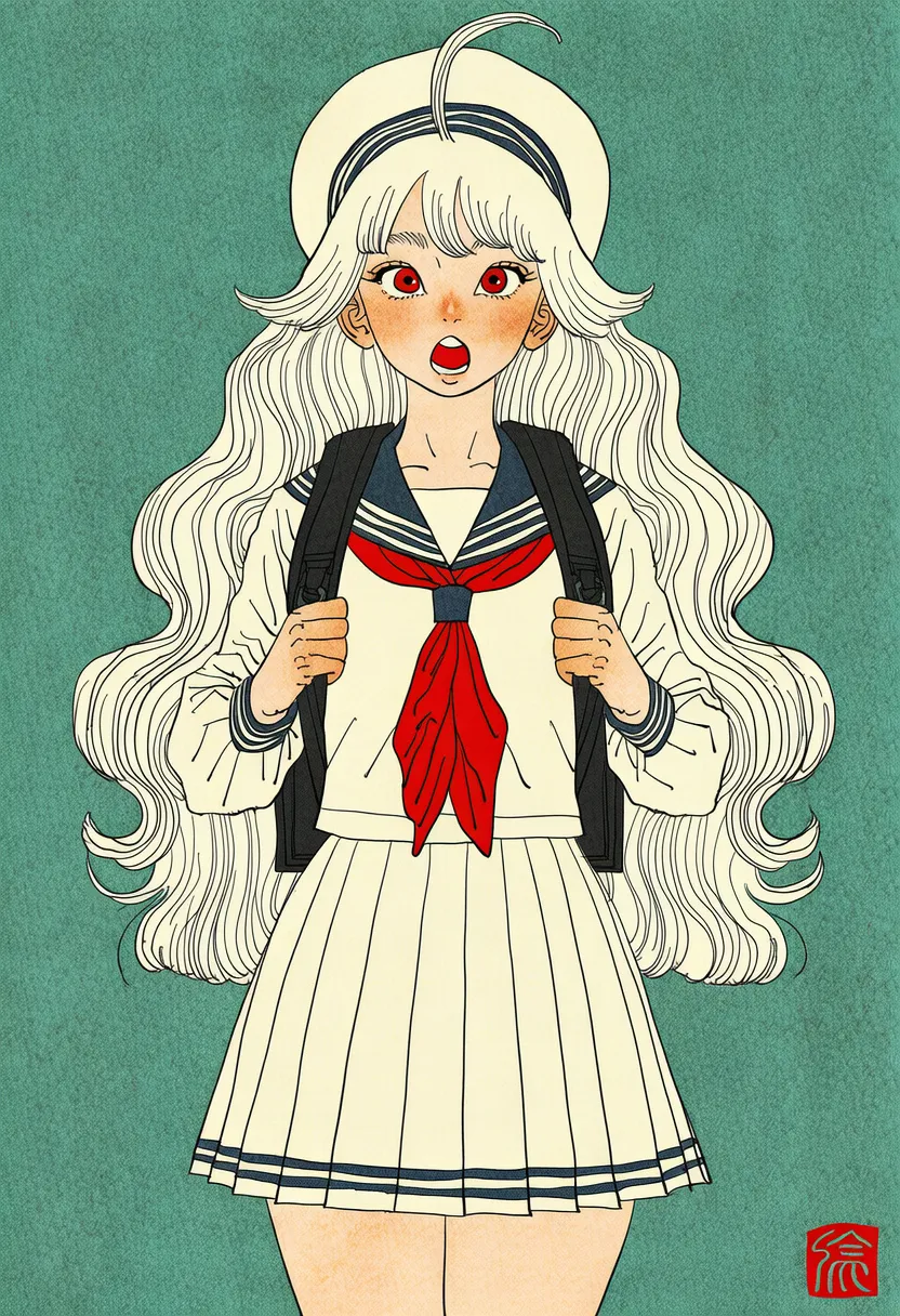
 ligne claire: Ligne claire. Uniform black outlines |
 nihonga: Nihonga. Mineral-pigment texture, negative space |
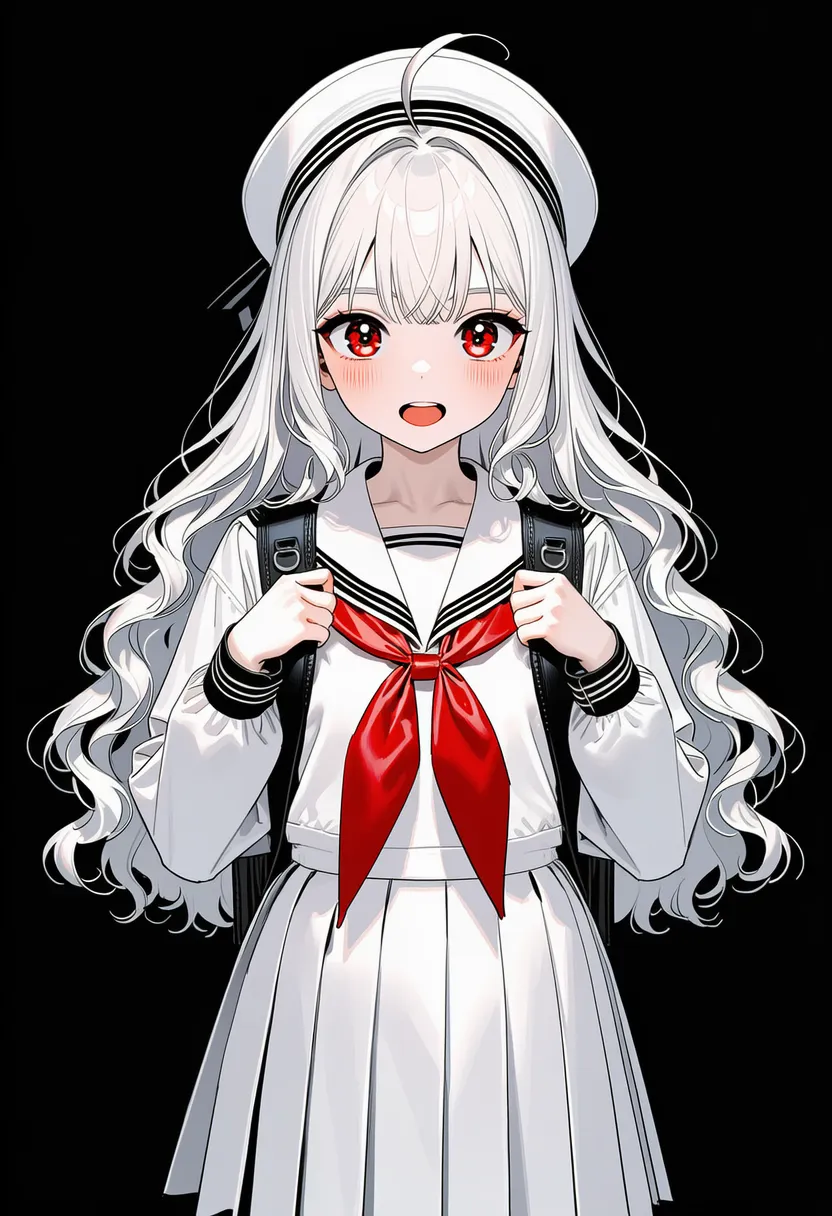 ukiyo-e: Ukiyo-e. Japanese woodblock, flat |
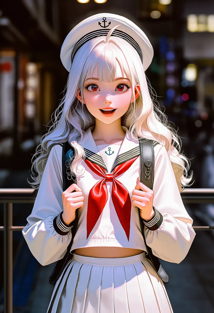 realistic: Realistic rendering |
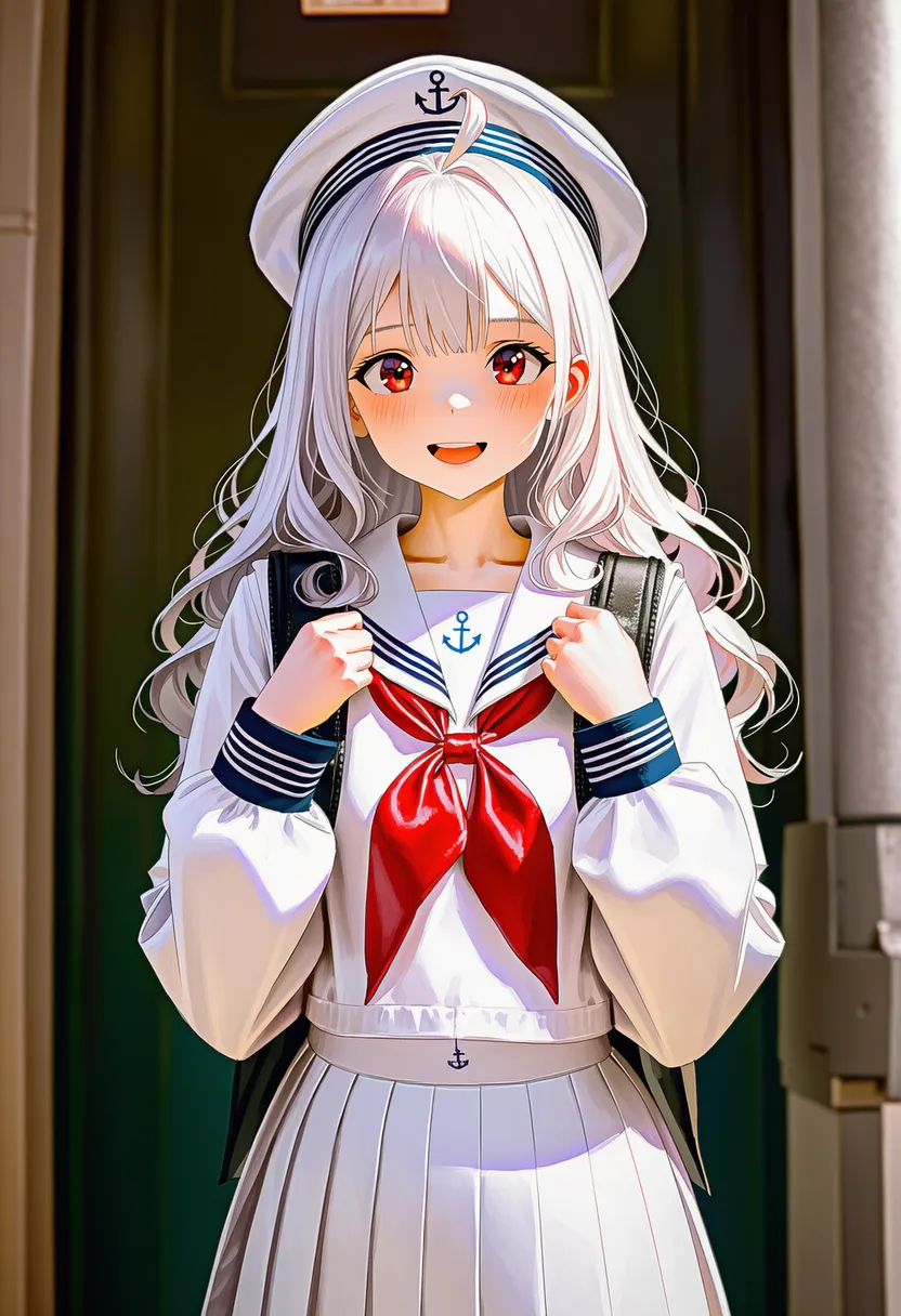 photorealistic: Photo-real rendering |
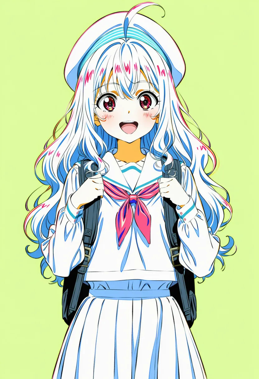 color trace: Colored lineart (concept-art look) |
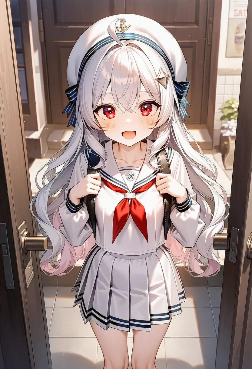 game cg: Dating sim / RPG event CG style |
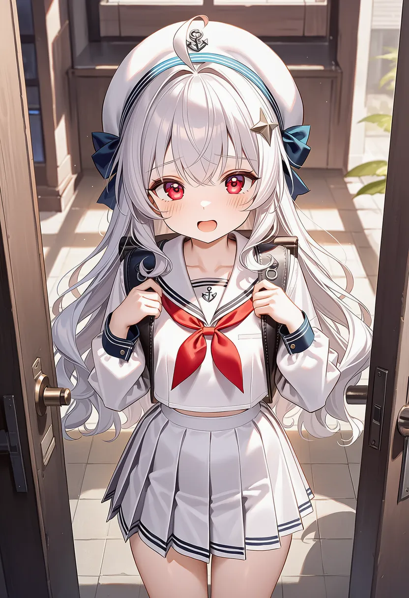 official art: Official merch / promo illustration |
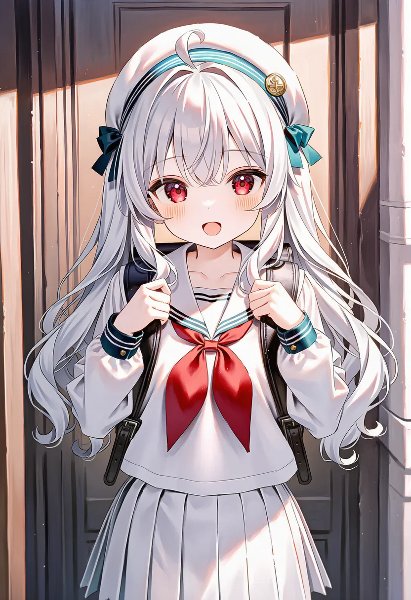 shikishi: Japanese shikishi board, gold trim |
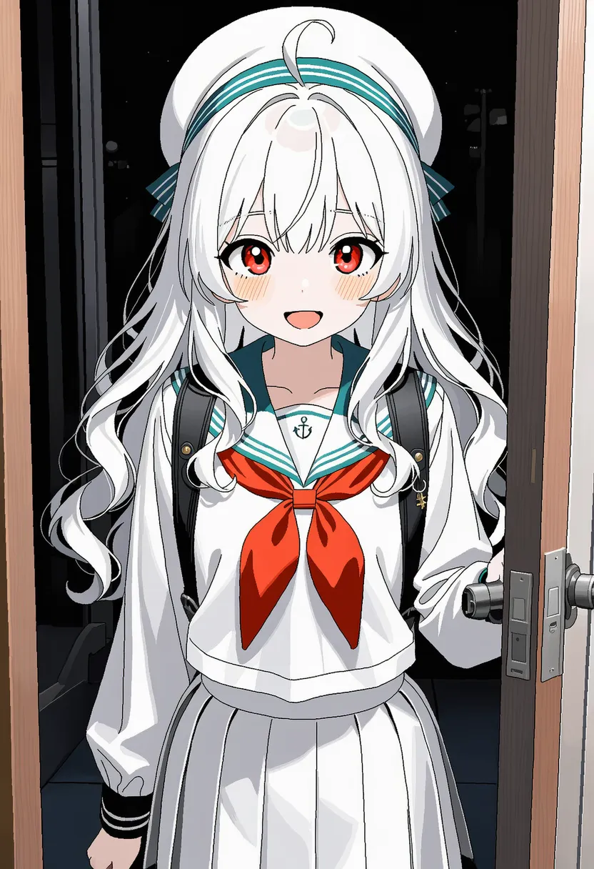 oekaki: Web oekaki vibe, jagged pixels |
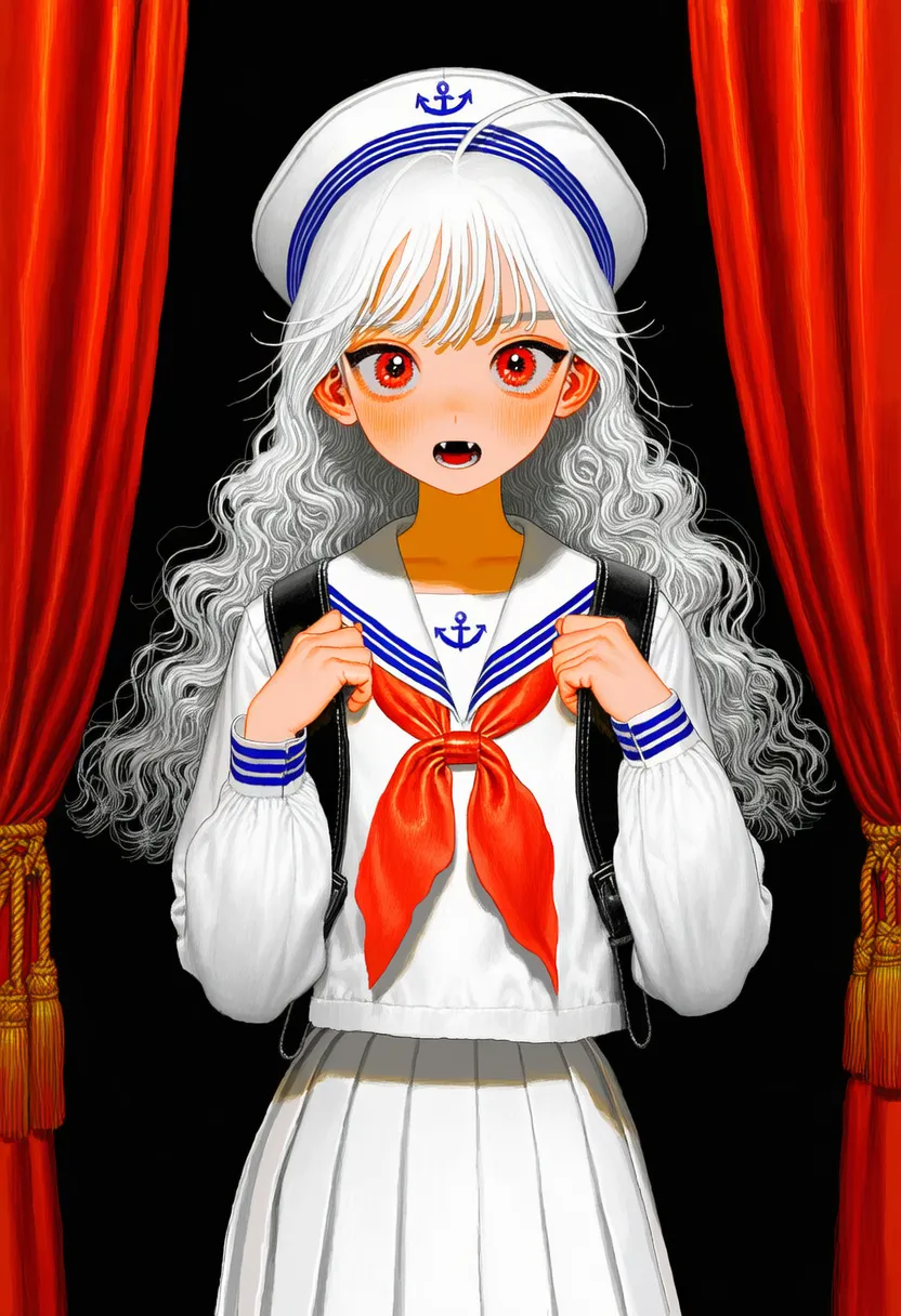 tegaki: Handwriting/blog vibe, mouse-drawn |
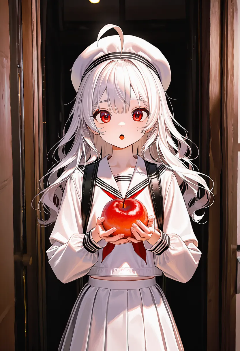 surrealism: Surrealism. Uncanny object placement |
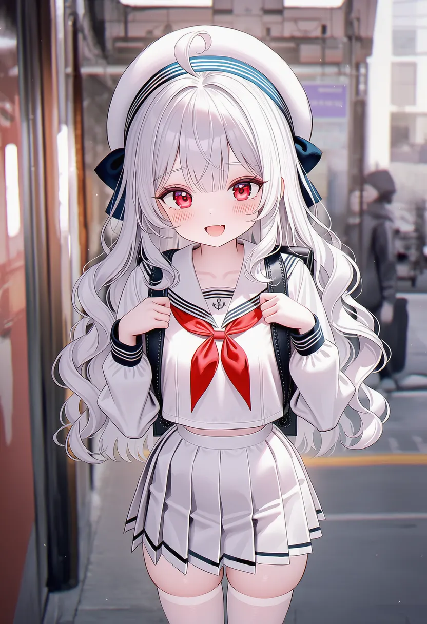 cubism: Cubism. Deconstructed into shapes |
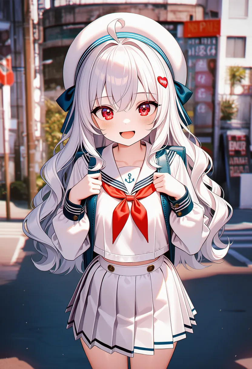 pop art: Pop art. Pop culture, bold colors |
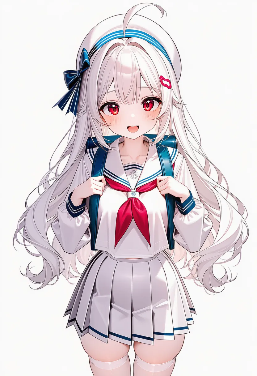 expressionism: Expressionism. Distortion for emotion |
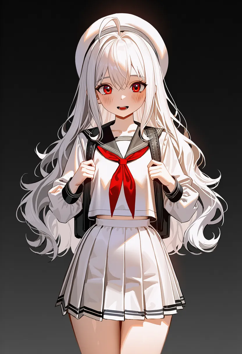 baroque: Baroque. Dynamic, dramatic light |
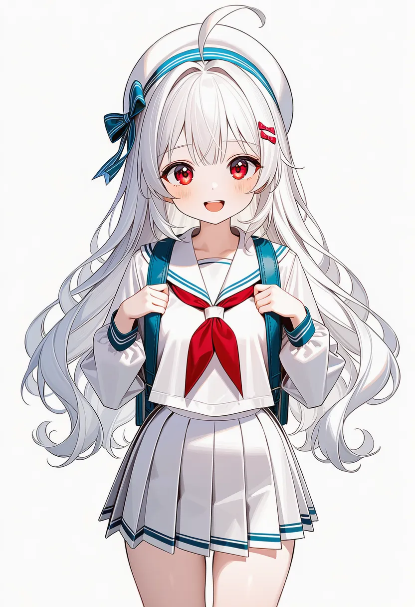 minimalist: Minimalist. Bare-minimum lines and color |
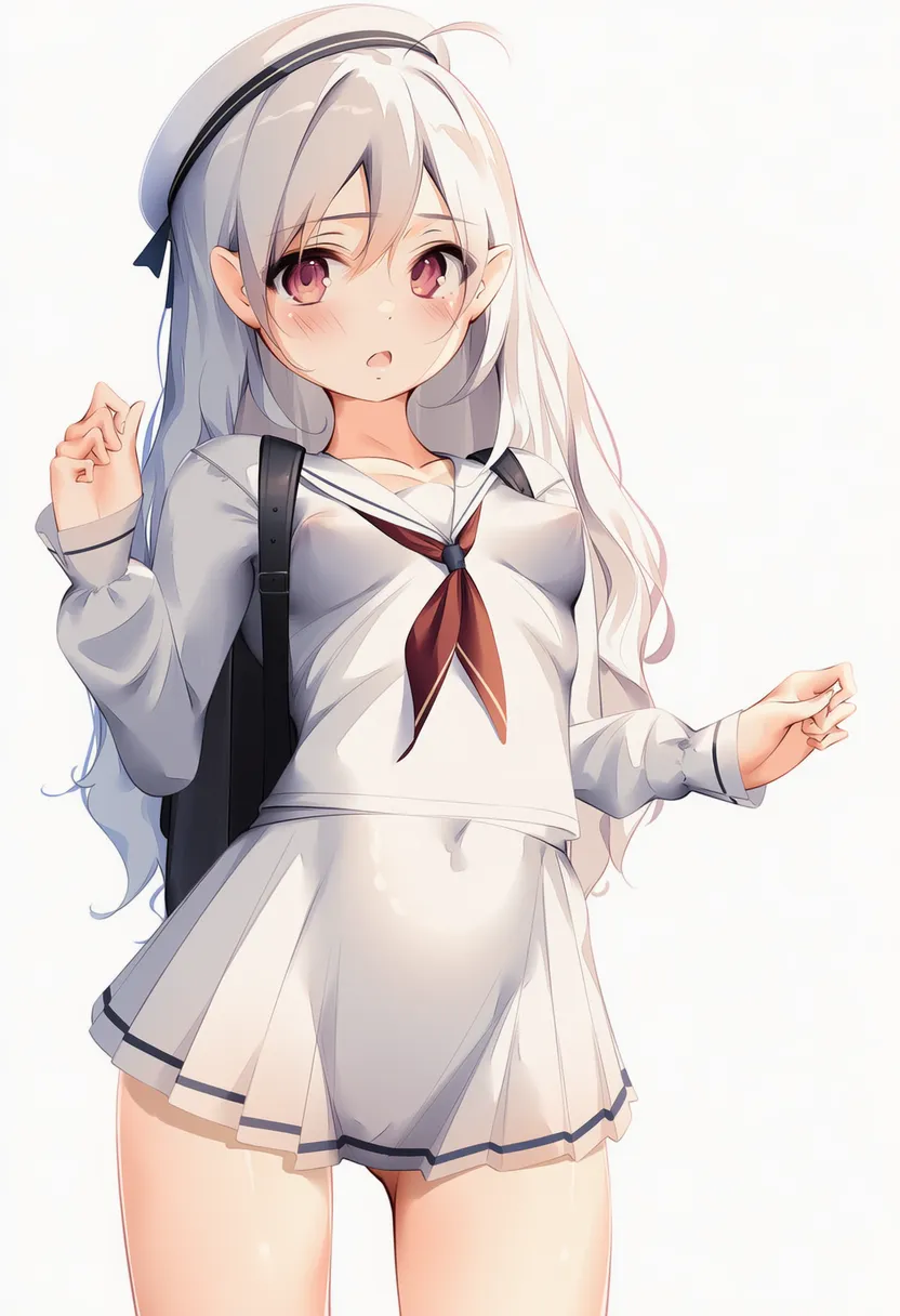 rococo: Rococo. Pastel, aristocratic, elegant |
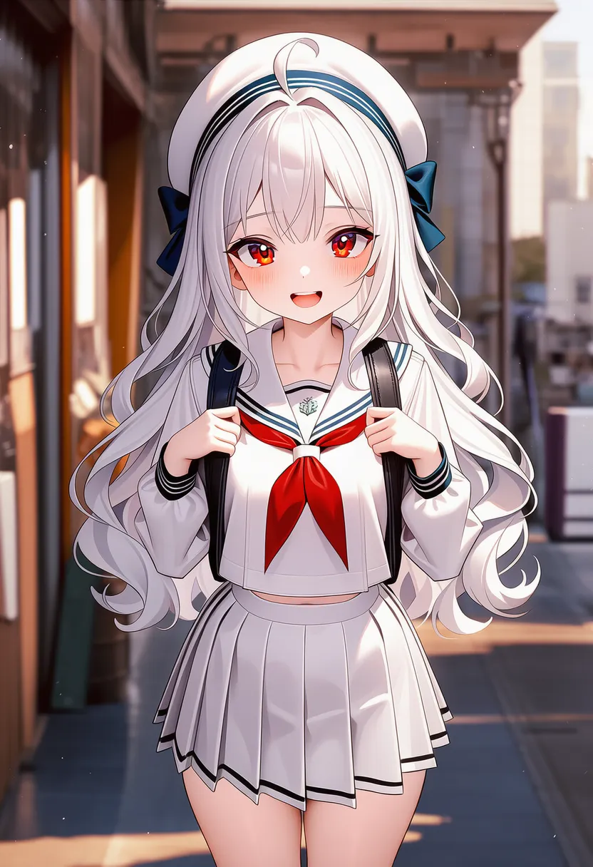 dada: Dada. Discord, the art of nonsense |
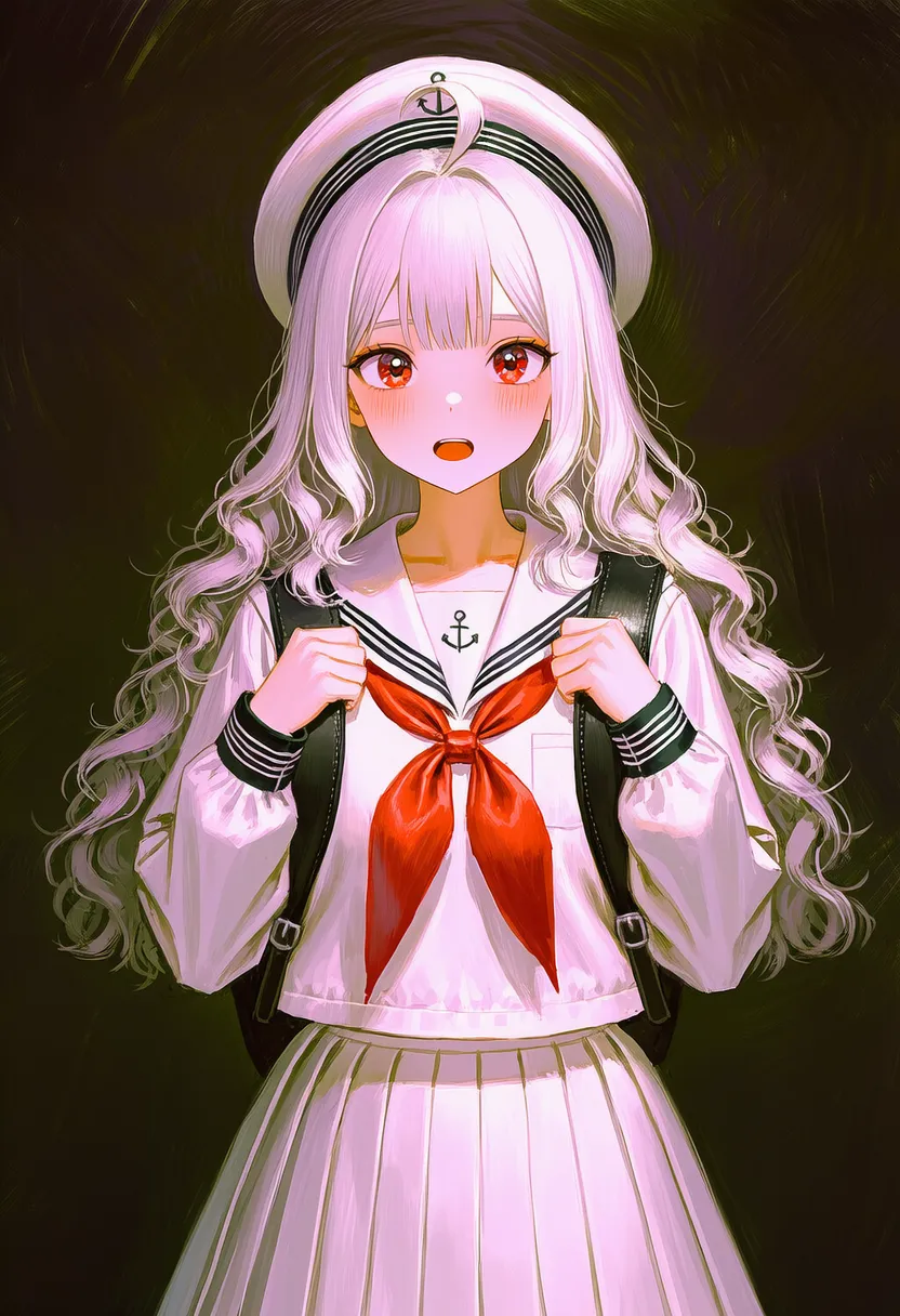 impressionism: Impressionism. Shifting light, color-first |
▶ 4.5. Genre & Mood
Sets the mood — mostly the background.
Reference original |
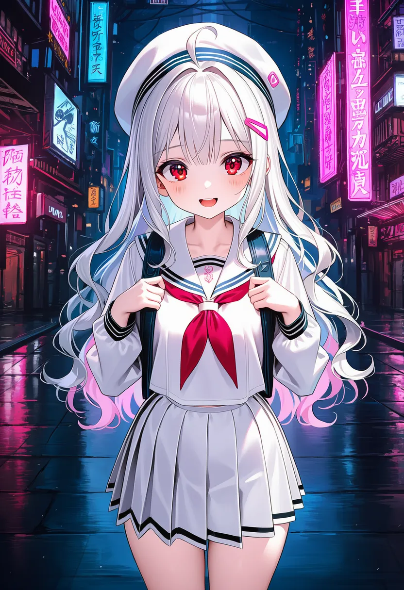 cyberpunk: Cyberpunk. High-tech, neon |
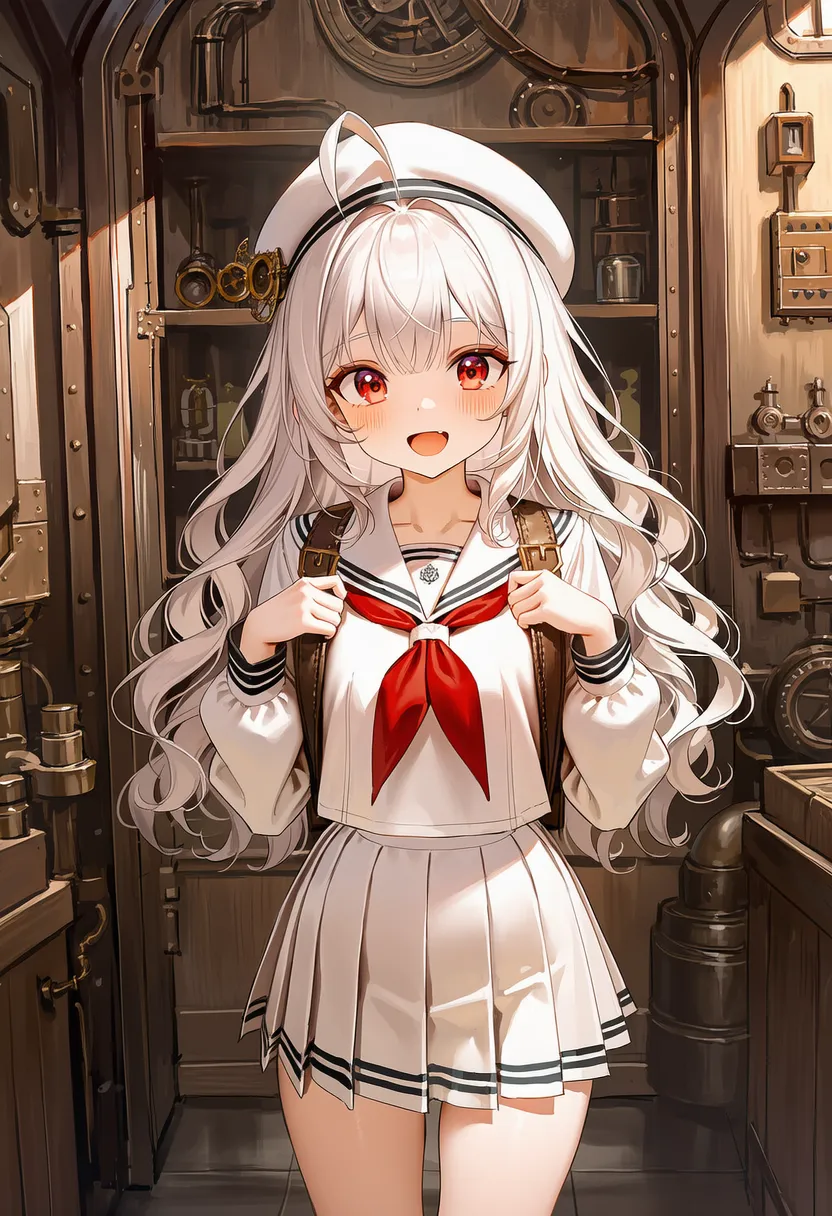 steampunk: Steampunk. Steam engines, gears |
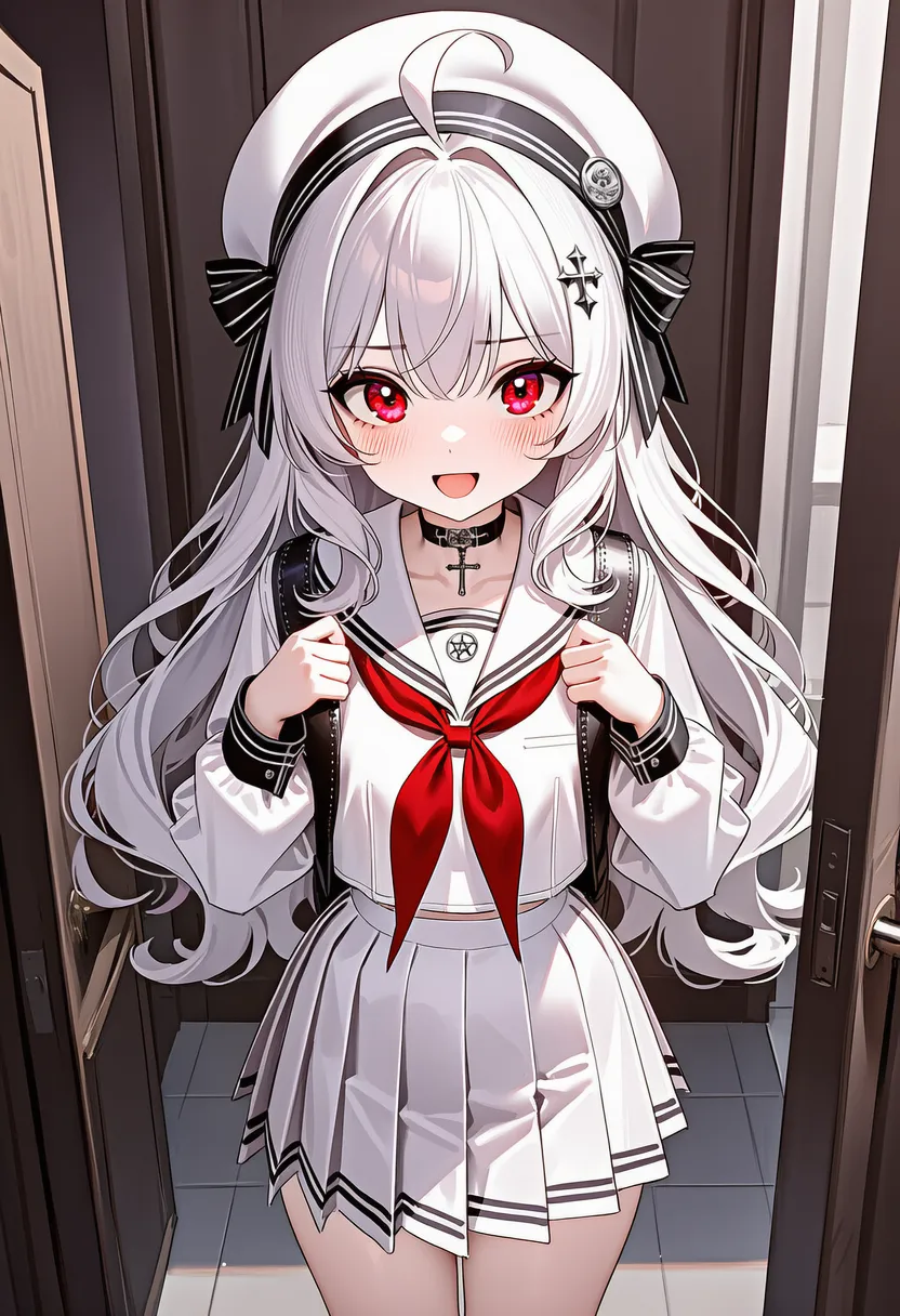 gothic: Gothic. Medieval darkness, vampires |
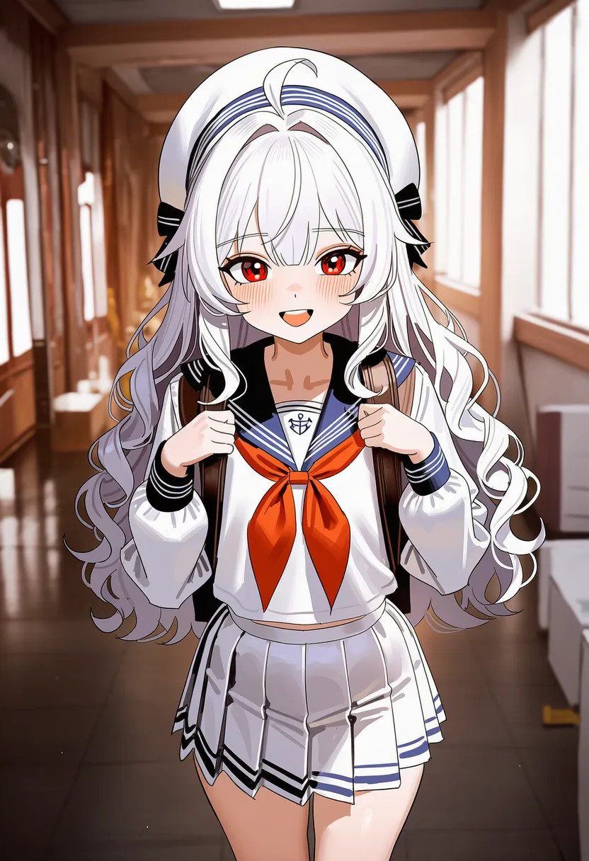 arcanepunk: Arcanepunk. Magic, science, early-modern |
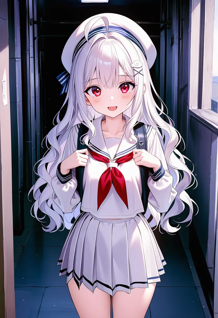 noir: Noir. Dark crime-film atmosphere |
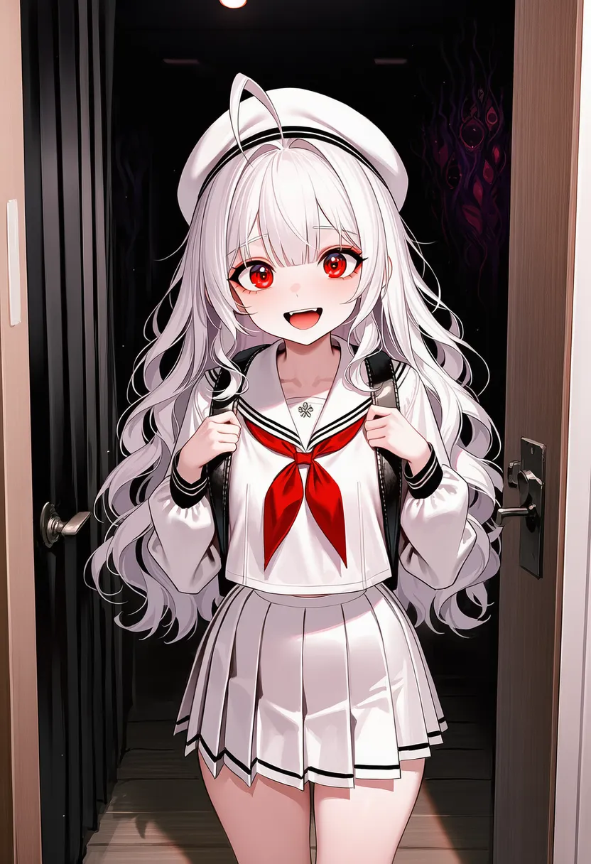 horror visual: Horror. Eerie and unsettling |
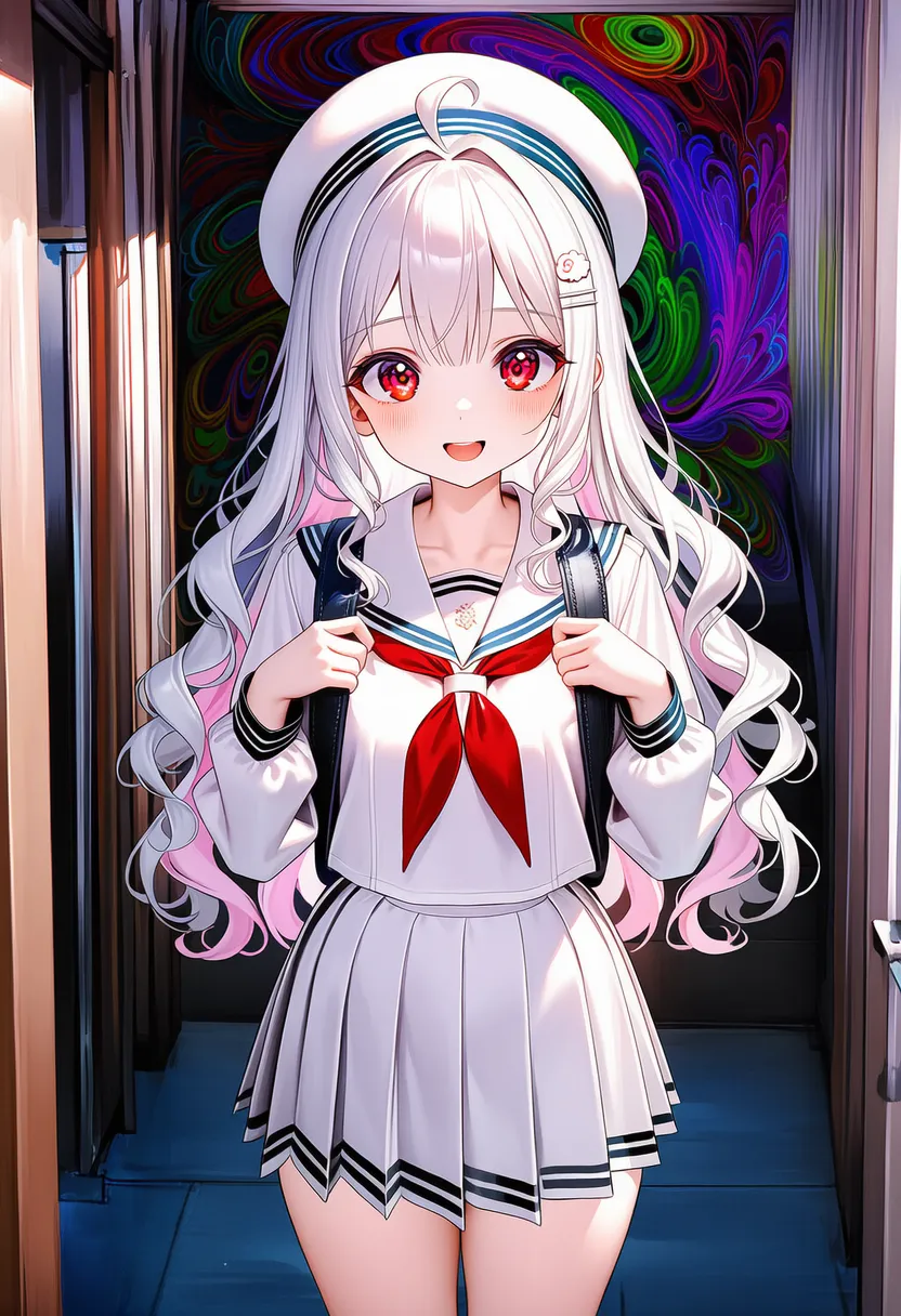 psychedelic: Psychedelic. Hallucination, neon swirls |
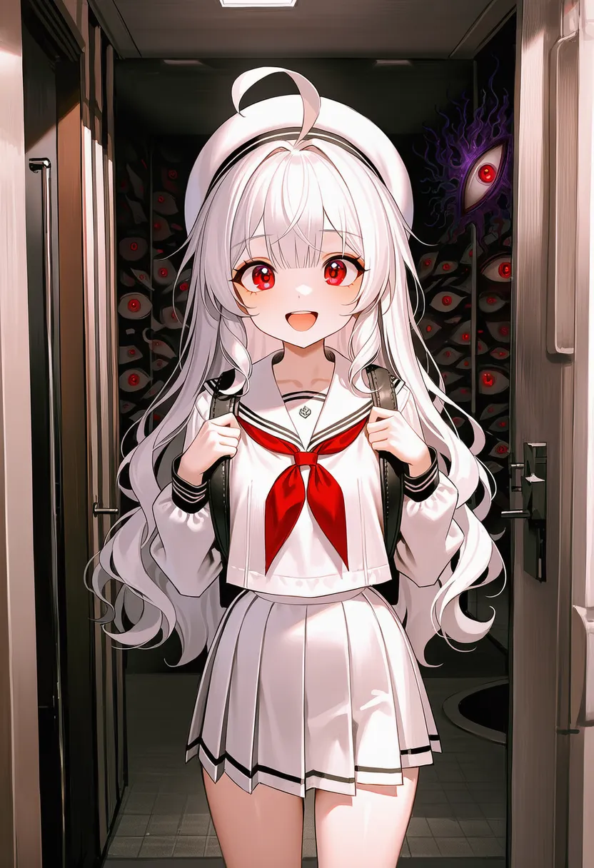 surreal: Unreal and dreamlike |
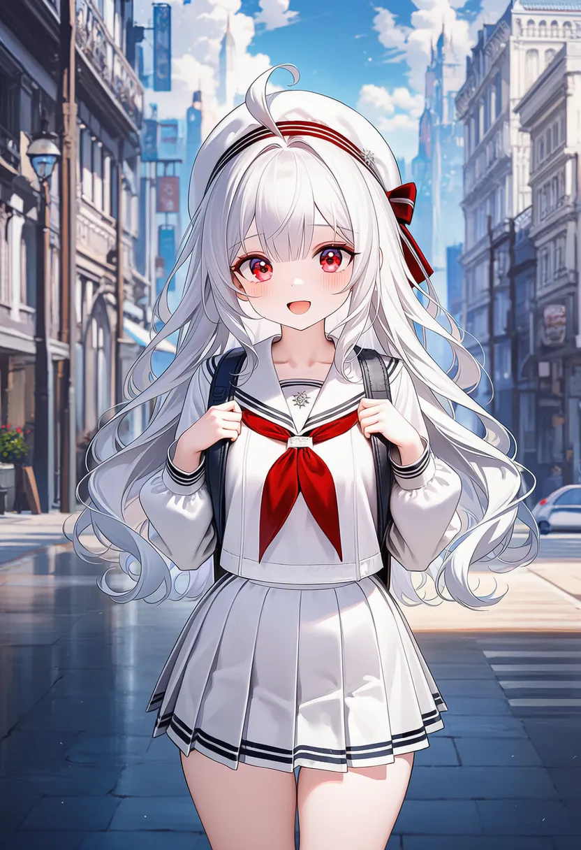 ethereal: Ethereal. Light, spiritual air |
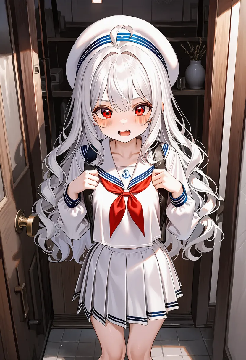 gritty: Rough and dusty, hard-boiled |
 dreamy: Dreamy, hazy and soft |
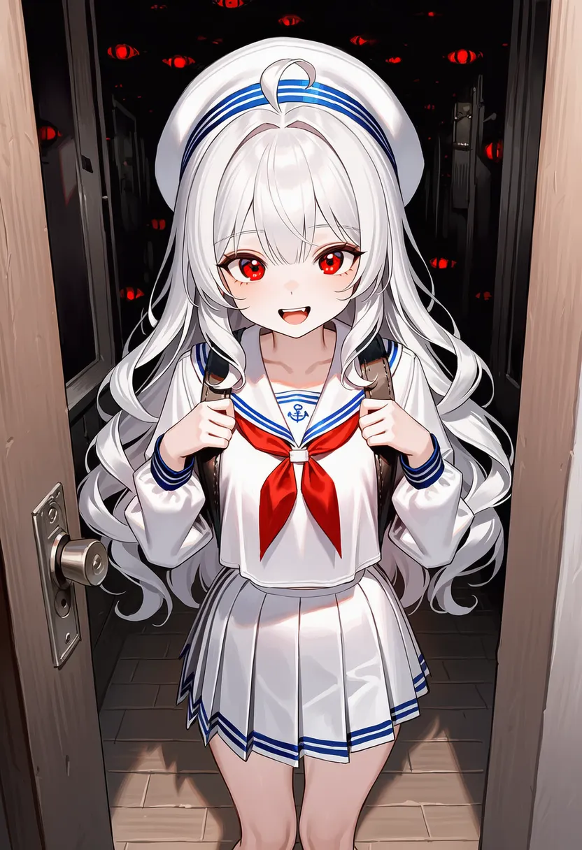 ominous: Ominous. Something-bad-is-coming tension |
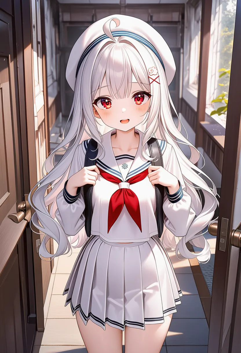 serene: Calm and peaceful, still |
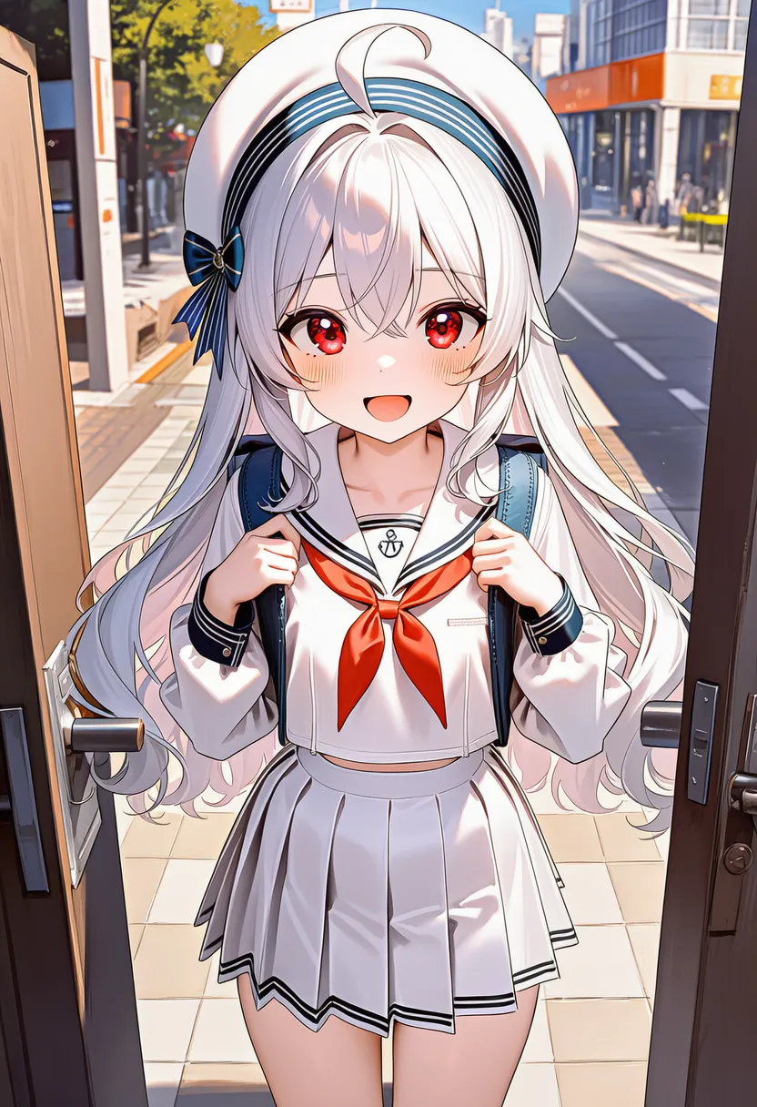 vibrant atmosphere: Lively, vivid atmosphere |
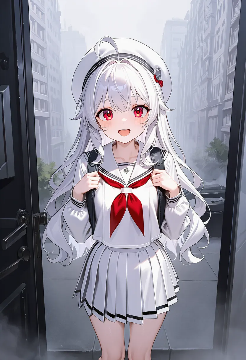 foggy: Thick fog |
 starry night: Starry night |
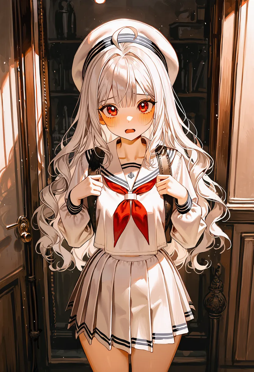 melancholic: Melancholy, quiet sadness |
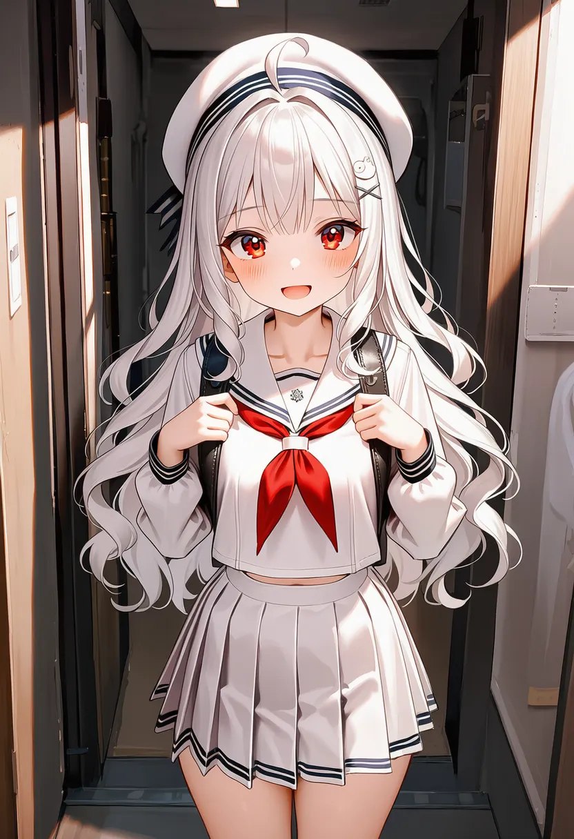 nostalgic: Nostalgic, warm old-days feel |
▶ 4.6. Digital & Retro
Adds old-school graphics or digital-art flavor.
Reference original |
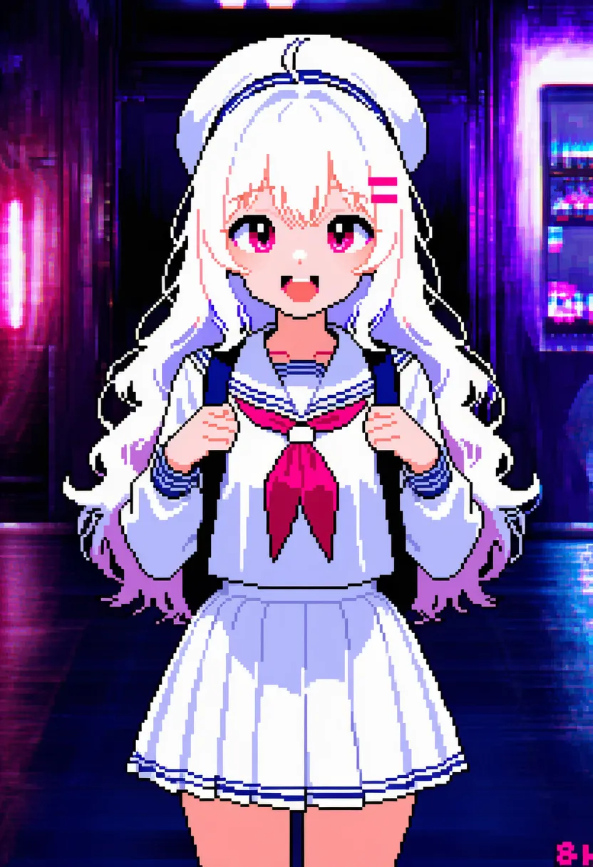 8-bit: Famicom (8-bit) game graphics |
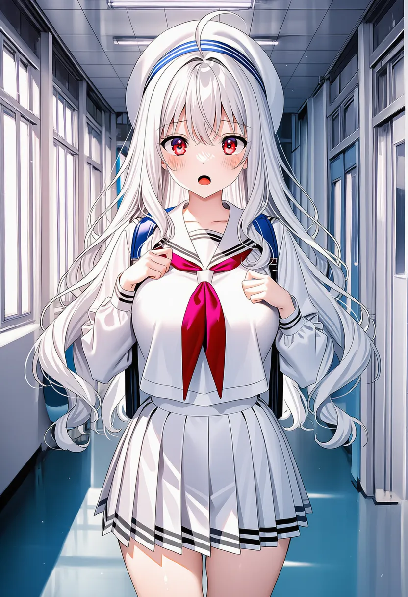 16-bit: Super Famicom (16-bit) graphics |
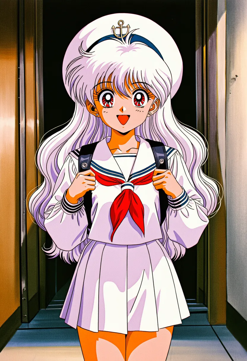 retro art: Retro style, broad sense |
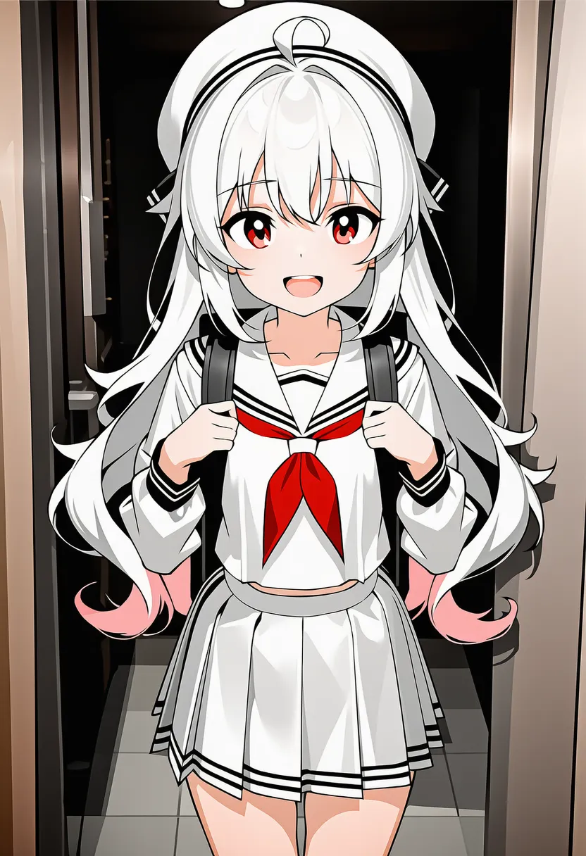 vectored: Vector graphics |
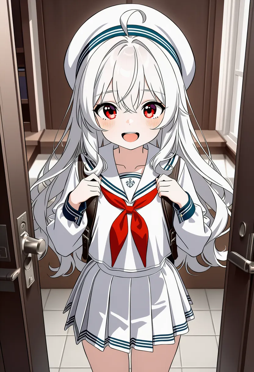 vector art: Clean, crisp planes |
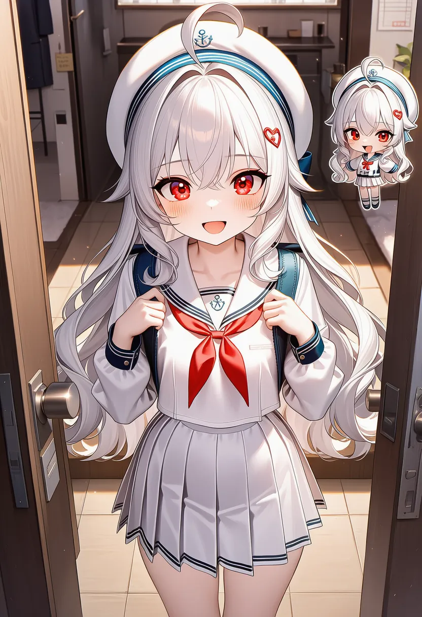 chibi: SD character. Big head, tiny body |
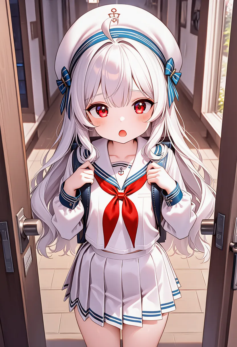 super deformed: SD character (similar to chibi) |
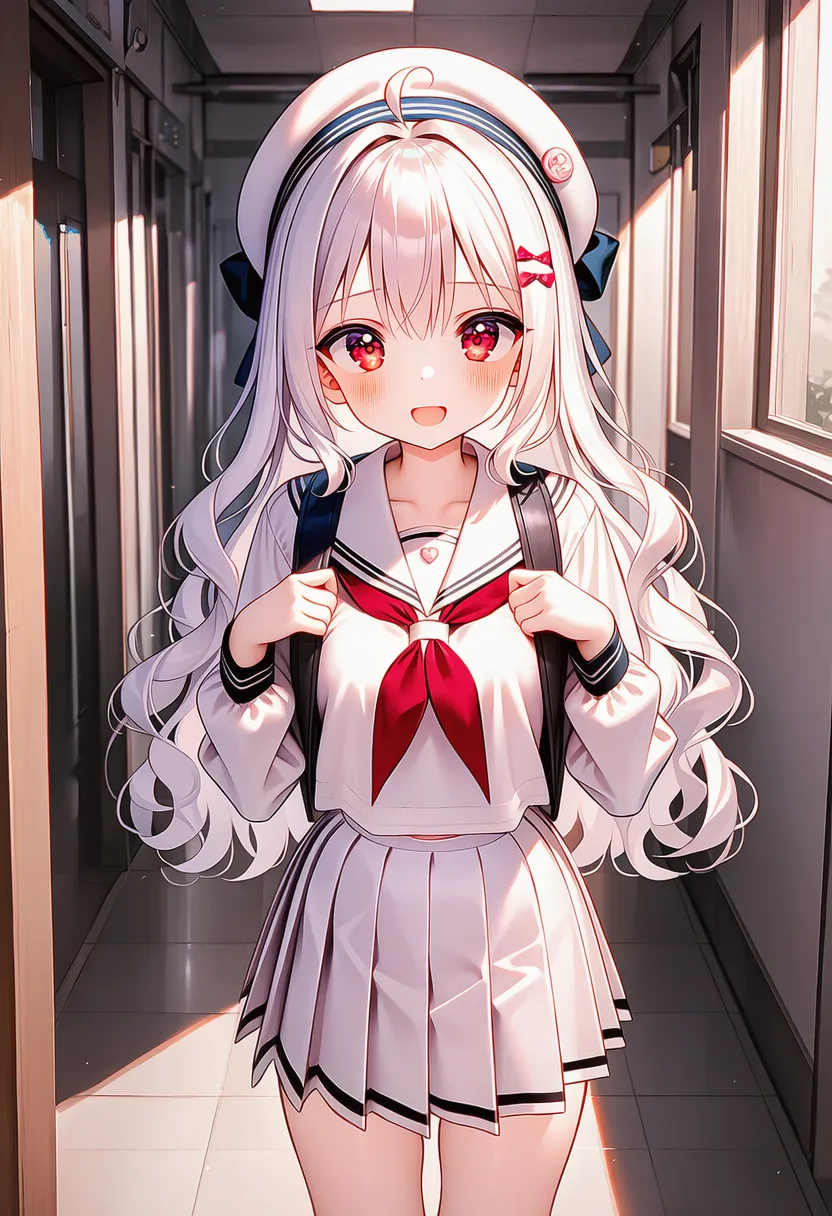 ms paint: MS Paint vibe, clunky lines and primary colors |
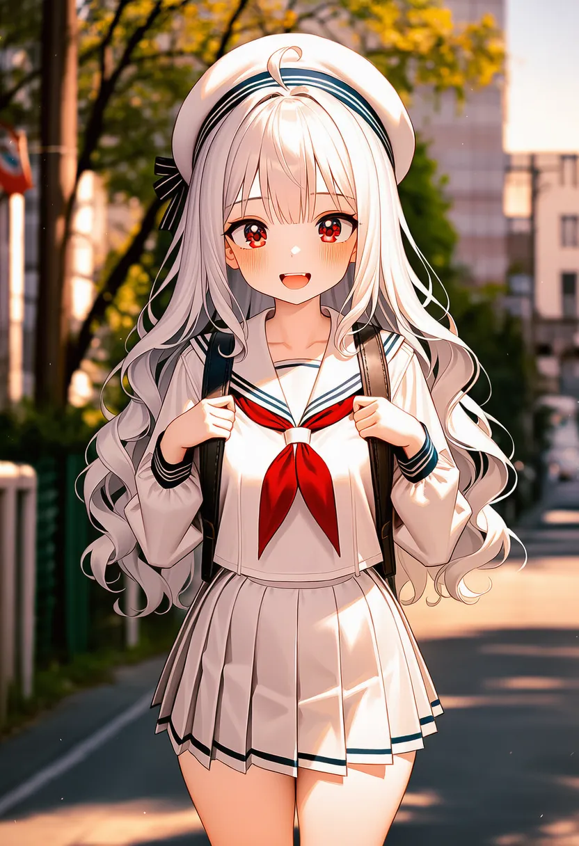 mspaint: MS Paint vibe, take 2 |
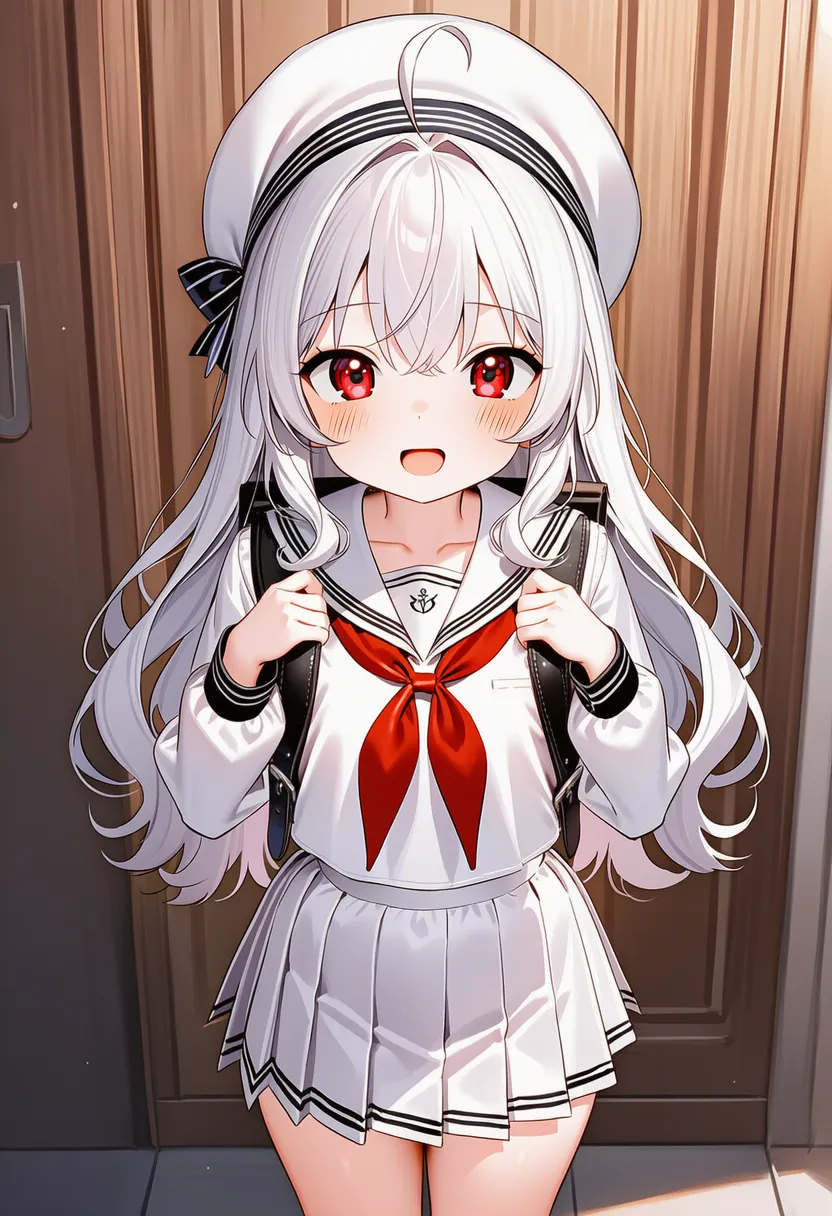 lowres: Low-res. Broken-looking |
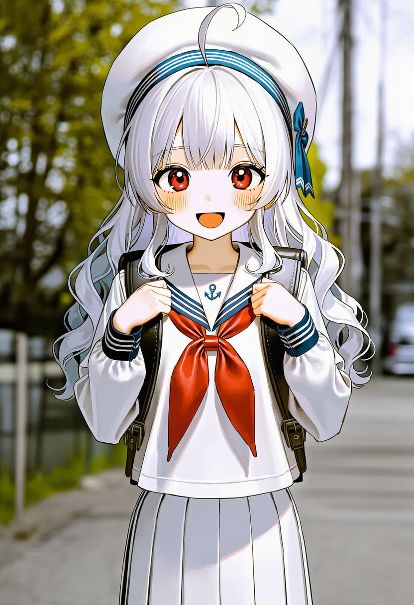 low poly: Low poly. Angular 3D modeling |
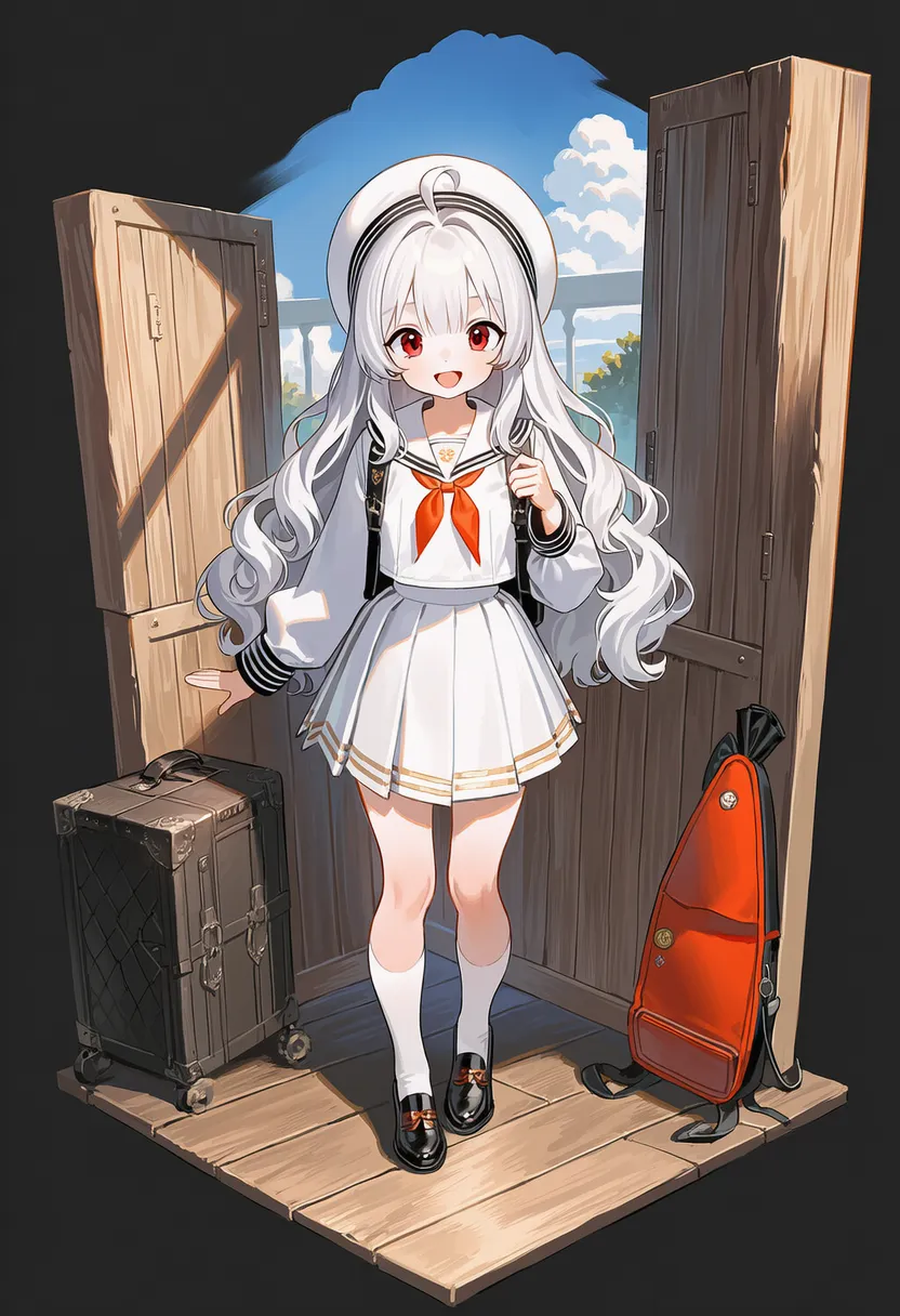 diorama: Diorama. Museum miniature |
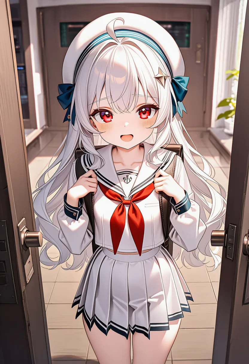 tilt-shift: Tilt-shift. Miniature effect |
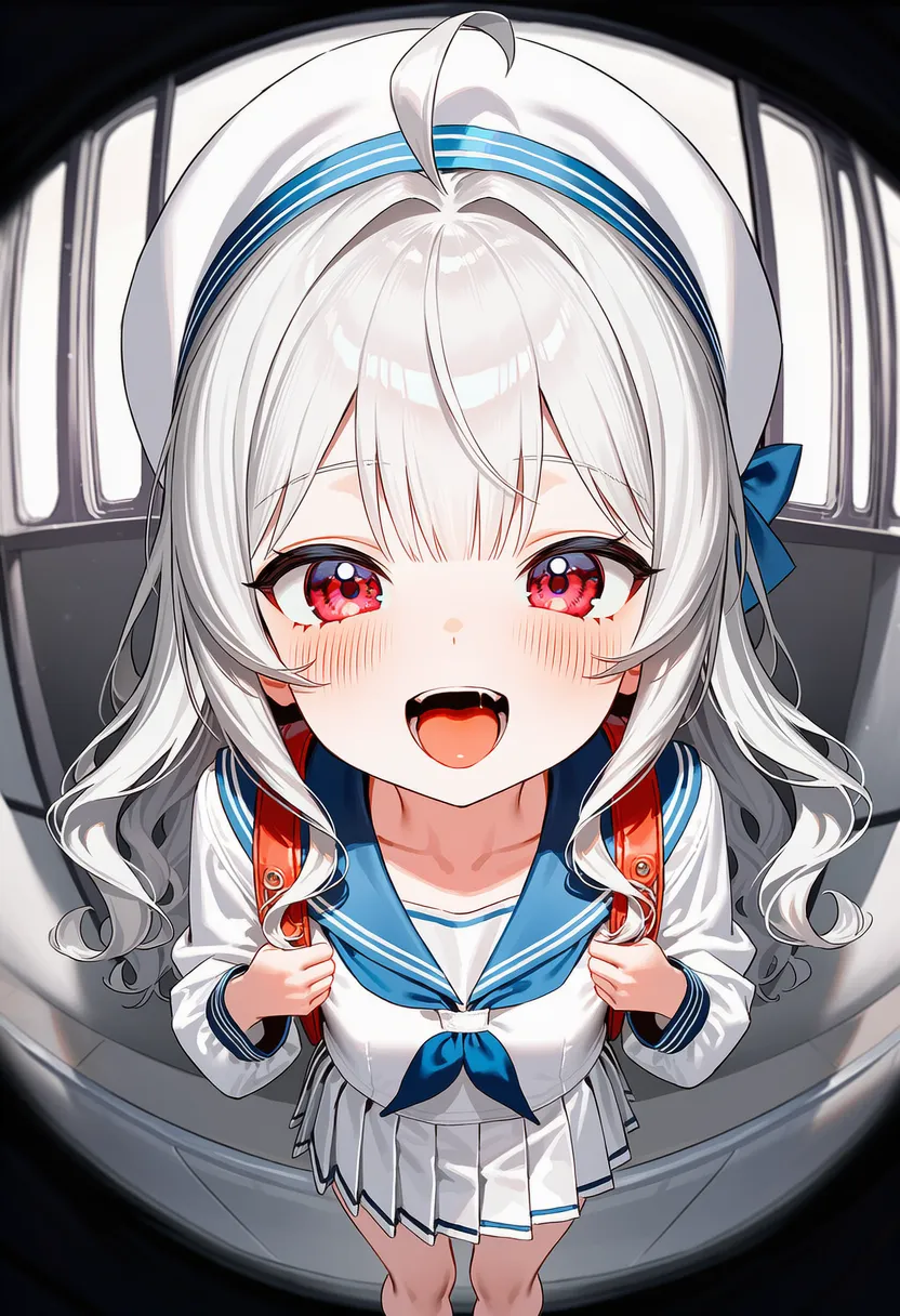 fisheye: Fisheye lens distortion |
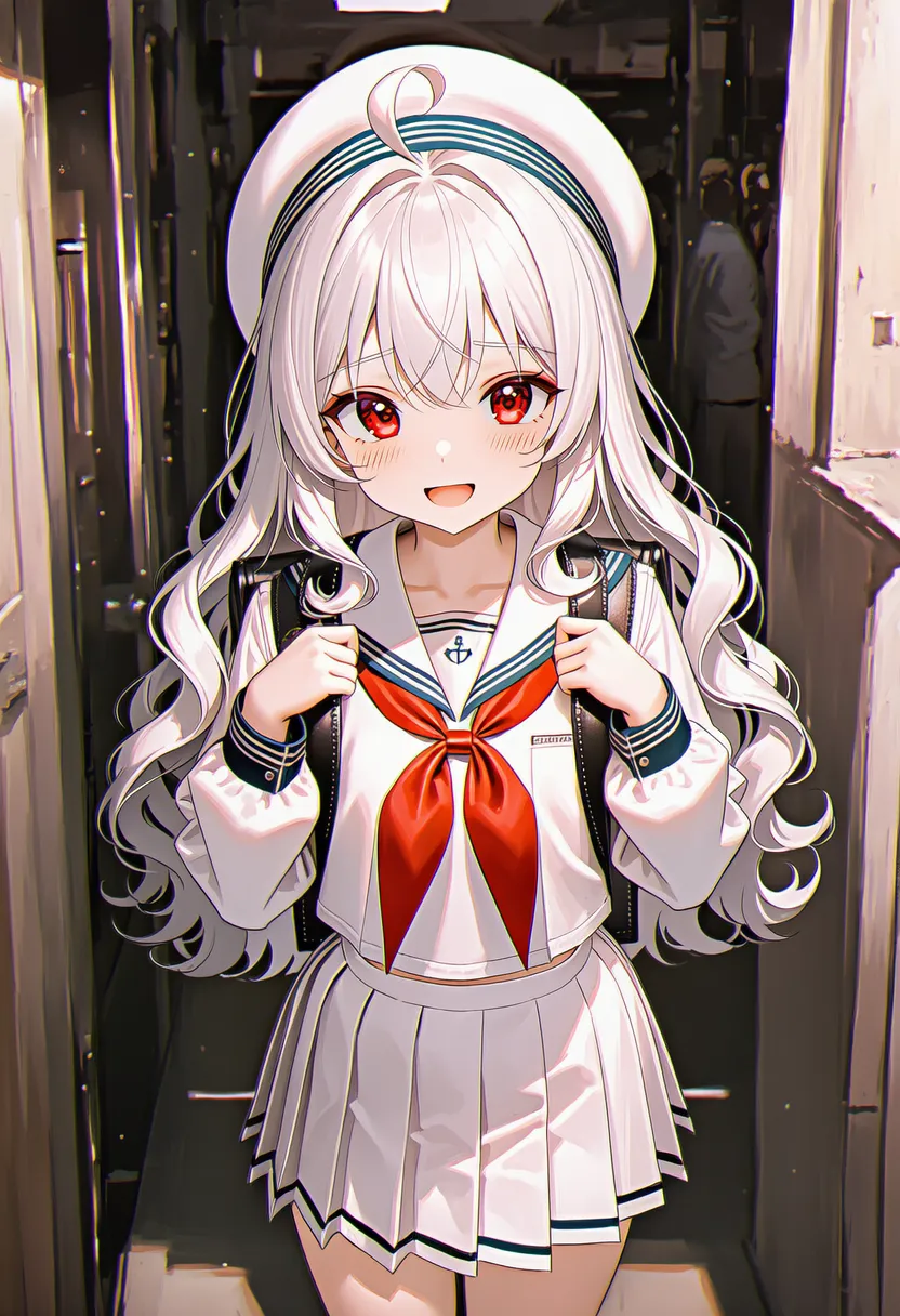 anamorphic: Anamorphic. Horizontal light streaks |
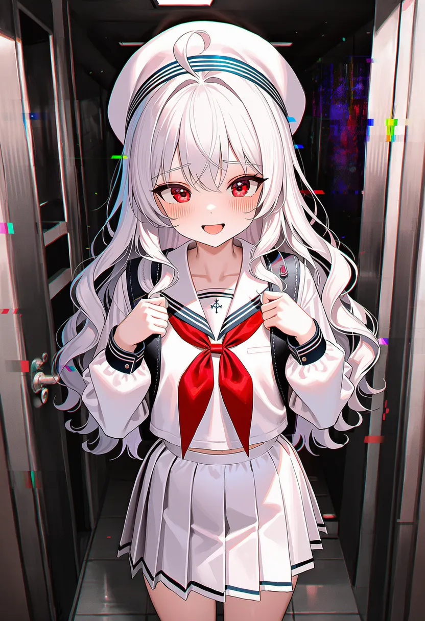 glitch art: Glitch. Digital errors, broken screen |
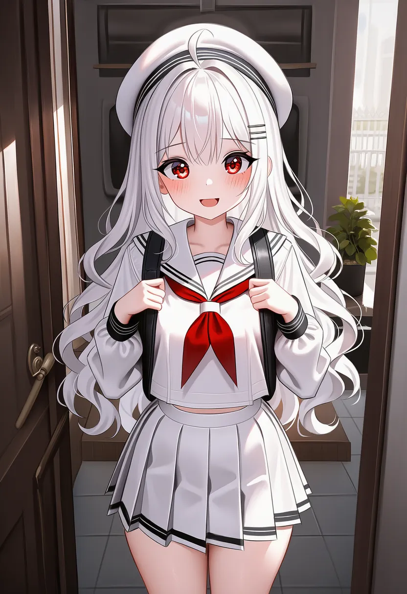 datamosh: Datamosh. Video compression errors |
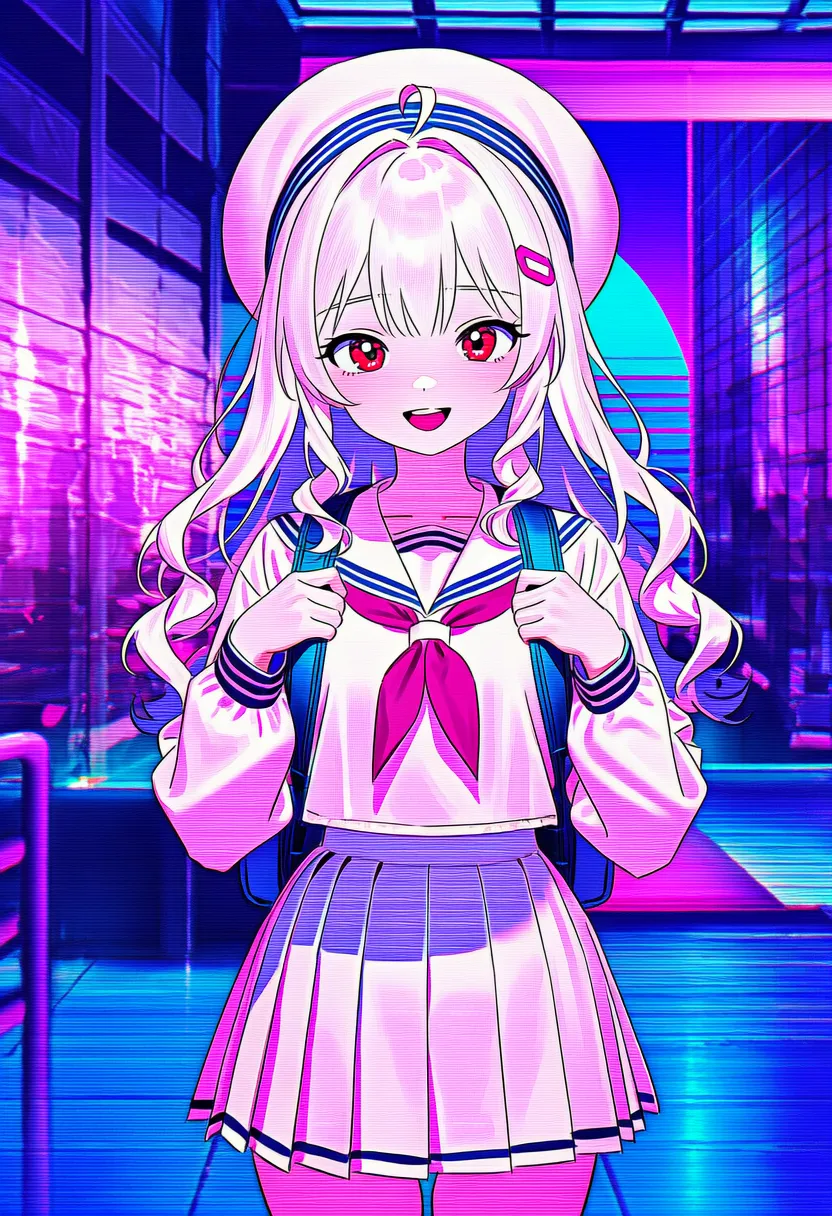 vaporwave: Vaporwave. 80s, plaster busts |
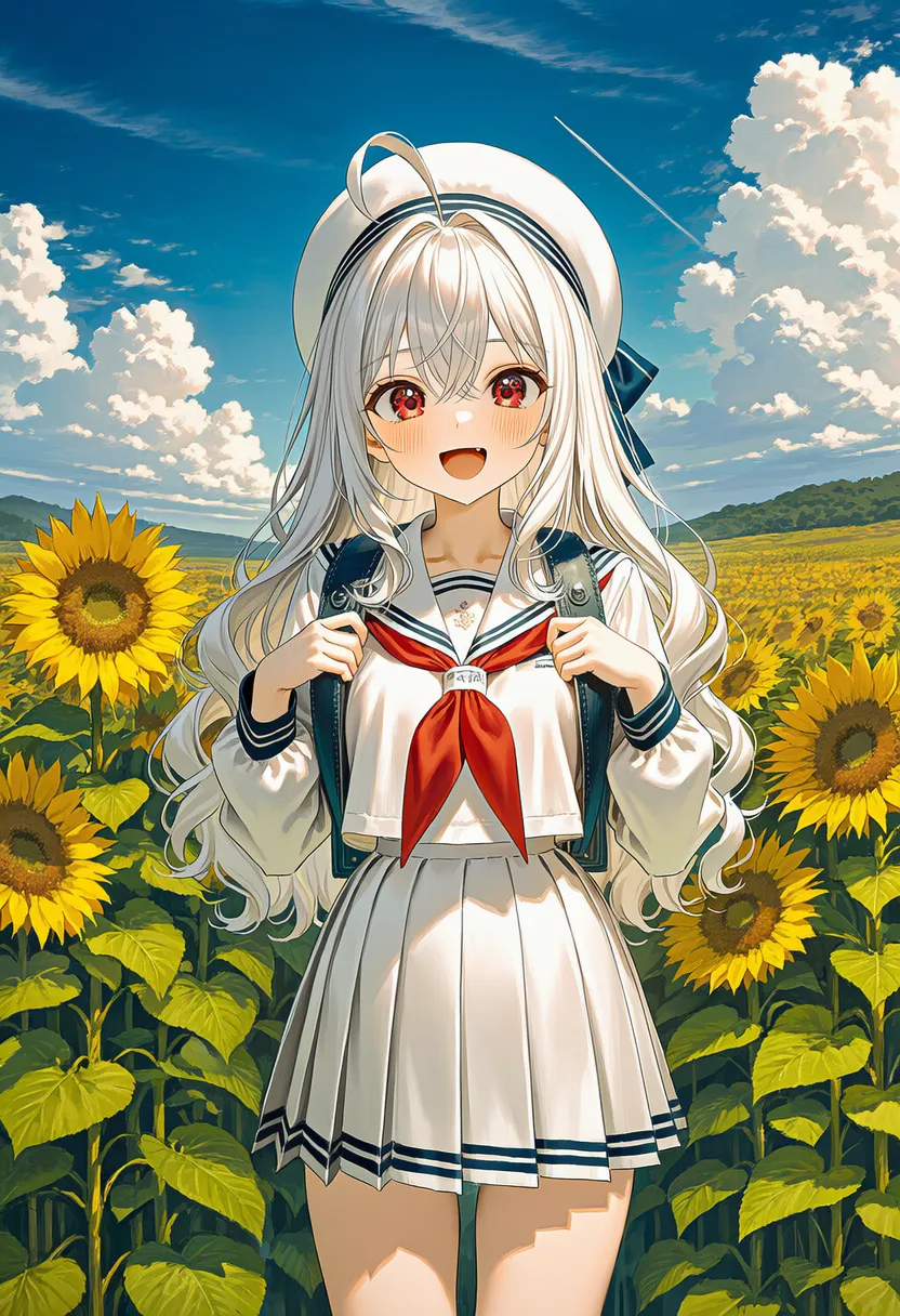 frutiger aero: Mid-2000s, water droplets, grass |
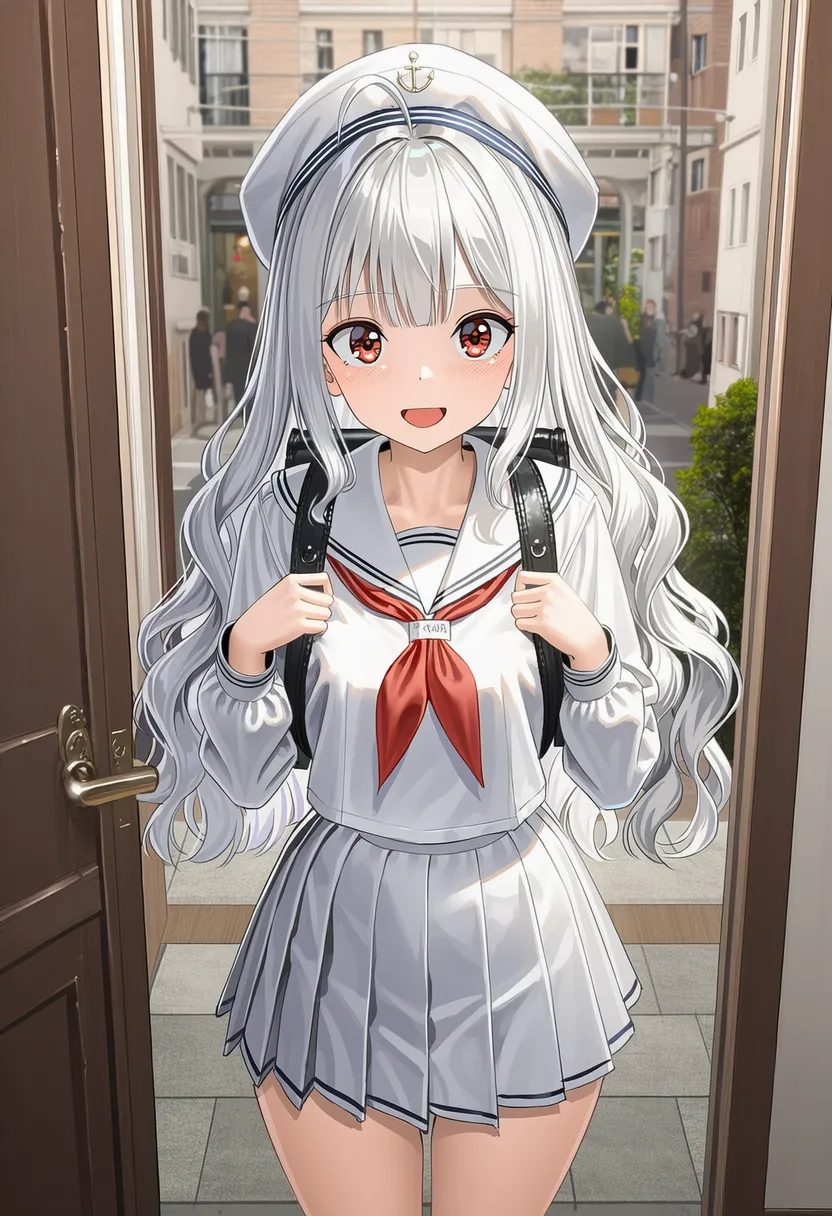 y2k: Y2K fashion/design. Cyber, funky |
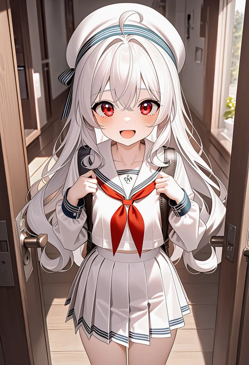 skeumorphism: Skeuomorphism. Imitating real materials |
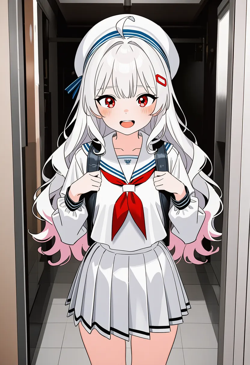 flat design: Flat design. Flat, modern |
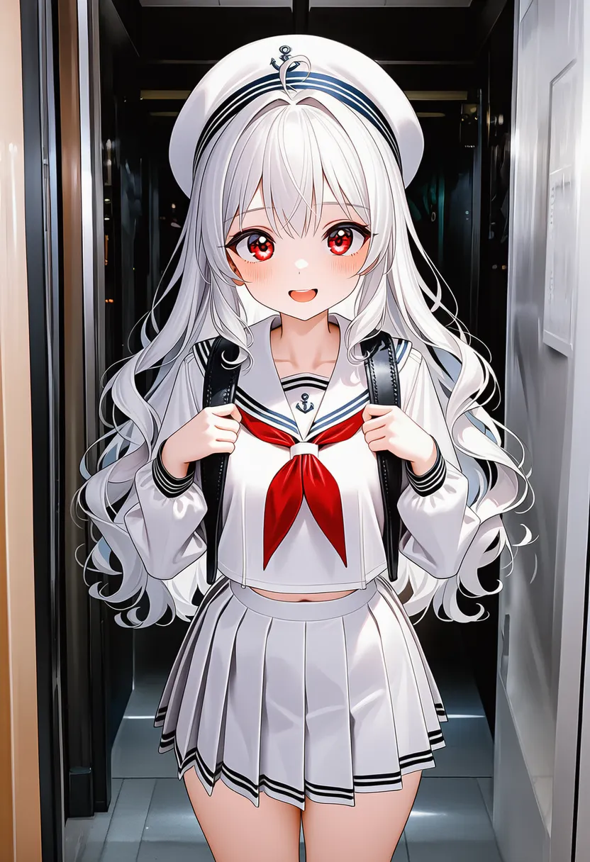 material design: Material design. Paper layers and shadows |
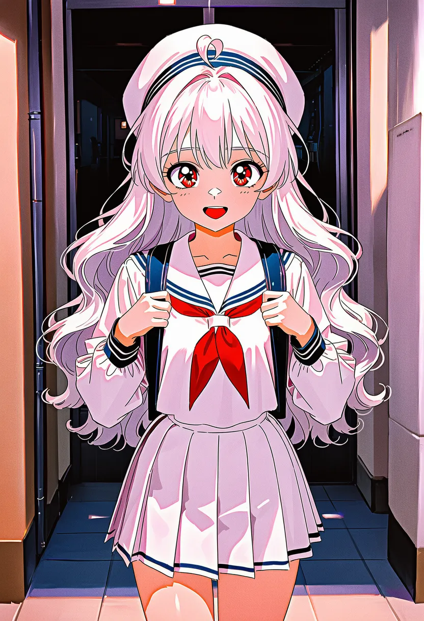 90s style: 90s anime/illustration style |
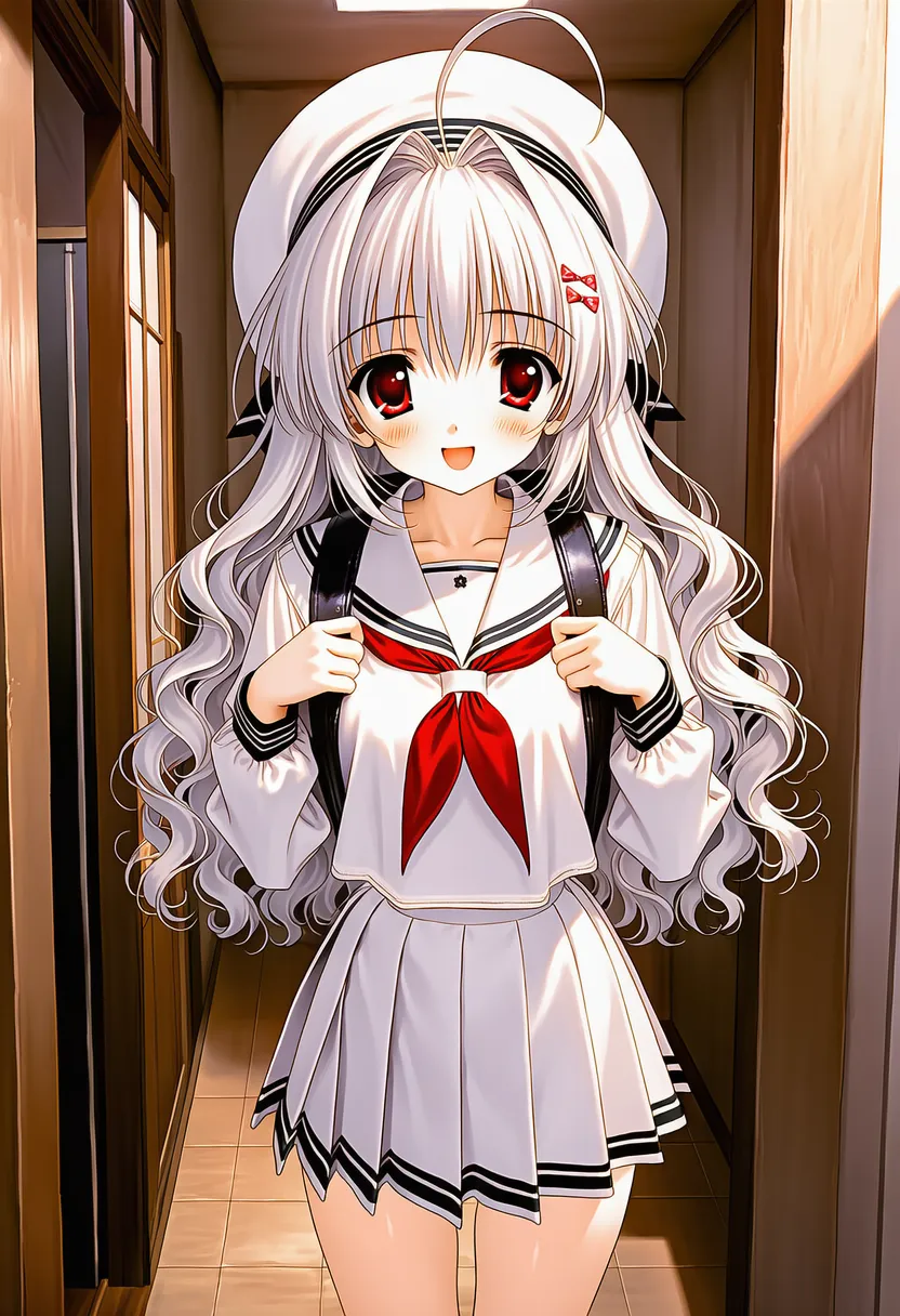 2000s style: 2000s anime/illustration style |
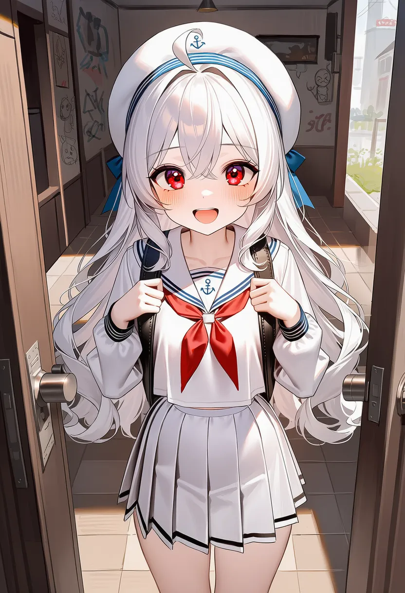 doodle: Idle doodles |
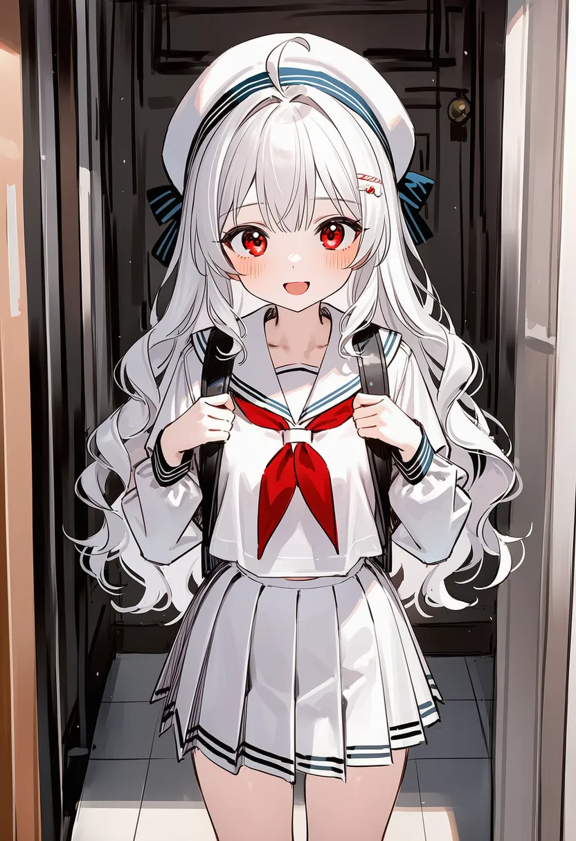 rough sketch: Rough shape-only sketch |
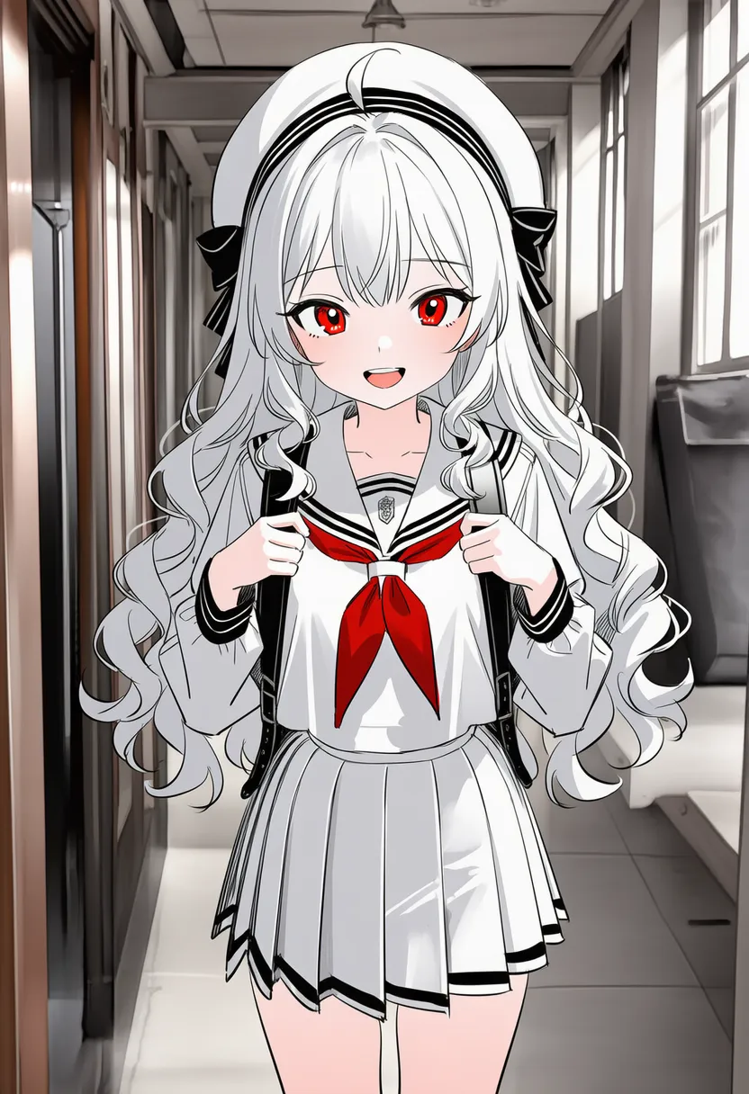 monochrome sketch: Monochrome sketch |
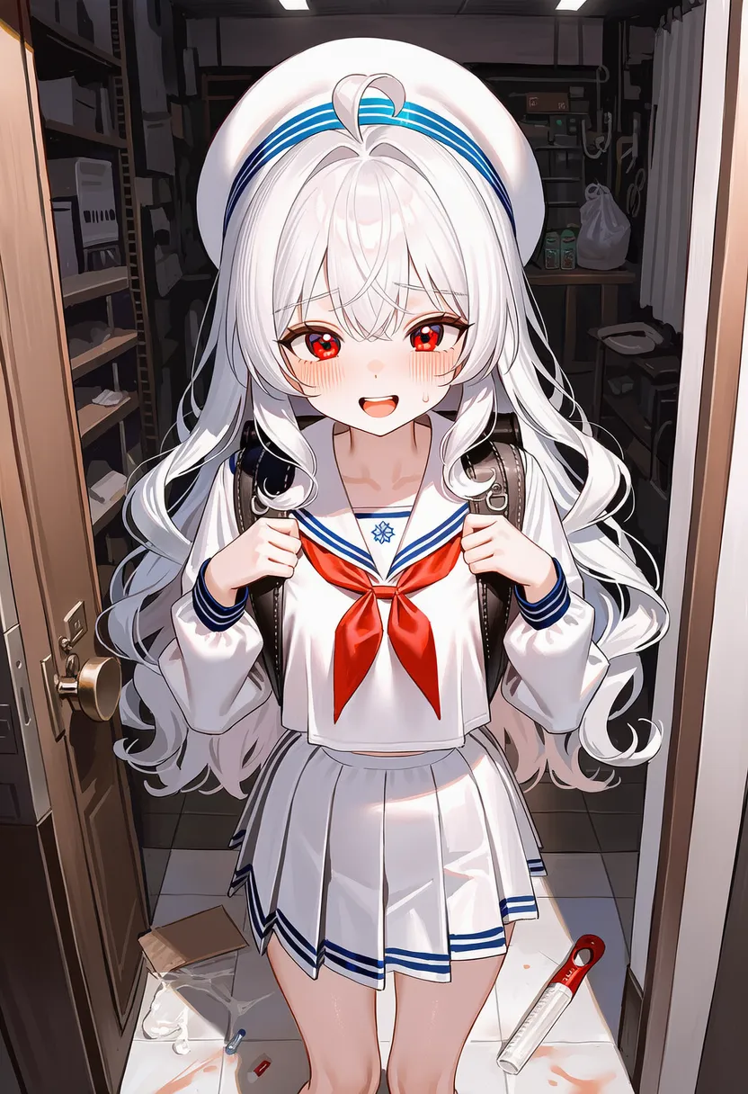 messy: Unpolished, messy |
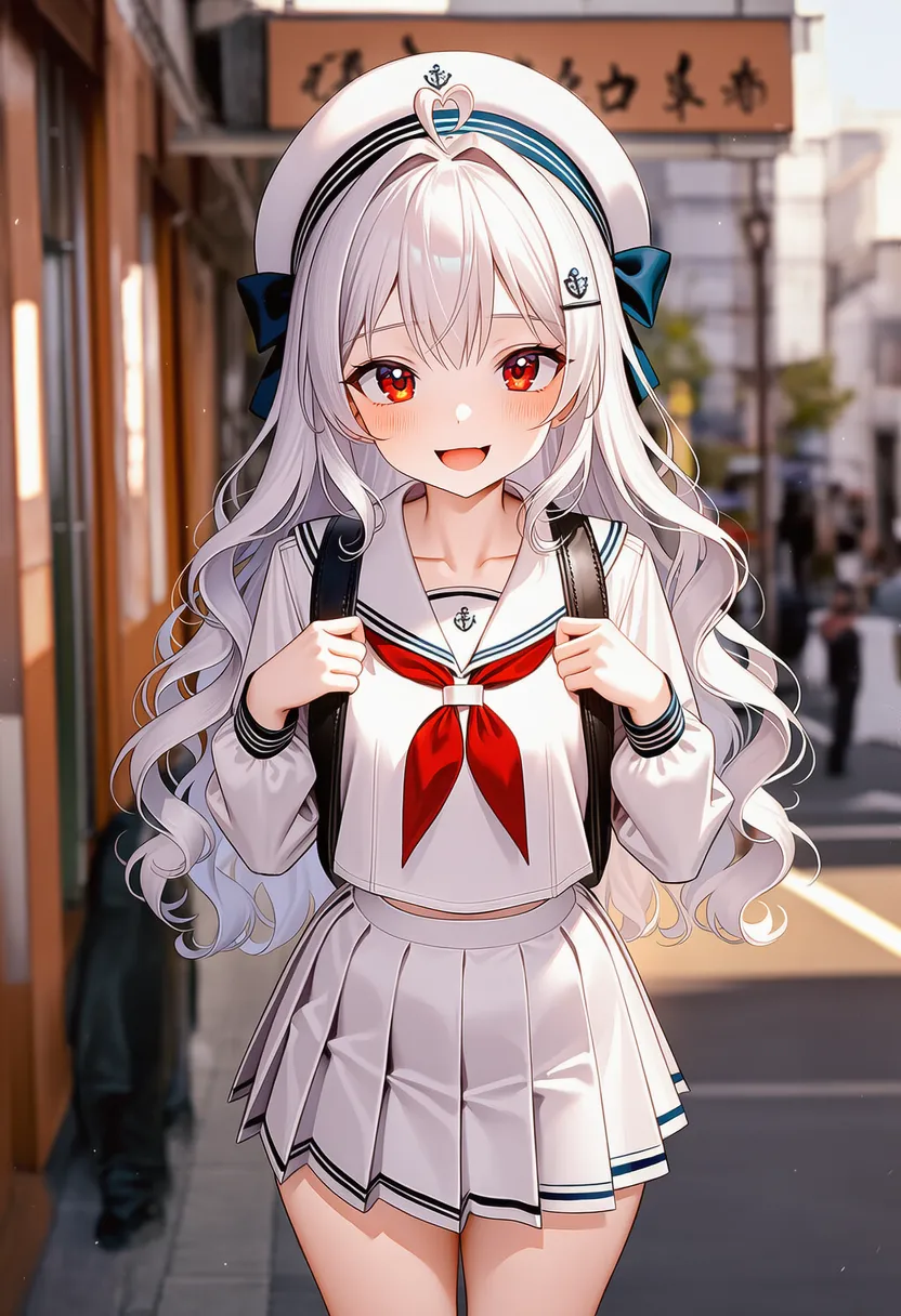 low quality: Intentionally low quality |
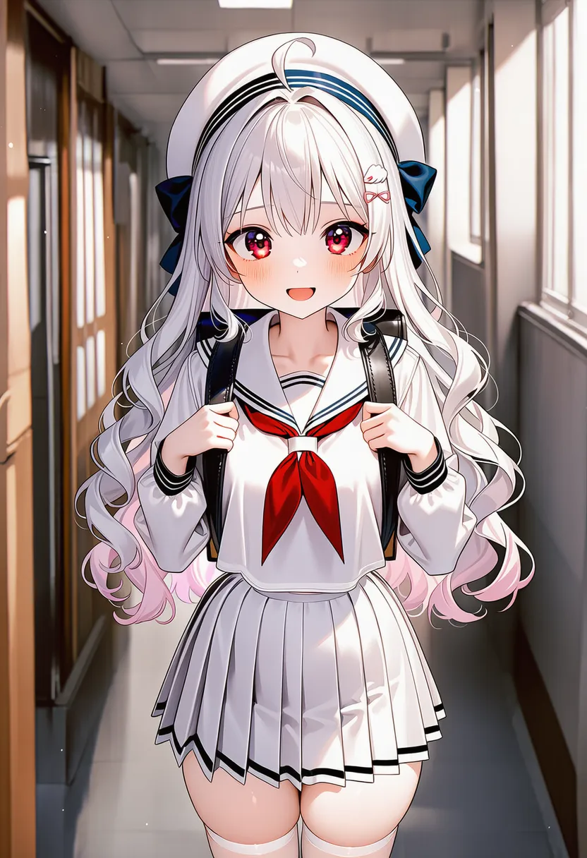 bad anatomy: Intentionally janky anatomy style |
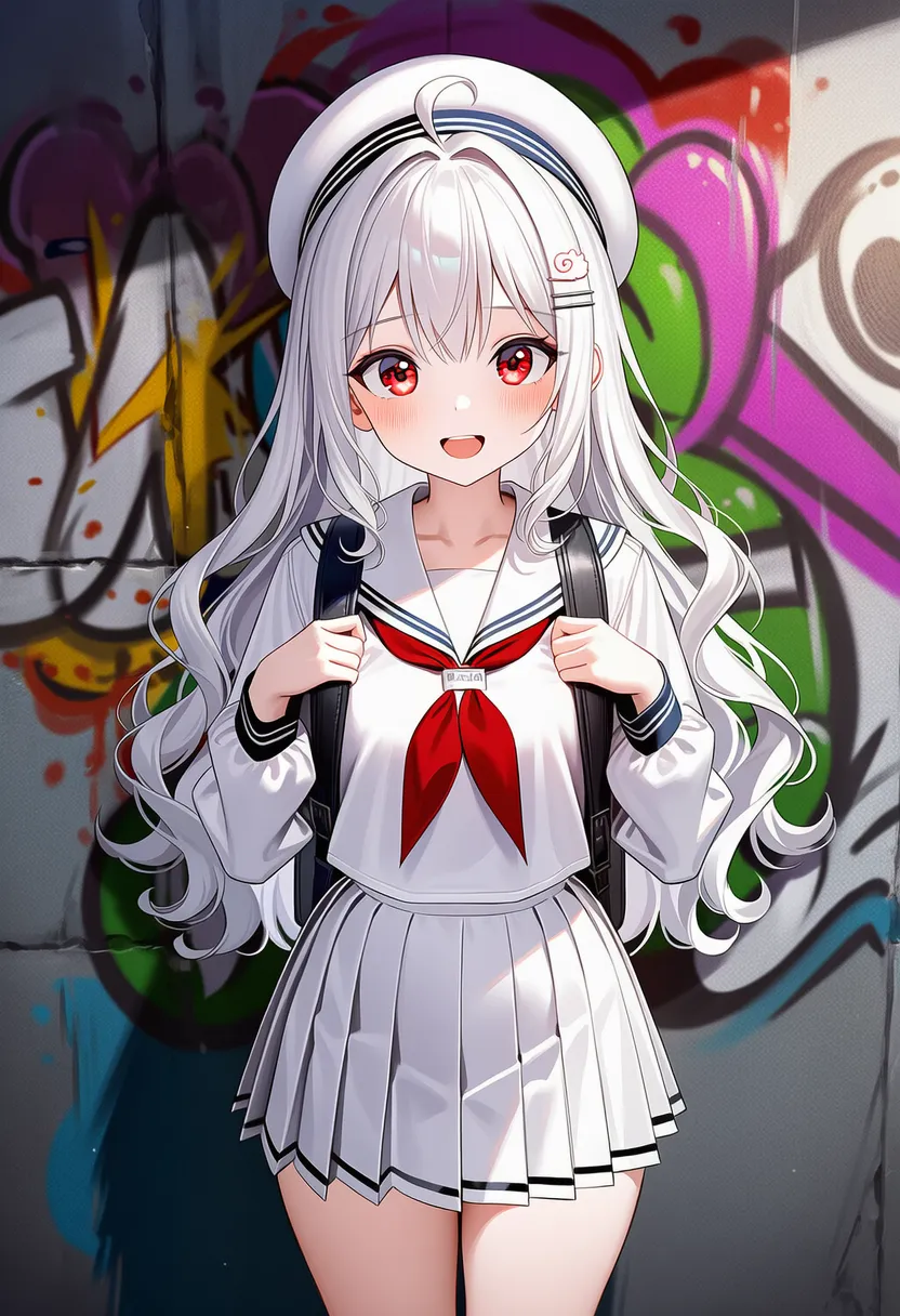 graffiti: Graffiti. Spray on walls |
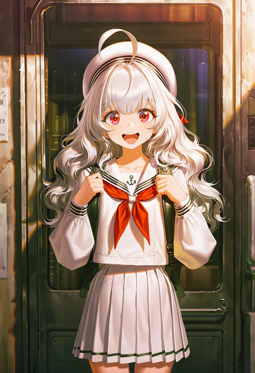 stencil: Stencil. Cut-out print feel |
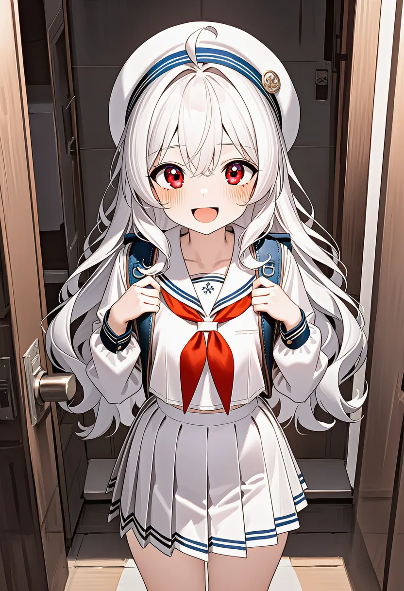 woodblock print: Woodblock print style |
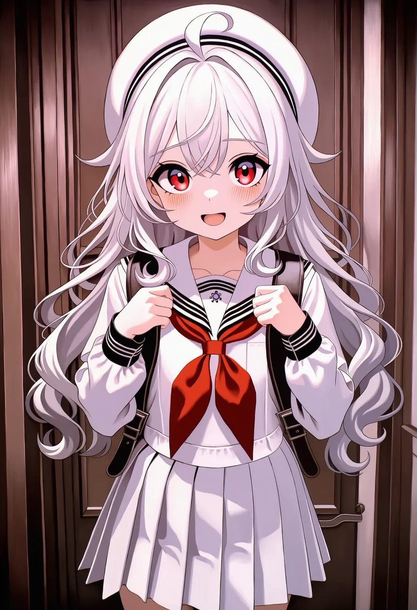 kirigami: Kirigami. Paper-cutting craft |
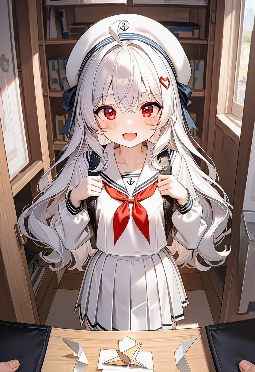 papercraft: Papercraft. Paper models |
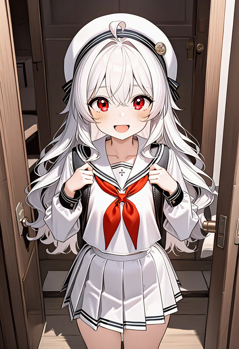 origami style: Origami style |
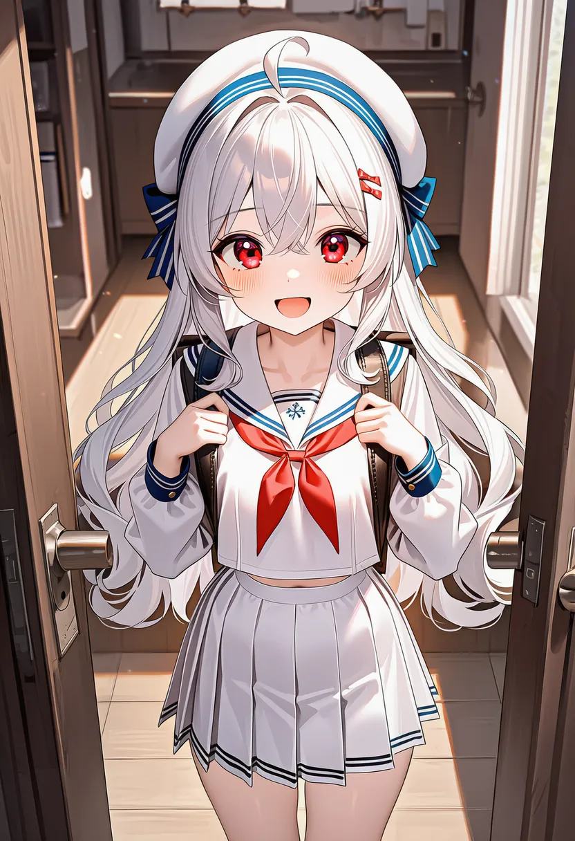 illustration: Generic illustration |
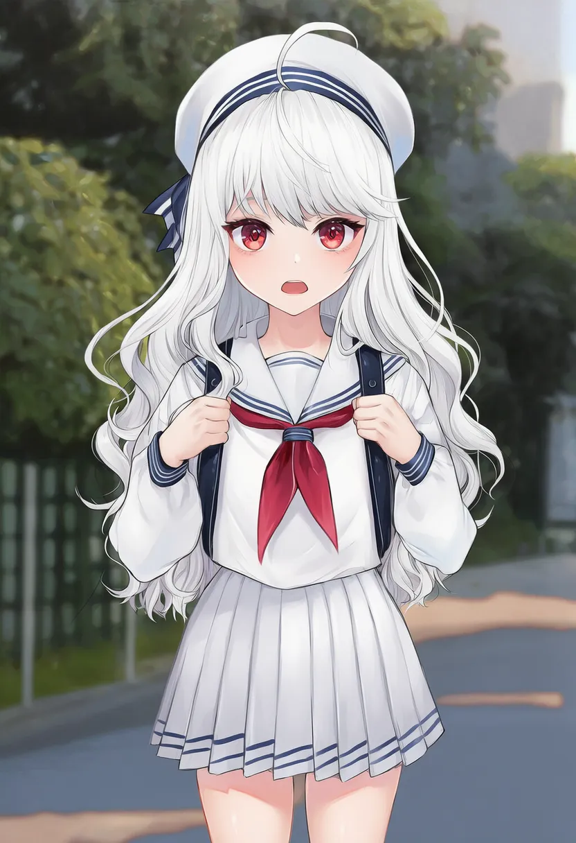 year 2021: That year's trending style |
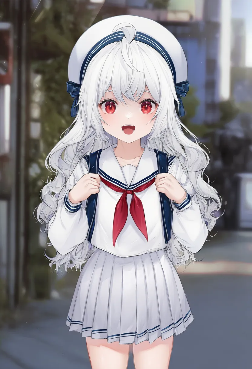 year 2022: That year's trending style |
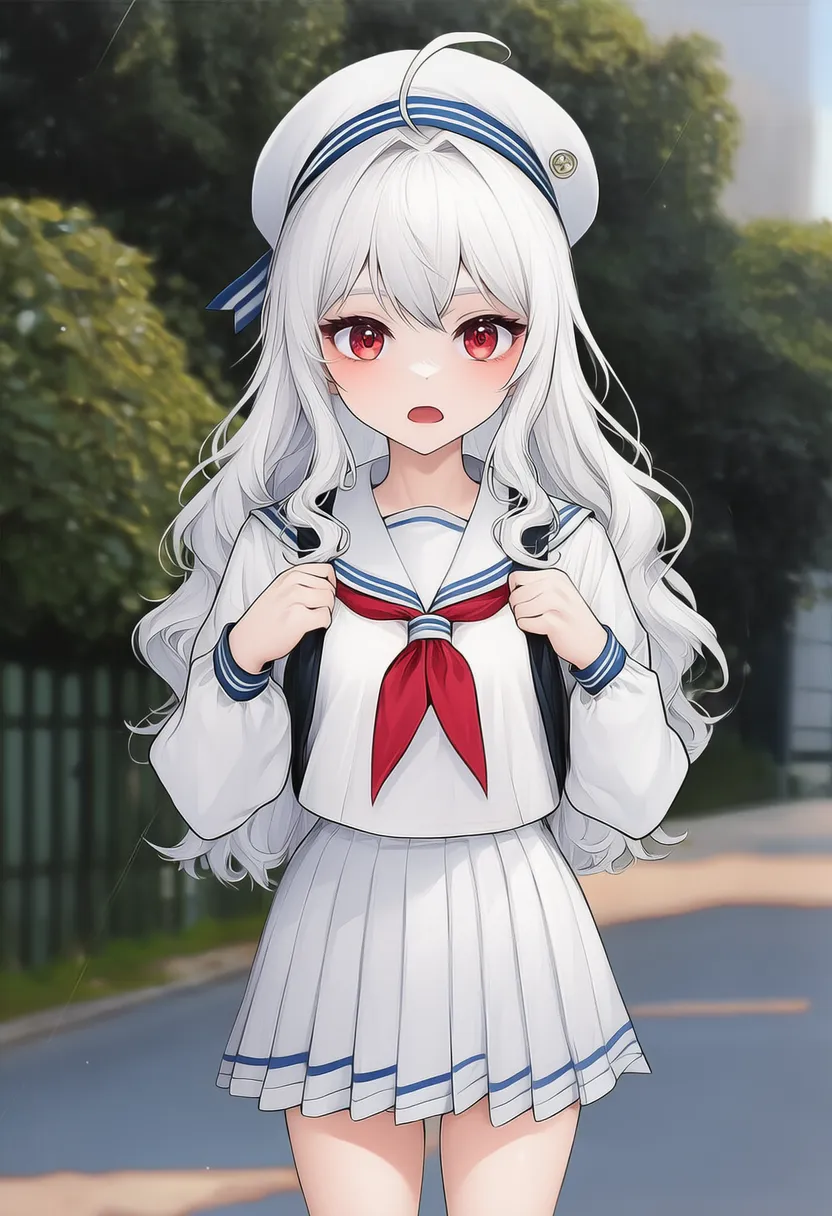 year 2023: That year's trending style |
year 2024: That year's trending style |
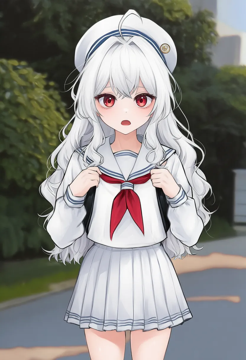 year 2025: That year's trending style |
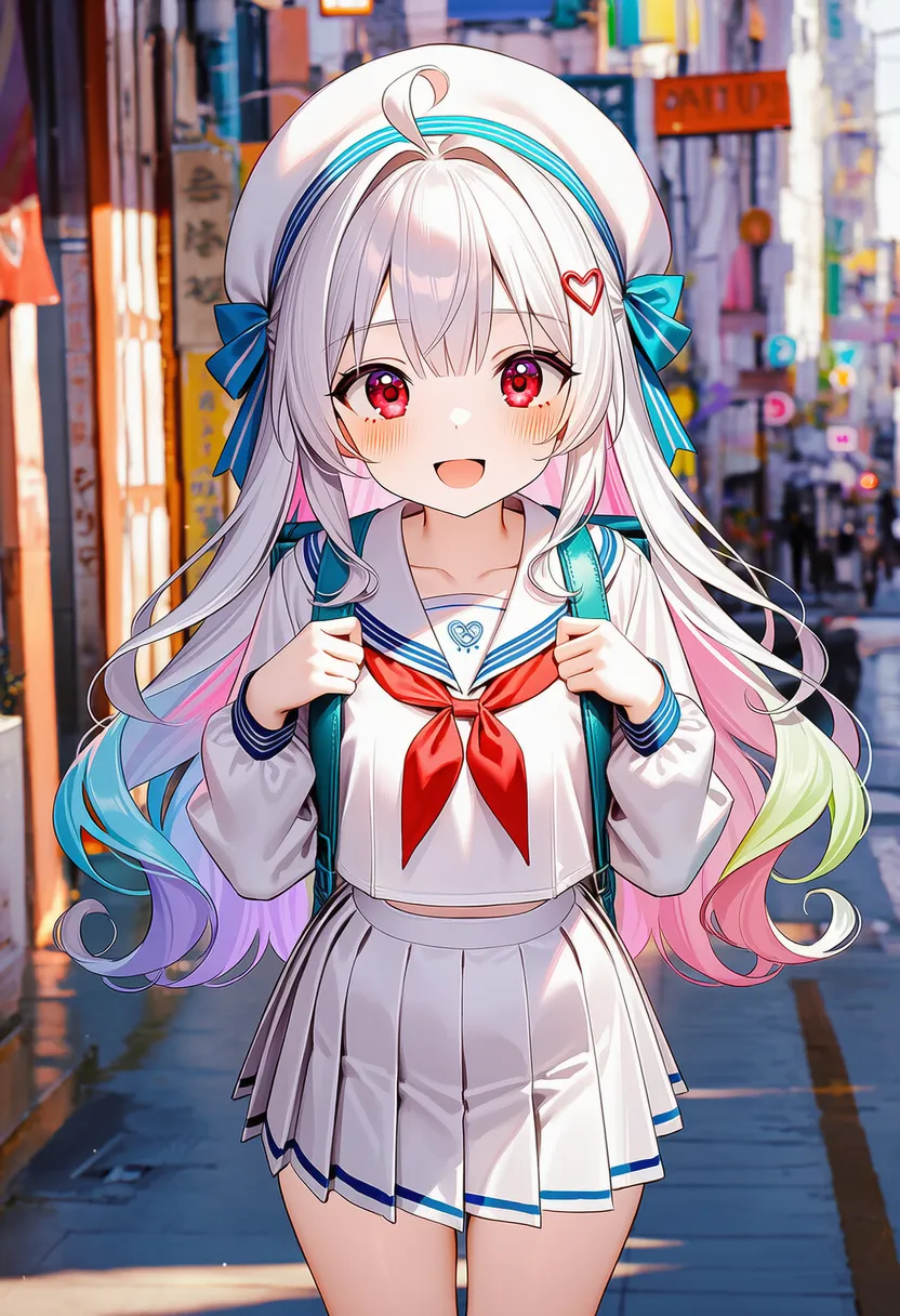
▶ 4.7. Color Palettes
Adjusts the overall color tone.
Reference original |
 colorful: Colorful, varied hues |
 dark: Dark, heavy tones |
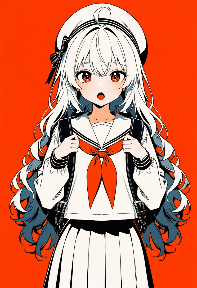 limited palette: Limited color count, sleek |
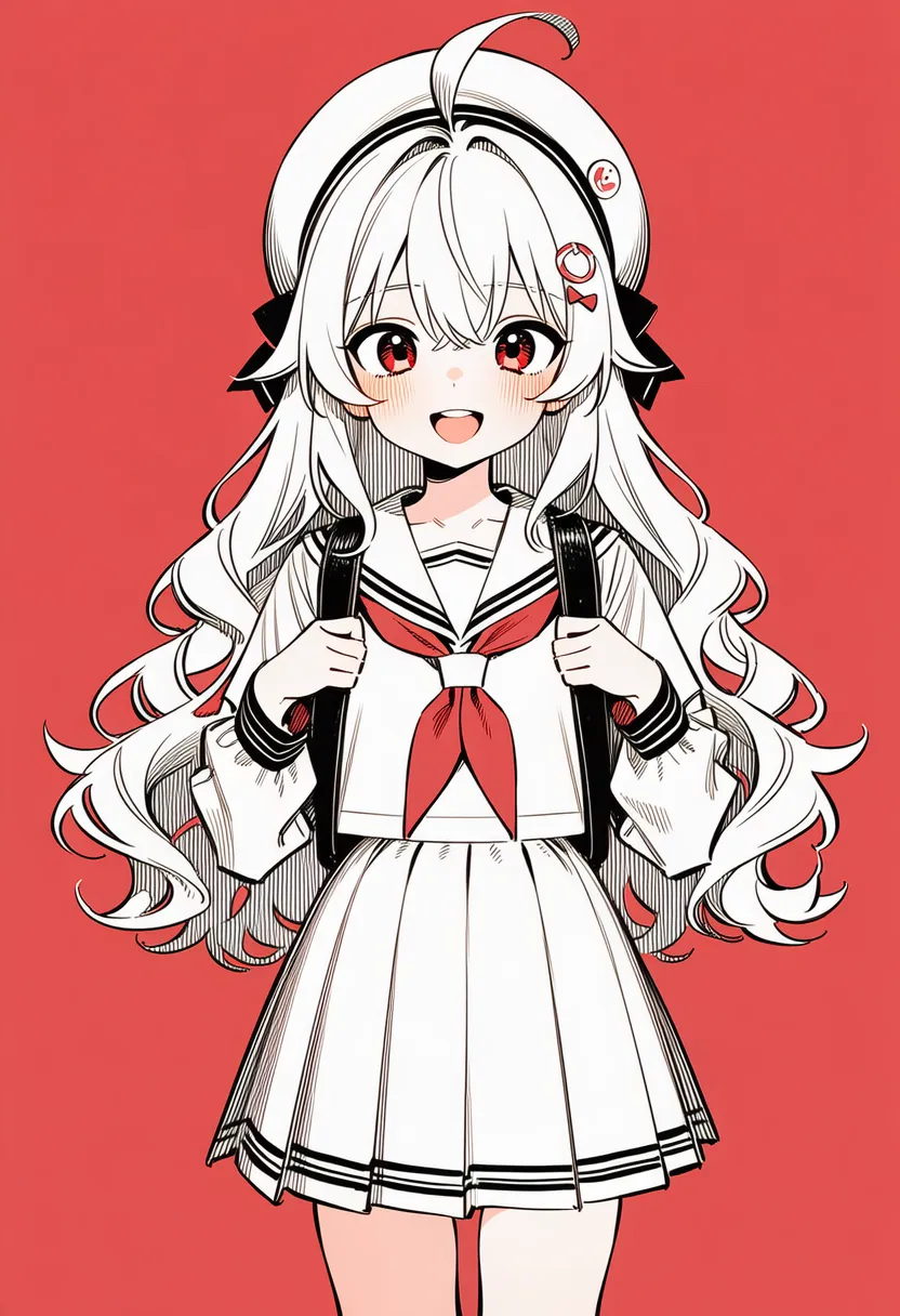 partially colored: B/W with partial coloring |
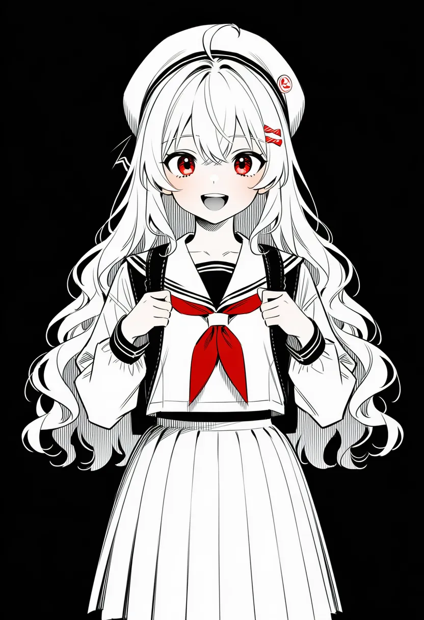 spot color: Highlighting specific spots (eyes, blood, etc.) |
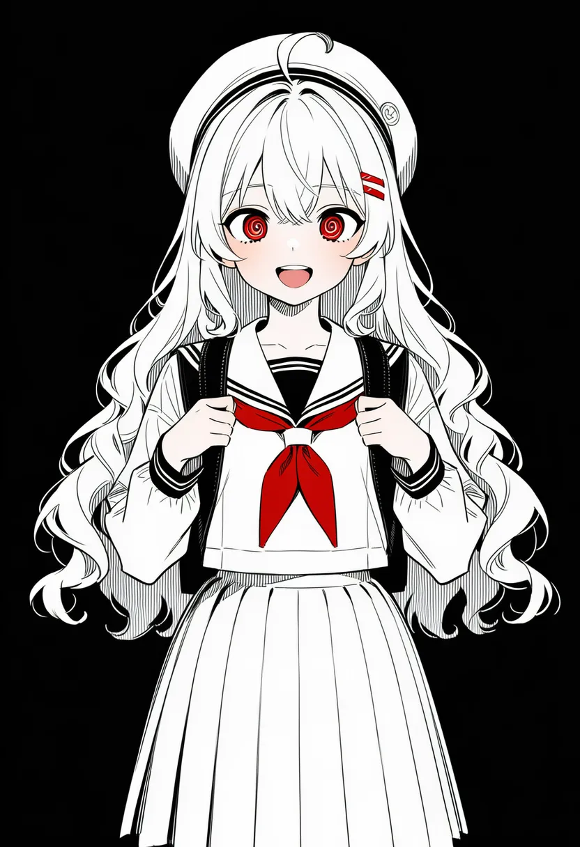 monochrome: Single tone |
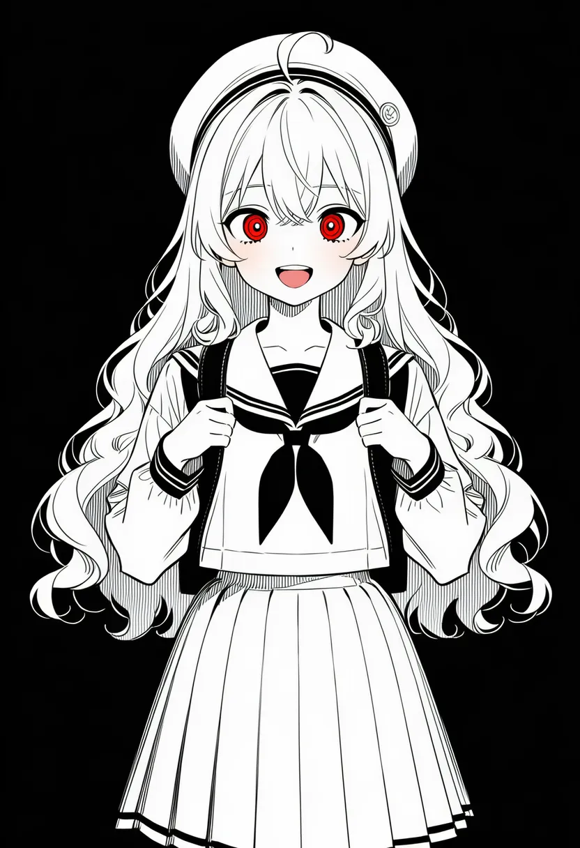 greyscale: Grayscale (true black-and-white) |
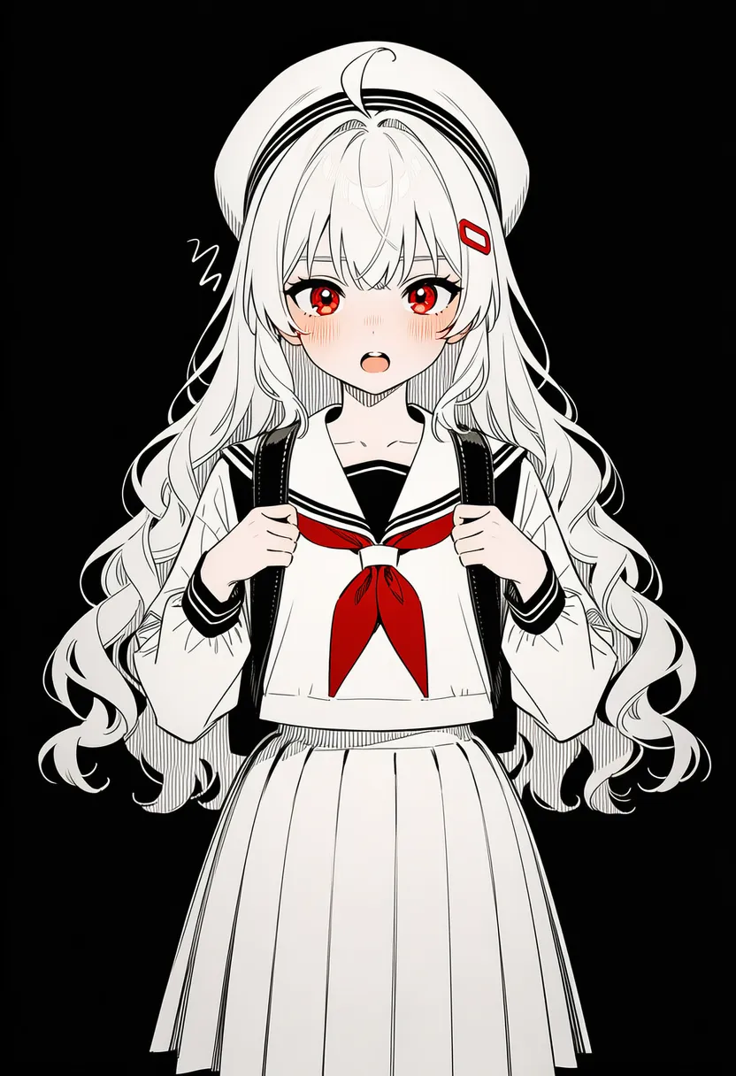 monochromatic: Single-hue color scheme |
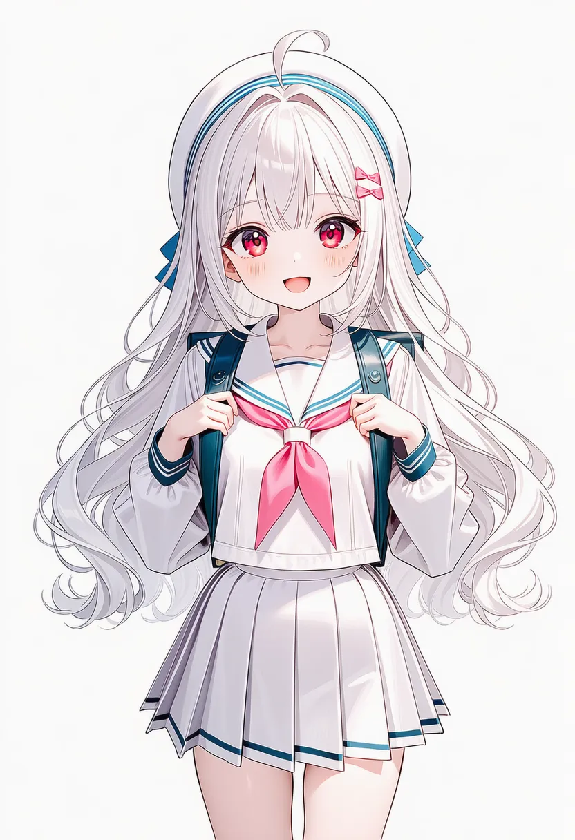 pale color: Pale, faint colors |
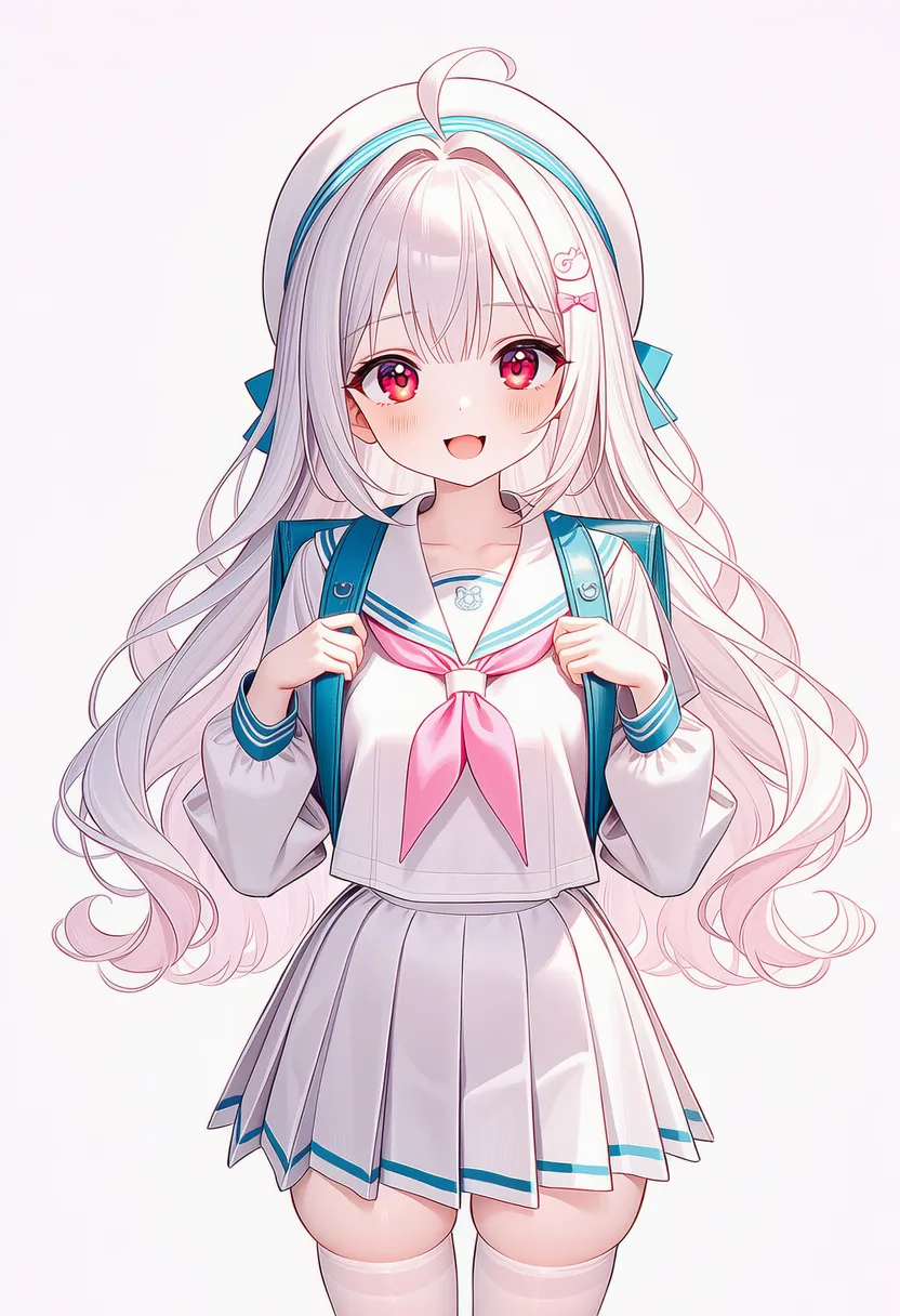 pastel colors: Pastel tones. Soft and sweet |
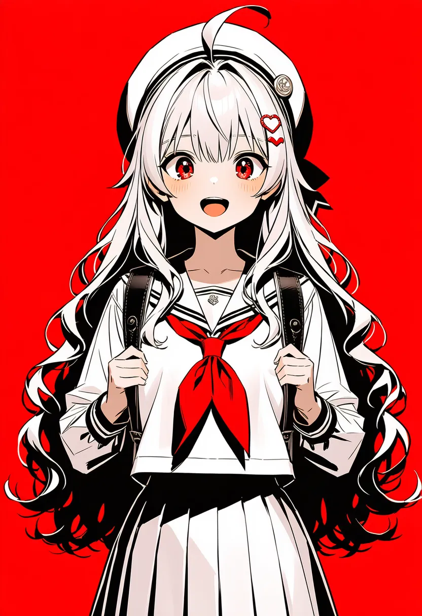 high contrast: Very strong contrast |
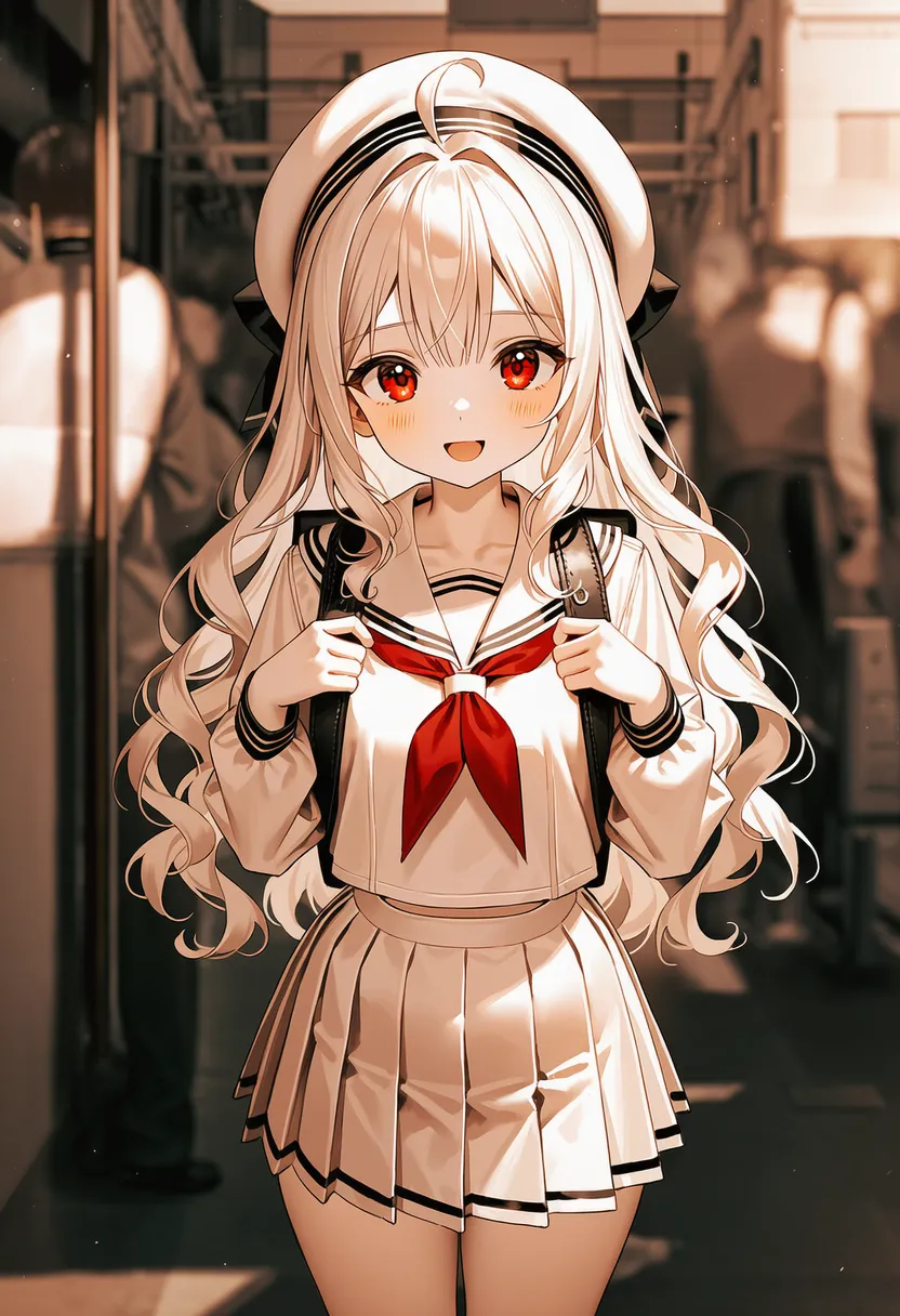 sepia: Sepia. Faded brown tones |
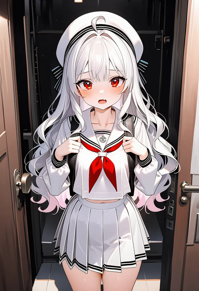 desaturated: Washed-out colors (low saturation) |
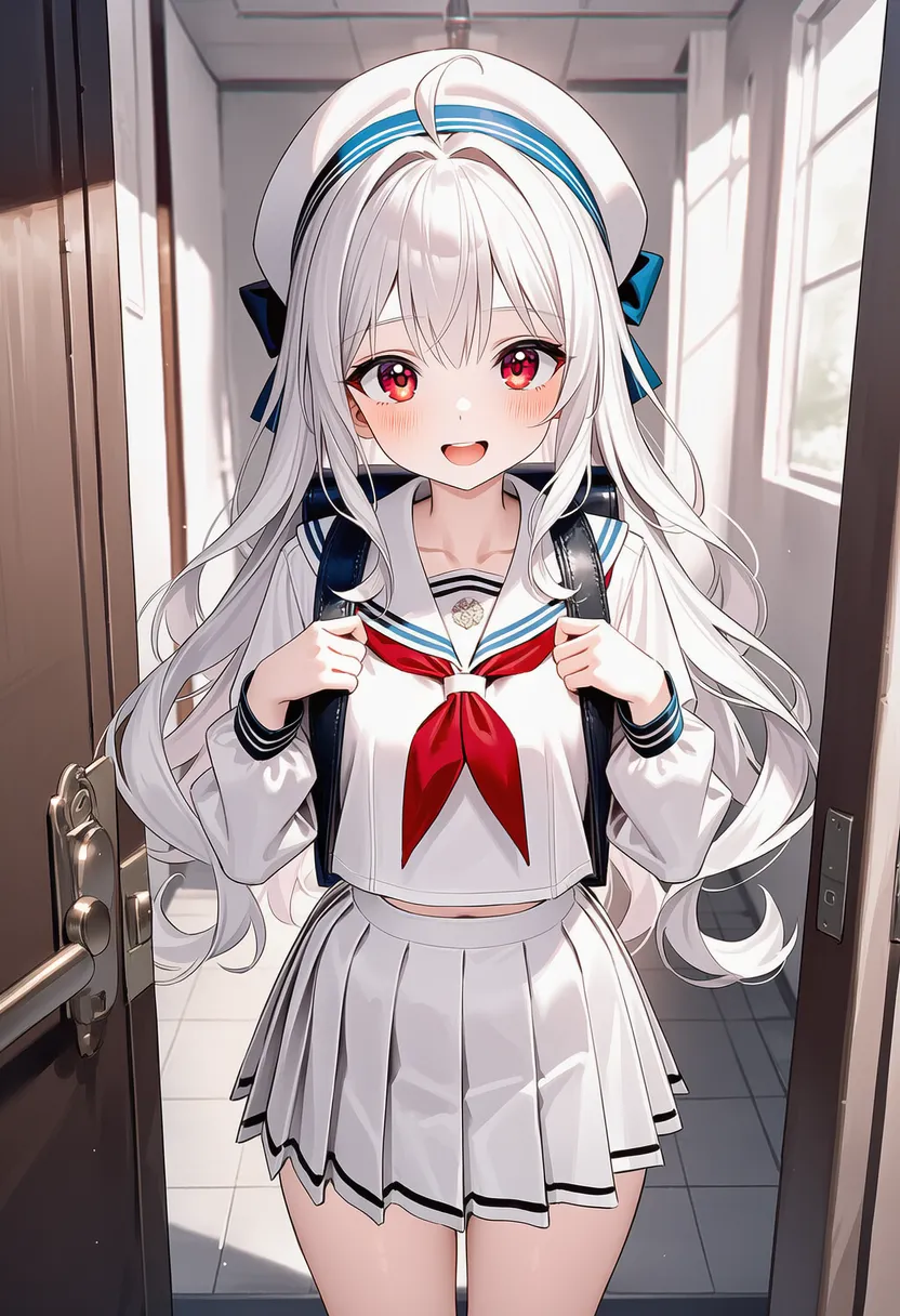 duotone: Two contrasting colors |
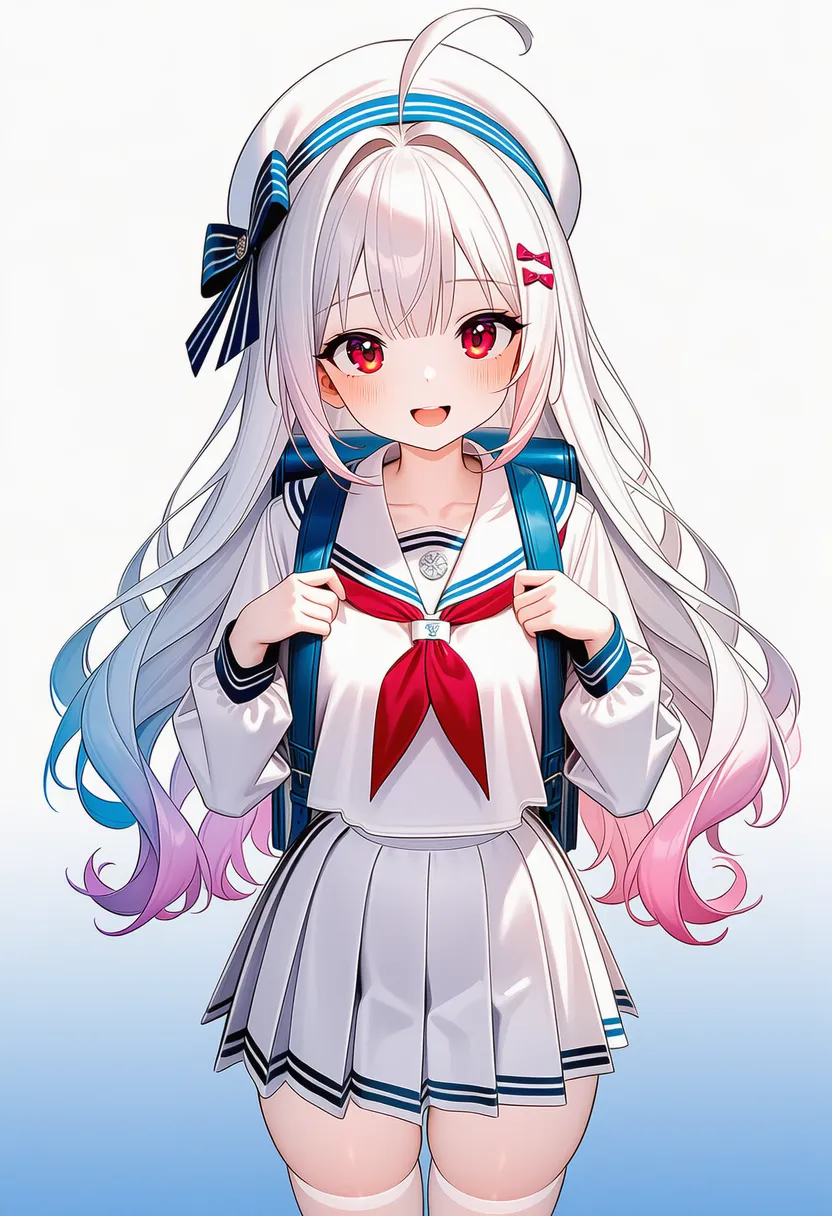 gradient: Emphasized gradients |
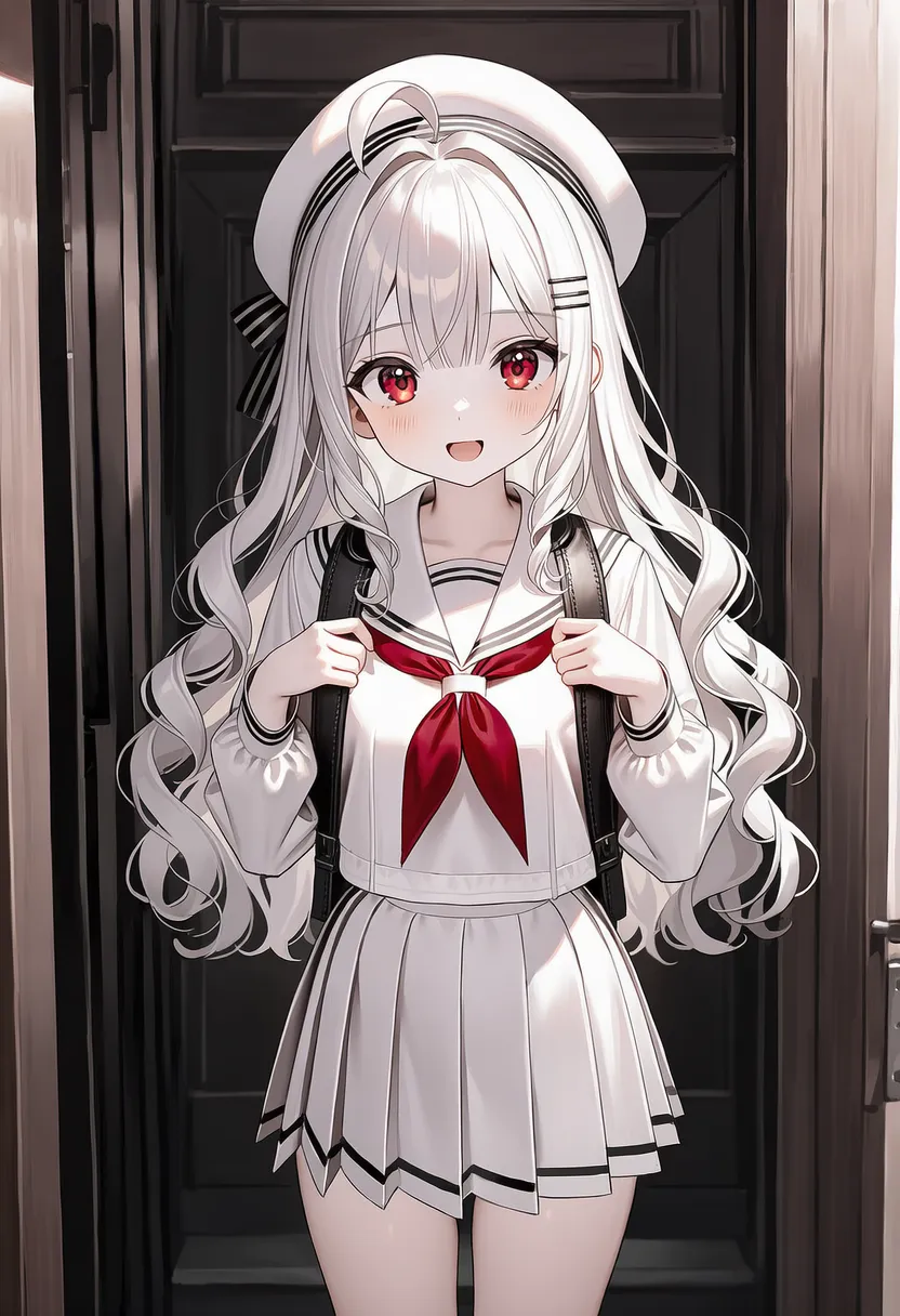 muted color: Calm, muted colors |
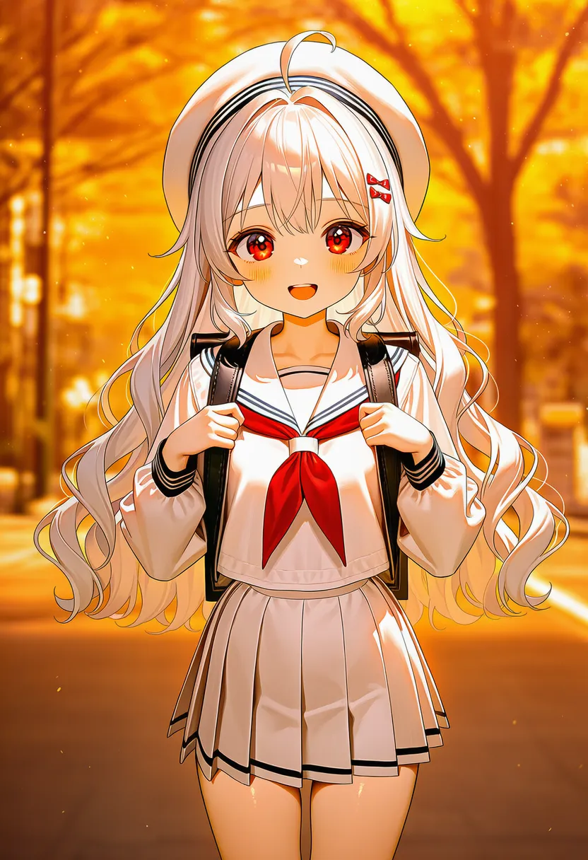 warm colors: Warm colors (red, orange, yellow) |
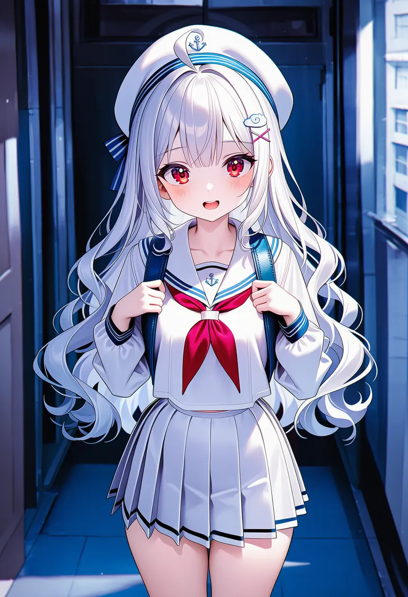 cool colors: Cool colors (blue, violet, cyan) |
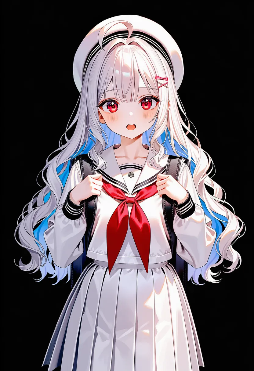 low contrast: Low contrast, hazy and soft |
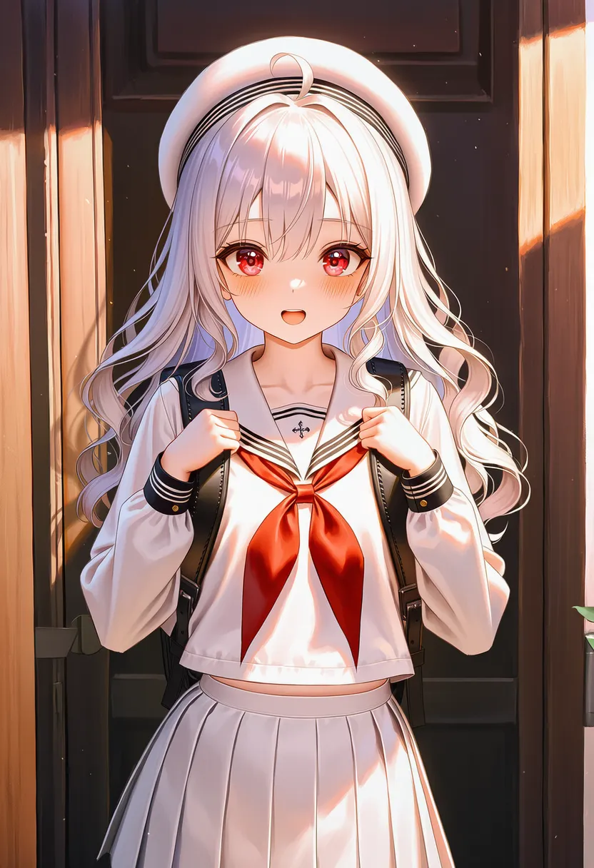 iridescent: Rainbow sheen (soap bubble) |
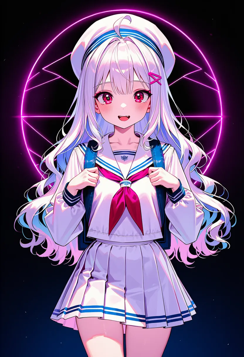 neon theme: Neon-heavy, flashy |
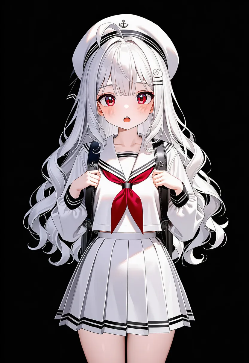 black theme: Black theme |
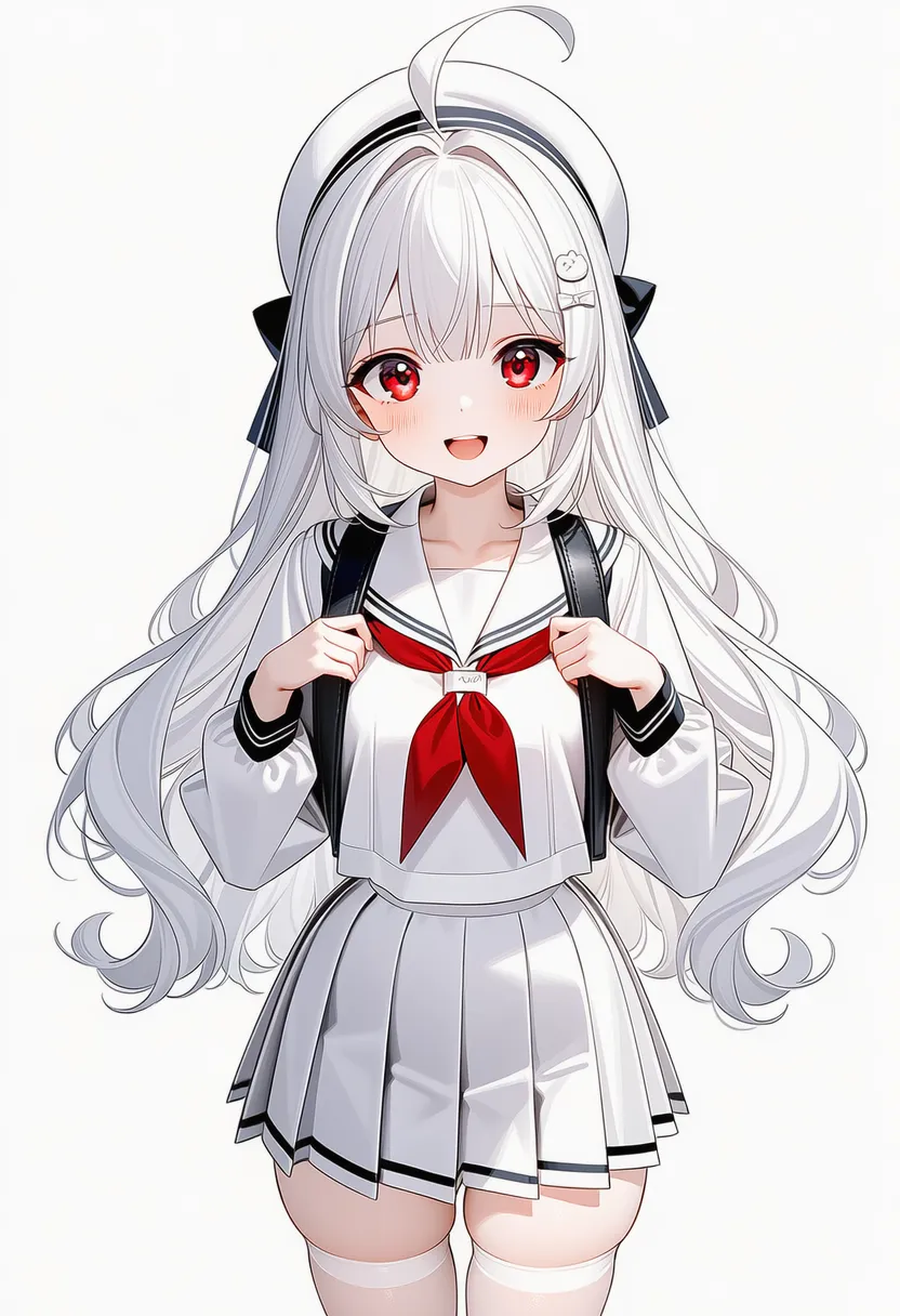 white theme: White theme |
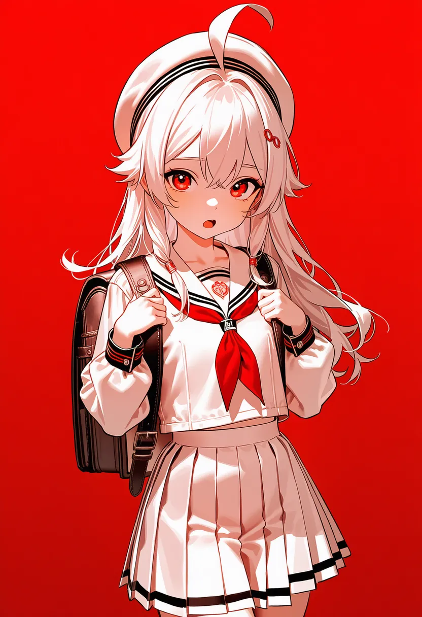 red theme: Red theme |
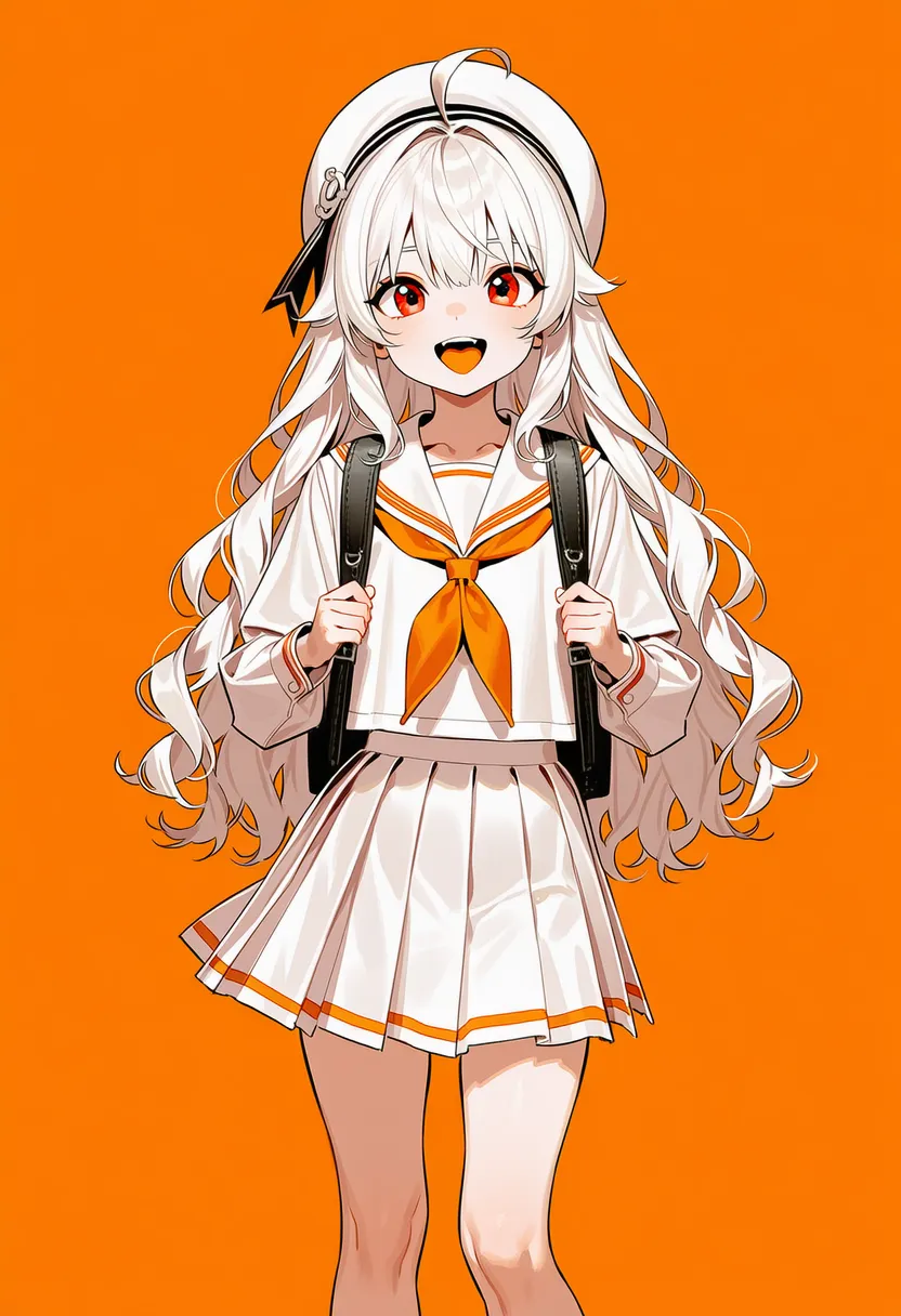 orange theme: Orange theme |
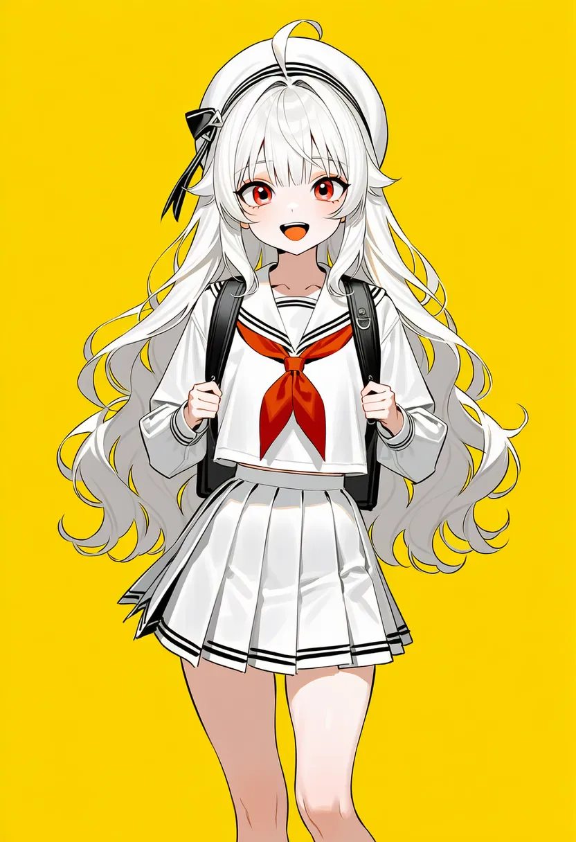 yellow theme: Yellow theme |
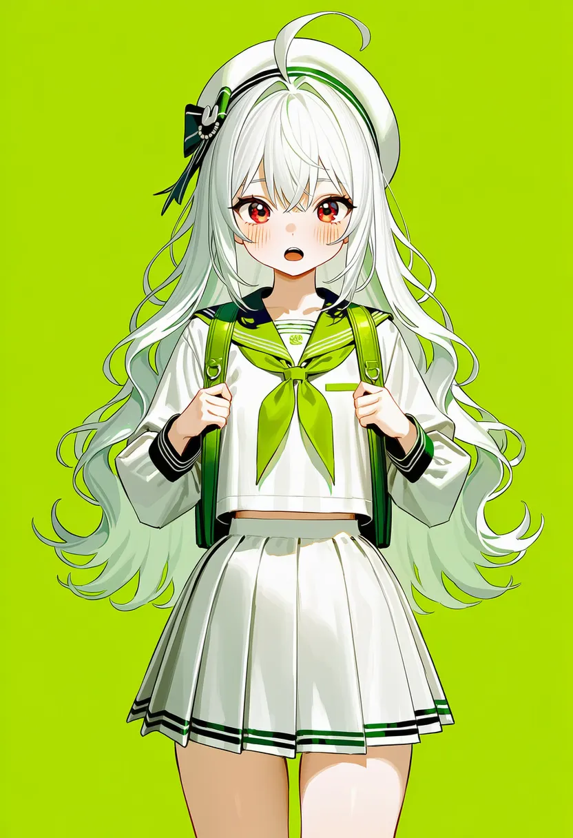 green theme: Green theme |
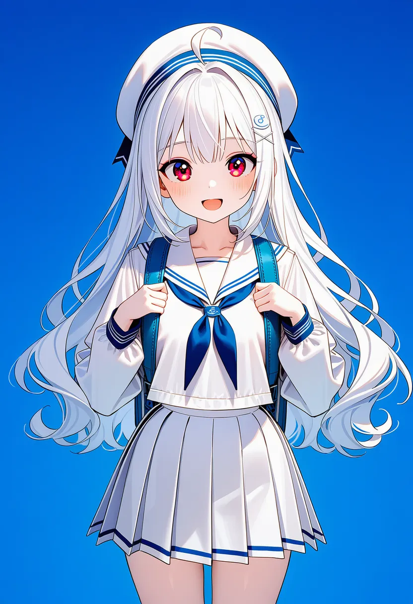 skyblue theme: Sky-blue theme |
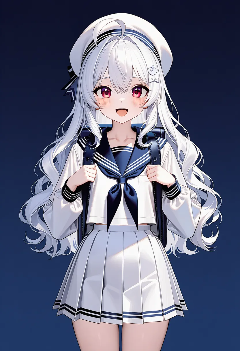 navy theme: Navy theme |
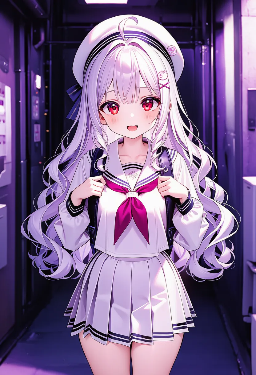 purple theme: Purple theme |
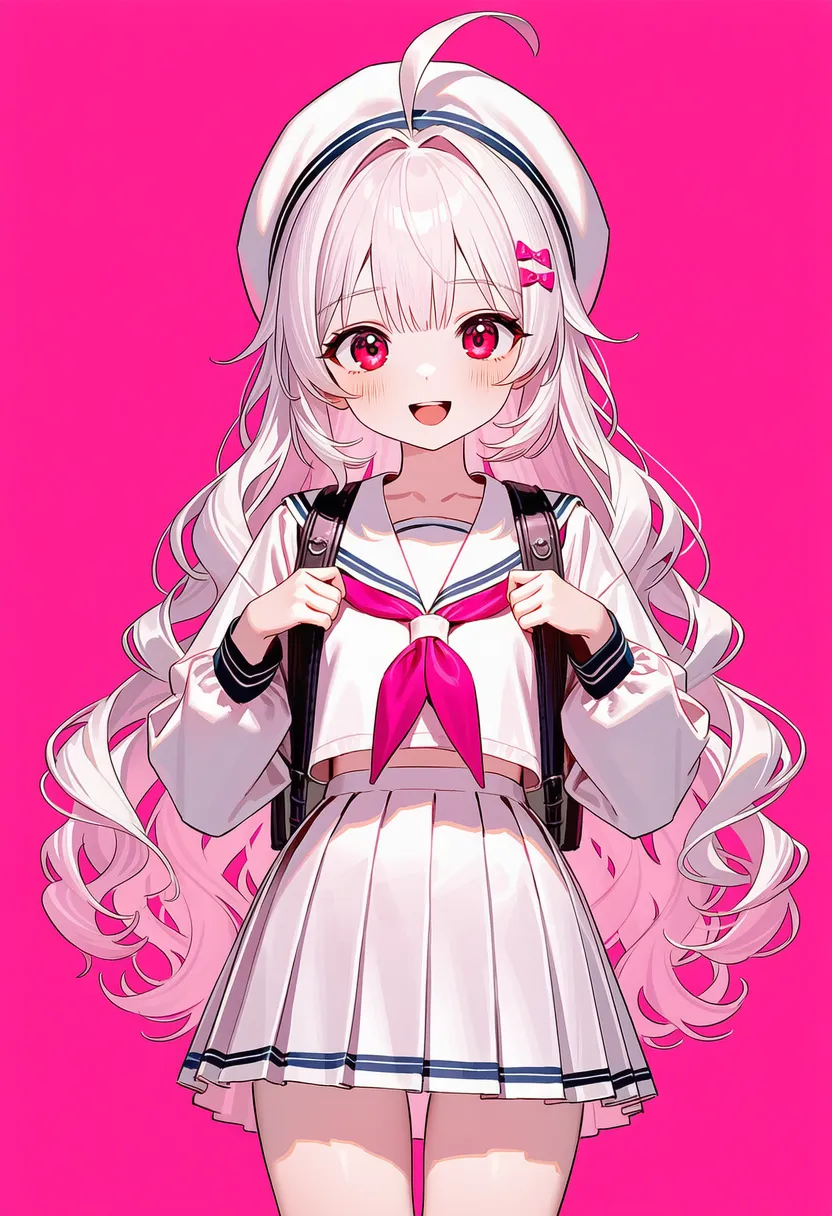 pink theme: Pink theme |
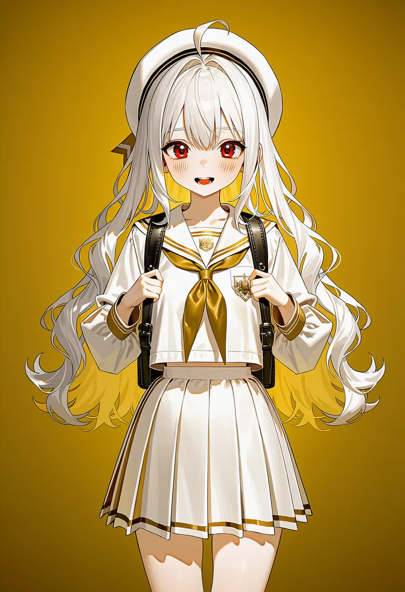 gold theme: Gold theme |
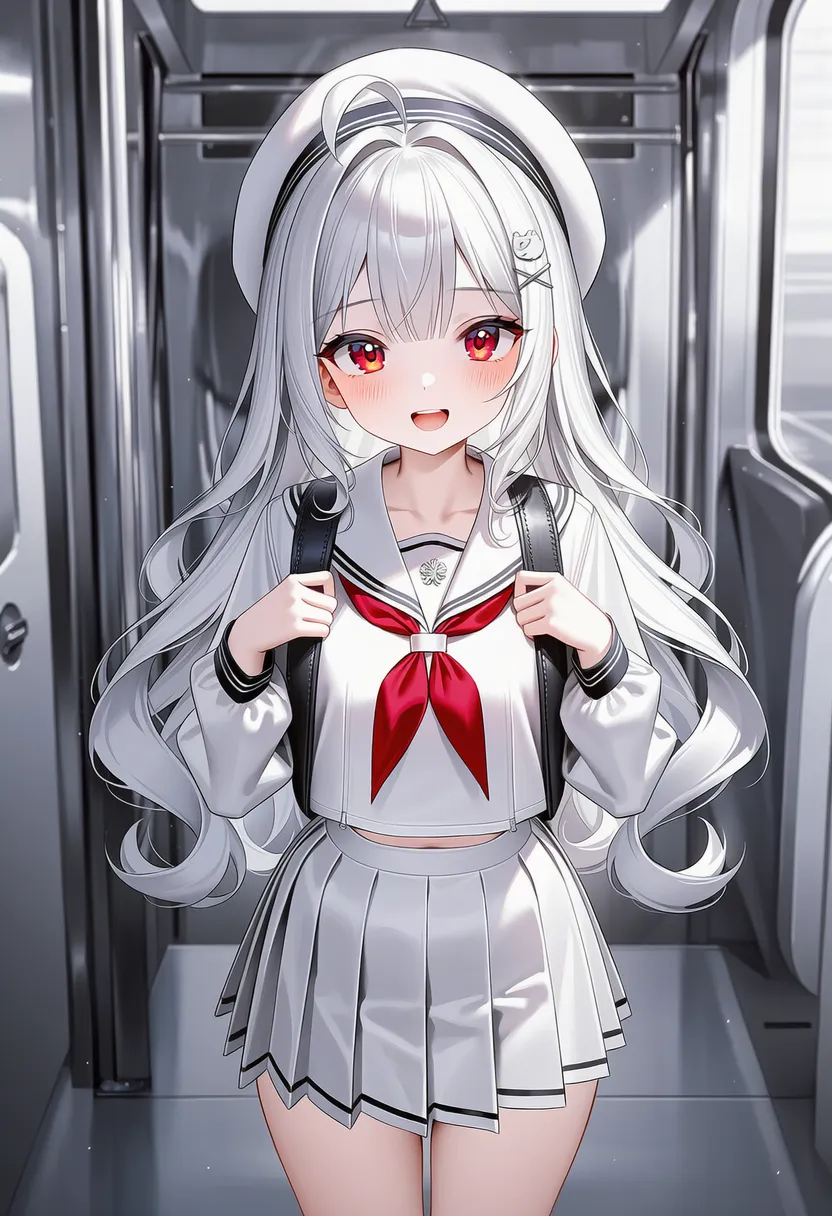 silver theme: Silver theme |
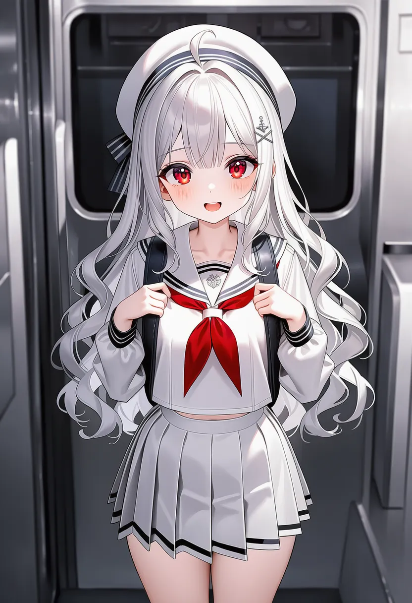 grey theme: Gray theme |
▶ 4.8. Lighting & Atmosphere
Lighting and filters..
Reference original |
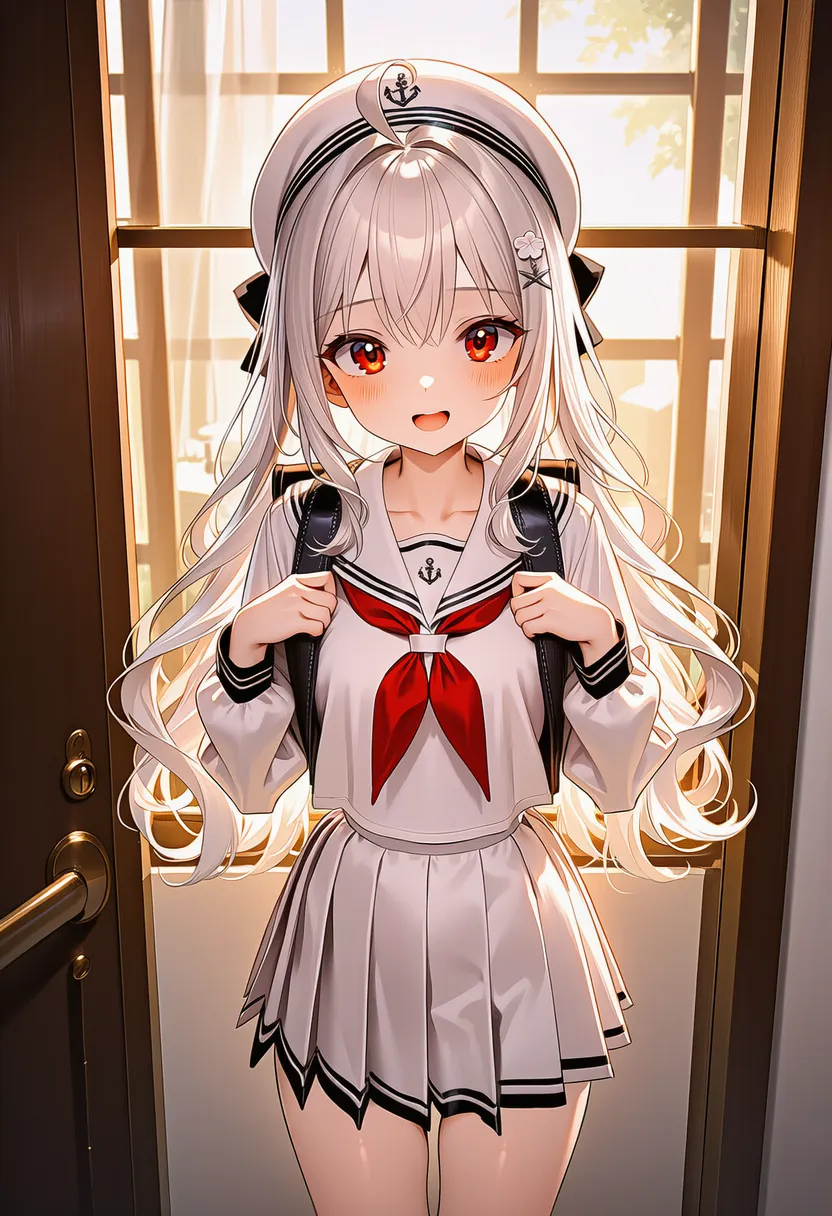 backlighting: Backlight. Halo/silhouette |
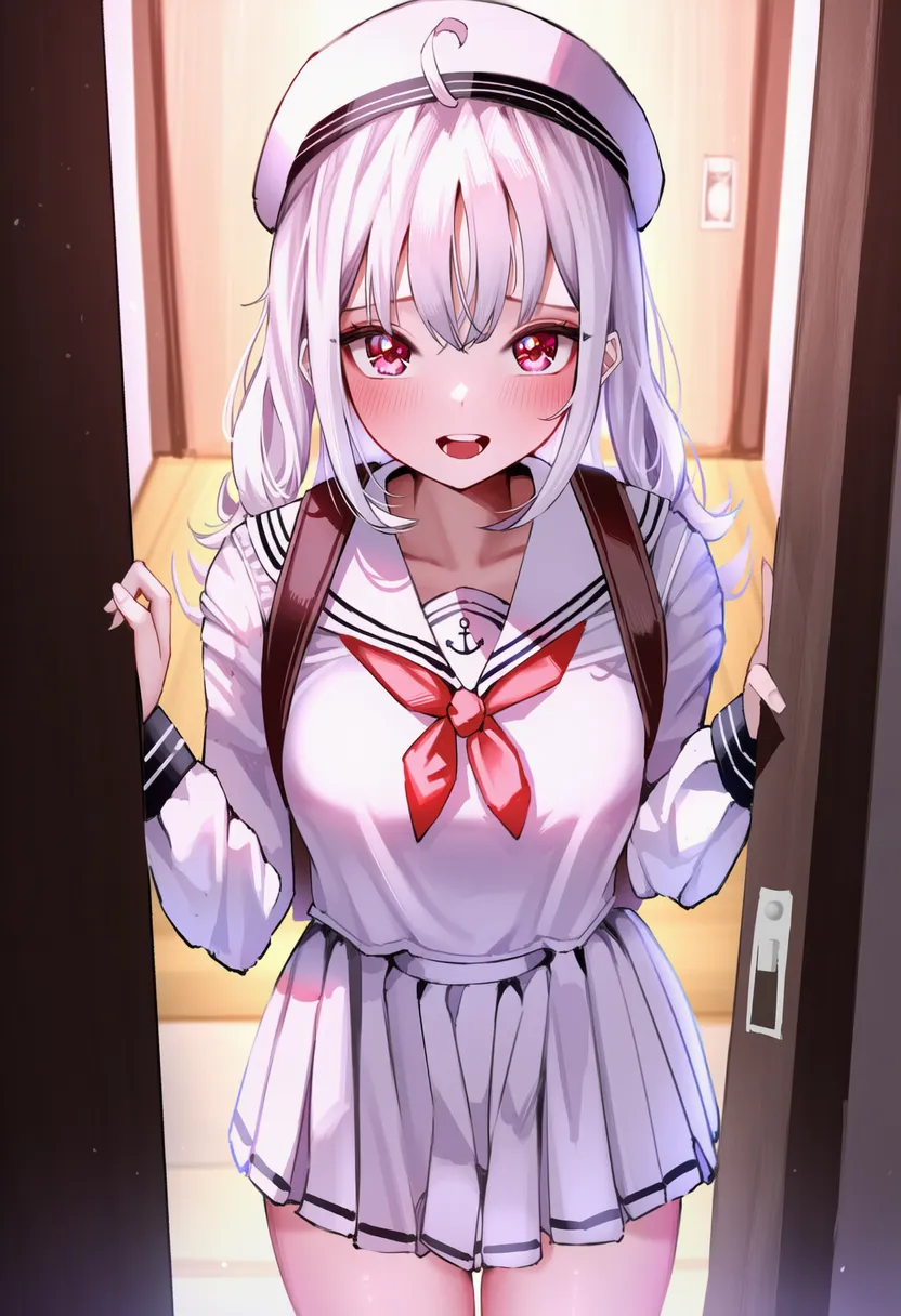 bloom: Light bloom. Soft glow |
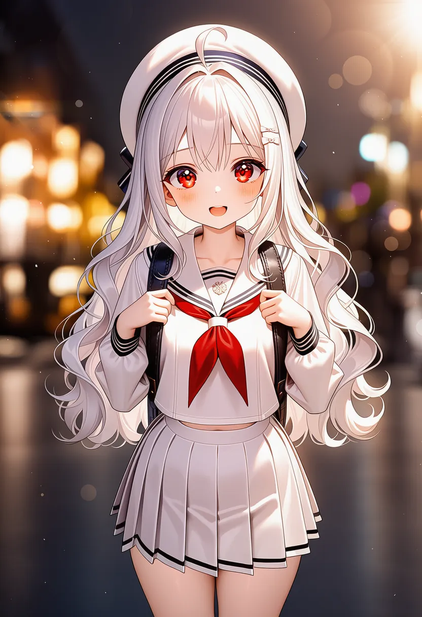 bokeh: Out-of-focus light orbs |
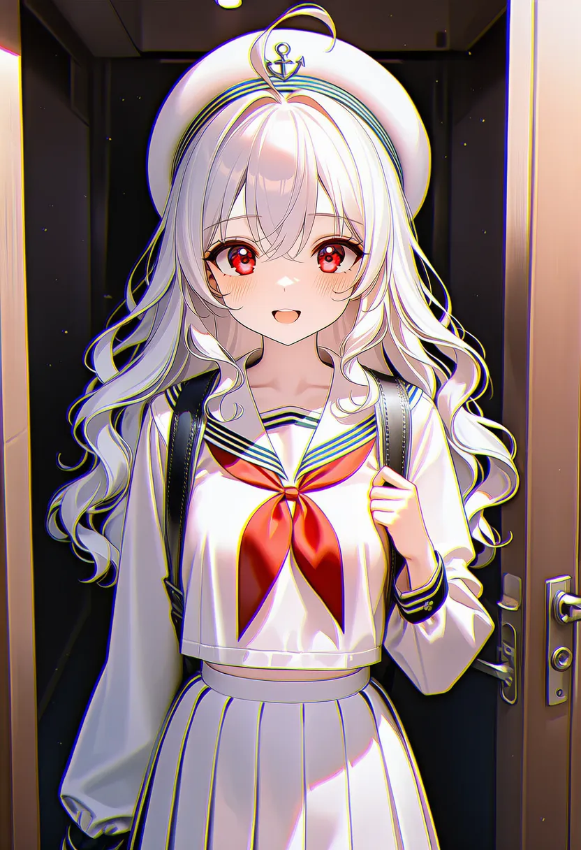 chromatic aberration: Chromatic aberration. 3D-glasses fringing |
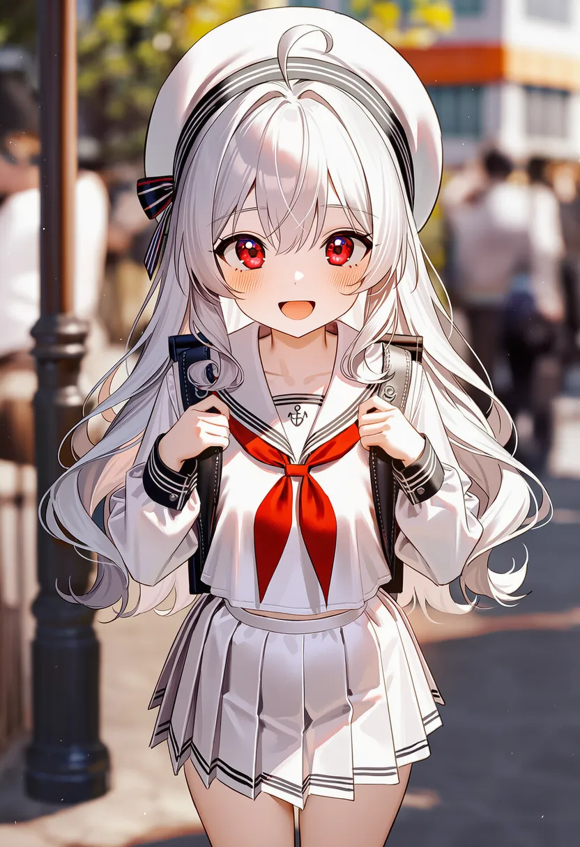 depth of field: Depth of field. Blurred background |
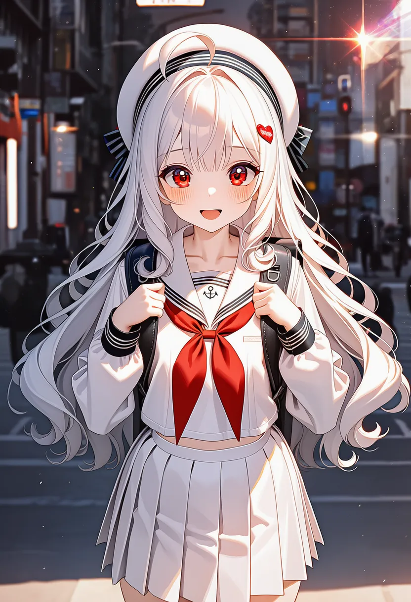 diffraction spikes: Light spikes (cross-shaped) |
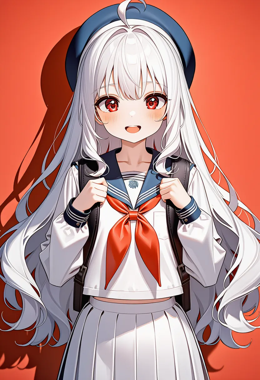 drop shadow: Shadow behind objects (graphic-design style) |
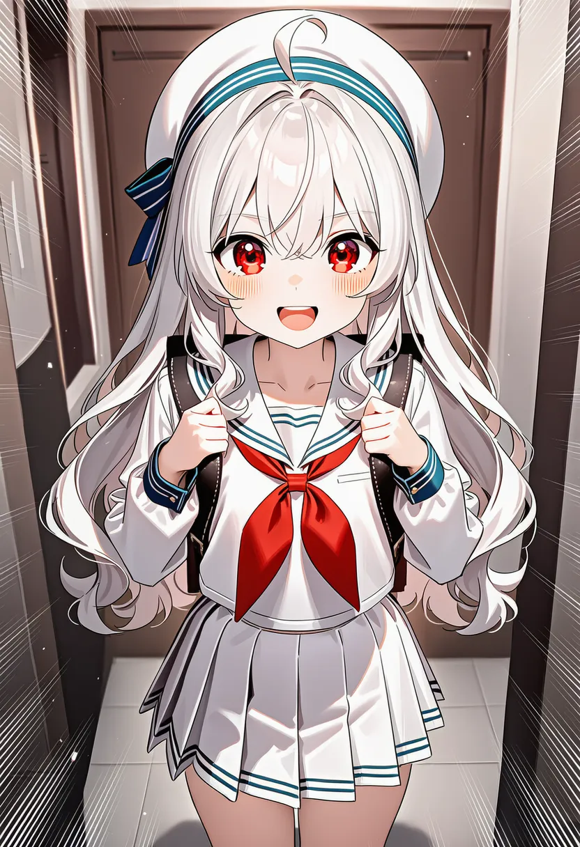 emphasis lines: Emphasis lines (manga effect) |
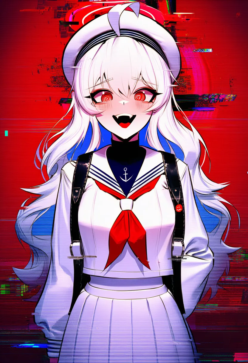 glitch: Crackling noise |
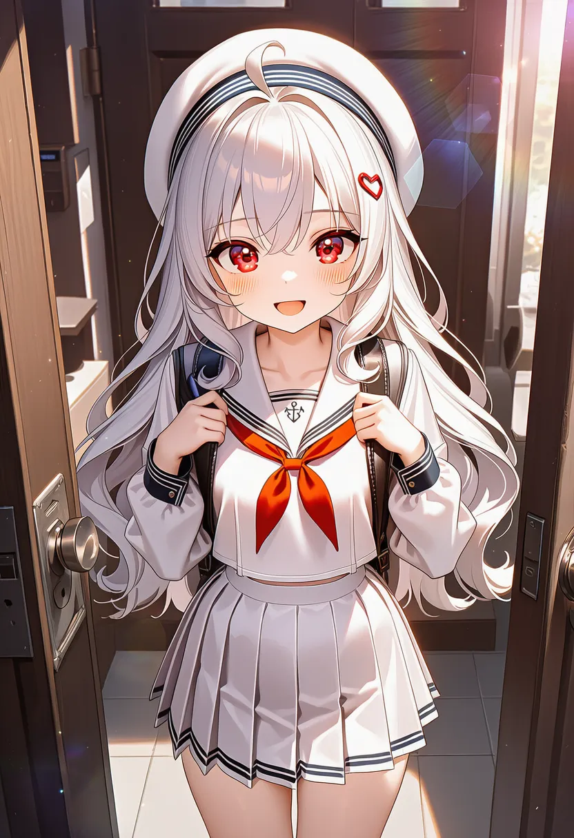 lens flare: Lens flare (hexagonal light) |
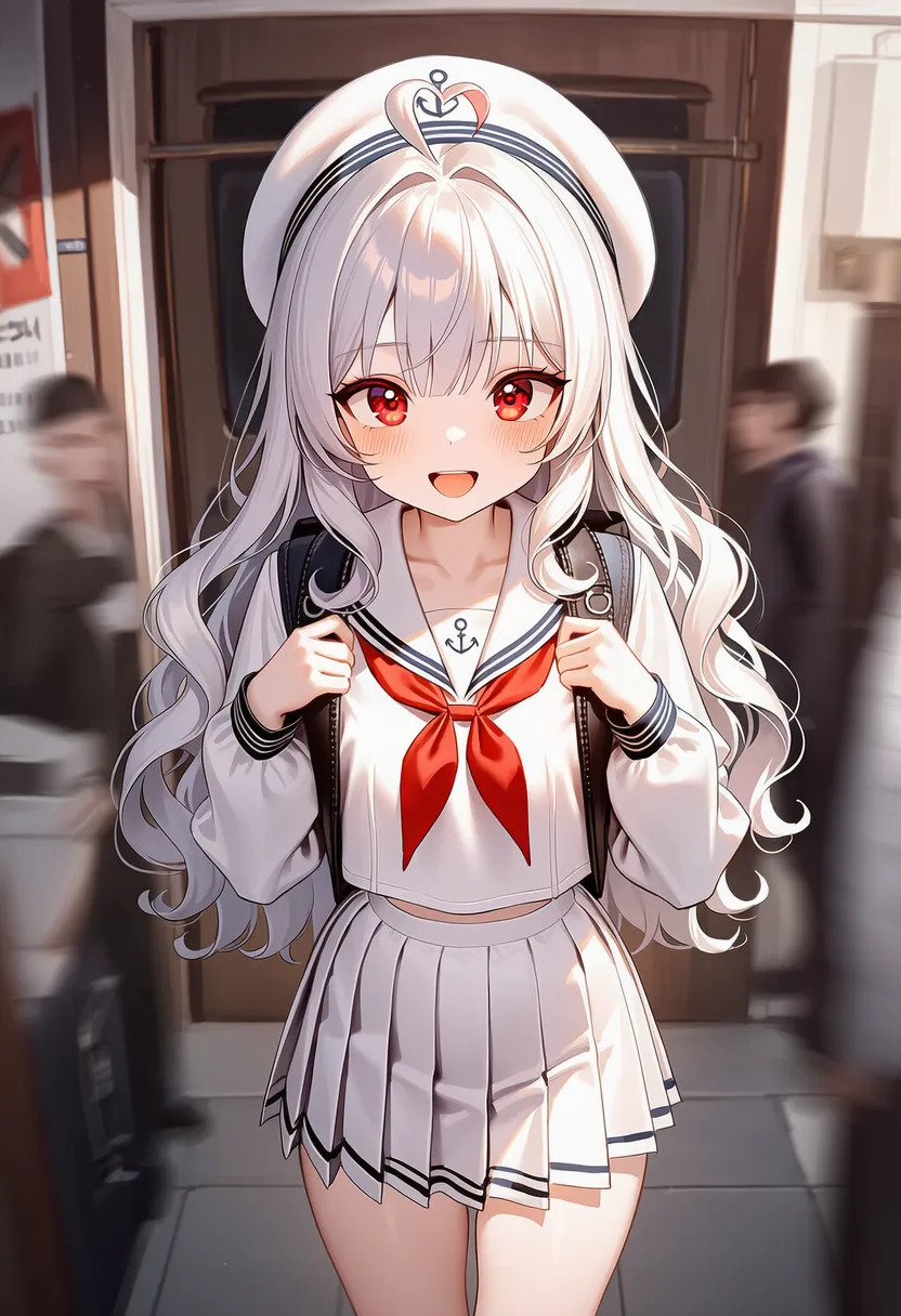 motion blur: Motion blur |
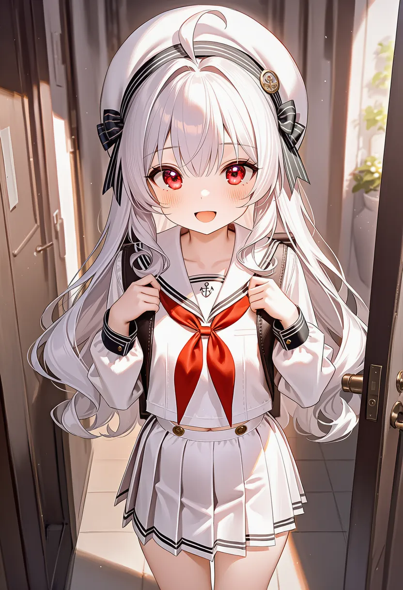 soft focus: Overall hazy and dreamy |
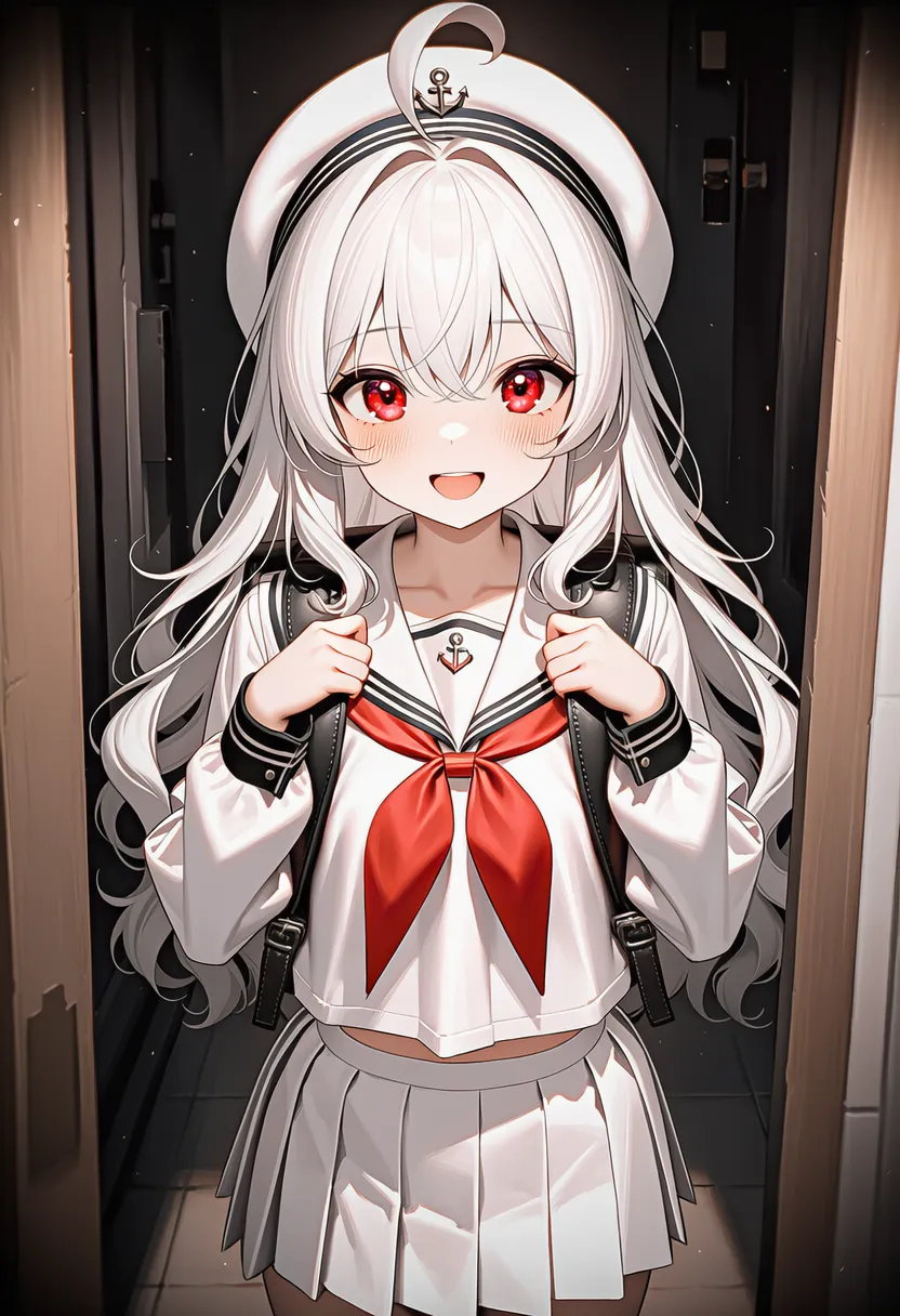 vignette: Vignette. Darkened edges |
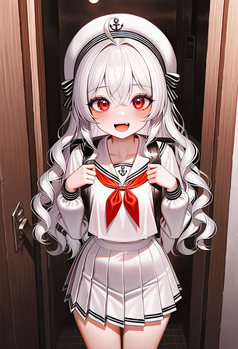 film grain: Film grain. Grainy texture |
 film emulation: Movie-film color emulation |
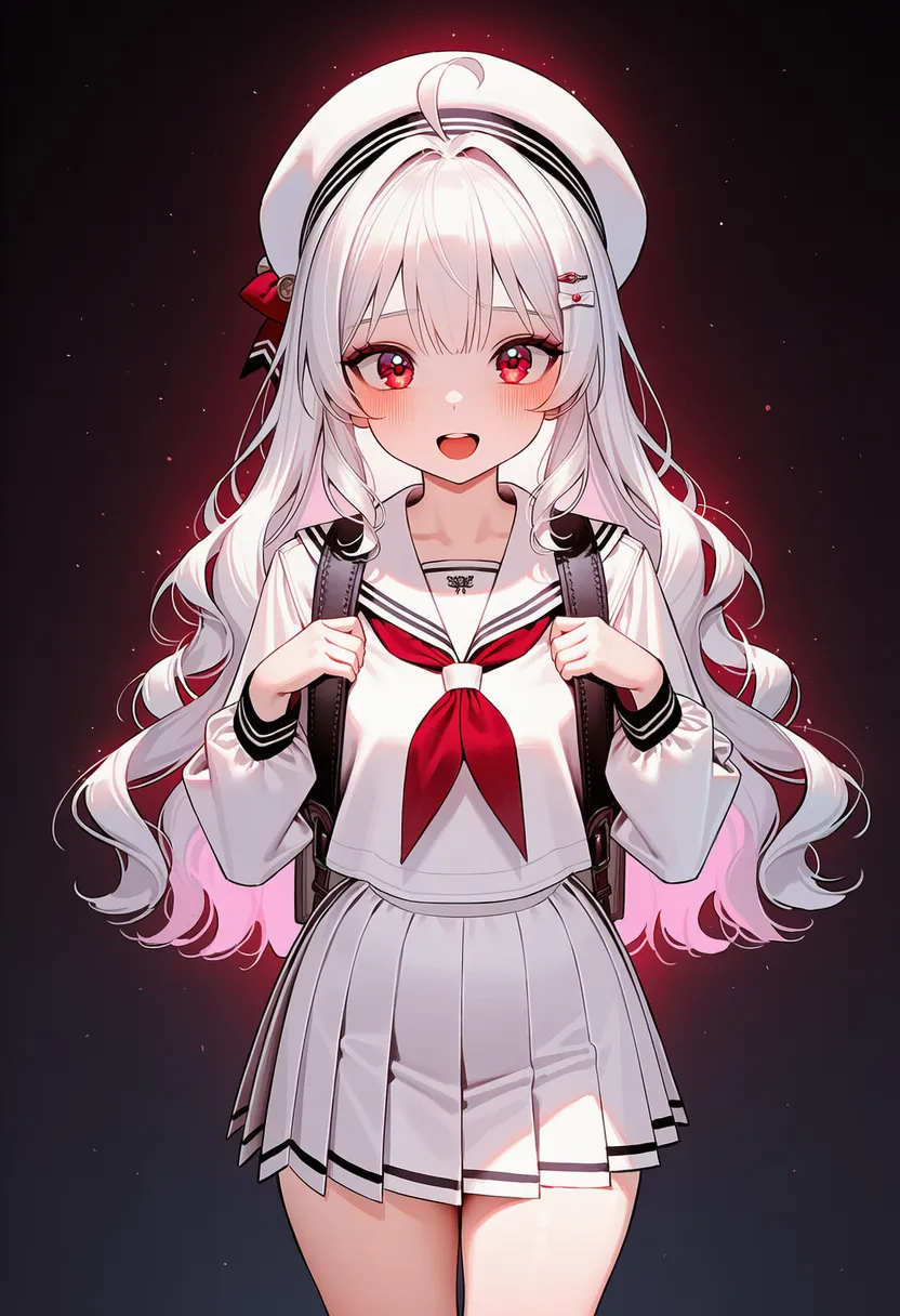 glow: Glow effect |
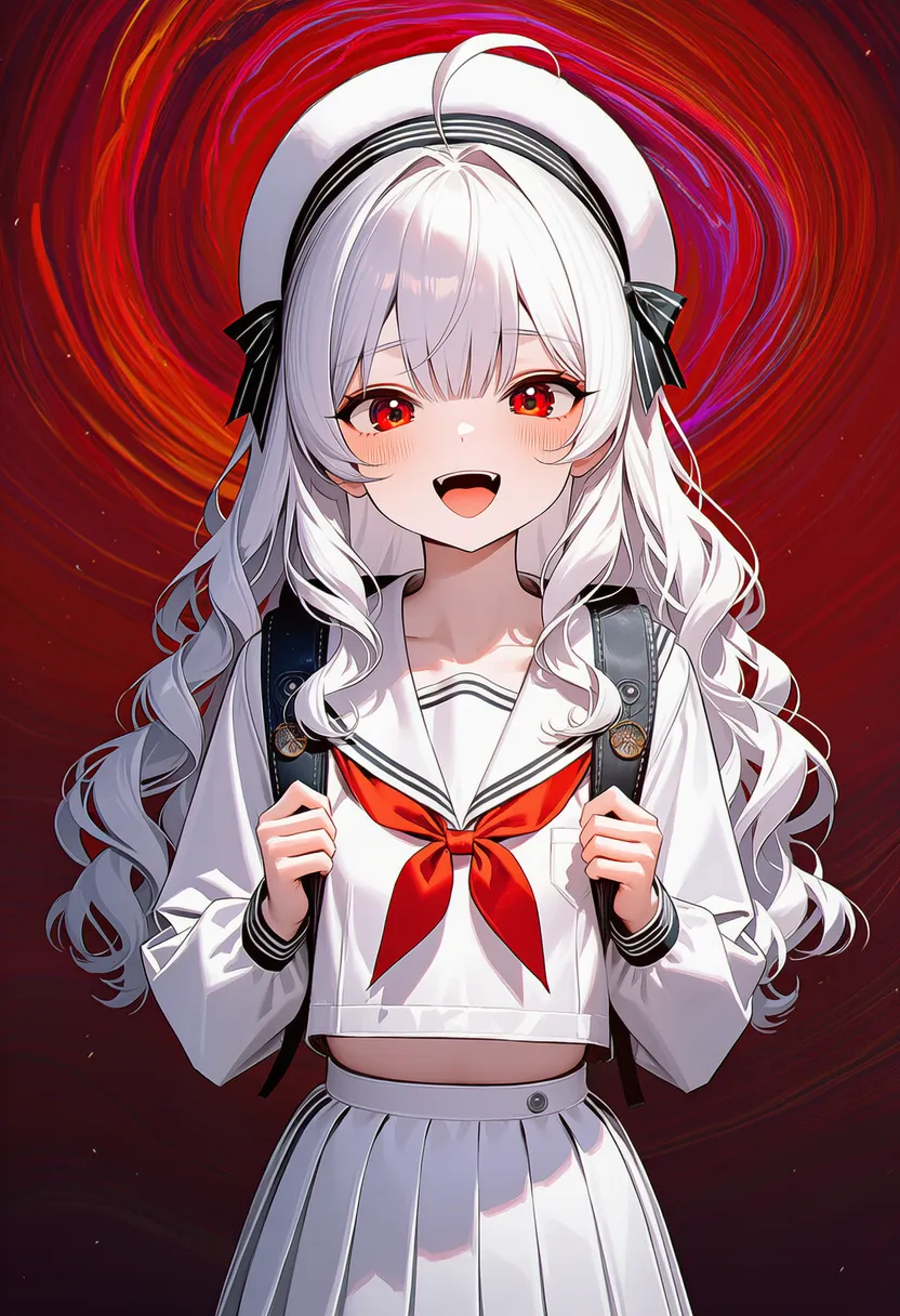 distortion: Distortion. Warped space |
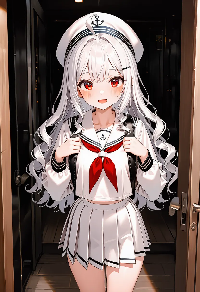 cinematic lighting: Cinematic lighting design |
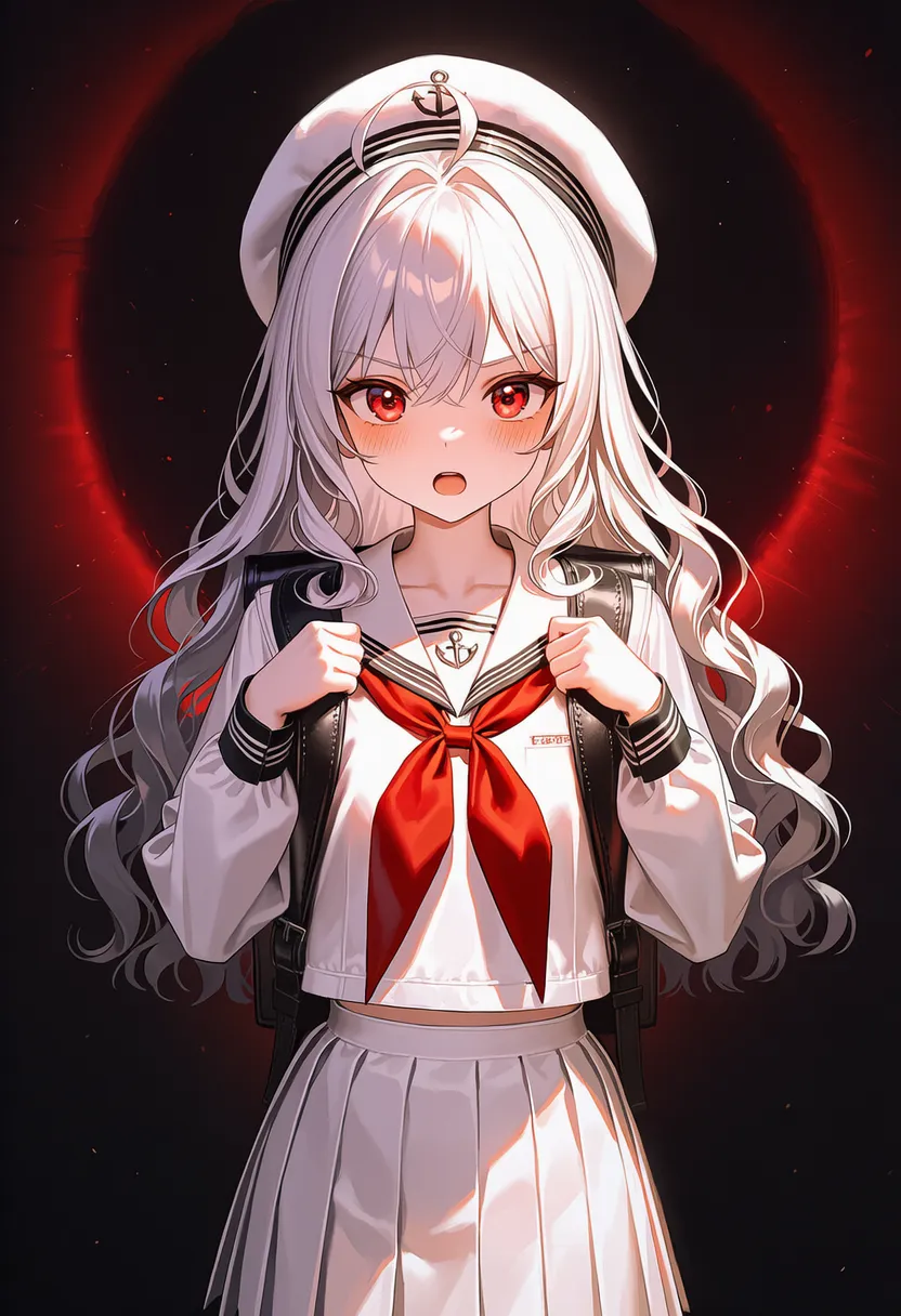 dramatic lighting: Stage-play dramatic contrast |
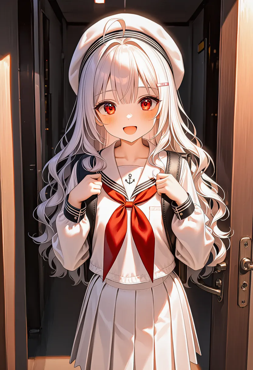 rim lighting: Rim highlight |
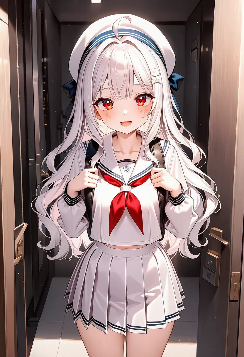 soft lighting: Softly diffused |
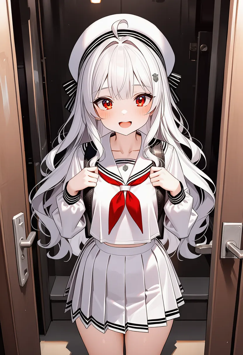 volumetric lighting: Atmospheric depth, light scattering |
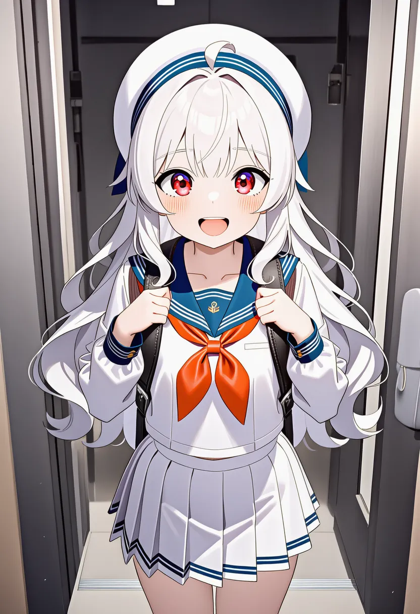 god rays: God rays (Tyndall effect) |
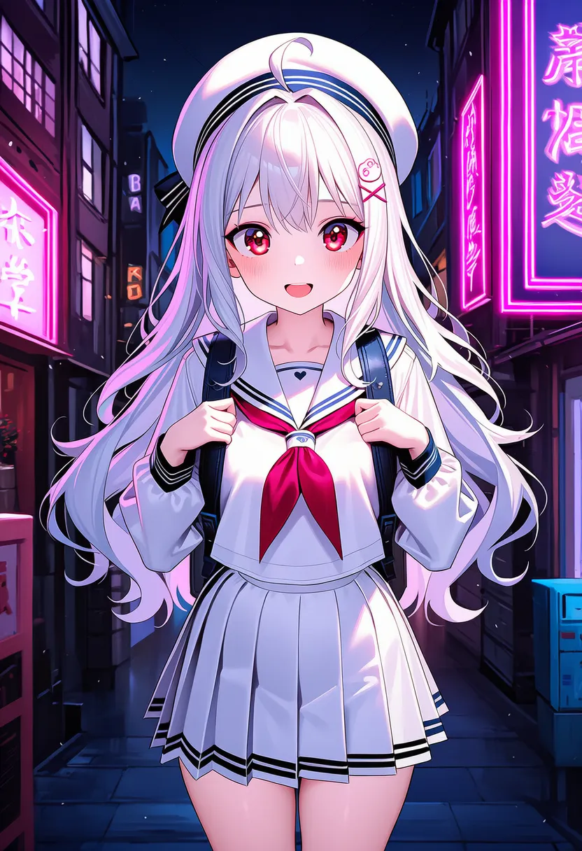 neon lighting: Neon sign lighting |
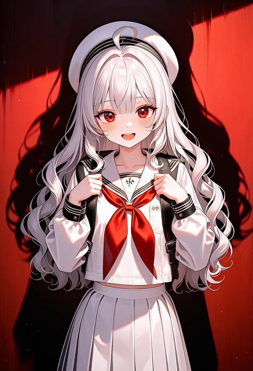 dramatic shadows: Deep, dark shadows |
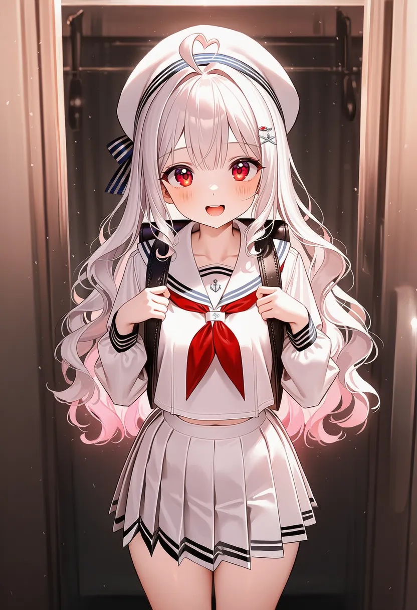 glowing edges: Glowing outlines |
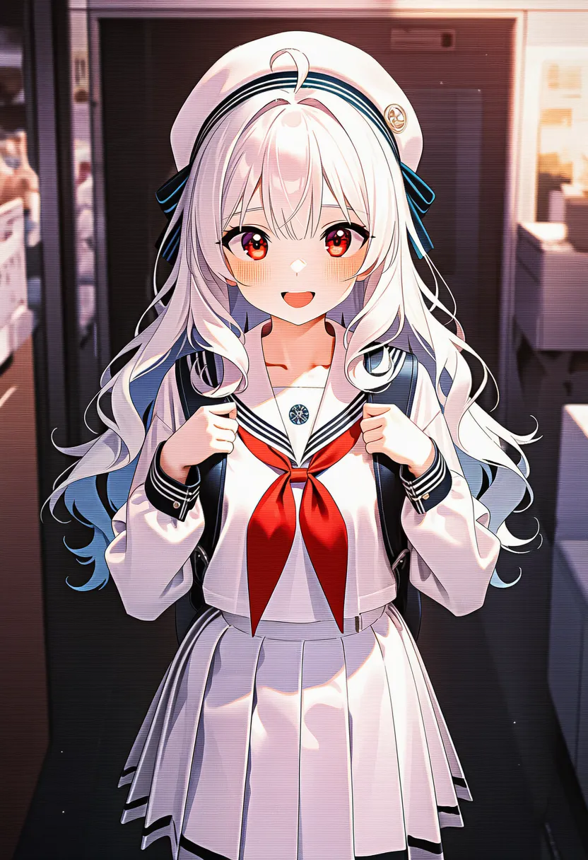 scanlines: Scanlines. CRT stripes |
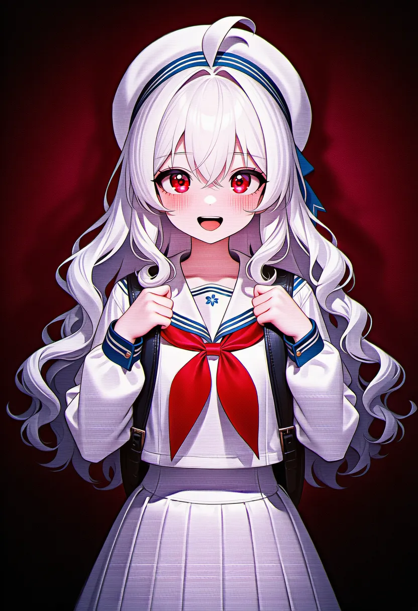 vhs: VHS tape noise |
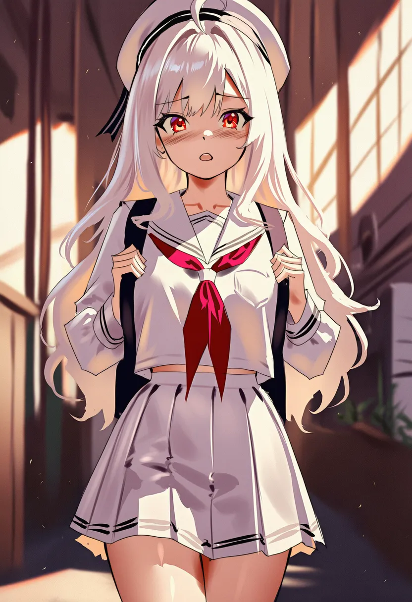 sunset lighting: Sunset light |
▶ 5. Composition / Viewpoint
Eyes forward.
Tags deciding how the character is placed, from what angle, and through whose eyes you're looking.
5.1. Shot Types
Reference |
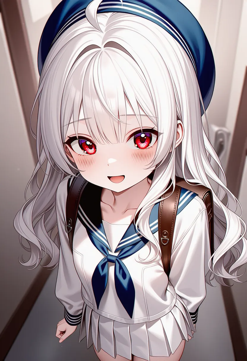 extreme close-up: Extreme zoom on eyes/mouth |
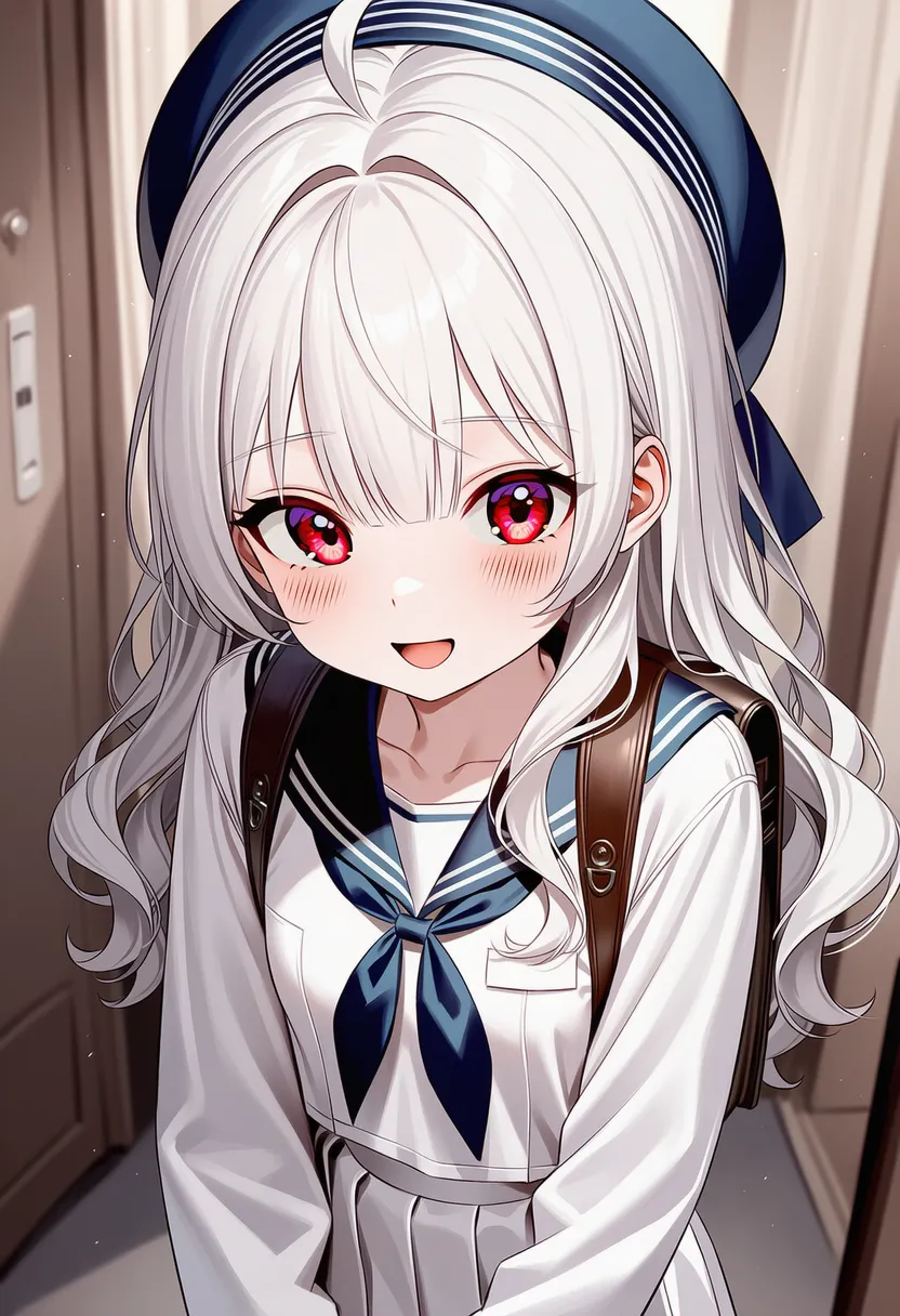 close-up: Face-focused |
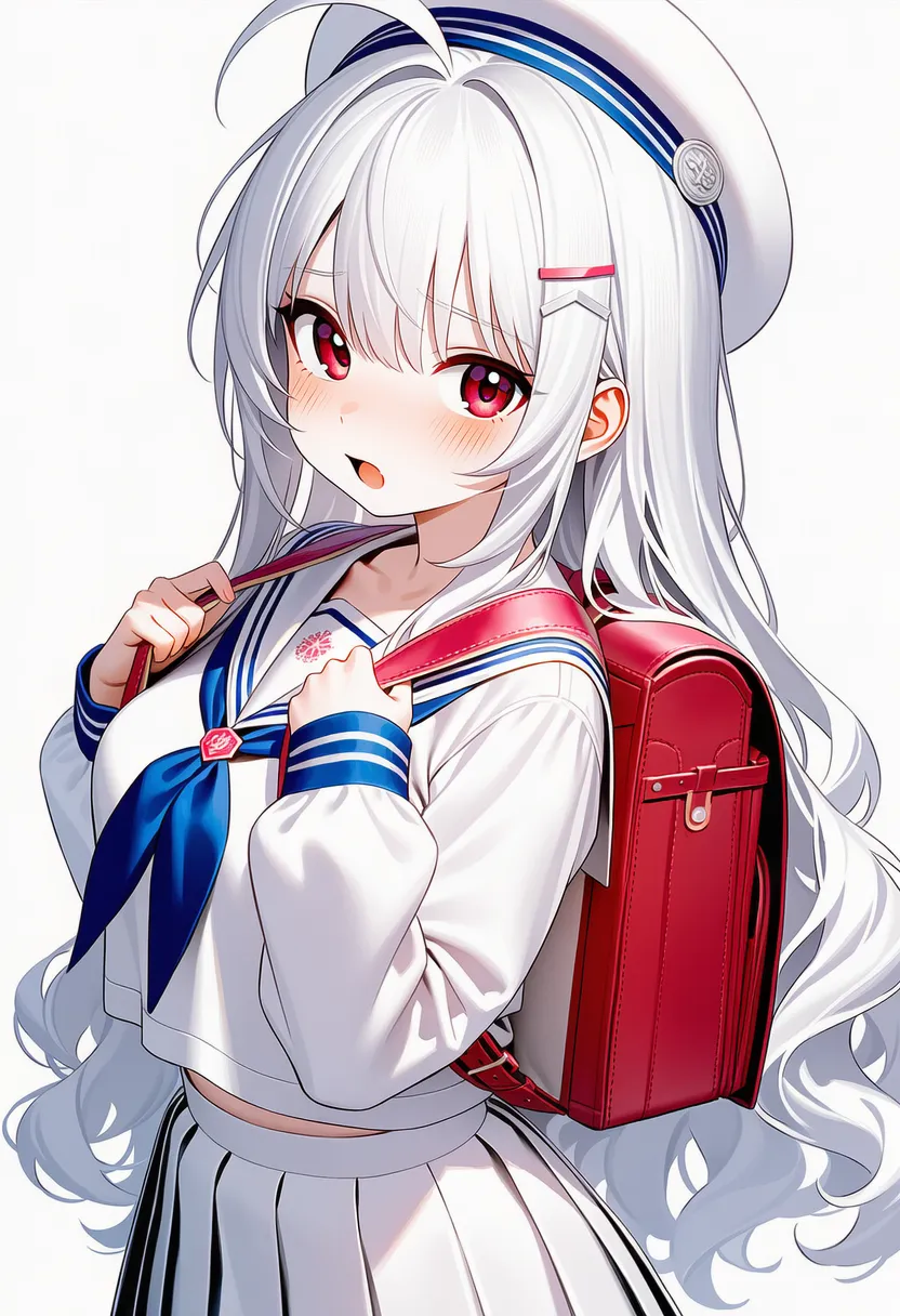 bust shot: From the upper chest up |
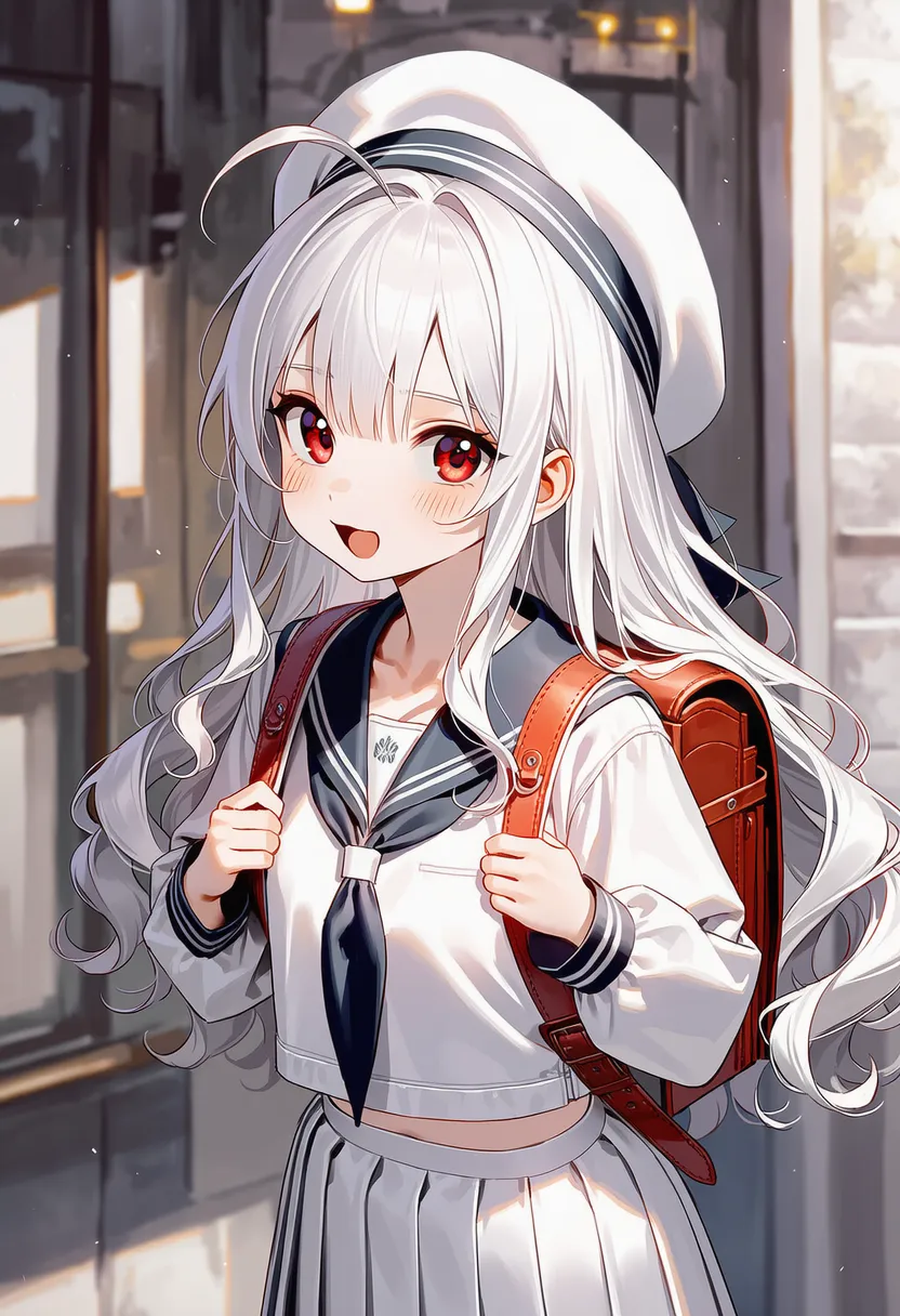 portrait: Portrait composition |
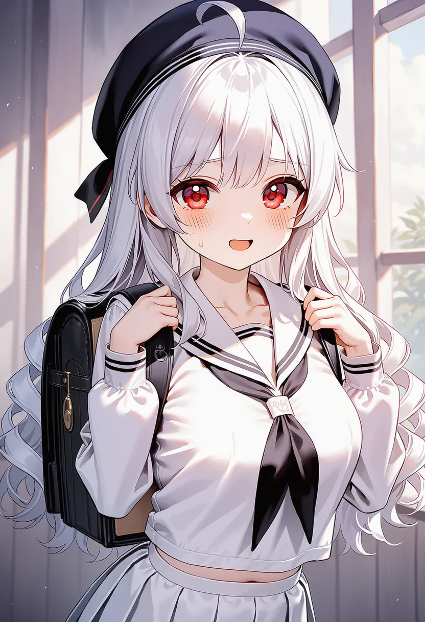 upper body: Upper body from the waist |
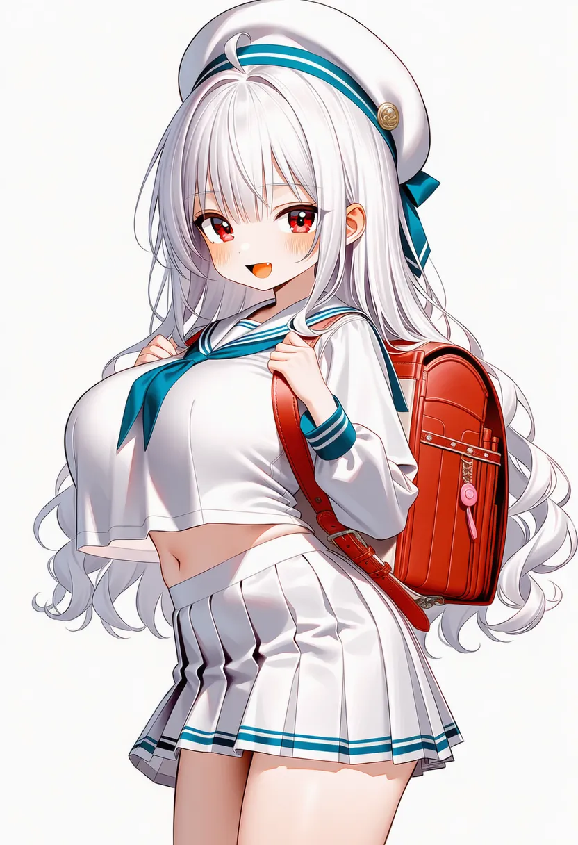 cowboy shot: Above the knees/thighs |
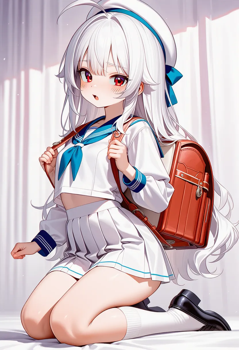 kneeling: Kneeling composition |
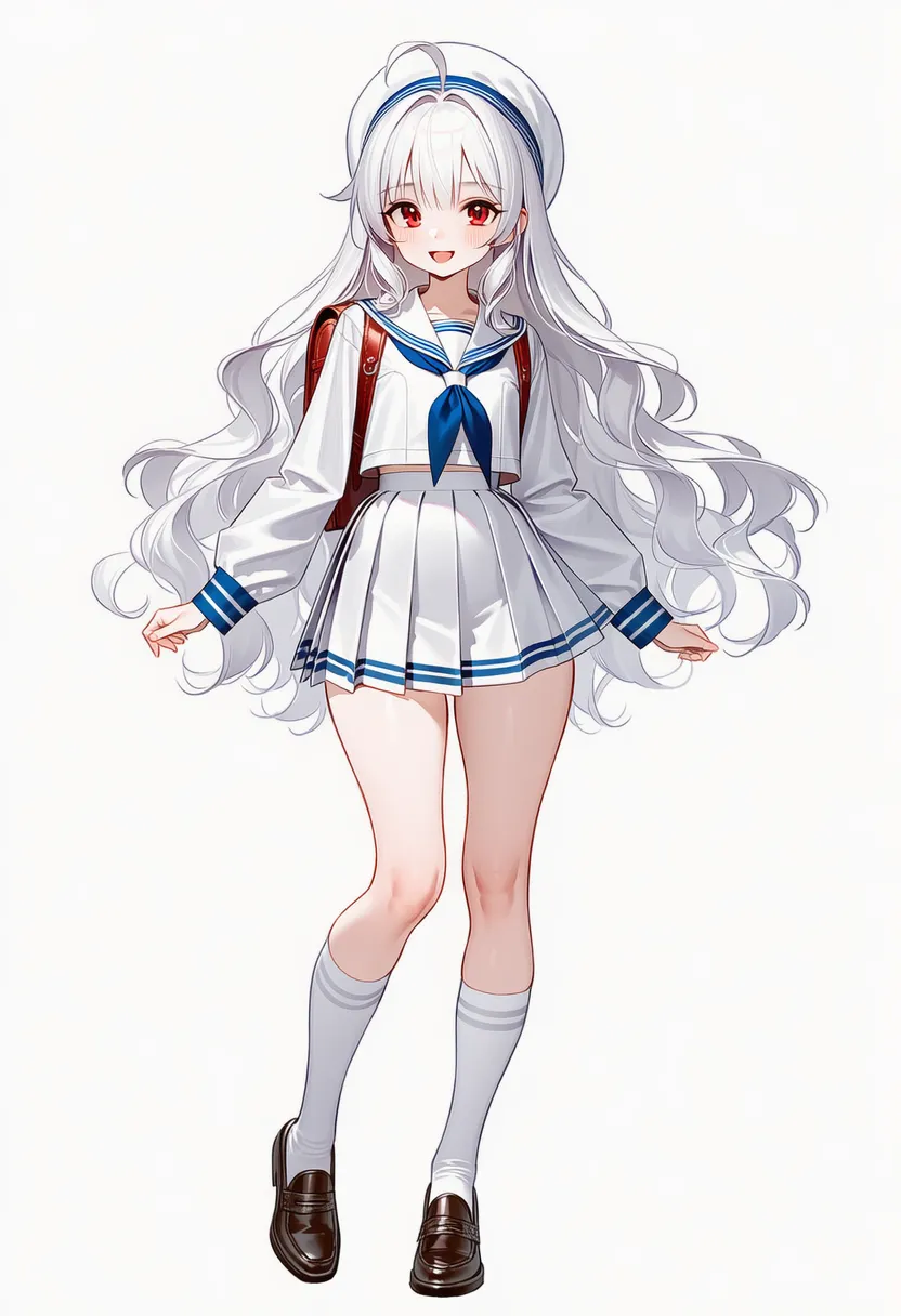 full body: Full body |
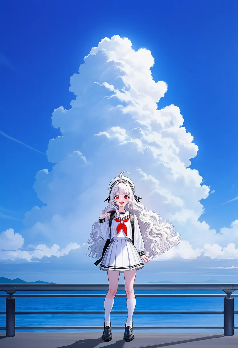 long shot: Small figure, wide background 1 |
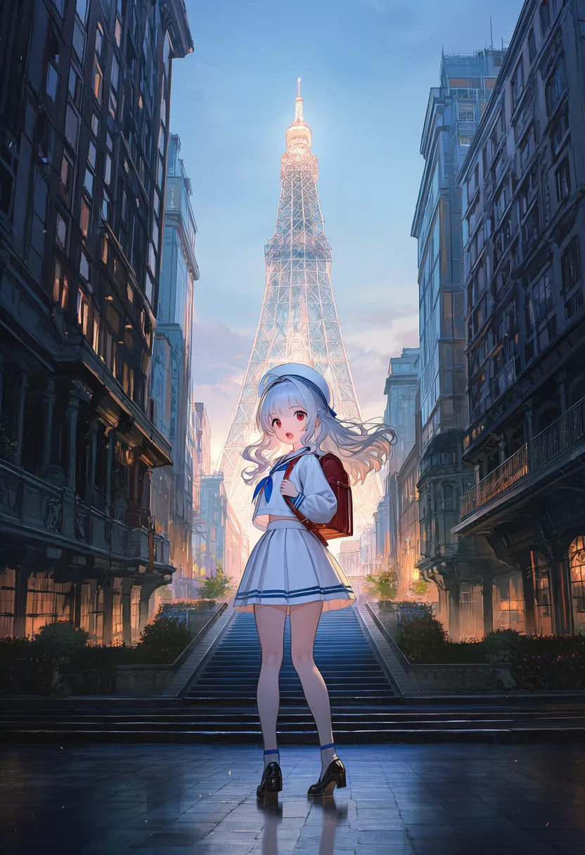 wide shot: Small figure, wide background 2 |
5.2. Camera Angles
Reference original |
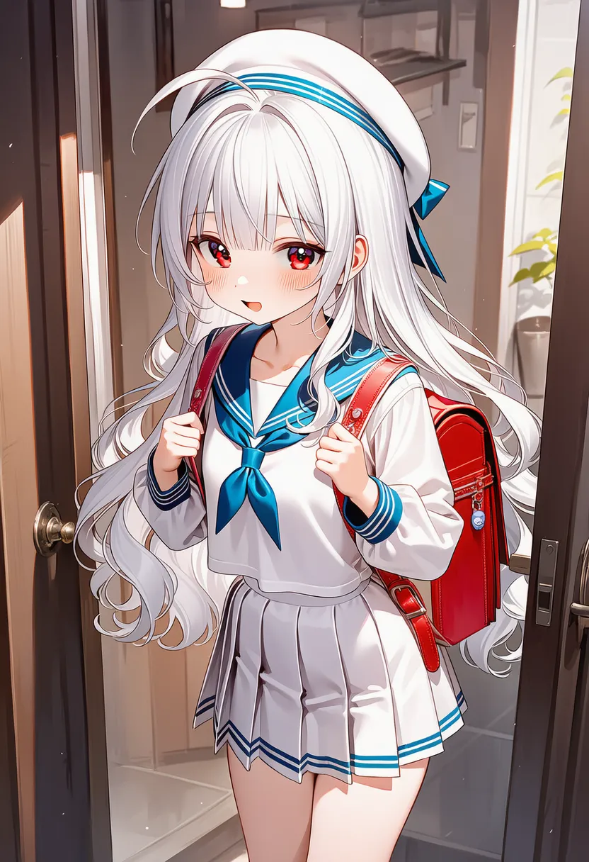 eye-level shot: Eye-level angle |
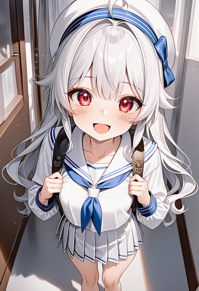 high angle: Looking down |
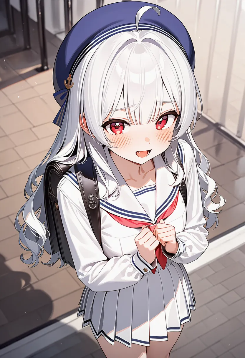 from above: Looking down 2 |
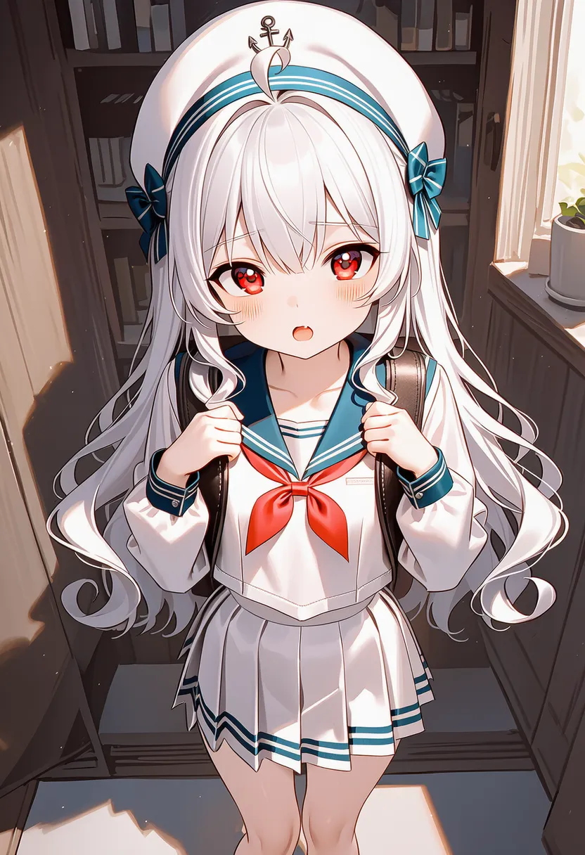 bird's-eye view: Straight-down view (map-like) |
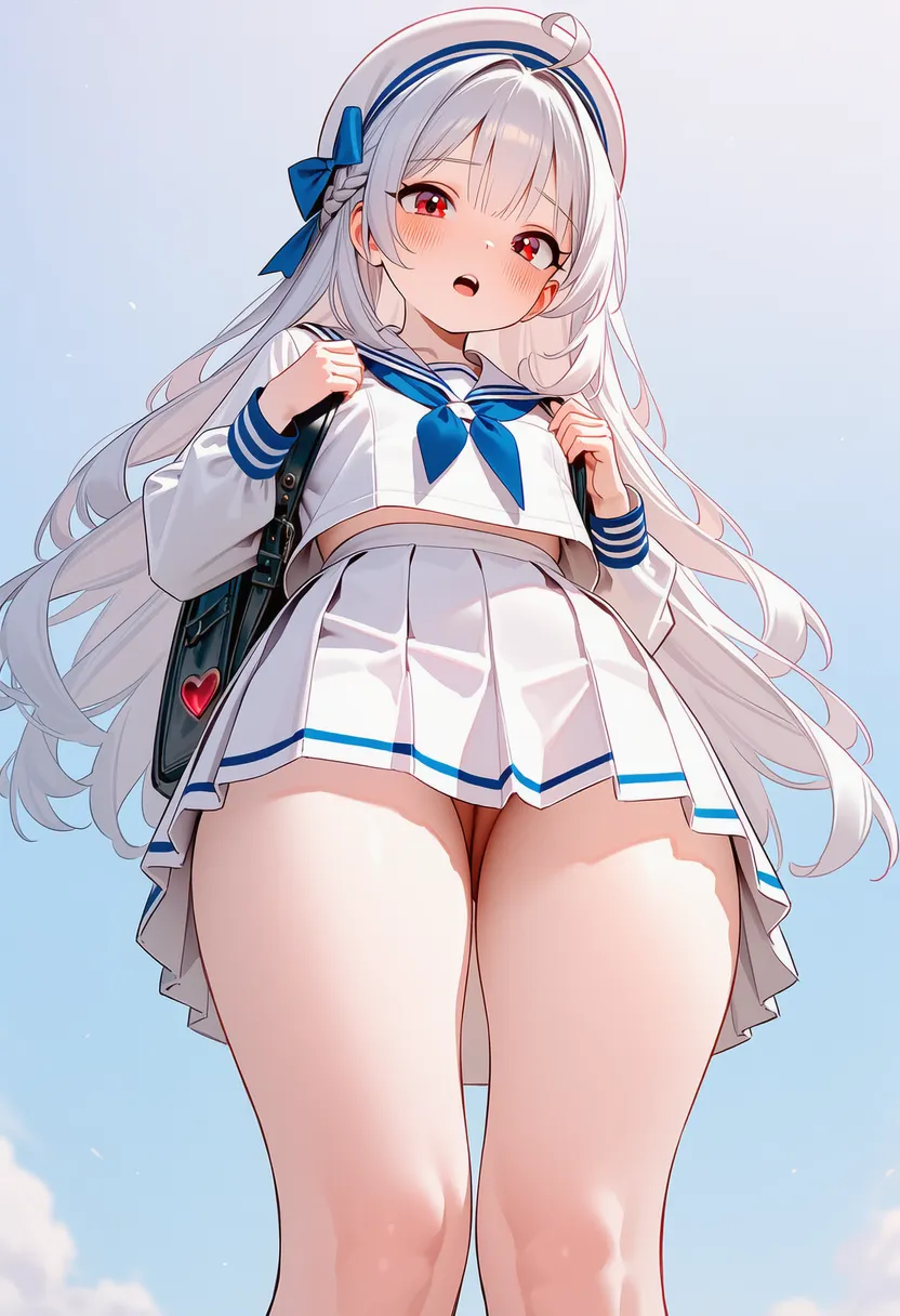 low angle: Looking up |
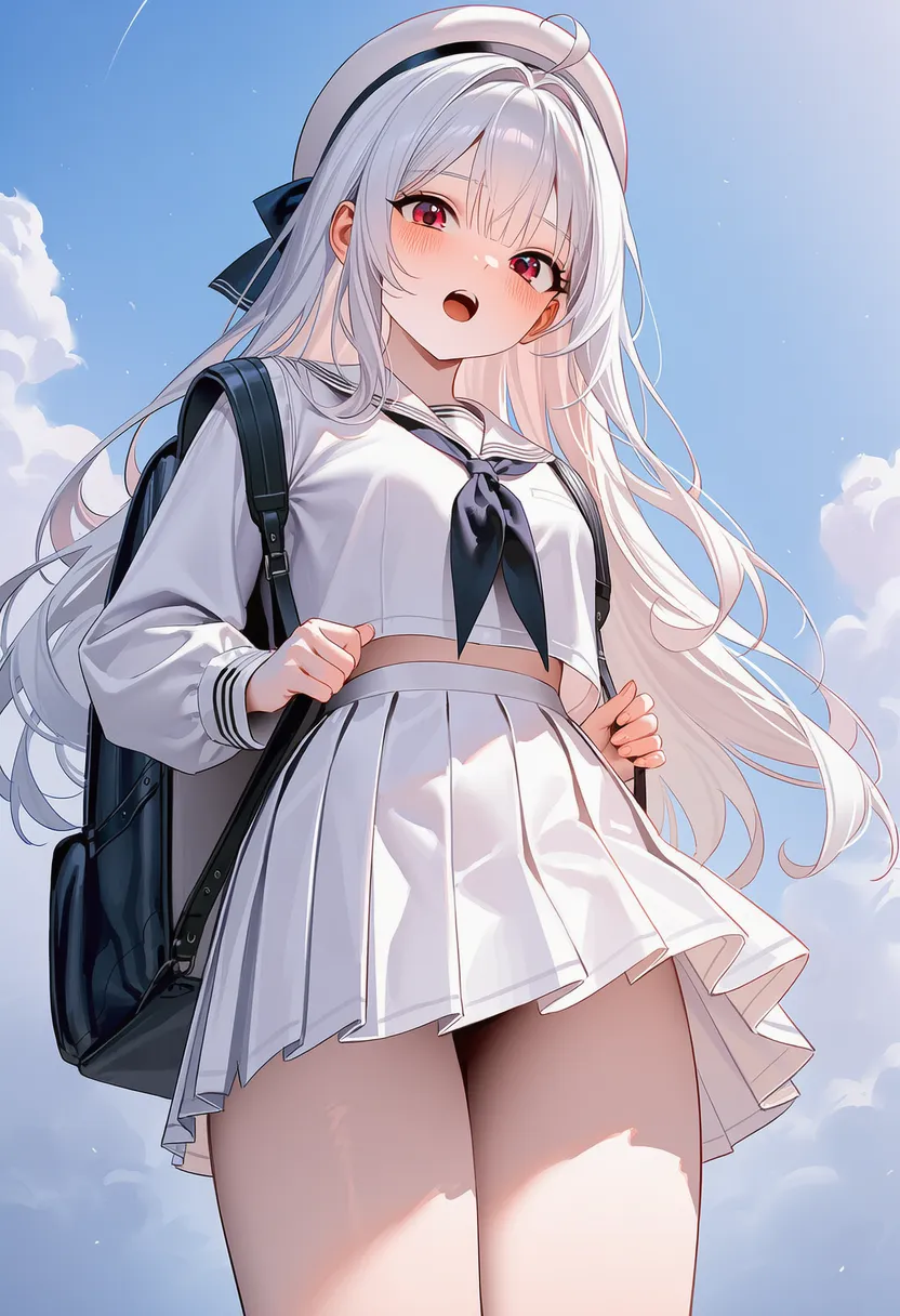 from below: Looking up 2 |
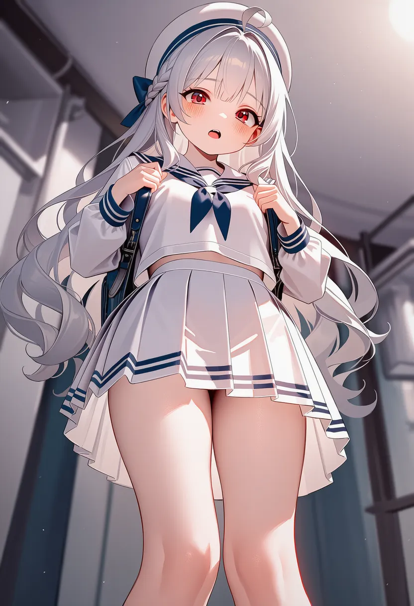 worm's-eye view: Ground-level looking up |
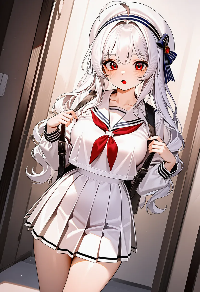 dutch angle: Tilted angle |
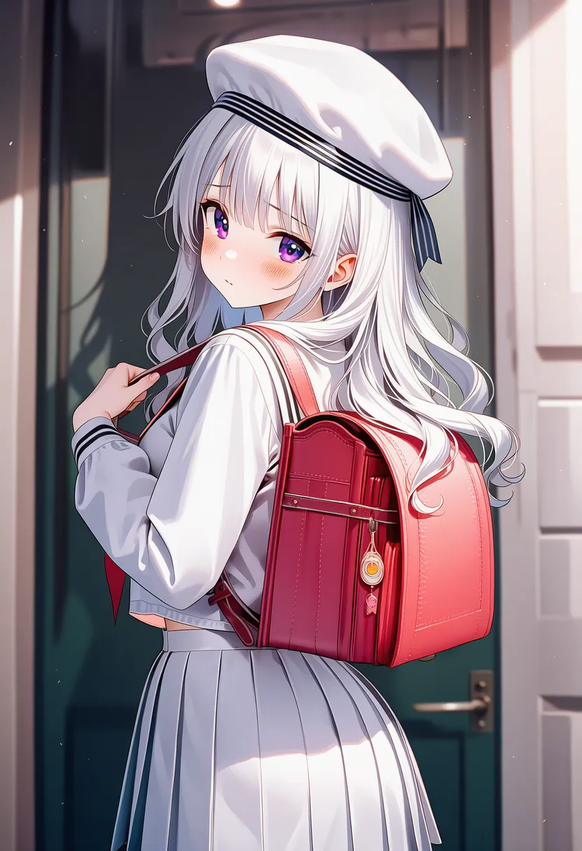
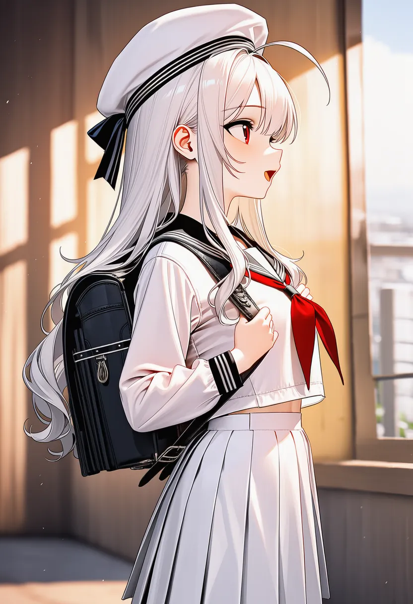 profile: Side profile |
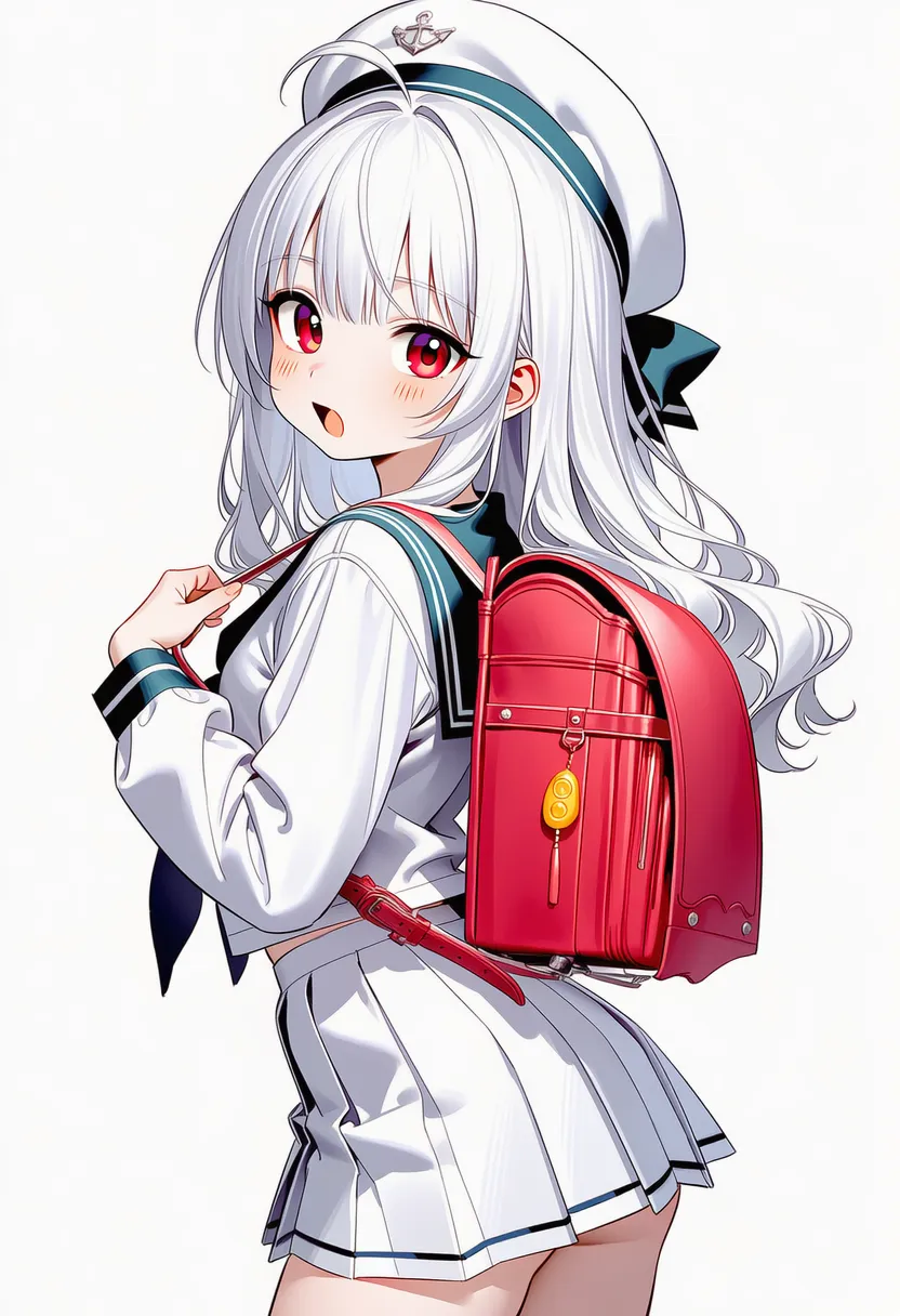 from side: Side profile 2 |
 from behind: From the back |
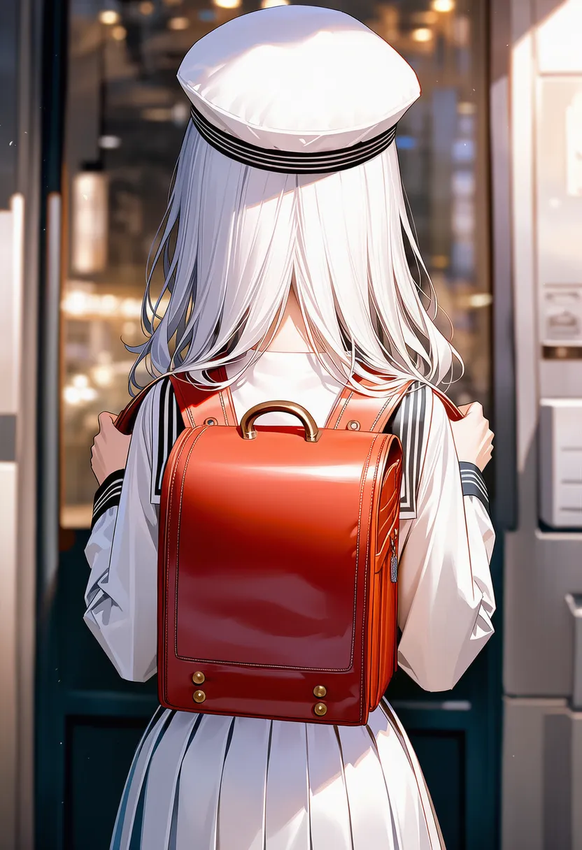 back view: From the back 2 |
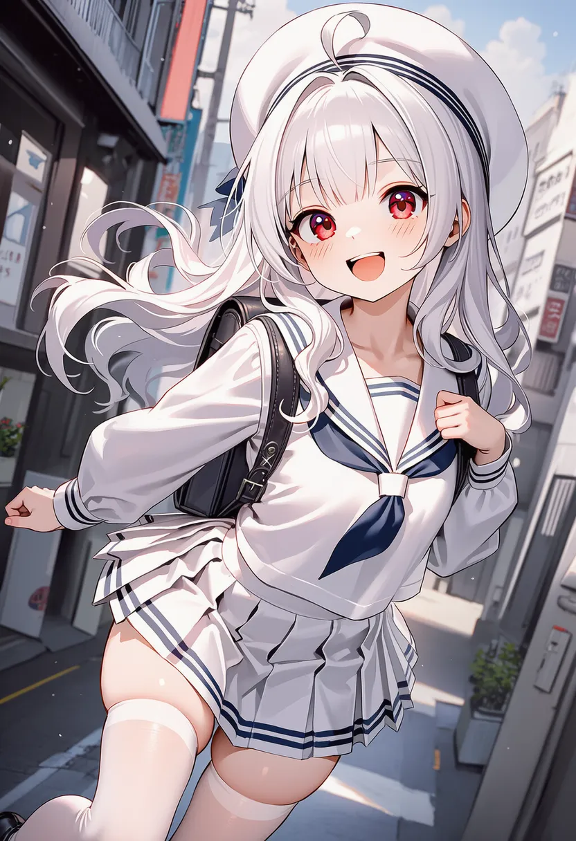 dynamic angle: Dynamic, exaggerated angle |
5.3. Camera POV
 looking at viewer: Looking at you |
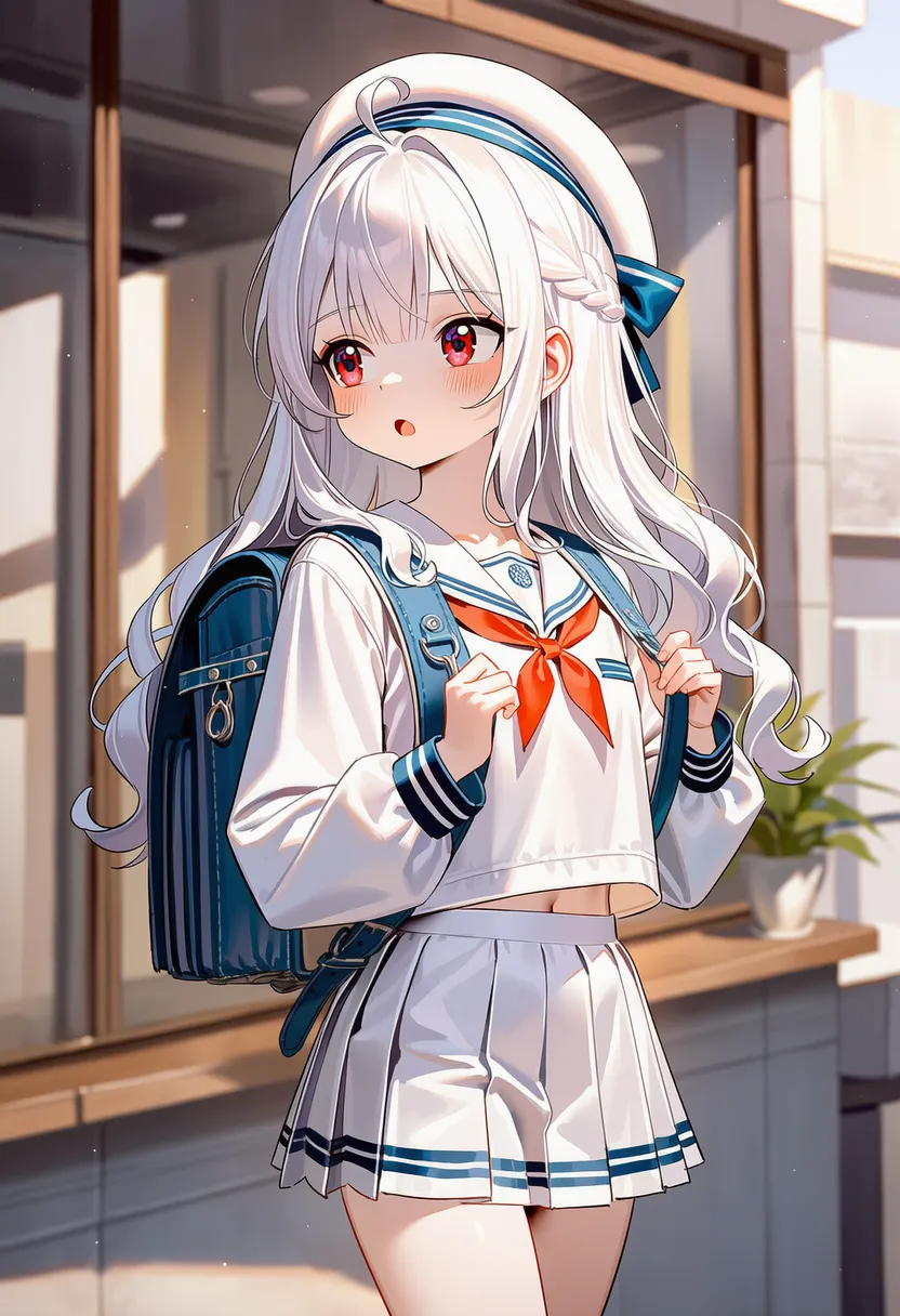 looking away: Looking elsewhere |
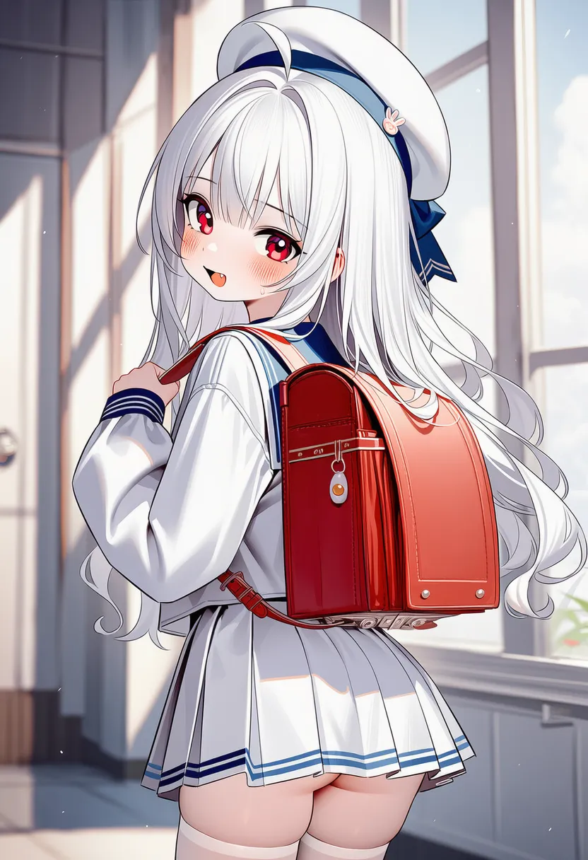 looking back: Looking back over the shoulder |
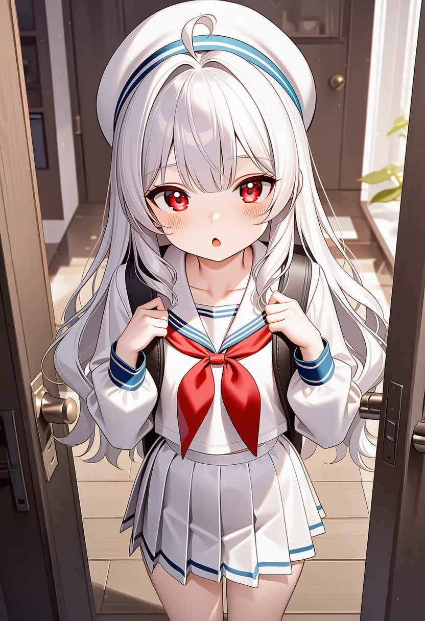 eye contact: Making eye contact |
5.4. Situational Compositions
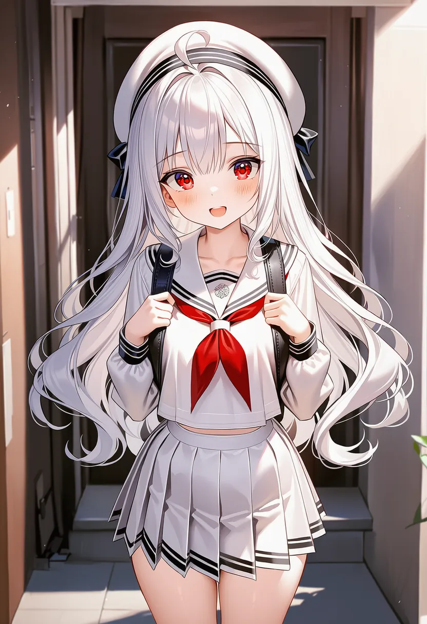 dating sim: Dating-sim dialogue-box framing |
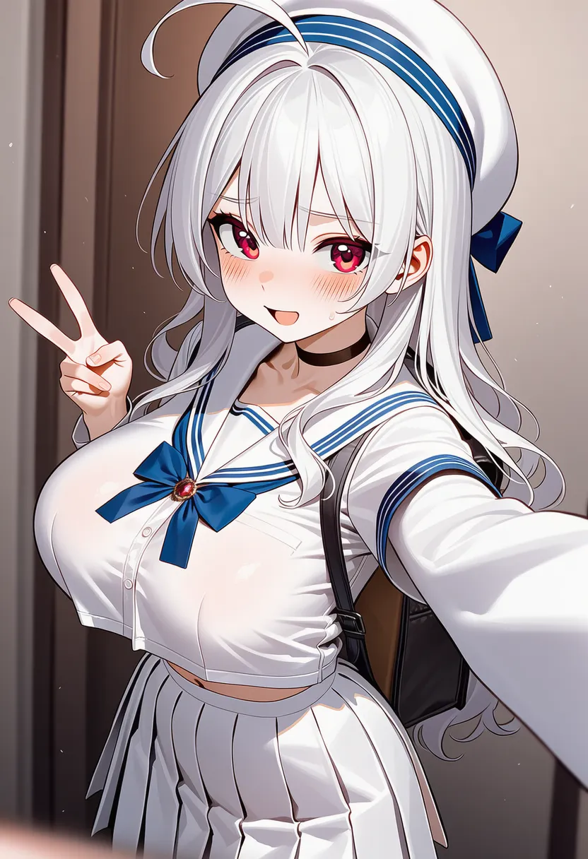 selfie: Selfie framing |
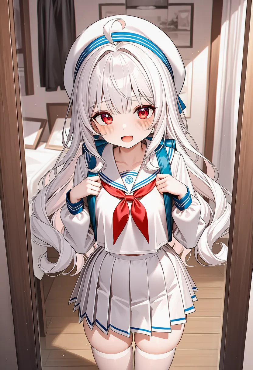 mirror: Mirror shot |
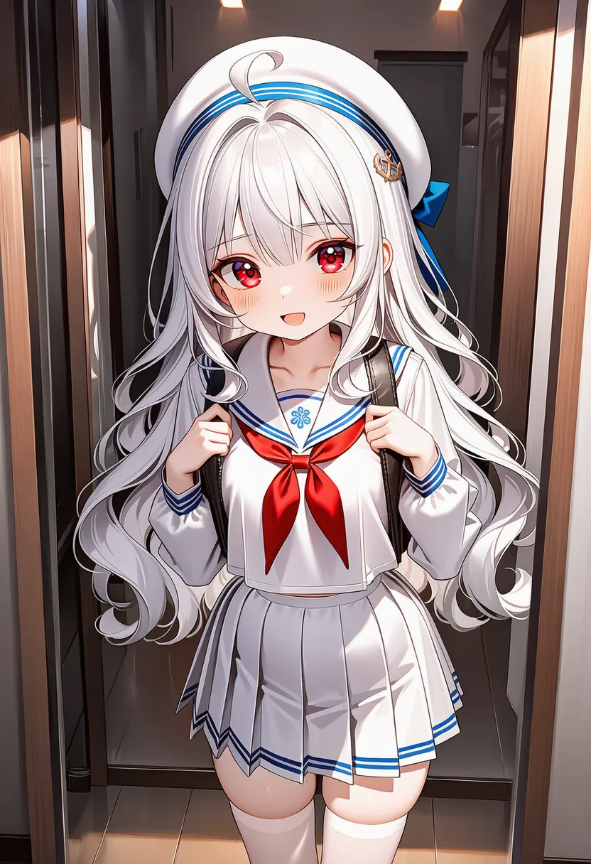 reflection: Reflection in glass/water |
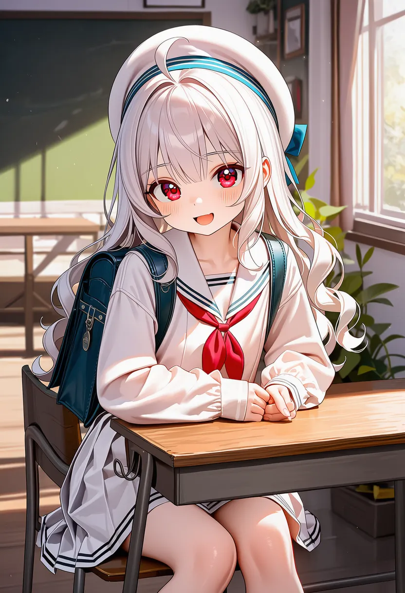 across table: Across-the-table framing |
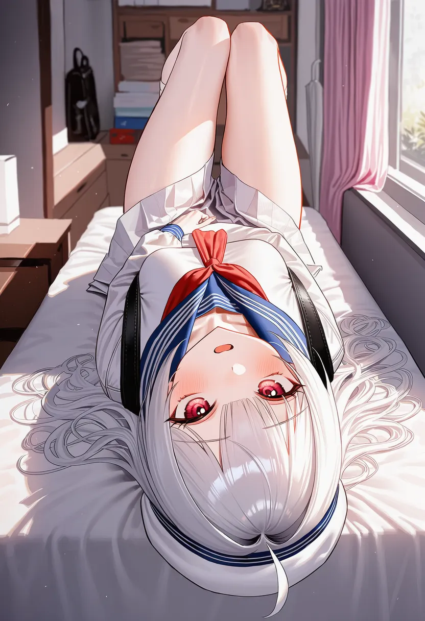 upside-down: Hanging/flipped upside down |
▶ 6. Quality Tags / Negative Prompt
Further explanation is omitted.
Think of it as: add what raises quality, remove what you don't want to see. But some of it may clash with what you're going for, so before using a list run it through a translator or an AI and check what's actually in there.
6.1. Quality tags
6.1.1. Base quality: masterpiece, best quality, amazing quality, very aesthetic, best illustration, novel illustration
6.1.2. Resolution & detail: highres, absurdres, incredibly absurdres, ultra-detailed, intricate details
6.1.3. Style control: solo artist, artist collaboration (use with negative weights or in the negative)
6.2. Negative prompt list
6.2.1. Quality killers: worst quality, bad quality, low quality, lowres, blurry, jpeg artifacts, scan artifacts, dithering, halftone, screentones, film grain, chromatic aberration
6.2.2. Unwanted elements: text, logo, watermark, signature, artist name, blank page
6.2.3. Anatomy & composition errors: bad anatomy, mutation, deformed, distorted, disfigured, bad hands, extra digits, fewer digits, bad face, mob face, bad eyes, bad proportions, amputee, bad perspective, multiple views
6.3. Recommended presets
This is the most reliable combo of the ones I picked up. Use as-is or trim to taste.
solo artist, -5.3::artist collaboration::, year 2024, year 2023, year 2022, year 2021, -1::clean text::, -1::flat color::, natural, incredibly absurdres, very aesthetic, highres, masterpiece, best quality, amazing quality, -3::simple illustration::, best illustration, novel illustration
blank page, text, logo, watermark, too many watermarks, reference, signature, artist name, dated, artistic error, scan artifacts, jpeg artifacts, upscaled, aliasing, film grain, heavy film grain, dithering, chromatic aberration, digital dissolve, halftone, screentones, artist:xinzoruo, artist:milkpanda, artist:kurukurumagical, artist collaboration, one-hour drawing challenge, toon (style), 1990s (style), 4koma, 2koma, mutation, deformed, distorted, disfigured, bad anatomy, unnatural hair, bad face, mob face, bad eyes, empty eyes, bad proportions, bad limbs, amputee, bad arm, bad hands, bad hand structure, extra digits, fewer digits, bad leg, extra leg, distorted composition, bad perspective, multiple views, disorganized colors, unfinished, incomplete, displeasing, very displeasing, unsatisfactory, inadequate, deficient, subpar, poor, blurry, lowres, worst quality, bad quality, fewer details
▶ 7. Assorted Tips
Master of Everyday Life
Small tips I saw around, compressed with AI. If you have tips too small for their own post, send them my way and I'll fold them in.
7.0. Use AI, but doubt it.
AI these days is good — ask for Danbooru-style tags and it delivers. But once you get into detailed info, make doubting a habit. It will slip in plausible-looking fake tags.
Still, if you want AI to build tags or answer questions, first ask it: 'turn on search and check when the latest (NAI) version came out.' Get it loaded with current info, then use it.
7.1. How aspect ratio changes the style
AI strongly learned tall images as 'portraits of people' and wide images as 'landscapes with scenery'. So the same prompt gets different focus depending on the ratio.
1. Portrait (2:3 ~ 9:16) : character & outfit detail
You get a 'character-focused' composition. It tries to fill the frame with the full or half body, so face detail and outfit rendering come out best here. Perfect for phone wallpapers. The tradeoff: the background gets cramped and stuffy, and when you want an epic backdrop the character keeps blocking the view.
- Rescue the background: push wide angle lens, zoom out, from below (low angle to claim sky) hard.
- If the figure is too big, add far away, full body and raise their weights.
2. Landscape (3:2 ~ 16:9) : mood & background & staging
The opposite — 'background/story-focused'. The view opens up, background detail pops, and tags like fantasy world, cityscape land great. PC wallpaper material. Cinematic staging works too. The catch: two problems tag along,
- Mushy faces: fewer face pixels relative to the canvas, so features smear more often. Enhance is your friend here.
- Doppelgängers: you write 1girl, and the AI, unable to stand the empty space, draws a second one. Add multiple girls, extra girls to the negative and raise 1girl, solo, solo focus.
To make the figure big in landscape, mix in cowboy shot or close-up to force up their share of the frame. rule of thirds is also recommended.
3. Square (1:1)
The most stable, but easily boring. Instagram energy. Without something like three quarter view for dynamism, it can come out ID-photo straight.
7.2. 'Why won't this come out?' Q&A
A pile of fixes for when the image breaks, gets weird, or refuses to cooperate.
Q1. I used a word I know and it isn't recognized.
A. The AI learned Danbooru tags.
• slim body: slender (X) → skinny (O)
• smile: gentle smile (X) → light smile (O)
• Tip: check the circle color in autocomplete (white=trained / black or missing=not trained)
Q2. The pose or composition I want never, ever appears.
A1. Canvas ratio: lying/sitting poses and group shots favor Landscape; full-body shots favor Portrait.
A2. Tag conflicts: did you say upper body and then put shoes on them?
Q3. My character/artist won't show up.
A. V4.5F's data goes to about Feb–Mar 2025. It doesn't know newer characters. Raise the weight to 1.5~2.0 or use Character Reference.
Q4. The image is way too punchy or weirdly deep-fried.
A. You floored the CPG (gas pedal). Lower CPG, or raise Rescale (brakes) to 0.2~0.5.
Q5. Colors keep bleeding. (hair color onto clothes, background onto everything)
A1. Color separation: use the multicolored hair tag. Put break between tags.
A2. Background invasion: gen with simple background or white background first, then inpaint.
Q6. Hands/feet are a mess or limbs get amputated.
A. Hands are hard for AI too.
• Negative: add bad hands, extra digits, amputee.
• Positive: add detailed hands, anatomically correct.
• Tip: pockets (hands in pocket) or hiding hands behind the back saves a lot of pain.
Q7. My character turns transparent like a ghost.
A. Check the negative for translucent; add solid skin, opaque to the positive.
Q8. I add Muscular and get a monster, not a person.
A. The muscular tag is tangled up with a lot of monster data.
• Fix: add monster, alien skin, grotesque, veiny overload, non-human etc. to the negative.
Q9. A specific color (White hair etc.) never shows up.
A. Heavy color contamination.
• Fix 1: put an image of the color you want (e.g. a blank white image) in Vibe Transfer.
• Fix 2: directly negative the offending colors — pink hair, blonde hair, etc.
7.3. Detail & Styling Tips
Not error fixes — recipes for when you want things prettier or with a specific flavor.
[Body types & fit]
1. Body-shape basics
The most important line on a female body is the waist - hips - thighs curve.
The steeper this line, the more mature and feminine it reads; the gentler, the younger and more androgynous.
- Key points: bottom of the ribcage (waist) → upper pelvis → saddlebags (outer thigh line)
- Straight torso: these three points nearly in a line.
- Hourglass: narrow waist, wide hips pulls the waist in and widens the hips for a dramatic line.
- The secret of saddlebags:
- On real women, saddlebags sit lower than the crotch, which can make legs look shorter.
- But AI places them about level with the crotch, effectively lengthening the legs.
- With a pretty lower-body line, leggings and tight skirts look ridiculously good.
2. Female body-type tags
Easy to remember as height × volume combos.
- Base types:
- tall + slim (with curves): skinny
- tall + stacked: curvy
- short + slim: petite
- short + stacked: shortstack
- Flesh control:
- emaciated: skin and bones (starvation level)
- plump: a bit of flesh (soft)
- Per-part details:
- narrow waist: wasp waist
- wide hips: hip royalty (mature look)
- pear-shaped figure: bottom-heavy (big hips only)
- flat ass: flat butt / narrow hips: narrow pelvis
- hip dips: the indented line between hip and thigh (realistic)
- thick thigh / slim legs: honey thighs / stick legs
3. Male body-type tags
- Feminine ~ androgynous:
- trap: otokonoko. Feminine hips and thighs.
- androgynous: androgynous. Slim waist but a male pelvis.
- Muscle development stages:
- lean muscle: lean muscle. (rendering improved in NAI 4.5)
- toned: trained build. (spans modest to beefy, so expect some gacha. Recommend pinning areas with arms, waist)
- muscular: full-on muscular.
- ⚠️ Warning: for the weird freaks that pop out with muscular alone, see Q8 above.
- Special builds:
- v-taper: V-shaped back (works best with muscular)
- strongman waist: tree-trunk strongman build (thick waist, must pair with muscular)
4. Anatomical details
These tags make features pop a bit more, but if the pose or build glitches it can read as an anatomy error, so careful.
- Bones & lines:
- collarbone, ribs, spine
- linea alba (vertical ab line), median furrow (back groove)
- dimples of venus, hip bones
- Muscles & areas:
- Upper: pectorals, deltoids, biceps/triceps
- Core: abs, obliques, navel
- State descriptions:
- shredded muscles: near-zero body fat, chiseled
- midriff: (when clothed) midriff shown by a crop top etc.
- muffin top: flesh spilling over tight pants
- belly: uncle gut
[Other character details]
• Eyes:
- Highlight control (overwhelming eyes): if the eyes look too intense, -1.2::white highlight in eyes:: + detailed iris makes calm, deep eyes.
- Special eye tags: mature eye (fine wrinkles), tear troughs, harame (sharp eyes), bags under eyes (dark circles).
- cloud shaped eyebrows
• Skin:
- Skin finish (texture): for soft matte skin, 1.3::matte skin::; for an oiled look, 1.3::glossy skin::.
- Realistic skin (extreme): subsurface scattering, realistic skin texture, pores. But too much pores weight ages the face with wrinkles, so mix with young or tune it down.
• Body (extra):
- Assorted body tags: small head, curvy, venus body, broad shoulders, large breasts, wide hips, thick thighs (voluptuous, idealized). thicc (thin waist + huge chest/thighs/butt). curvy (fuller than thicc). chubby (fleshy). fat (extreme, avoid).
• Horns:
- Using succubus instead of curled horns keeps the design consistent. If extra horns appear, try -1:: simple horns::.
• Hair:
- If white hair won't appear, feed a blank white (255.255.255) image into Vibe Transfer. Or add pink hair, blonde hair etc. to the negative.
[Color & lighting]
• Color grading recipes:
- Too punchy: 0.7::vibrant colors:: + 1.3::soft colors:: + 1.1::muted tones::
- Too muddy: 1.4::vivid colors:: + 1.2::rich colors::
- Force pastel: 1.5::pastel colors:: + -1.0::vibrant colors:: + -1.0::high contrast::
• Spot color: want only the eyes colored in a monochrome piece? greyscale, partially colored, spot color on eyes
• Lighting:
- Safe high quality (no-brainer picks): cinematic lighting, volumetric lighting
- Dramatic: dramatic lighting, rim lighting (halo)
- Soft: soft lighting, natural lighting
[Backgrounds]
• Draw me anything: location: indoors or location: outdoors (for "just draw SOME background!")
• Background quality UP tags: 3:: 3d background, photo background, ai-generated background, back lighting, screenshot background, game screenshot background, morning, atmospheric perspective:: – (weight them hard)
• Kill the background, focus the figure: transparent background, simple background, studio lighting, -2.0::detailed background ::
• Boost the background: 1.5::intricate background ::, photo background, volumetric fog
• Insert a background you want (copy): put the background image in Vibe Transfer at strength 1 and it reproduces well (use Information Extracted 1.0 etc.)
7.4. Interaction Tags
Clarify who does what in hugs, kisses, etc.:
• doer: source# hug
• receiver: target# hug
• mutual: mutual# hug
7.5. Basic Settings Tips
• Change the negative preset: gear icon in the input box > set "Undesired Content Preset" to None and write your own.
• Extra negatives: blank page, too many watermarks, 4koma etc. Too many can hurt quality, so consider negative weights like -1:: tag:: instead.
• Punchiness/noise control: Image too punchy? Raise CFG Rescale. Noise appearing? Weight tags individually, not grouped.
7.6. Prompt Boosting (positive/artist tags)
• Artist tag overfitting: an issue in V4.5. To restore V3/V4-era styles, lower the weight to 0.x (perfect restoration is hard).
• Style variations:
- Retro feel: faux retro artstyle, retro artstyle, film grain, 2000s (style), ligne claire, -1.5:: flat color::
- Feel the pixels: try -1:: pixel art, dithering:: ↔ 2:: pixel art, dithering::
7.7. Text Rendering
You can add speech bubbles and sound effects without opening Photoshop.
• The basic usage is the text: tag. Put it at the very end, and remove any no text tag.
- Example: speech bubble, text:Hello
• Interference from quality tags:
- Quality tags like masterpiece or best quality sometimes read the text as decoration and mush it. If text breaks, drop the quality tags or weight the text part up, e.g. 1.5::very clear text::.
- If unwanted text keeps appearing, negatives like text, speech bubble, signature, watermark help. On 4.5, a single no text tag catches most of it.
7.8. Composition, POV, Viewpoint
• POV: male POV – remove male face prompts. Female POV – female pov, lower body + remove female face prompts.
• Frontal/wide shot: 1.5:: wide shot, straight-on, pov:: – prevents side/lying shots.
• Perspective/dynamism: negative bad perspective together with positive perspective – dynamism UP.
7.9. Character Sheets / Profiles (business-card style)
• Steps:
- Base: reference sheet, turnaround, character image, character profile, border (character/background/frame).
- Full view: reference sheet, turnaround, character image, full body, multiple views (weight ↑).
- Expressions: reference sheet, turnaround, sprite sheet, portrait, cropped shoulders, head only, close-up, multiple views, full body (weight ↑).
- Edit: weld/touch up/add text in Clip Studio etc.
7.10. Character Consistency (i2i + Vibe Transfer only)
These days the answer is just 'use Character Reference', but knowing the no-Char.Ref way is still handy.
• When changing pose/expression/outfit, keep the Seed
• Expression/outfit: i2i inpaint — keep the original, paint only the changed area, edit the prompt, generate.
• Pose: Vibe Transfer (cut the image, paste the pose > i2i) or values (1.0/0.25, 0.25/1.0, 1.0/0.6) + gacha.
• Other: based on V4.5 Curated; test and adjust.
7.11. Other Odd Tags
• fur dataset: put at the very front of the prompt; word is it follows e621 styles/tags better.
• background dataset: said to be for 'photo-like illustrations with no humans, starring scenery/animals/objects'. Same deal — put it first. There's no anime dataset, but what we normally use basically is that.
▶ 8. Closing
You made it all the way here. Well done.
I thought I'd been doing AI art for 2 years — turns out it's been 5. I still don't know so much, still have so much to learn. What matters isn't how long you've done it, but continually gathering info and picking out what's actually useful to you.
Luckily there were plenty of info posts around, plenty of people who let me quote them, and plenty of collected resources — so I scraped together everything worth referencing and somehow finished this.
To everyone who wrote useful info posts, and everyone who posted and shared art shining with their own taste: thank you.
Thanks for reading all the way.
It's a rehash of an old post, but I've cleaned it up in HTML and added a few things.
Have fun rolling!